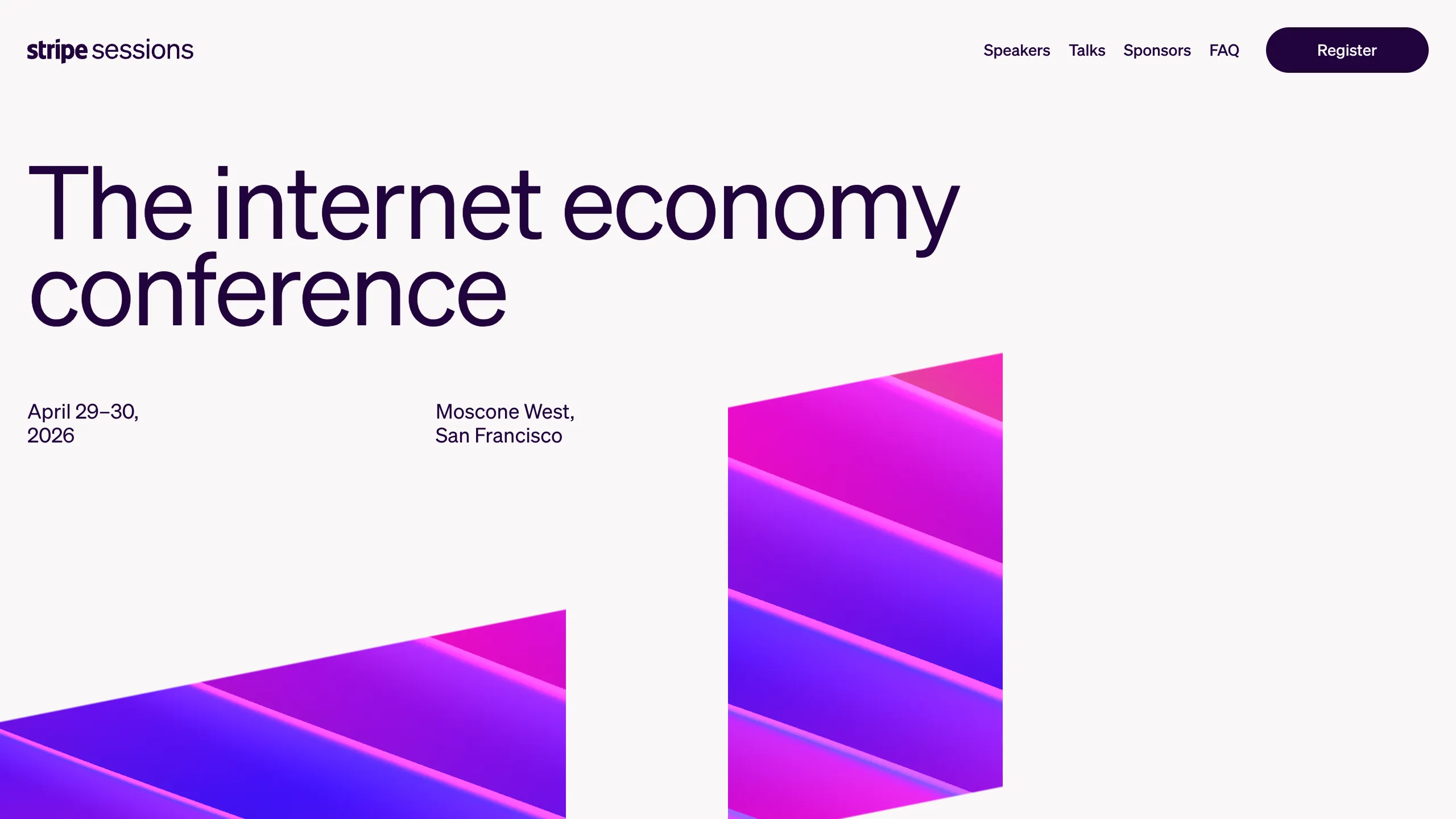
Stripe Sessions Conference Landing Page
A minimalist tech event landing page featuring a bold typography hero section, clean navigation header, and vibrant isometric gradient graphic elements.
Overview
This landing page for Stripe Sessions is a masterclass in high-end tech conference branding, balancing extreme minimalism with vibrant isometric 3D visuals. It serves as a strong clone reference for developers who need to present complex information through a clean, authoritative interface that relies on sophisticated typography and spatial layout.
Design System
- Color Palette & Visual Hierarchy: The background uses a soft off-white (
#F6F9FCstyle) to keep the focus on the dark navy/black typography (#0A2540). The primary visual interest comes from a multi-color isometric gradient block featuring fuchsia, purple, and gold tones, creating a high-contrast focal point that directs the eye upward toward the text. - Typography System: The design utilizes a clean sans-serif (Inter or similar geometric face). The hero headline uses a large display scale with tight letter-spacing for impact, while secondary metadata like dates and locations are set in a smaller, medium-weight font to maintain a clear hierarchy.
- Page Structure: The layout follows a classic F-pattern. It starts with a persistent header, transitions into a left-aligned hero section with asymmetrical whitespace, and utilizes a large graphic element on the bottom right to balance the composition.
- Reusable Components:
- Navigation Bar: A clean top-row nav with text-only links and a high-contrast primary CTA button ("Register") with rounded corners.
- Metadata Clusters: Small, organized blocks of text used for event logistics (Date, Venue) that can be easily repurposed for any event type.
- Button Styling: A pill-shaped "Register" button that uses white text on a dark background to define clear user intent.
- Implementation Clues: The HTML structure shows a semantic header and main section with broad container classes, suggesting a utility-first CSS approach (like Tailwind) to handle padding and flexbox alignment.
Use Cases
- Who should clone this pattern: Developers building professional event sites, developer summits, or SaaS product launches where brand authority is paramount.
- Remixing Effectively: A fintech app could reuse the typography scale and header layout while swapping the isometric conference graphic for product screenshots or abstract data visualizations.
- Practical Directions:
- Quick Section Clone: Rip the hero and header sections to create a high-converting "Waitlist" page.
- Full-Page Clone: Adopt the full structure for a multi-day conference site, using the bottom graphic area as a transition point into speaker grids or schedule tables.
- Suggested Scope: This is best cloned as a full-page layout to preserve the specific relationship between the massive whitespace and the bold typography.
Related Inspirations
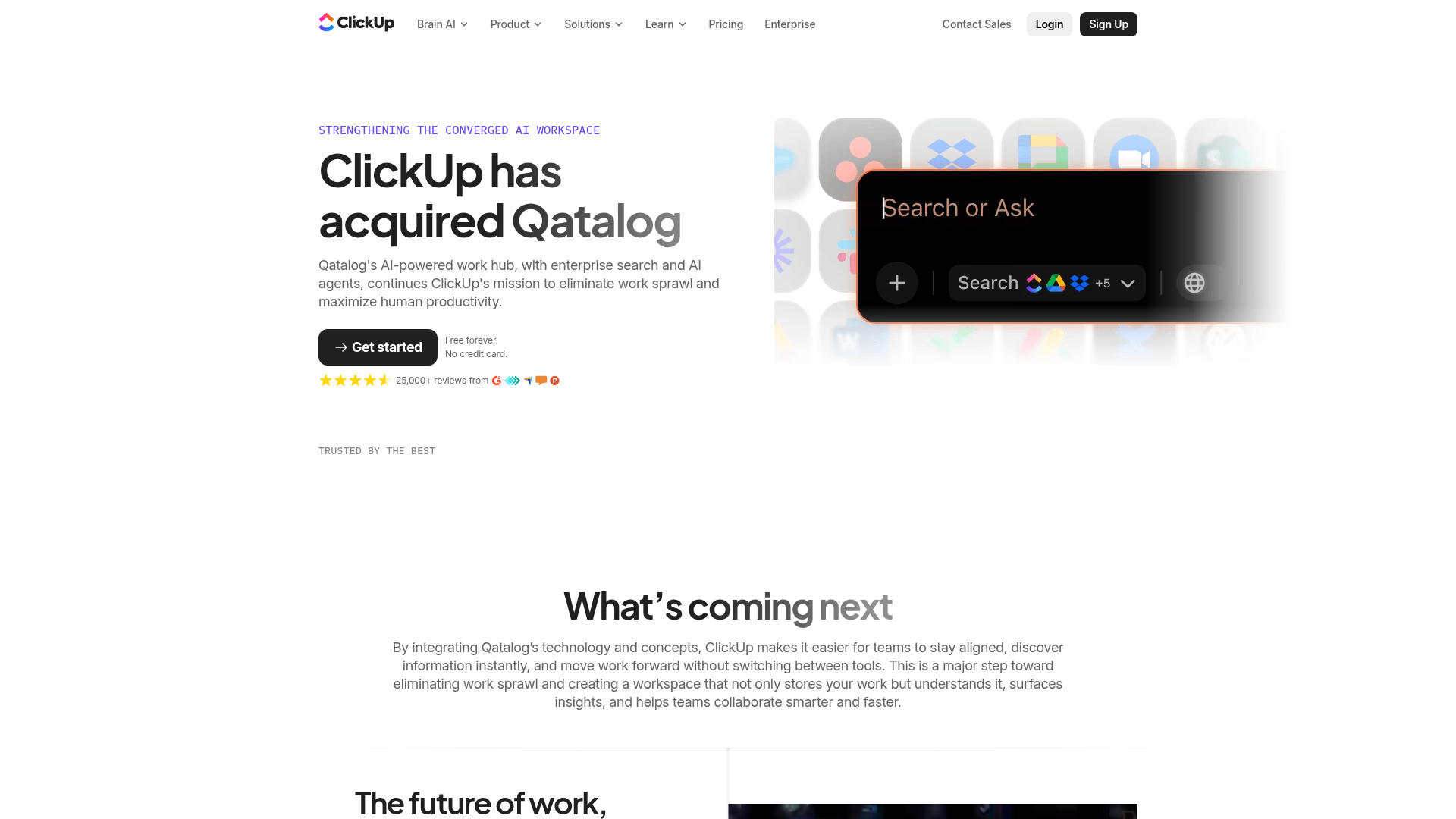
ClickUp Acquisition Hero Landing Page
Features a modern dark-themed hero section with a search UI graphic, bento-style feature grid, and a high-contrast CTA section with decorative gradients.
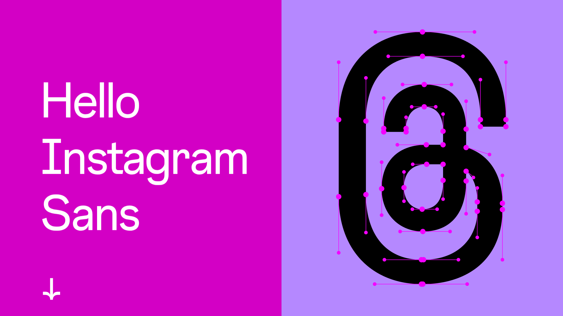
Instagram Sans Typography Showcase
A high-impact brand page featuring split-screen layouts, a character picker with technical font data, interactive type testers, and horizontal-scroll image and video carousels.

Google Holiday 100 Curator Landing Page
A minimalist e-commerce showcase featuring a wide hero section, clean search integration, and a bold typography-driven header designed for trending product collections.
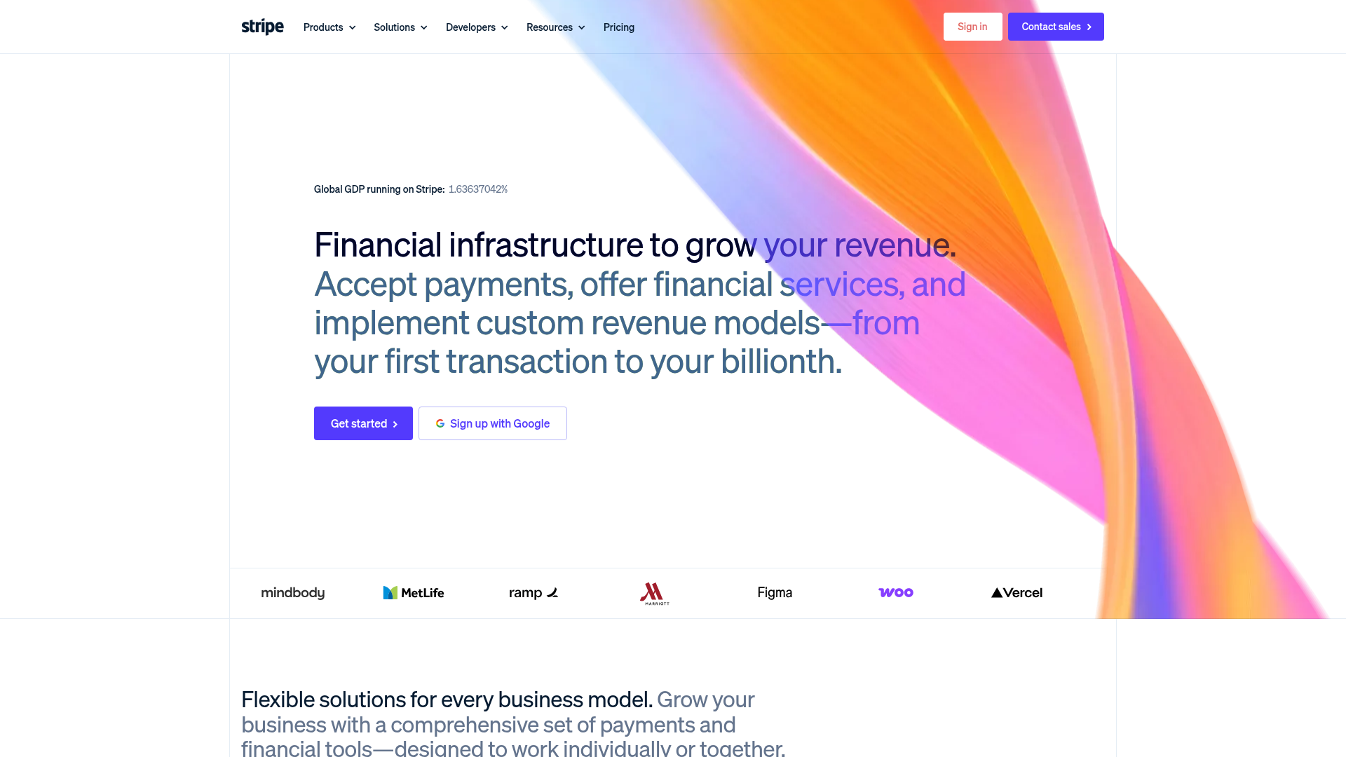
Stripe Modern SaaS Landing Page
A high-conversion landing page featuring a complex mesh-gradient hero, sticky navigation, and a horizontal logo wall for brand social proof.

GoCardless Payments Platform Landing Page
A dark-themed fintech landing page featuring a split-screen video hero, bento-style feature cards, a horizontal logo slider, and step-by-step accordion guides.
Playspace Acquisition Announcement Minimalist Layout
A clean, center-aligned announcement template featuring a vertical stack of rich text content and linked text elements on a neutral background.
