Instagram Sans Typography Showcase
A high-impact brand page featuring split-screen layouts, a character picker with technical font data, interactive type testers, and horizontal-scroll image and video carousels.
Overview
This website is a premium typography showcase for Instagram Sans, featuring a high-impact narrative layout designed to celebrate brand identity. It serves as an excellent reference for builders creating font foundries, portfolio sites, or interactive brand guideline documentations that need to combine static technical data with dynamic visual storytelling.
Design System
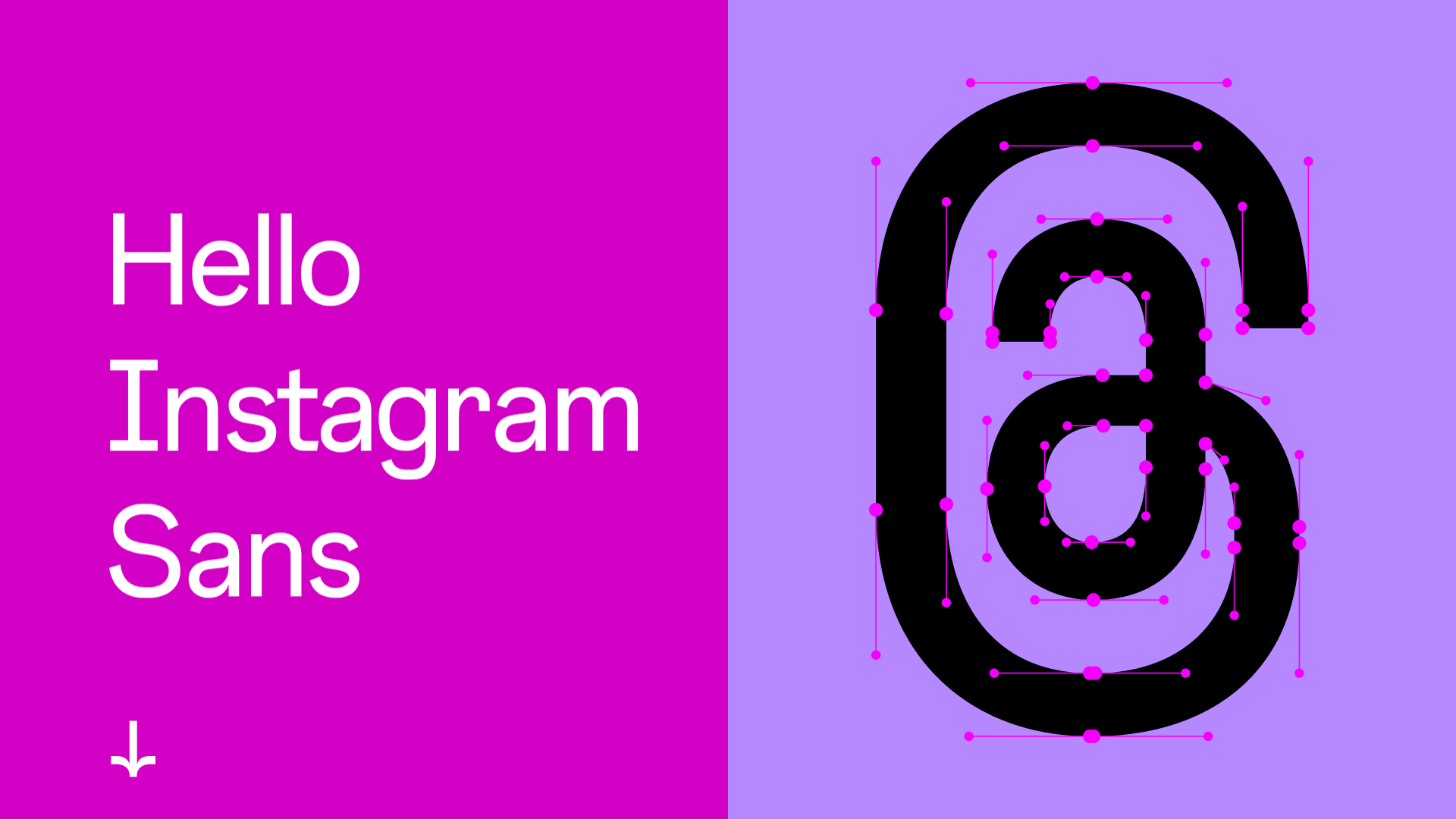
- Color Palette & Visual Hierarchy: The design uses a high-contrast split-screen aesthetic. Primary colors include a vibrant magenta (
#D300C5) and light lavender (#F689FF), complemented by deep blacks and pure whites. Hierarchy is established through extreme scale, with massive typography taking center stage against clean, color-blocked backgrounds. - Typography System: The site solely showcases "Instagram Sans," utilizing a range of weights from Light to Bold and Condensed. The scale is dramatic, using large display headers (
_a6sv) alongside smaller informational text to create a rhythm between "expression" and "explanation." - Page Structure & Flow: The flow starts with an heroic split-screen intro, followed by explanatory text blocks with generous white space. It transitions into horizontal image/video carousels (
_a8ec), multi-language animated displays, a technical character picker, and finally an interactive type tester. - Reusable Components:
- Split-Screen Hero: A layout with text on one side and an animated glyph or image on the other.
- Character Picker: A grid-based selection tool that displays technical font data (Unicode, Hex, Cap Height) upon interaction.
- Interactive Type Tester: A
textareabased component that allows users to toggle font styles (Regular, Bold, etc.) and alignment while testing the face. - Horizontal Media Carousel: A robust swipe-enabled container for showcasing video and image assets.
- Interaction & Motion: The site uses scroll-triggered transitions and CSS animations (
_a8vl) for language transitions. The character picker and type tester provide immediate visual feedback, while theSwipe to explorecues indicate horizontal navigation patterns. - Implementation Clues: The HTML uses functional class naming conventions (e.g.,
_a8td,_a9jk) characteristic of Meta’s internal frameworks. It relies heavily on absolute positioning within flex containers to achieve the perfectly centered, split-screen effect.
Use Cases
- Who Should Clone: Developers building design system documentation, type foundries, or high-end agency portfolios.
- Effective Remixes: This pattern can be adapted for a product launch page by swapping the font focuses for product features, or for an educational site that needs a custom "character picker" for technical specifications.
- Practical Directions: Reuse the character picker logic to showcase icon sets or color swatches. Swap the vibrant brand colors for a more muted palette to ground the high-energy layout in a different industry context (e.g., luxury goods or architecture).
- Suggested Scope: For a quick win, clone the Type Tester and Character Picker sections as standalone utilities. For a full brand reveal experiences, clone the full-page sequence to leverage the narrative flow from abstract visuals to technical detail.
Related Inspirations
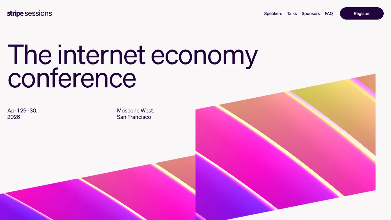
Stripe Sessions Conference Landing Page
A minimalist tech event landing page featuring a bold typography hero section, clean navigation header, and vibrant isometric gradient graphic elements.
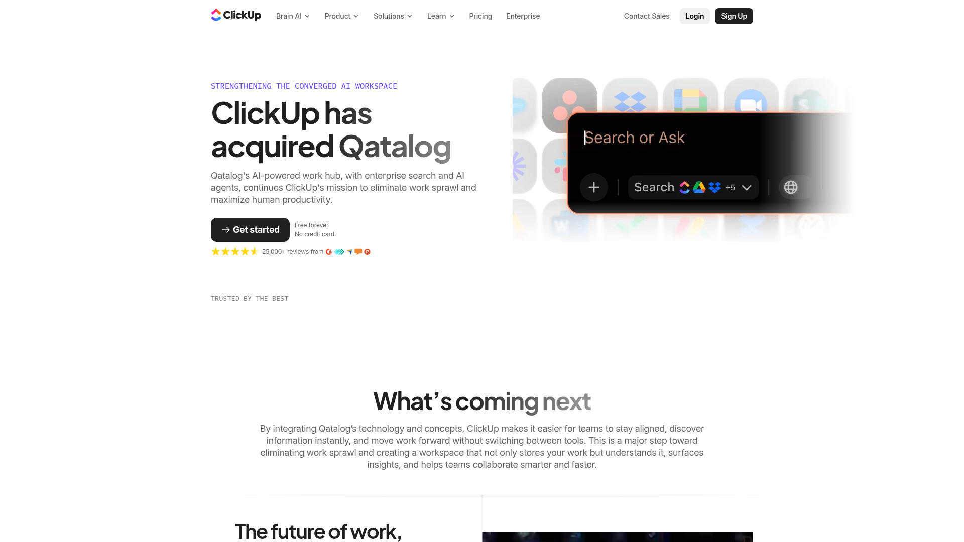
ClickUp Acquisition Hero Landing Page
Features a modern dark-themed hero section with a search UI graphic, bento-style feature grid, and a high-contrast CTA section with decorative gradients.
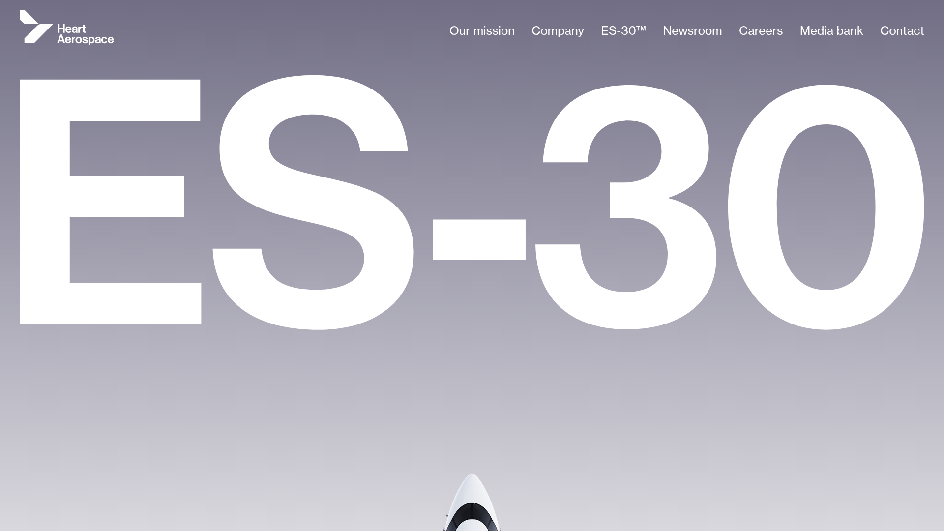
Heart Aerospace Landing Page
A minimalist industrial design featuring a full-screen video hero section, large-scale typography, high-contrast grid layouts, and an interactive partner logo gallery.
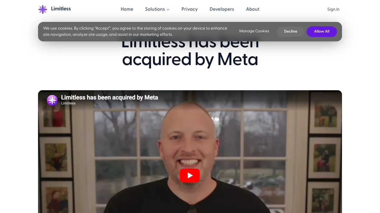
Limitless Acquisition Announcement Page
A clean announcement layout featuring a sticky blurred navigation bar, embedded video hero, glassmorphism cards for text content, and integrated FAQ accordions.
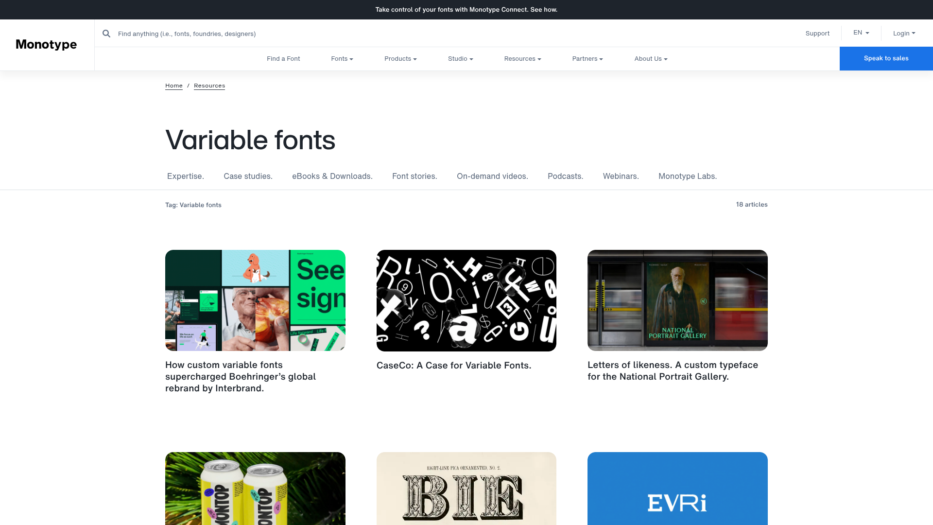
Monotype Variable Fonts Resource Gallery
A clean masonry grid layout featuring content cards with hover-state overlays, category filtering, and responsive image scaling for a media-rich resource center.
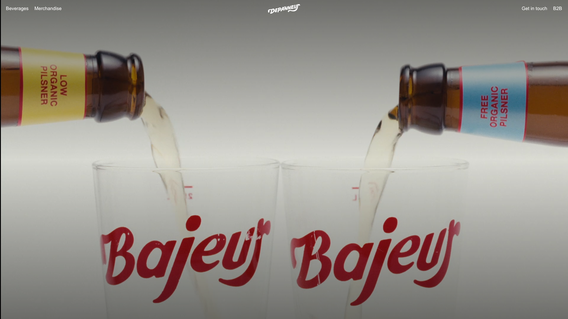
Depanneur Beverage E-commerce Hero
A minimalist Shopify storefront featuring a full-screen background video hero, sticky translucent navigation, and integrated mobile menu components.
