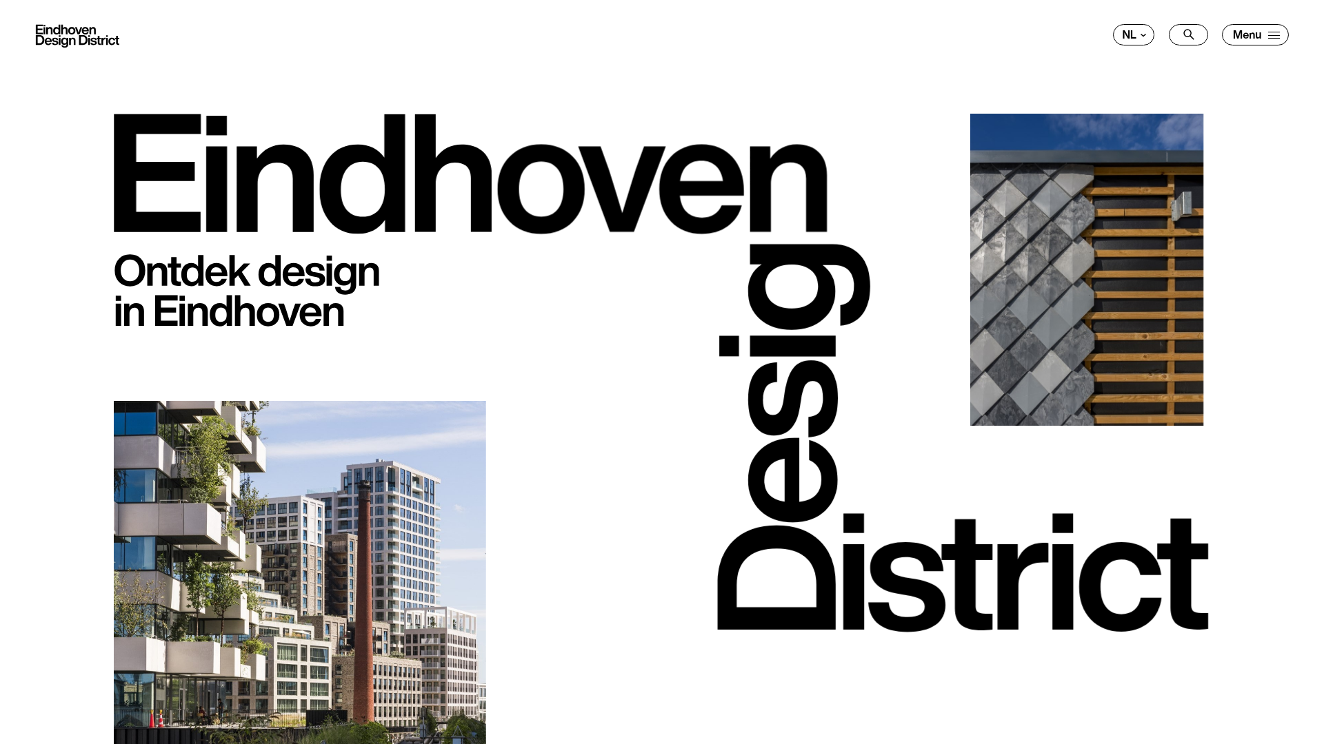
Eindhoven Design District Landing Page
A minimalist, typography-focused showcase featuring a split-screen project gallery with sticky scroll-based animations, horizontal article sliders, and a high-contrast brutalist design.
Overview
This landing page is a high-impact, typography-driven showcase for the Eindhoven Design District, blending brutalist aesthetics with professional Swiss-style layouts. It serves as an excellent reference for builders looking to implement bold, editorial-style scrolling experiences and asymmetrically balanced grids that prioritize readability and visual grit.
Design System
- Color Palette & Visual Hierarchy: The site uses a high-contrast foundation of stark white backgrounds and solid black text. It introduces vibrancy through section-specific 'data-themes' (pink, blue, red) that change the background color during scroll, creating a clear visual rhythm between different projects.
- Typography System: The design is dominated by a heavy, tightly-spaced Sans-Serif font (likely a custom variant of Helvetica or Inter). It utilizes massive heading scales for the hero area, with vertical text-orientation for the word "Design," creating a layered, architectural feel. Subheadings use a smaller but weighted scale for information density.
- Page Structure: The flow consists of a dynamic hero with overlapping image figures, followed by a text-heavy intro, a "Projecten" (Projects) section featuring split-screen sticky scrolling, a horizontal article slider ("Artikelen"), and finally a full-width footer CTA.
- Reusable Components:
- Split-Screen Project Cards: A layout where text is pinned on one side while the image scrolls or transitions based on the
pin-spacerlogic. - Horizontal Sliders: Implemented via
flickity, featuring a custom fraction-based pagination (e.g., "1/6"). - Rounded Buttons: Outlined and filled pill-shaped buttons that provide a soft contrast to the rigid typography.
- Split-Screen Project Cards: A layout where text is pinned on one side while the image scrolls or transitions based on the
- Interaction & Motion: The site uses
GSAPandScrollTrigger(evident frompin-spacerandtransform: translate3dclasses) to create sticky sections where images reveal or change as the user scrolls. Images utilize areveal-imagewrapper that scales or slides the content into view. - Implementation Clues: The HTML uses
data-barba="wrapper"for smooth AJAX page transitions andflickityfor touch-responsive sliders. The structure relies on a 12-column grid system with specializedcontainerandgridutility classes.
Use Cases
- Who should clone this: Creative agencies, architecture firms, or urban development projects that need to present a mix of long-form articles and visual portfolios in a prestigious, modern format.
- Effective Remixes: This pattern works well for luxury fashion lookbooks or tech portfolios where the brand identity relies on bold, oversized messaging.
- Remix Directions:
- Style Swap: Keep the split-screen scroll logic but replace the high-contrast black/white with a more organic or pastel palette for a different brand mood.
- Info Architecture: Adapt the "Projecten" vertical scroll section into a service listing for a B2B consultancy.
- Suggested Scope: Developers should prioritize cloning the Sticky Project Section first, as its split-screen scroll logic is the most technically distinct and visually rewarding part of the experience.
Related Inspirations
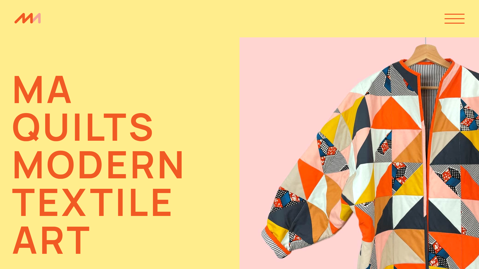
MA Quilts Textile Portfolio Site
A vibrant portfolio layout featuring a two-column animated hero, horizontal marquee text, and dynamic CMS-driven grid galleries for showcasing artistic products and blog posts.
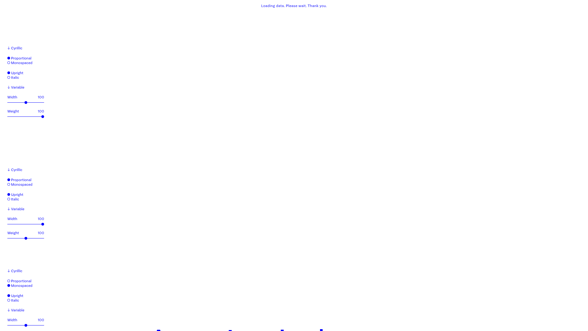
GT America Typography Tester
A layout-heavy landing page featuring interactive font testing toolkits with multi-language support, font-weight sliders, and content-editable text areas.
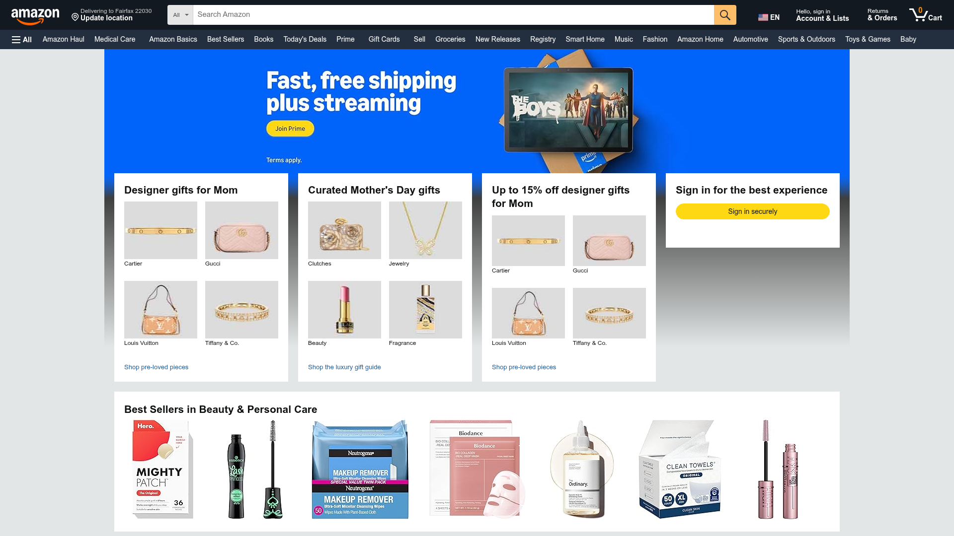
Amazon Marketplace E-commerce Homepage
A complex dashboard layout featuring a carousel hero banner, multi-column bento grids for categorized promotions, and a horizontal product recommendation slider.
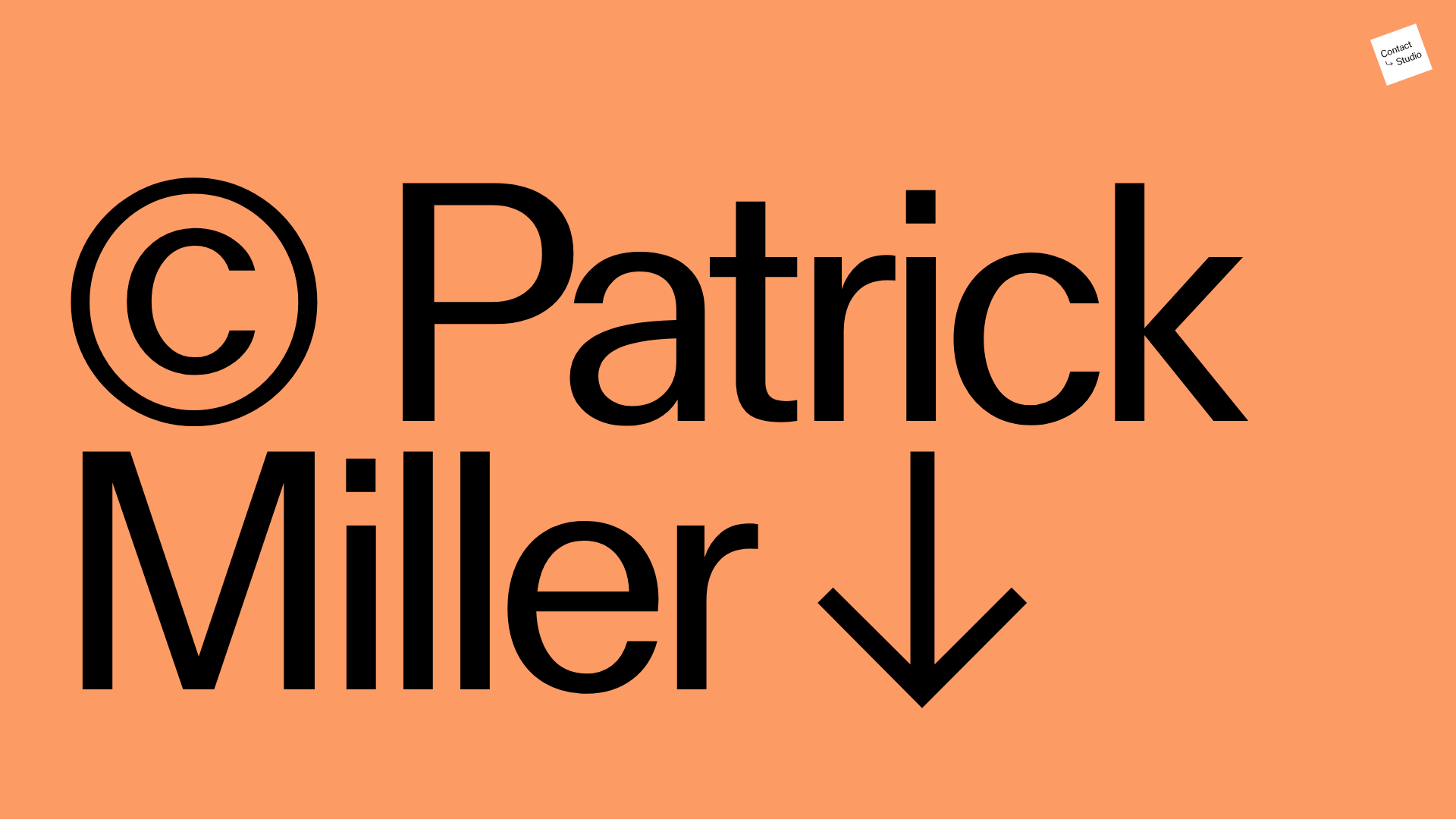
Patrick Miller Photography Portfolio Template
A minimalist, full-bleed photography portfolio featuring a split-screen grid, scroll-triggered section transitions, and integrated Swiper.js image carousels for project galleries.
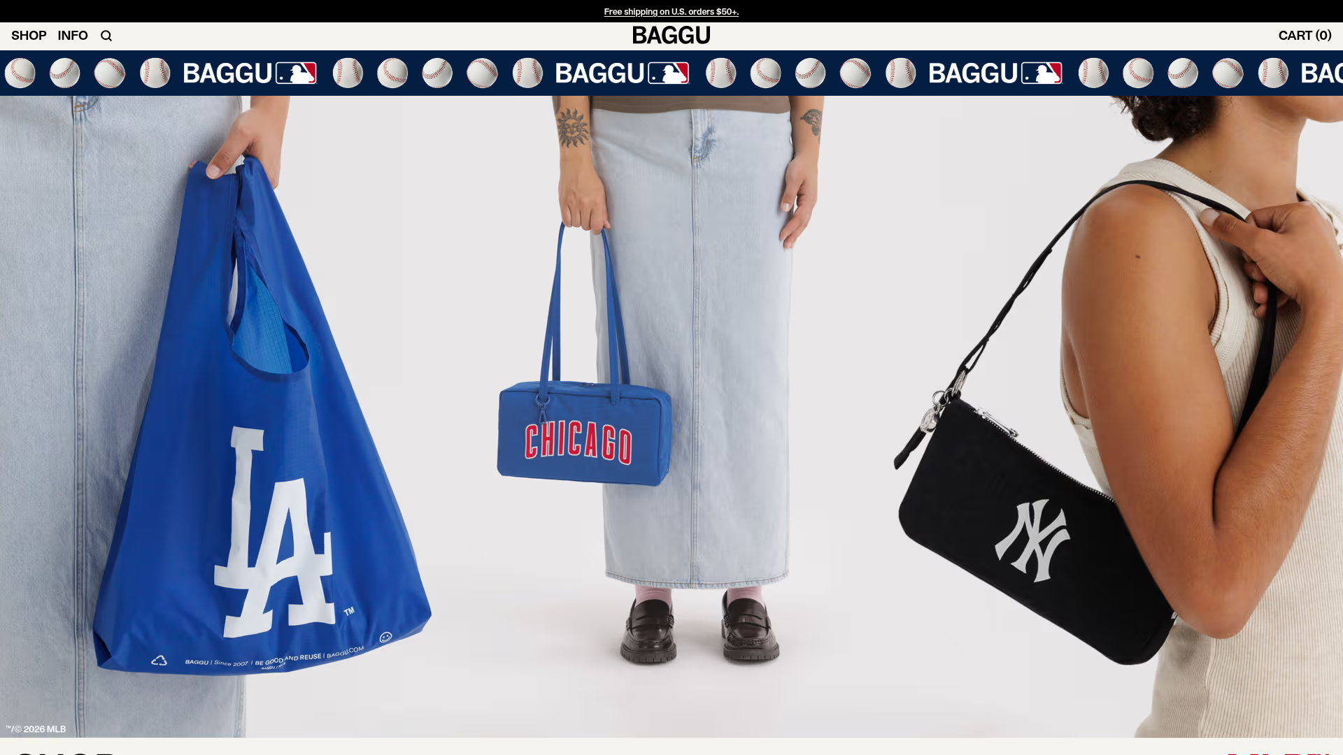
BAGGU Minimalist E-commerce Hero Template
A clean retail landing page layout featuring a full-width high-impact hero section, a sticky integrated banner, and a minimalist navigation header optimized for product launches.
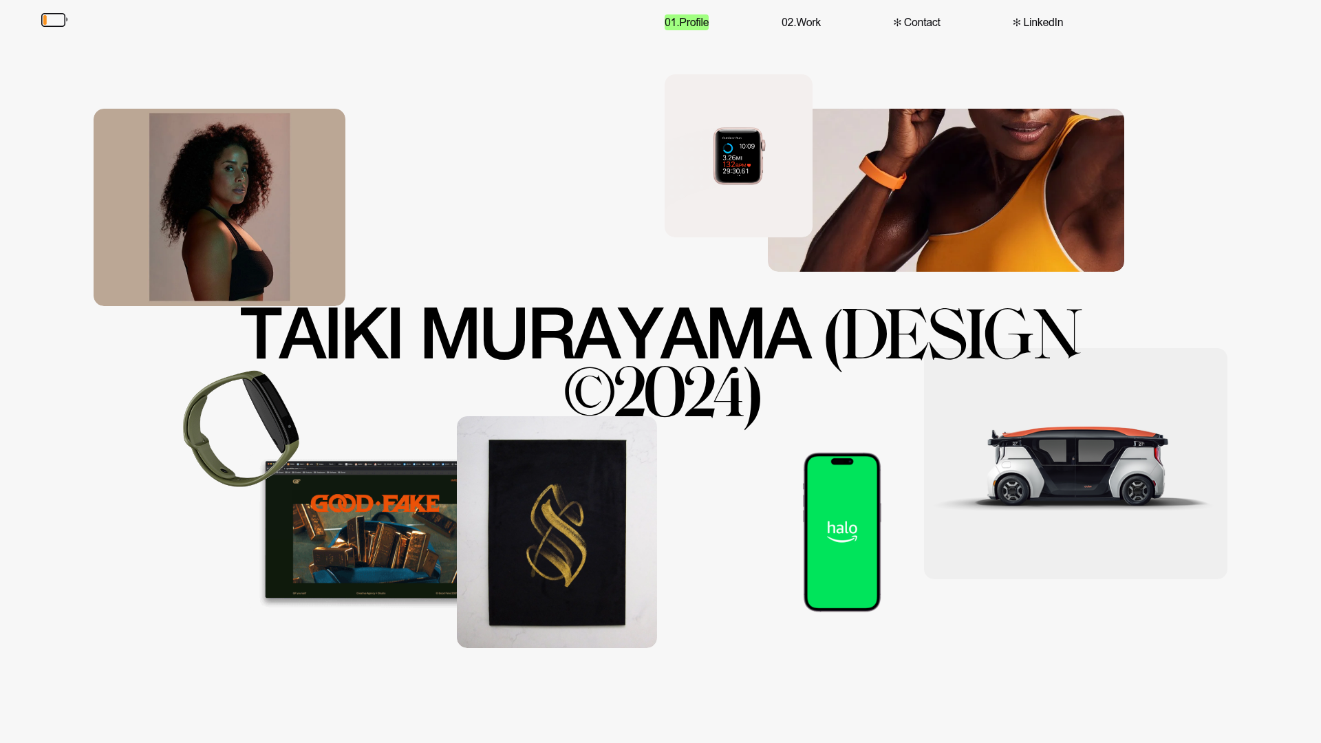
Taiki Murayama Portfolio Bento Grid
A minimalist designer portfolio featuring a dynamic bento-style layout for project imagery, integrated accordion project lists, and high-contrast typography.
