Minimalist Center-Aligned Domain Error Page
A clean, centered layout template suitable for error states, maintenance pages, or simple typographic landing pages.
Overview
This is a minimalist, center-aligned error state page designed to communicate a technical failure ("Domain error") with maximum clarity and zero visual distraction. It serves as an excellent clone reference for building lightweight system pages, maintenance placeholders, or typography-driven landing screens that require a high degree of focus and minimal load time.
Design System
- Color Palette and Visual Hierarchy: The design uses a high-contrast, achromatic palette. A deep charcoal or black (#1A1A1A) is used for the primary heading to establish immediate hierarchy, while a medium gray (#808080) is used for the sub-header to indicate secondary information. The background is a clean, solid white (#FFFFFF).
- Typography System: The layout relies on a modern sans-serif typeface. The primary heading (
h1) uses a bold weight and large scale to command attention, while the description (h2) uses a regular weight and smaller scale with increased tracking for readability. - Page Structure and Section Flow: The structure is dead-simple: a single container div (
class="content") that is vertically and horizontally centered within the viewport. This layout ensures the message remains the focal point regardless of screen resolution. - Reusable Components: The core component to clone is the Center-Aligned Hero Block. This wrapper handles the flexbox or CSS grid logic required to pin content to the dead center of the screen.
- Implementation Clues: The HTML shows a semantic hierarchy using
h1andh2nested within acontentutility class. This structure suggests a utility-first approach where layout is handled by a parent container rather than complex nested grids.
Use Cases
- Who should clone this pattern: Developers building system-level pages (404, 500 errors, maintenance mode) or extremely minimal "Link-in-bio" style landing pages.
- Effective Remixes: This pattern can be effectively remixed into a "Coming Soon" page by adding an email input field below the sub-header or a product launch teaser by replacing the text with a brand logo and a countdown timer.
- Practical Remix Directions: Swap the achromatic palette for brand-specific gradients, or maintain the layout but integrate a subtle SVG background animation to add visual interest without breaking the minimalist hierarchy.
- Suggested Clone Scope: This is a perfect full-page clone for quick deployment. Because the HTML is so lean, it can be integrated into any existing framework as a standalone template file.
Related Inspirations
403 Forbidden Access Page
A minimal, default server-side error page containing a centered heading on a plain white background.

Google Holiday 100 Curator Landing Page
A minimalist e-commerce showcase featuring a wide hero section, clean search integration, and a bold typography-driven header designed for trending product collections.

Finn Pet Supplements Landing Page
An e-commerce landing page featuring high-contrast typography, a sticky brand logo banner, parallax scroll effects on product headers, and a clean product grid.
Playspace Acquisition Announcement Minimalist Layout
A clean, center-aligned announcement template featuring a vertical stack of rich text content and linked text elements on a neutral background.
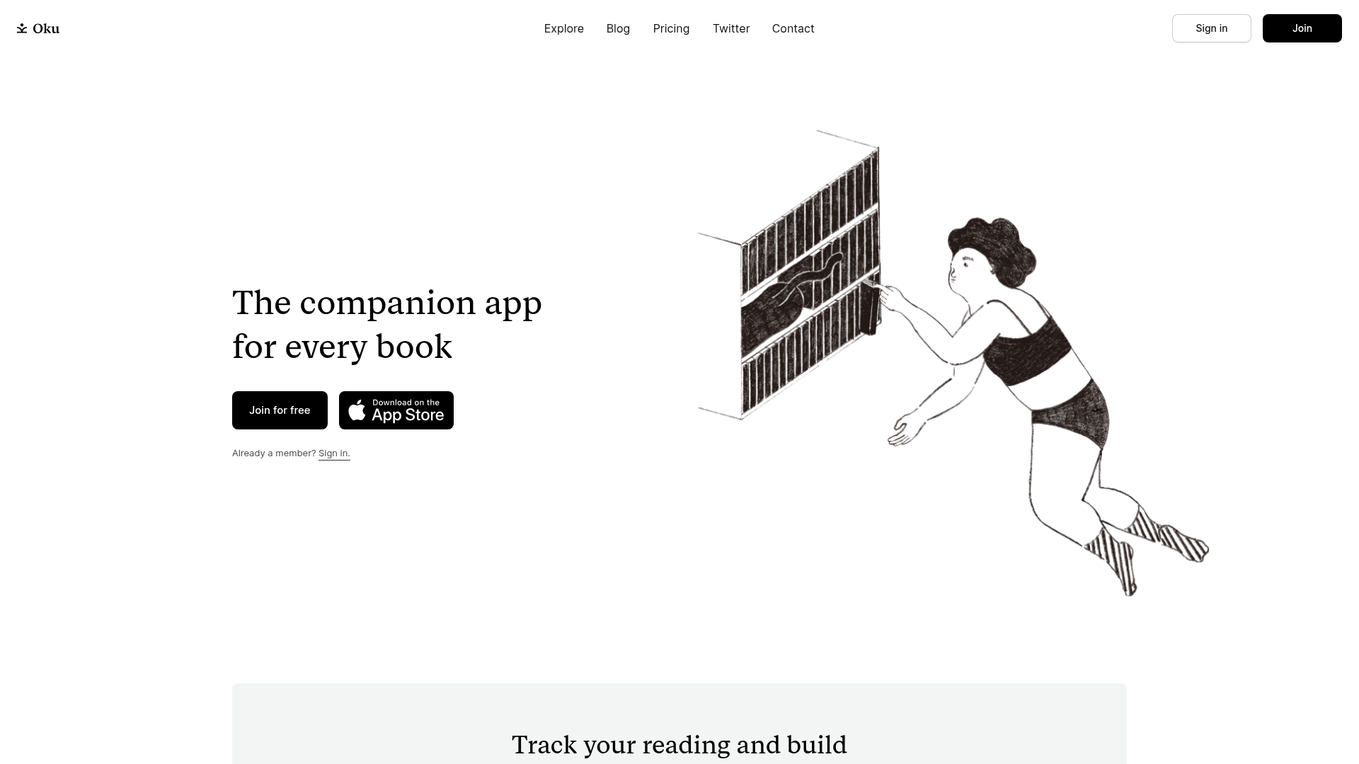
Oku Minimalist Book Tracking Landing Page
A clean, typography-focused landing page featuring a minimalist header, illustrated hero section, and clear call-to-action buttons for app downloads.

OpenWeb B2B Service Landing Page
A professional landing page layout featuring a central animated hero area, data visualization counters, a client logo grid, testimonial slider, and tabbed lead generation forms.
