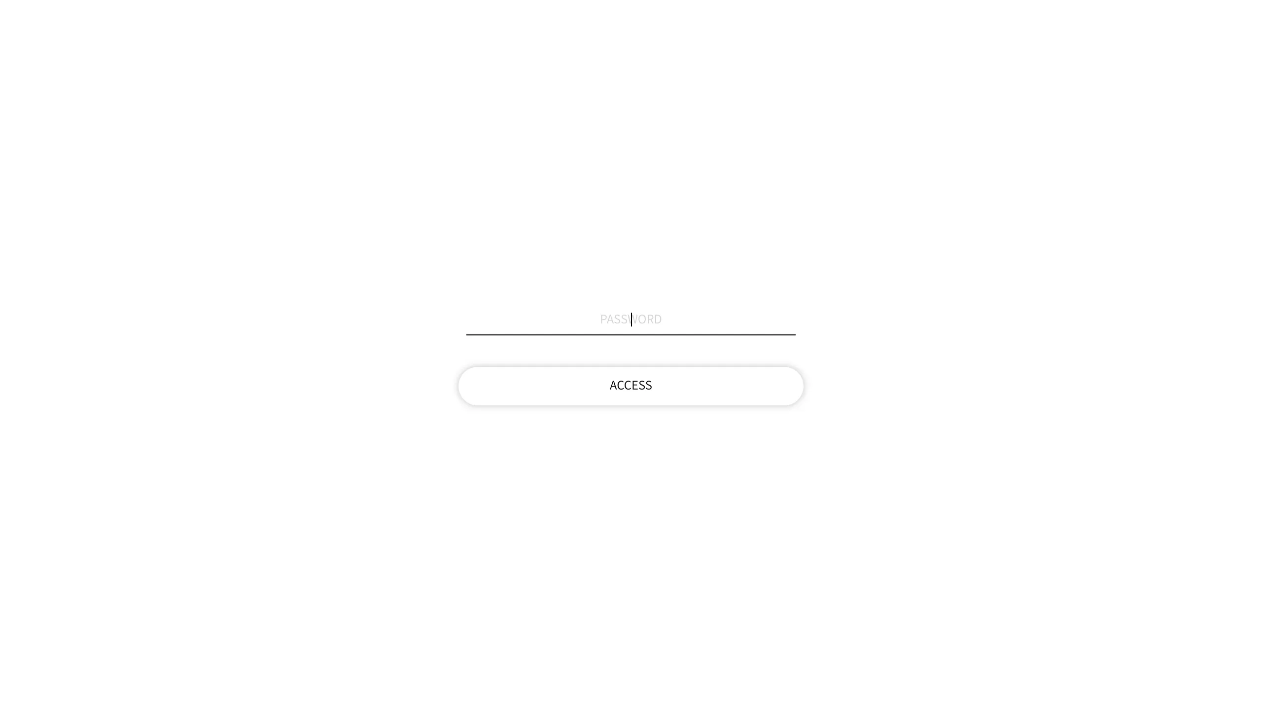
Minimalist Password Protected Entry Page
A stark, centrally aligned landing page featuring a thin-line text input field and a pill-shaped access button for basic authentication flows.
Overview
This is a minimalist authentication gateway designed for password-protected storefronts or landing pages. Its extreme focus on utility and high white-space ratio makes it an excellent reference for builders looking to implement a distraction-free 'Coming Soon' page or a private site entry point.
Design System
- Color Palette & Visual Hierarchy: The design uses a monochrome, high-contrast palette of pitch black (#000000) for text and lines against a pure white (#FFFFFF) background. The hierarchy is strictly centered to draw immediate focus to the interaction point.
- Typography: The text utilizes a clean, sans-serif typeface in uppercase. The 'PASSWORD' placeholder is light-weight and small-scale, while the 'ACCESS' button text is slightly more emphasized to signify action.
- Page Structure: The layout is a single vertical stack centered both horizontally and vertically in the viewport. It consists of a horizontal line input followed by a rounded button.
- Reusable Components:
- Minimalist Input: A single border-bottom text field that eliminates the traditional box-model input feel.
- Pill Button: A rounded-rectangle button ('btn') with a subtle border and generous internal padding.
- Interaction Design: Based on the HTML structure, the form features a standard
POSTaction. The input uses a vertical bar cursor for text entry, maintaining the thin-line aesthetic throughout the interaction. - Implementation Clues: The HTML reveals a standard
<form>structure with hidden security tokens (storefront_password), suggesting this is a lightweight template designed for e-commerce platforms like Shopify or custom-built access gates.
Use Cases
- Who should clone this: Developers needing a quick, professional 'Under Construction' gate or photographers/designers requiring a simple password entry for private client galleries.
- Effective Remixes: This pattern can be effectively remixed by adding a background image with a low-opacity overlay, or by switching the monochrome theme to a brand-specific accent color.
- Remix Directions:
- Brand Swap: Keep the layout but replace the white background with a dark-mode charcoal and use a vibrant neon color for the bottom input line.
- Information Architecture: Add a small logo above the input or a 'Contact Support' link in a smaller font size at the bottom for better UX.
- Suggested Clone Scope: This is ideal for a full-page clone. Given the simplicity of the CSS required to center a small form, it serves as a perfect foundation for any gatekeeper functionality.
Related Inspirations

Google Holiday 100 Curator Landing Page
A minimalist e-commerce showcase featuring a wide hero section, clean search integration, and a bold typography-driven header designed for trending product collections.

Finn Pet Supplements Landing Page
An e-commerce landing page featuring high-contrast typography, a sticky brand logo banner, parallax scroll effects on product headers, and a clean product grid.
Playspace Acquisition Announcement Minimalist Layout
A clean, center-aligned announcement template featuring a vertical stack of rich text content and linked text elements on a neutral background.
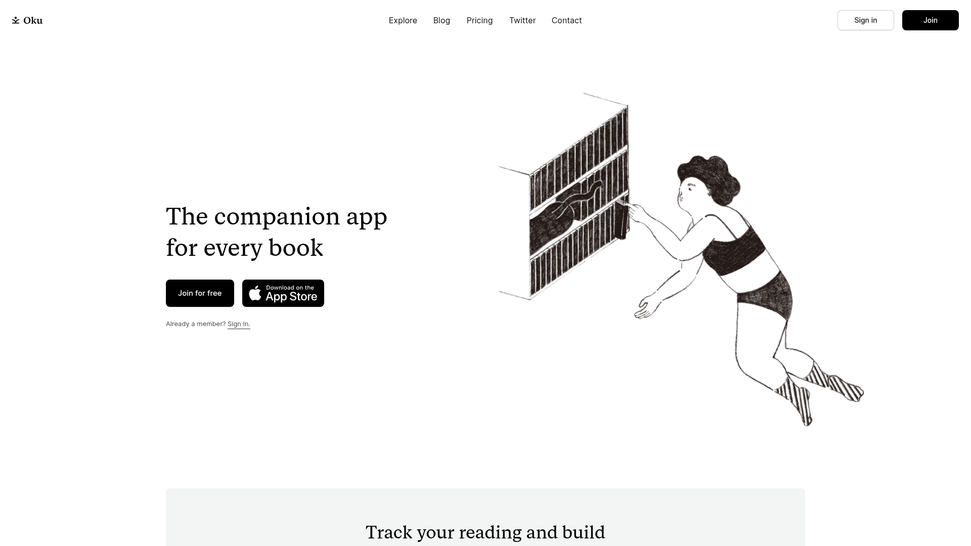
Oku Minimalist Book Tracking Landing Page
A clean, typography-focused landing page featuring a minimalist header, illustrated hero section, and clear call-to-action buttons for app downloads.

OpenWeb B2B Service Landing Page
A professional landing page layout featuring a central animated hero area, data visualization counters, a client logo grid, testimonial slider, and tabbed lead generation forms.

Slite SaaS Knowledge Base Landing Page
A clean SaaS hero section with a conversational headline, secondary call-to-action buttons, and a structured software interface preview featuring user testimonials.
