Evoke Creative Studio Portfolio Grid
A minimalist portfolio layout featuring a full-width image carousel, fixed oversized typography, and interactive project cards with color-themed hover overlays.

Overview
This website features a high-impact, minimalist portfolio layout designed for creative studios. It centers on a horizontal project carousel that balances colorful visual assets with massive, fixed display typography, making it an excellent reference for builders wanting to showcase a visual narrative with bold editorial flair.
Design System
- Color Palette & Visual Hierarchy: The primary background is white, allowing various project-specific colors to pop. Visual hierarchy is split between the massive black brand name and the vibrant, square project cards that act as the primary focal points.
- Typography: The system utilizes a heavy sans-serif typeface (likely a variant of Franklin Gothic or similar grotesque). The title "EVOKE" is set in a fixed, oversized scale that dominates the lower third of the viewport, creating a literal foundation for the imagery above.
- Page Structure: The layout consists of a
fixedorstickybottom section containing the brand name, while the space above features aswiper-horizontalimage carousel. The carousel items are organized into three distinct cards visible at once in the desktop view. - Reusable Components:
- Project Overlay Card: A square container with an image/video background and a
hover-overlaydiv that triggers a color-coded state change. - Swiper Carousel: A horizontal navigation block with minimal arrow icons (
swiper-nav). - Logo/Title Section: An oversized, responsive text block designed to sit at the bottom of the viewport.
- Project Overlay Card: A square container with an image/video background and a
- Interactions:
- Dynamic Hover: Each card has a
hover-overlaywith a specificbackground-color(e.g.,#ff5a46,#005f73). On hover, a "VIEW" prompt appears. - Media Integration: The grid seamlessly mixes static images (
img) with looping mp4 videos (video) using lazy loading.
- Dynamic Hover: Each card has a
- Responsive Behavior: The HTML indicates distinct desktop (
outer-image-carousel-wrap) and mobile (mobile-images-wrap) structures. On smaller screens, the horizontal carousel likely stacks vertically or maintains a single-column swipe to accommodate the square aspect ratios.
Use Cases
- Who should clone this: Independent designers, creative agencies, and illustrators with high-quality visual assets who want a "gallery-first" landing page.
- Product Remixing: Photography portfolios can swap the bold black text for thin serifs for a more luxury feel; fashion brands can replace square cards with portrait-oriented cards.
- Remix Directions: Reuse the
hover-overlaylogic to create interactive mood boards, or adapt the oversized text bottom bar to display a scrolling news ticker or alternating project titles. - Clone Scope: A full-page clone is ideal to capture the unique interplay between the fixed typography and the carousel. However, the interactive square card component with color-matched overlays can be easily exported for standard grid layouts.
Related Inspirations

Clase Agency Branding Portfolio
A minimalist design agency portfolio featuring a typographic hero section, full-width image articles, sticky title bars, and integrated scrolling text marquees for a clean editorial layout.

Lundqvist & Dallyn Studio Portfolio
Minimalist design studio portfolio featuring a custom video loader, world clock navigation, and a fluid masonry-style grid for high-quality photography and type design showcases.

AcolorBright Design Agency Portfolio
Minimalist bento-style portfolio layout featuring numerical section headers, horizontally scrolling project teasers, and a clean grayscale client logo grid.
Manna Architects Minimalist Portfolio Grid
A clean, single-page architecture portfolio featuring a centered intro, a varied multi-column image gallery with captions, and a detailed project service breakdown.
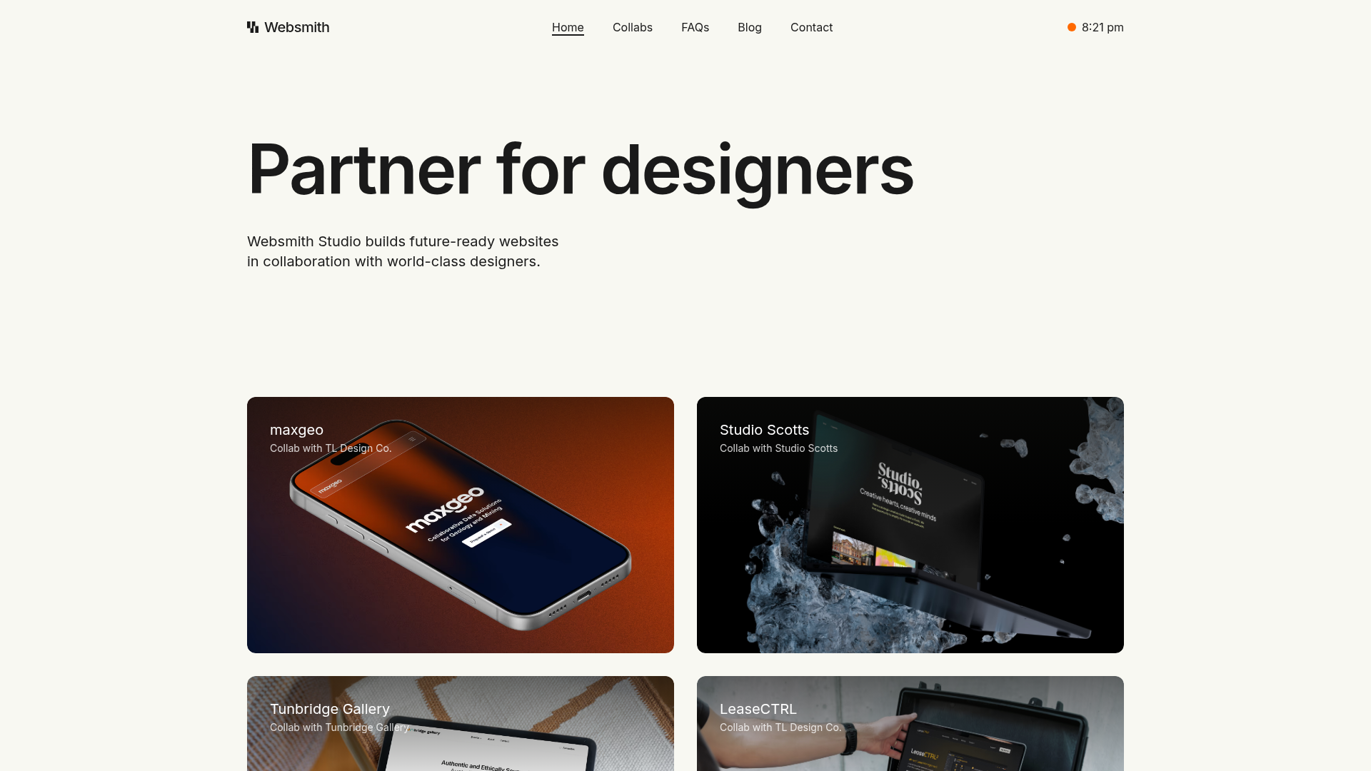
Websmith Studio Portfolio Site Template
A clean studio portfolio featuring a responsive bento-style project grid, interactive process cards, and a split-screen testimonial section built with Tailwind CSS.
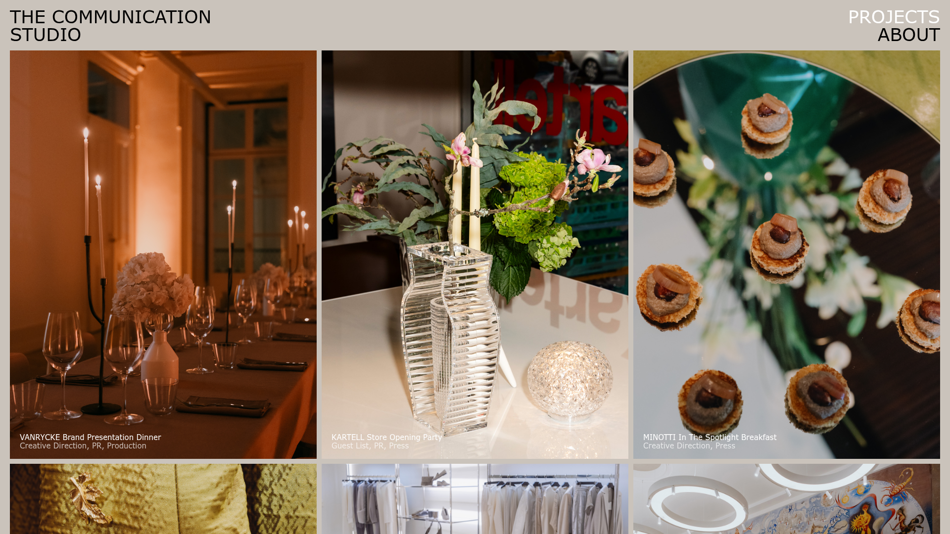
The Communication Studio Portfolio Grid
A minimalist creative agency portfolio featuring a gapless image grid with image-swap hover effects and Tailwind-based reveal animations.
