Xi He Studio Minimalist Portfolio
A clean, typography-focused designer portfolio featuring a fixed side panel with a chronological project log, responsive column-based layouts, and integrated horizontal image slideshows.
Overview
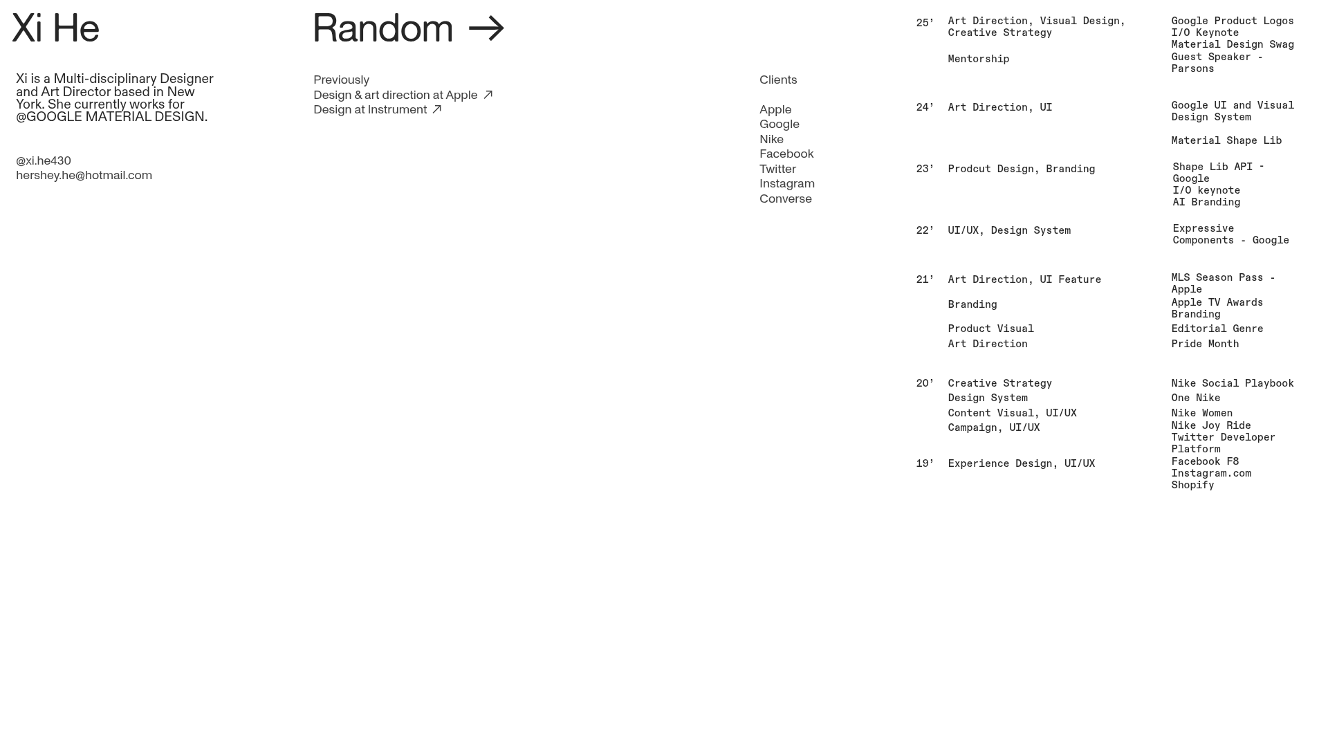
Xi He Studio is a minimalist, typography-driven portfolio that leverages a unique split-screen layout to present professional history alongside visual projects. It is an exceptional reference for builders aiming to balance heavy textual data (like a CV or log) with a dynamic media gallery without cluttering the interface. The design's strength lies in its use of a fixed side panel and a fluid, column-based content area that maintains a sense of high-end editorial organization.
Design System
- Color Palette & Visual Hierarchy: The site uses a high-contrast monochrome palette (black on white) to emphasize content over interface. Visual hierarchy is established through spatial distribution rather than color, using wide-margined columns to create a breathable, sophisticated layout.
- Typography System: The design relies on a clean sans-serif typeface. It utilizes varied font sizes—large headers for name and section titles (like "Random"), standard body copy for descriptions, and smaller "caption" style text for the chronological log to denote secondary metadata.
- Page Structure & Flow: The site is structured with a fixed-top or fixed-side element (
pinned-top fixed stacked-pagein the HTML) that contains a dense, three-column project index. The main scrollable area features horizontalgallery-slideshowcomponents interleaved withcolumn-settext blocks that explain project details. - Reusable Components:
- The Chronological Log: A three-column grid (
column-unitslot 0, 1, 2) that maps years to roles and specific projects. - Horizontal Slider: A flexible
gallery-slideshowthat supports both hard-cut and fade transitions for varied media types (GIFs, PNGs). - Linked Headers: Navigation items like "Random →" serve as simple, high-impact functional call-to-actions.
- The Chronological Log: A three-column grid (
- Interaction & Motion: The slideshows include navigational arrows on hover and smooth transitions. The code indicates
zoomablemedia items, suggesting an integrated lightbox or expansion feature for high-resolution viewing. - Responsive Behavior: The HTML includes
mobile-stack="true"on column sets, ensuring that the multi-column desktop layout collapses into a single-column vertical flow on smaller screens while maintaining the pinned visibility of the index.
Use Cases
- Who should clone this: Individual creatives (designers, architects, creative directors) who need to showcase a high volume of past work experience alongside visual highlights.
- Effective Remixes: Design agencies can remix this by replacing the individual name with a brand logo and using the right-side index as a categorical filter for services rather than a chronological timeline.
- Remix Directions: Swap the monochromatic scheme for a brand-specific primary color while keeping the
bodycopygrid structure intact. Adapt the "Previous Clients" list into a live "Current Availability" or "Services Offered" block. - Clone Scope: A quick section clone of the
column-setlog is ideal for adding a professional history section to an existing site. A full-page clone is recommended for those wanting a comprehensive, singular-page "CV-as-Portfolio" experience.
Related Inspirations
Alec Babala Monochrome Portfolio Layout
A minimalist, high-contrast monochrome portfolio featuring a typewriter-style grid for writing logs, photography tiles, and structured career experience sections.
Studio Lathe Minimalist Portfolio List
A high-contrast, minimalist portfolio layout featuring a dense list-based project index with flexible category labeling and a full-screen yellow background.

Niklas Rosén Designer Portfolio Index
A minimalist, responsive grid-based portfolio index featuring a clean 16-column layout, typographic list components, and a custom dark mode transition.

Clase Agency Branding Portfolio
A minimalist design agency portfolio featuring a typographic hero section, full-width image articles, sticky title bars, and integrated scrolling text marquees for a clean editorial layout.

Ayaka B. Ito Creative Portfolio
A minimalist design portfolio featuring an immersive full-screen hero image, clean typographic navigation, and a structured layout for showcasing branding and editorial projects.

Lundqvist & Dallyn Studio Portfolio
Minimalist design studio portfolio featuring a custom video loader, world clock navigation, and a fluid masonry-style grid for high-quality photography and type design showcases.
