Studio Few Typography Portfolio Gallery
A minimalist font foundry layout featuring interactive type testing sliders, clean grid structures, and variable font customization components.
Overview
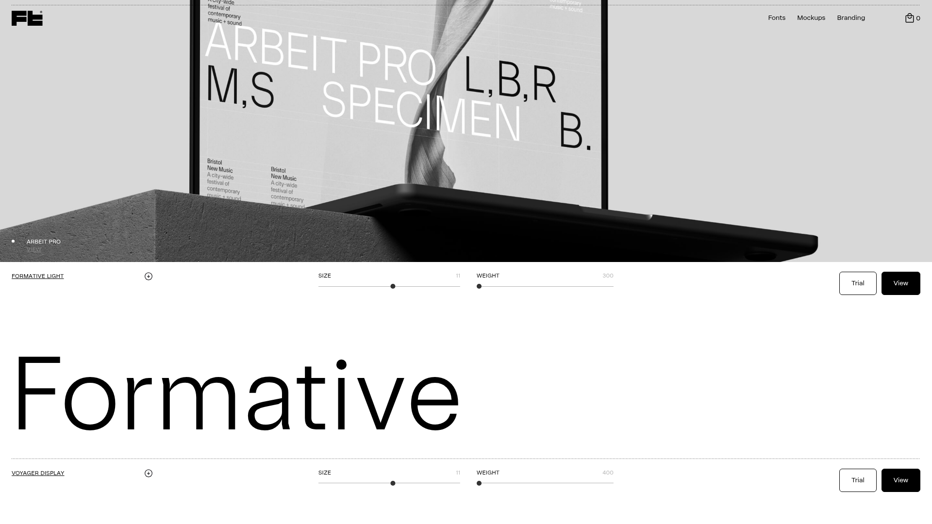
Studio Few Typography Portfolio is a refined, minimalist type foundry website that allows users to interactively test variable font axes directly on the home page. It serves as an excellent reference for builders wanting to showcase high-quality digital assets through a clean, grid-based layout that prioritizes content over ornamentation. The site's strength lies in its seamless integration of custom font-testing sliders (using the Fontsampler library) within a standard eCommerce framework.
Design System
- Color Palette & Visual Hierarchy: The design uses a sophisticated, low-contrast neutral palette (likely whites, light greys, and blacks) to ensure the typography remains the focal point. Hierarchy is established through extreme scale, with font specimens taking up massive real estate against fine-line dividers.
- Typography System: The site uses a mix of its own proprietary fonts (Formative, Voyager, Arbeit Pro) in a variable format. The UI elements (labels, buttons, nav) use a small, uppercase sans-serif at approximately 11px to contrast with the giant
11vwspecimen text. - Page Structure & Section Flow: The layout follows a linear vertical stack separated by thin horizontal rules (
.separator). It starts with a large hero image/video, followed by repeating sections for each font family. Each section contains a grid (configured viaw-layout-grid content4-grid) featuring horizontal sliders for font properties and a large editable text field (contenteditable="true"). - Reusable Components:
- Interactive Type Tester: A horizontal layout of sliders (Leading, Size, Weight, Letterspacing) that updates the font style in real-time.
- Minimalist Navigation: A transparent navbar with a logo on the left and utility links (Fonts, Mockups, Branding) on the right.
- Action Buttons: Small, pill-shaped or rectangular buttons (
.button-small) with distinct "View" (solid) and "Trial" (outlined/ghost) states.
- Interaction & Motion: The UI features smooth opacity transitions and subtle Y-axis transforms (
translate3d(0, 20px, 0)) as elements enter the viewport. The sliders provide immediate visual feedback on the variable font's weight and width axes. - Implementation Clues: Built on Webflow with Stripe integration for commerce. The font testing is powered by
fontsampler.js, which injects specific variable font settings into the inline styles of the specimen text blocks.
Use Cases
- Who should clone this pattern: Digital product creators, font designers, and plugin developers who need to demonstrate adjustable parameters of their software or assets.
- What products can remix it effectively: SaaS pricing calculators, photography portfolios (replacing font sliders with filter sliders), or luxury fashion lookbooks that favor high-end minimalist aesthetics.
- Practical remix directions:
- Brand Swap: Change the neutral palette to a high-contrast dark mode or vibrant neon for a more "tech" look.
- IA Adaptation: Instead of font axes, use the sliders and grid structure to compare different product tiers or technical specifications.
- Quick Section Clone: Builders should specifically target the
.content4-gridsection as a standalone component for any interactive "playground" feature.
- Suggested clone scope: A full-page clone is ideal for those building a portfolio or boutique store, while the interactive slider-specimen grid is the best candidate for a targeted section-only remix.
Related Inspirations
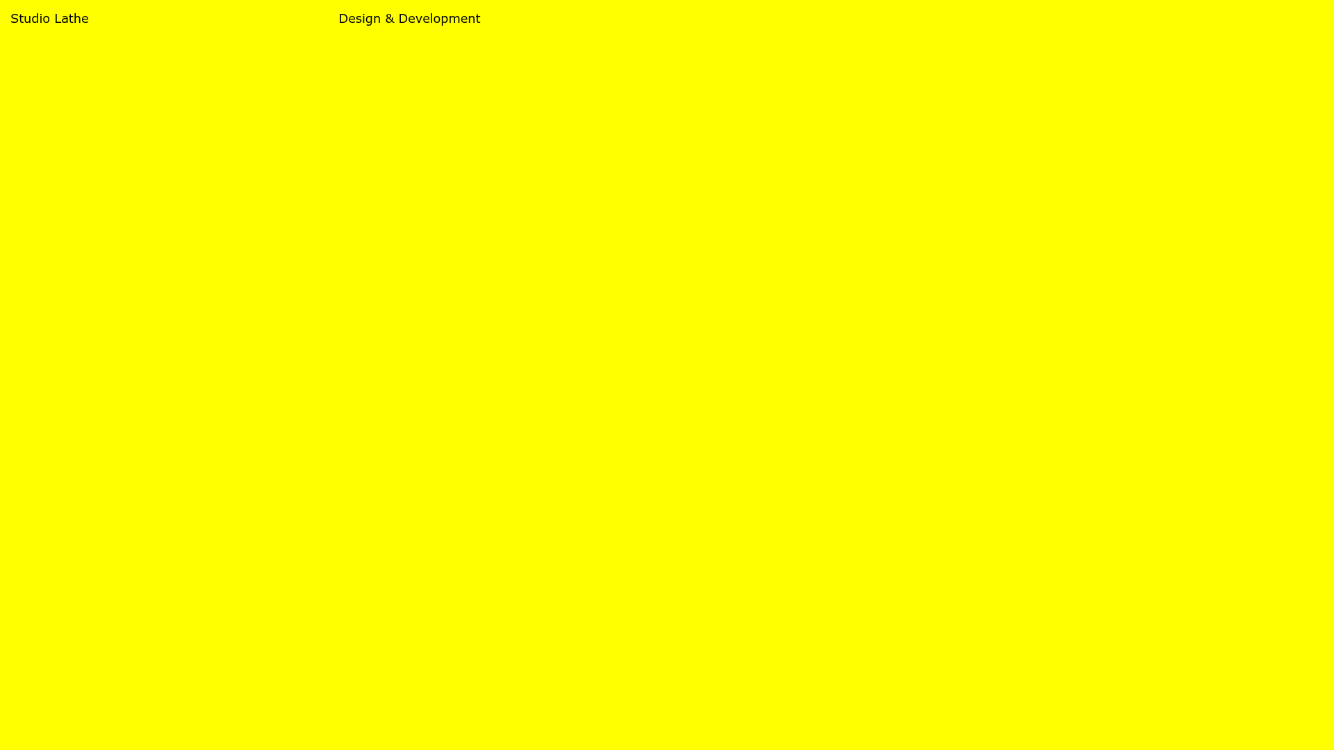
Studio Lathe Minimalist Portfolio List
A high-contrast, minimalist portfolio layout featuring a dense list-based project index with flexible category labeling and a full-screen yellow background.

Niklas Rosén Designer Portfolio Index
A minimalist, responsive grid-based portfolio index featuring a clean 16-column layout, typographic list components, and a custom dark mode transition.

Clase Agency Branding Portfolio
A minimalist design agency portfolio featuring a typographic hero section, full-width image articles, sticky title bars, and integrated scrolling text marquees for a clean editorial layout.

Lundqvist & Dallyn Studio Portfolio
Minimalist design studio portfolio featuring a custom video loader, world clock navigation, and a fluid masonry-style grid for high-quality photography and type design showcases.

Baubauwerk Minimal Agency Portfolio Homepage
A clean studio site featuring a centered text hero, scatter-plot filterable project gallery, and full-bleed image sections for case studies.

AcolorBright Design Agency Portfolio
Minimalist bento-style portfolio layout featuring numerical section headers, horizontally scrolling project teasers, and a clean grayscale client logo grid.
