Fey Financial Dashboard Landing Page
A high-fidelity dark mode landing page featuring sticky scroll-based feature reveals, glassmorphic portfolio UI components, and a side-navigation feature dock.
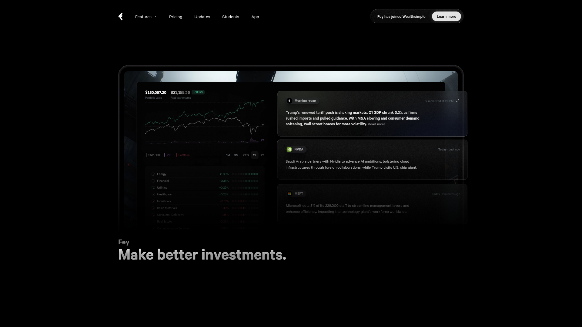
Overview
Fey is a sophisticated financial dashboard landing page that blends high-end aesthetic with data-dense utility. It serves as an excellent reference for builders because it demonstrates how to present complex financial information through a minimalist, dark-mode 'glassmorphic' interface that prioritization clarity and motion.
Design System
- Color Palette & Visual Hierarchy: A strictly dark-themed UI relying on a deep black background (#000000) with subtle grey containers and high-contrast white text. Accents are used sparingly for financial indicators (green for positive returns, red for negative trends) and brand-specific gradients (orange-to-brown and blue-to-deep-blue) for feature headers.
- Typography System: Uses a clean, neo-grotesque sans-serif. Visual hierarchy is achieved via weight and scale: large, heavy-weight headlines (e.g., 'Make better investments.') contrast against small, medium-weight labels used in the side navigation and data cards.
- Page Structure: The flow moves from a high-impact hero (combining a dashboard preview with core value prop) into a 'Highlights' bento-style grid, followed by a vertical feature dock that triggers content updates based on scroll or interaction.
- Reusable Components:
- Glassmorphic Cards: Floating containers with thin borders and subtle background blurs used for the 'Morning recap' and stock alerts.
- Side-Navigation Dock: A vertical bar of icon-only buttons that expand to show descriptive tooltips or state changes.
- Input Field: A specialized 'natural language command' bar with an AI-glow effect (seen in the 'Screener reimagined' section).
- Interaction & Motion: The UI uses sticky scroll-based reveals (indicated by the
data-component="sticky"in HTML) where text fades and blurs out while dashboard elements slide or transform on the Y-axis. There is heavy use ofwill-change: transformandopacitytransitions for smooth performance. - Implementation Clues: The HTML shows a Next.js framework using
styled-components(identifiable bysc-class prefixes). Images are optimized vianext/imageand assets are served via R2/Cloudflare for high-performance video and SVG rendering.
Use Cases
- Who should clone this pattern: Developers building SaaS dashboards, Fintech apps, or AI agents that need to present high-density information without overwhelming the user.
- What products can remix it effectively: Portfolio trackers, crypto-analytical tools, project management command centers, and developer tool landing pages that rely on 'Command+K' interfaces.
- Practical remix directions: Swap the specific stock data for crypto tickers or server health metrics. The navigation dock can be repurposed as a persistent app sidebar. The bento-grid 'Highlights' section is perfect for any product wanting to showcase multiple features simultaneously.
- Suggested clone scope: The hero section and its floating card components are ideal for a quick high-impact clone. The full-page clone is best for those wanting to master the sophisticated sticky-scroll transitions and complex layer stacking.
Related Inspirations
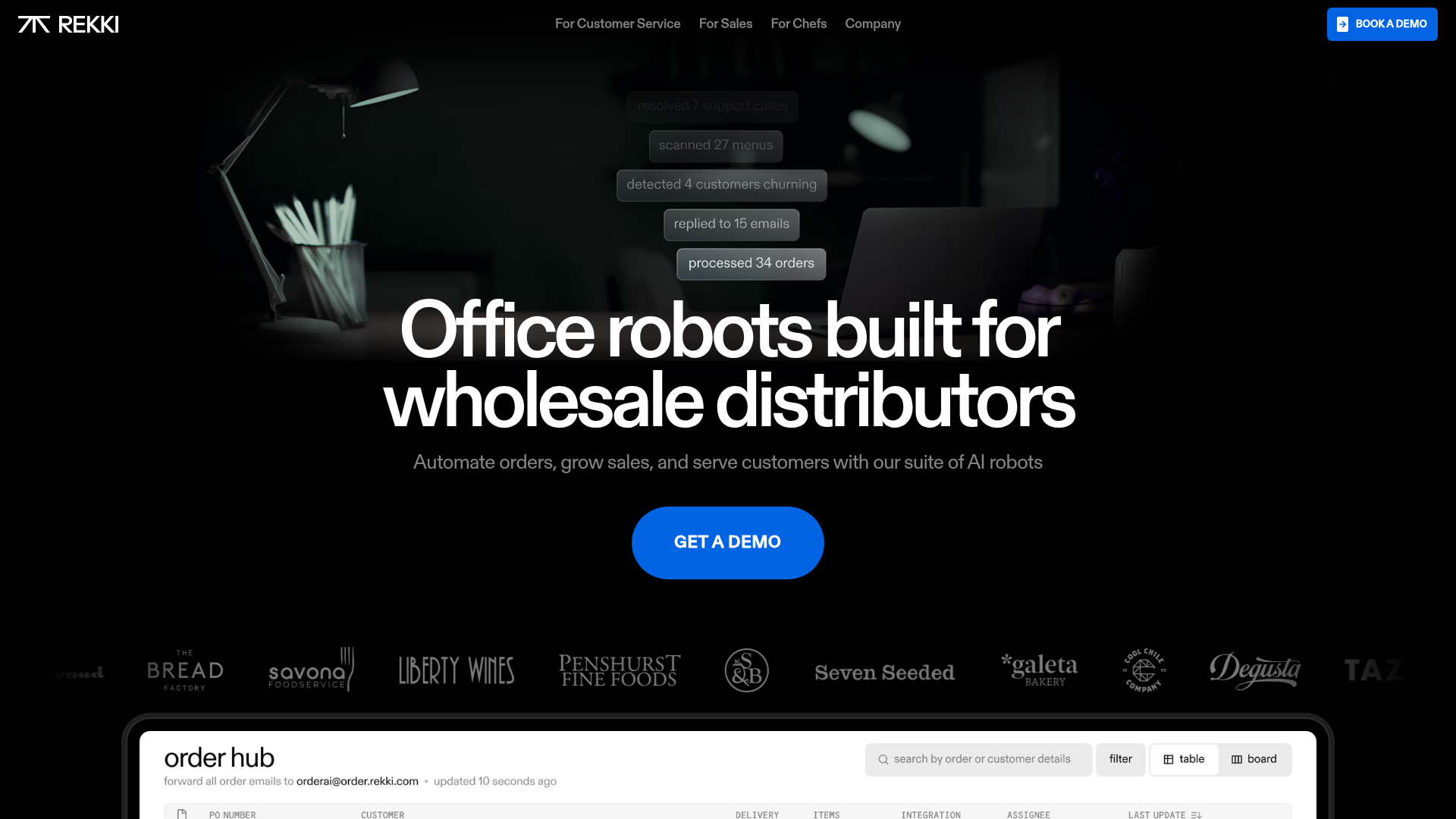
REKKI AI Automation SaaS Landing Page
A high-impact dark-mode landing page featuring a floating label hero section, marquee brand logos, an interactive dashboard UI preview, and card-based testimonial grids.
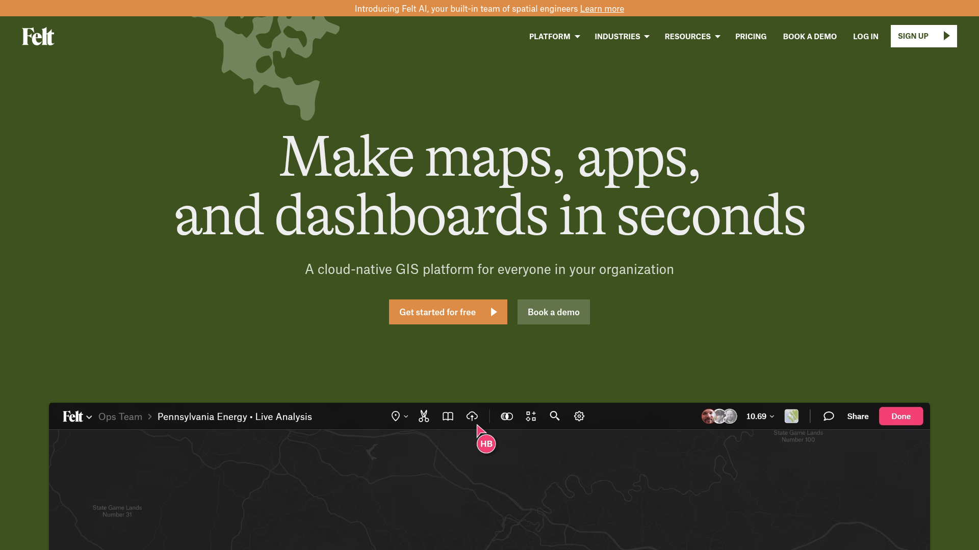
Felt GIS Platform Landing Page
A high-end SaaS layout featuring a dark-themed animated video hero, logo grids, data source icon sections, and a gallery of interactive project cards.
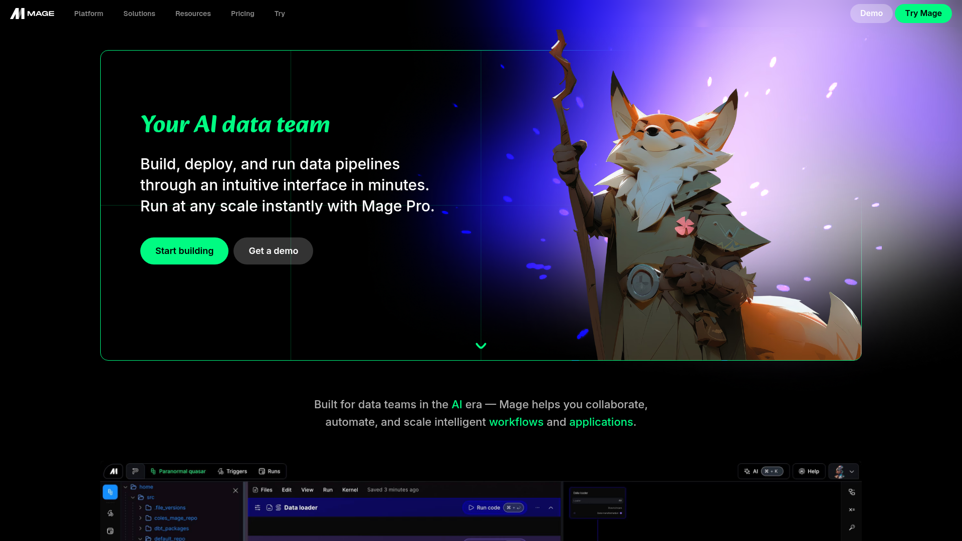
Mage AI Landing Page Hero
A dark-themed developer tool landing page featuring a split-screen hero layout with a high-quality illustration, call-to-action buttons, and a bottom code editor interface preview.
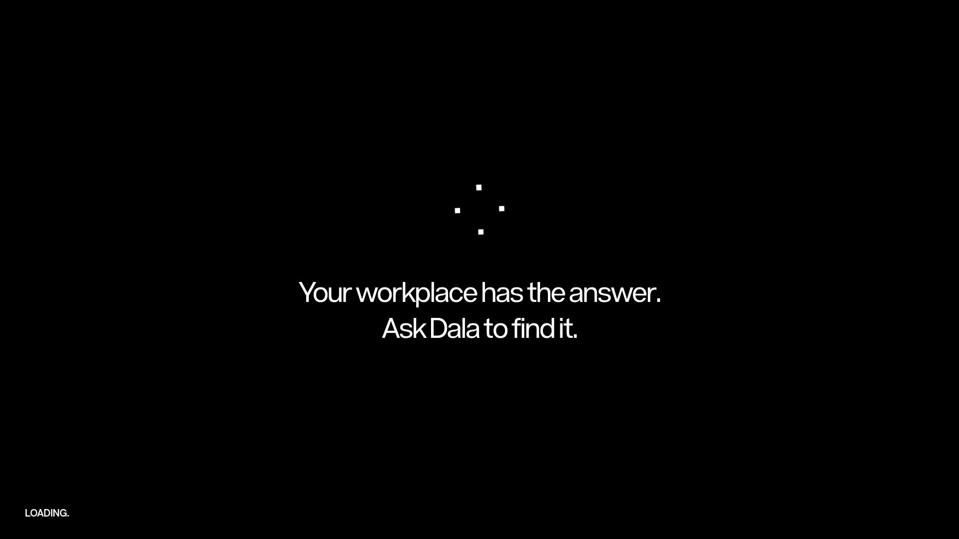
Dala AI Animated Loading Landing Page
A high-end dark mode landing page featuring a custom SVG spinner, smooth GSAP-driven scroll animations, horizontal team slider, and localized WebGL parallax effects.
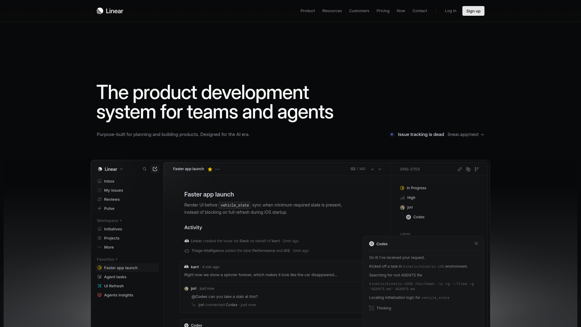
Linear Product Development System Landing Page
A high-fidelity dark-themed landing page featuring a complex dashboard UI mockup, glassmorphism effects, and a sophisticated sidebar navigation layout.
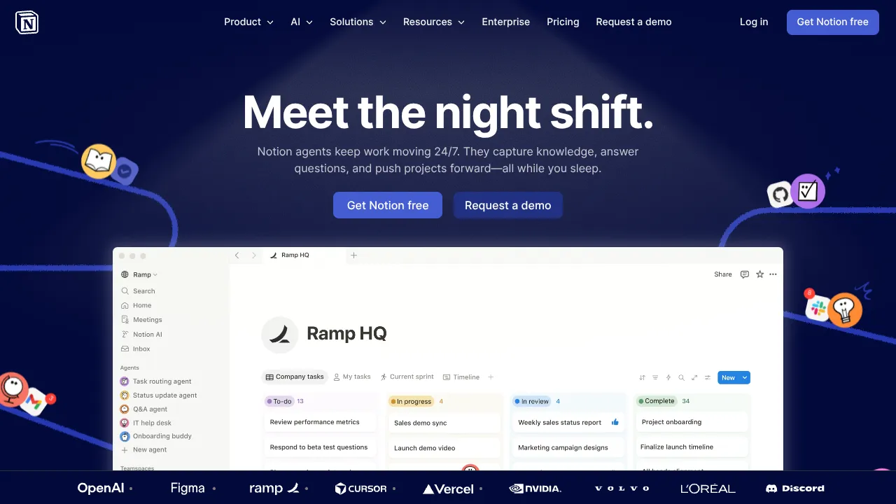
Notion AI Landing Page Design
A high-impact SaaS hero section featuring a dark-themed layout with a centralized product glassmorphism window, animated illustrated accents, and a scrolling logo marquee for social proof.
