Notion AI Landing Page Design
A high-impact SaaS hero section featuring a dark-themed layout with a centralized product glassmorphism window, animated illustrated accents, and a scrolling logo marquee for social proof.
Overview
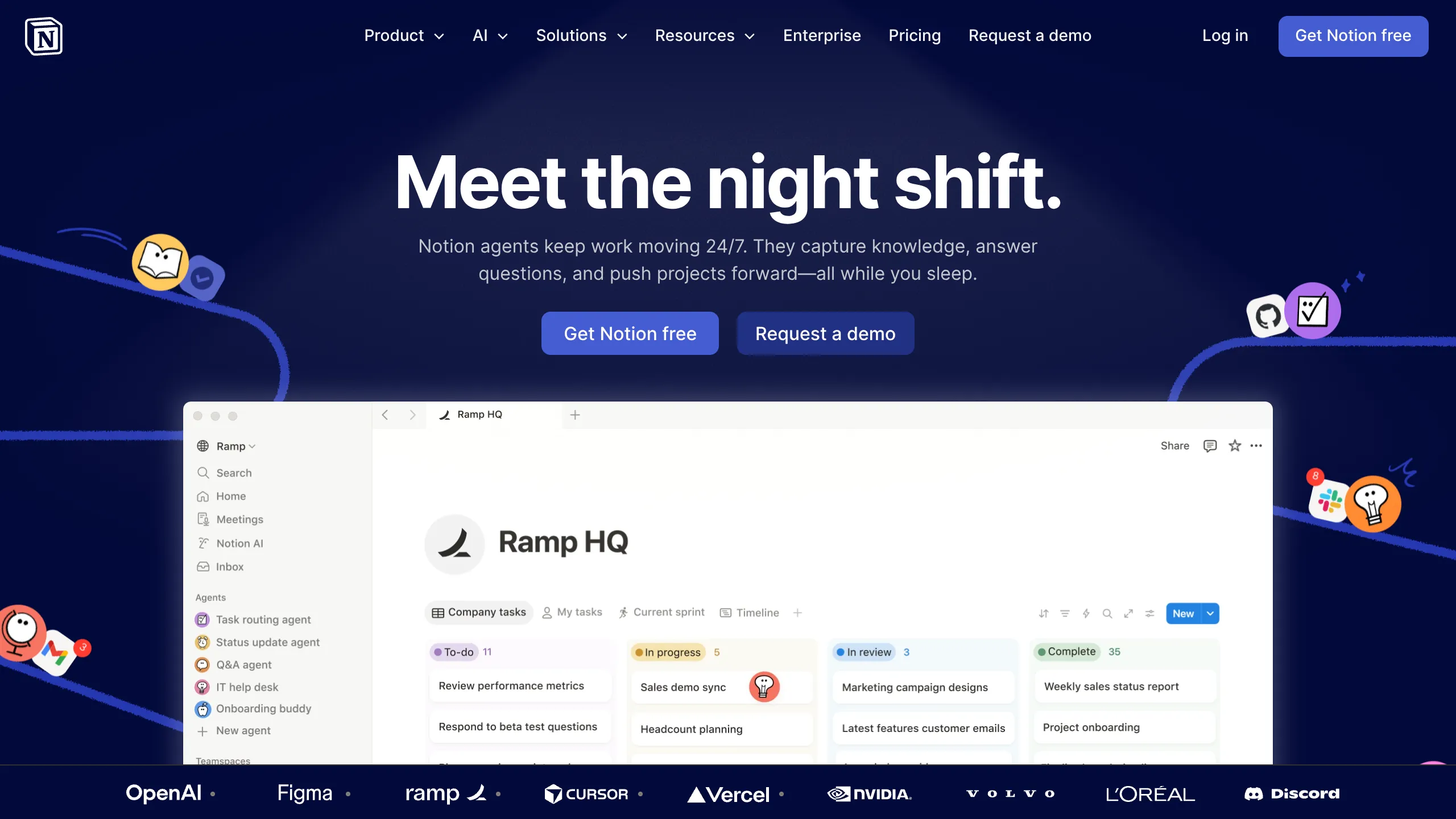
This landing page is a masterclass in modern SaaS product marketing, specifically highlighting Notion's AI automation capabilities. It utilizes a sophisticated "dark mode" aesthetic with a central focal point on an interactive product interface to demonstrate complex features through visual storytelling. It is a strong reference for developers looking to build high-conversion hero sections that balance deep technical content with approachable illustrations.
Design System
- Color Palette & Visual Hierarchy: The design uses a deep navy-to-black background (#05051a) which makes the high-contrast white typography and bright product window pop. A subtle radial spotlight behind the main heading draws the eye to the center. Vibrant accent colors are provided by hand-drawn illustrations and integrated app logos (Slack, GitHub, Figma).
- Typography: A sans-serif font family (Inter or similar) is used with a clear hierarchy. The H1 is extra-bold and large, emphasizing the "night shift" metaphor, while subheaders and body copy use lighter weights for readability. The product window uses a smaller, UI-focused type scale to simulate a real software environment.
- Page Structure: The layout follows a classic Z-pattern: brand logo and navigation at the top, a centered hero title and CTA cluster in the middle, followed by a large product preview screenshot, and concluding with an auto-scrolling logo marquee at the bottom for social proof.
- Reusable Components:
- Glassmorphism Window: The product preview features rounded corners, subtle shadows, and a clean white background that contrasts against the dark page.
- Multi-state Buttons: Both a high-contrast primary blue button and a secondary outlined/ghost button are present.
- Logo Marquee: A horizontal scrolling strip at the footer featuring monochrome partner logos (OpenAI, Figma, Vercel, etc.).
- Sidebar Navigation: The product mockup includes a reusable vertical nav component with icon/text pairings.
- Interaction Patterns: The design layout suggests a "sticky" navigation header. The floating icons (robots, notifications) are placed along curved paths, implying motion overlays or parallax effects during scrolling.
Use Cases
- Who should clone this: B2B SaaS startups, AI tool developers, and productivity app creators who need to explain "background" processes or automation features.
- Suggested remix directions:
- Brand Swap: Replace the navy background with a brand-specific gradient and swap the hand-drawn illustrations for 3D renders or photography.
- Feature Highlight: Use the central "app window" component to showcase different dashboard views depending on a user's selection from a tabs list.
- Service Adaptation: Adapt the "Agent" sidebar in the product mockup to represent different service tiers or utility modules for a non-software business.
- Suggested Clone Scope: Start by cloning the hero section (H1, CTA, and Product Window) as a standalone template. The logo marquee is a highly reusable utility for any landing page footer.
Related Inspirations
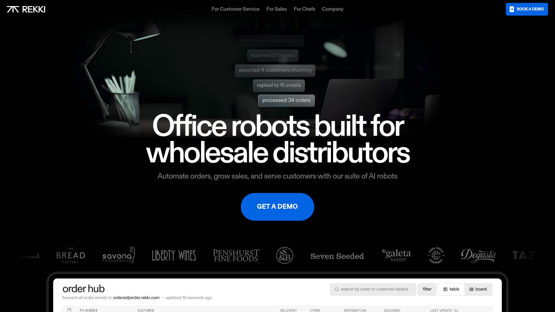
REKKI AI Automation SaaS Landing Page
A high-impact dark-mode landing page featuring a floating label hero section, marquee brand logos, an interactive dashboard UI preview, and card-based testimonial grids.
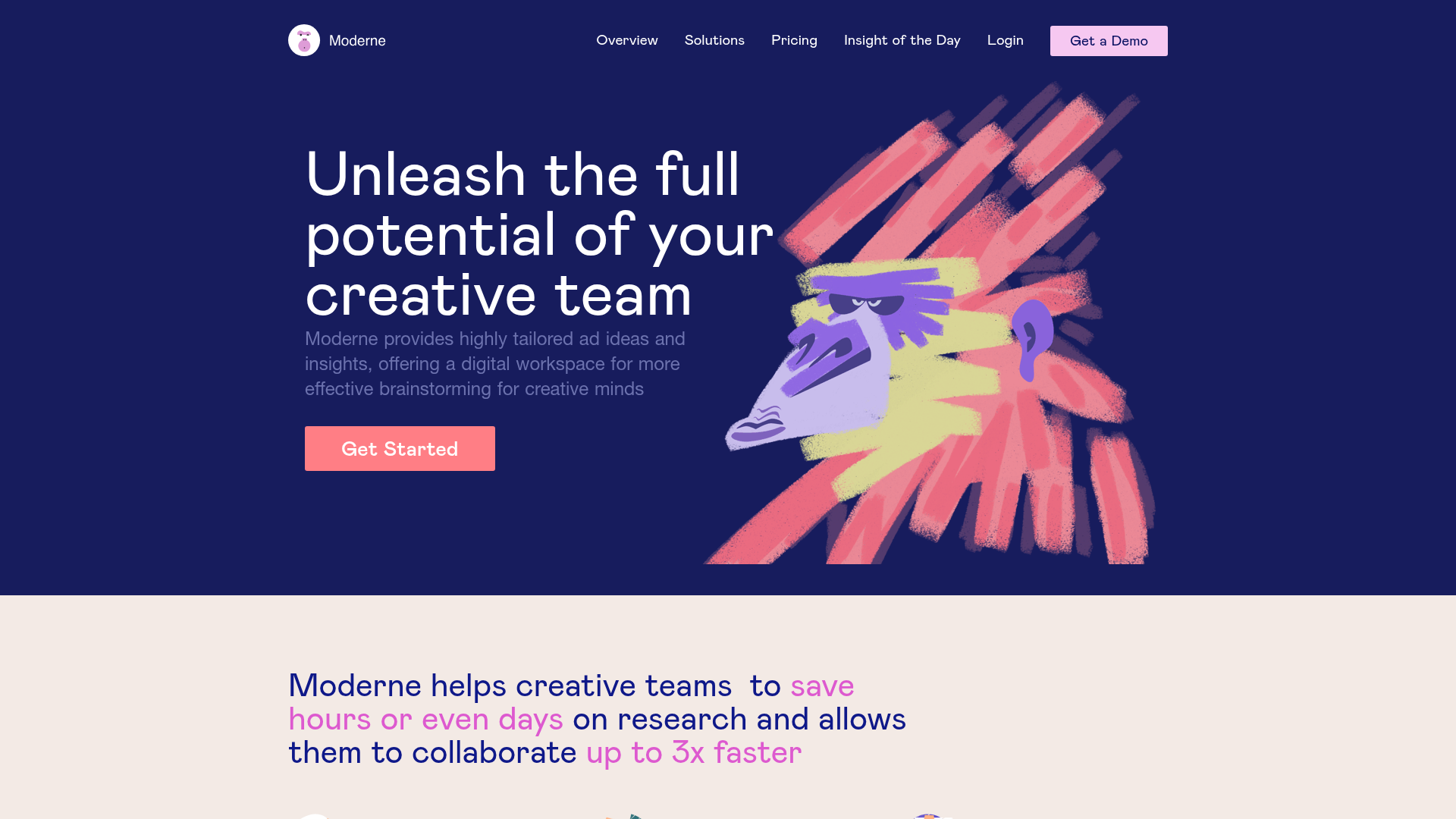
Moderne Creative Landing Page
A high-contrast landing page featuring a dark hero section with an artistic illustration overlay, distinct alternating content blocks, and a visual comparison bar chart component.
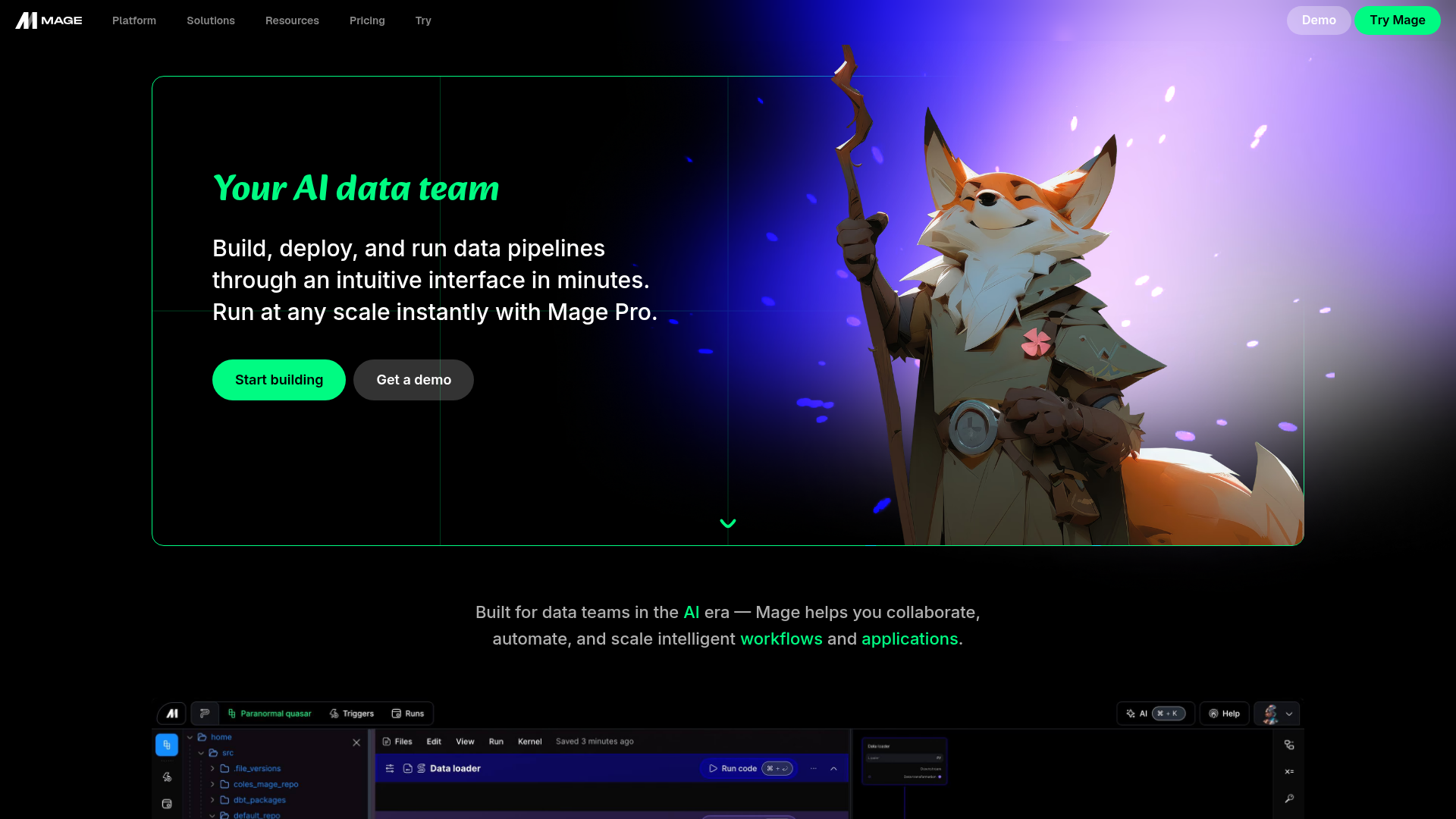
Mage AI Landing Page Hero
A dark-themed developer tool landing page featuring a split-screen hero layout with a high-quality illustration, call-to-action buttons, and a bottom code editor interface preview.
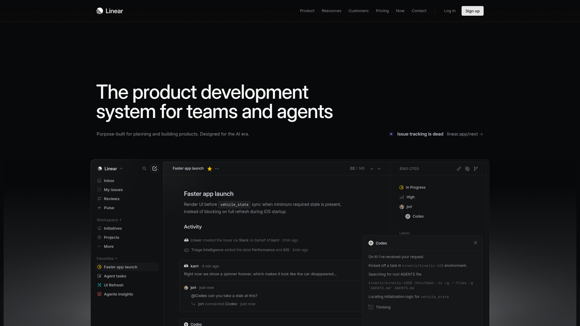
Linear Product Development System Landing Page
A high-fidelity dark-themed landing page featuring a complex dashboard UI mockup, glassmorphism effects, and a sophisticated sidebar navigation layout.
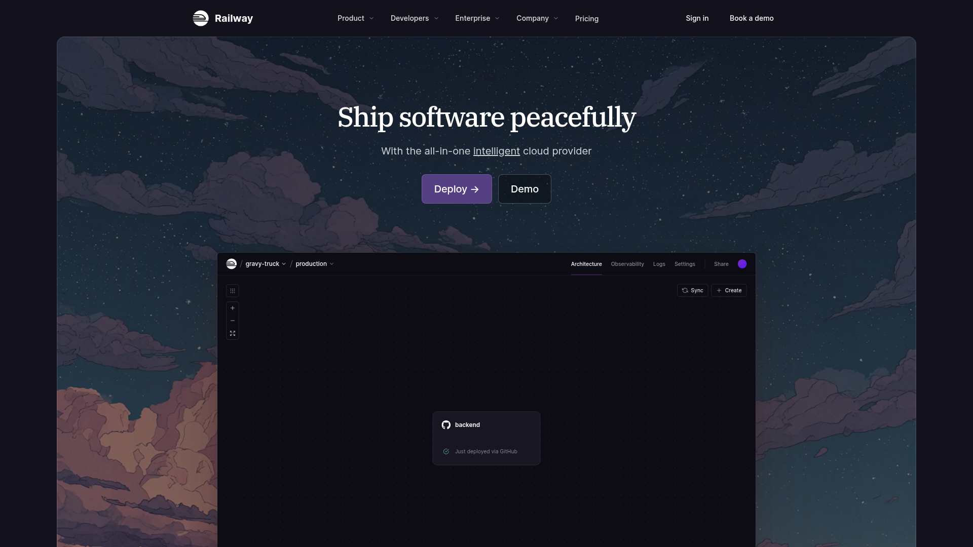
Railway Cloud Platform Landing Page
A dark-themed developer tool landing page featuring a twilight sky background, a custom dashboard interface mockup, and clean navigation with purple accents.

Vercel AI Cloud Landing Page
A modern landing page featuring a minimalist dark-themed navbar, a grid-overlay hero section with radial color gradients, and high-contrast typography for customer success stories.
