Felt GIS Platform Landing Page
A high-end SaaS layout featuring a dark-themed animated video hero, logo grids, data source icon sections, and a gallery of interactive project cards.
Overview
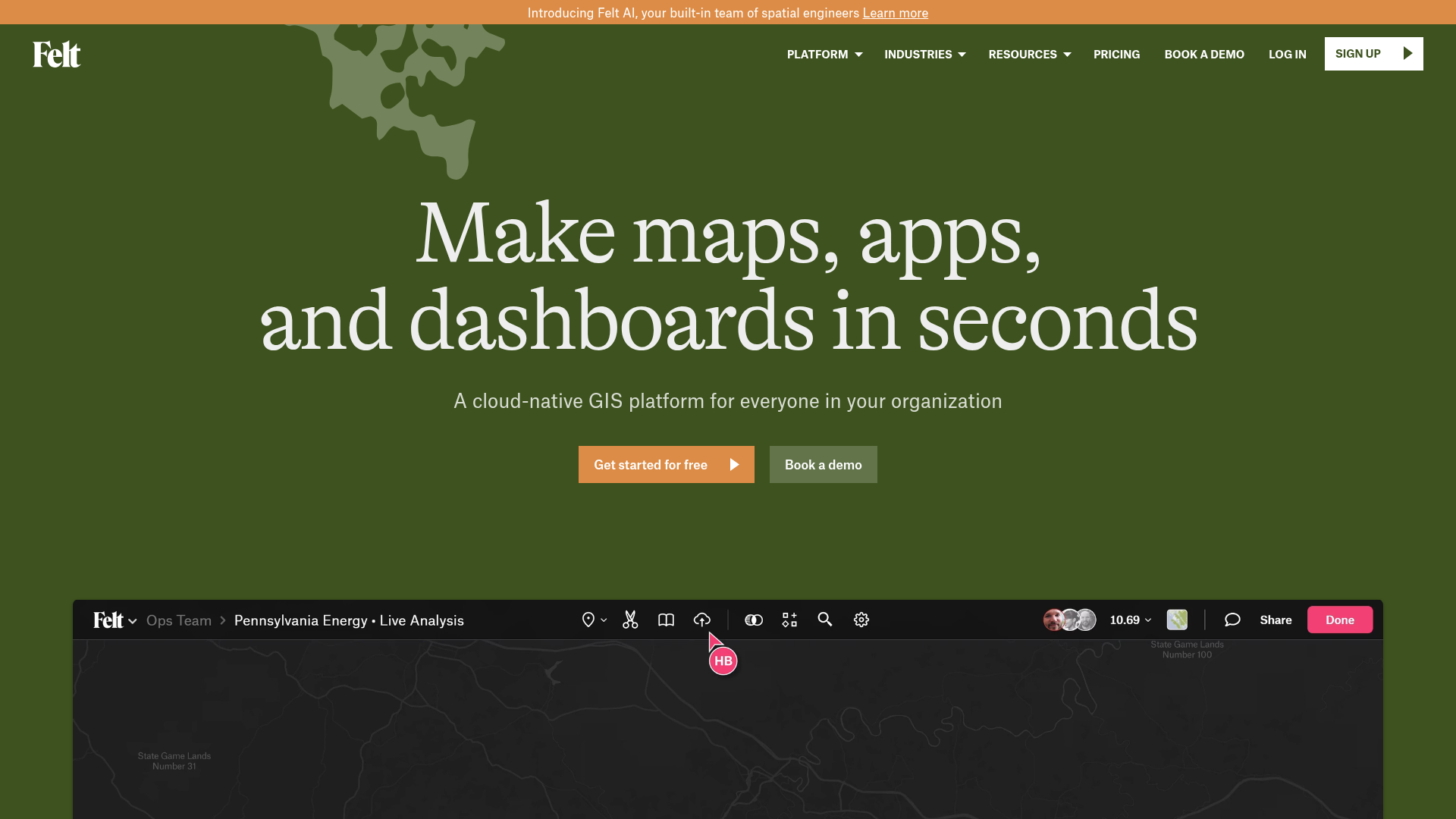
Felt’s landing page is a masterclass in high-end B2B SaaS design, effectively blending data-dense GIS concepts with a clean, approachable consumer interface. It serves as an excellent reference for builders because it demonstrates how to showcase complex software features through high-fidelity video embeds, structured grid systems, and a sophisticated dark-to-light thematic transition.
Design System
- Color Palette & Visual Hierarchy: The site uses a grounded, naturalistic palette. It begins with a deep forest green (
#3d5229roughly) hero section featuring cream-colored serif text. As the user scrolls, it transitions into a clean white and light gray interface. Accents include a functional salmon-orange (#e38f4f) for primary CTAs and a vibrant pink for UI indicators within the product preview. - Typography: The typography system relies on a high-contrast pairing. Headings use a sophisticated serif (Alpina) for a premium, "established" feel, while body copy and technical details use a clean, functional sans-serif and a monospace font (visible in the coordinate marquee and data labels) to reinforce the technical nature of the GIS product.
- Page Structure & Flow: The flow starts with an emotional hook (large serif headline and video), moves to social proof (logo grid), then transitions into a series of "Value Prop" sections. These sections alternate between feature descriptions and large-scale video or image demonstrations. The page concludes with a content-rich gallery and a "Customer Spotlight" testimonial block.
- Reusable Components:
- The Coordinate Marquee: A technical, animated ticker at the top using monospace text.
- Feature Grid: A clean 4x2 grid (landing-value-text-grid) with uppercase headers and minimal descriptions.
- Data Source Icons: A 12-item grid with monochromatic icons and labels, ideal for integration pages.
- Map Gallery Cards: Image-heavy cards with hover-triggered indicator arrows and truncated text descriptions.
- Interactions & Motion: The design uses heavy scroll-triggered transformations (visible in the
transform: translate3dandskewattributes in the HTML). Specifically, the "Customer Spotlight" uses a sticky vertical text container alongside a scrolling quote list. CTAs feature a “triangle” icon that suggests forward momentum. - Responsive Behavior: The HTML includes
hide-on-tabletclasses andw-nav-overlaycomponents, indicating a collapse from a horizontal nav to a hamburger menu. The video embeds are wrapped in aspect-ratio-controlled div blocks to maintain scale across devices.
Use Cases
- Who should clone this: Developers of technical platforms, data visualization tools, or complex B2B software that needs to appear "friendly" without losing its professional edge.
- Effective Remixes:
- BioTech/Environment: Keep the natural green palette and serif typography to signal sustainability or organic research.
- SaaS Analytics: Swap the map videos for dashboard animations while keeping the "Data Sources" grid to show integrations.
- Portfolio Gallery: Reuse the
map-gallery-homelist structure for a project showcase that requires high-impact thumbnails and brief metadata.
- Clone Scope: For a quick win, clone the Integration Grid or the Hero Section with its unique serif-on-dark-green styling. For a comprehensive project, the entire Feature Showcase flow provides a perfect blueprint for explaining complex software mechanics through UI-driven storytelling.
Related Inspirations
Moving Parts SwiftUI Component Library
A high-performance landing page featuring a interactive code comparison toggle, animated mobile UI previews, and a clean minimalist aesthetic for developer tools.
FigJam Product Landing Page
A collaborative tool showcase featuring a centered hero section, logo marquee, vertical tabbed feature switcher, and interactive carousel for templates.
REKKI AI Automation SaaS Landing Page
A high-impact dark-mode landing page featuring a floating label hero section, marquee brand logos, an interactive dashboard UI preview, and card-based testimonial grids.
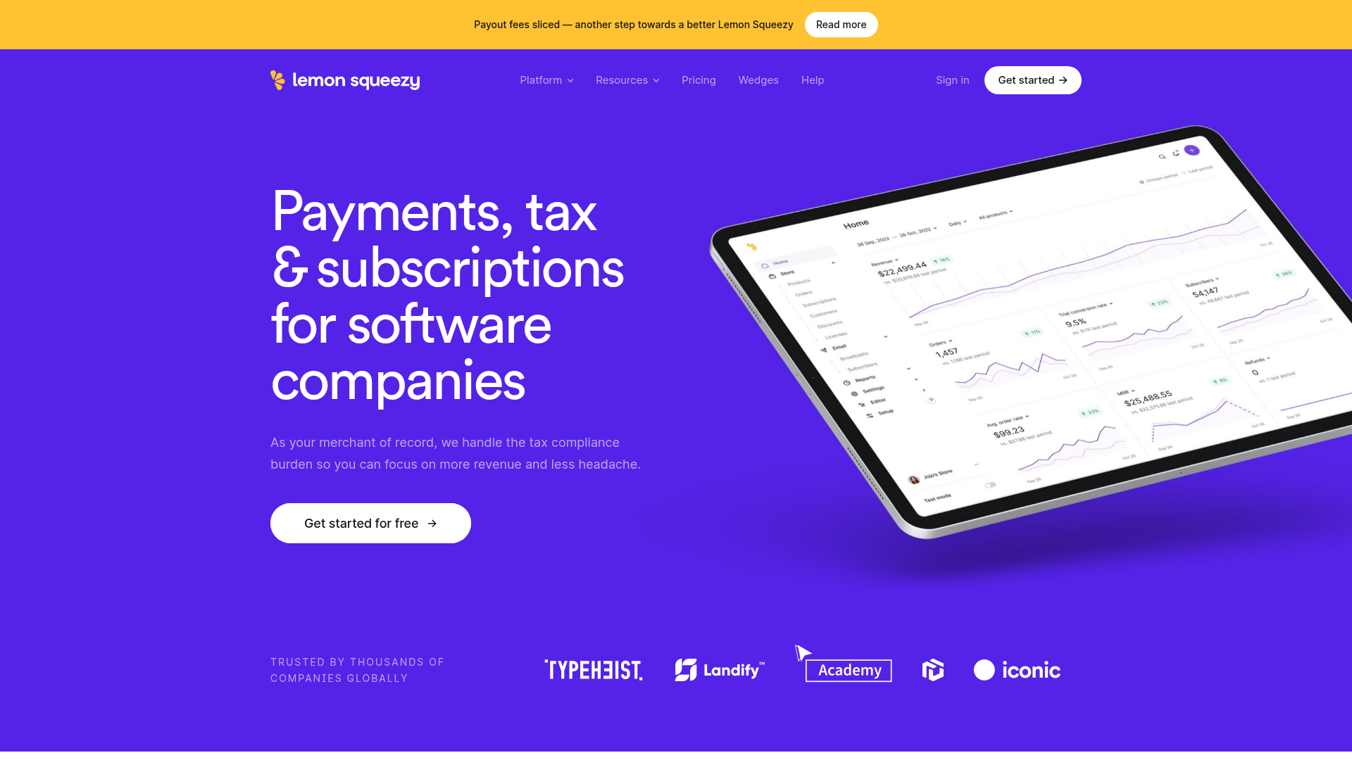
Lemon Squeezy SaaS Platform Landing Page
A high-conversion SaaS layout featuring a vibrant gradient hero, vertical tabbed feature sections, skewed device mockups, and a layered testimonial grid.
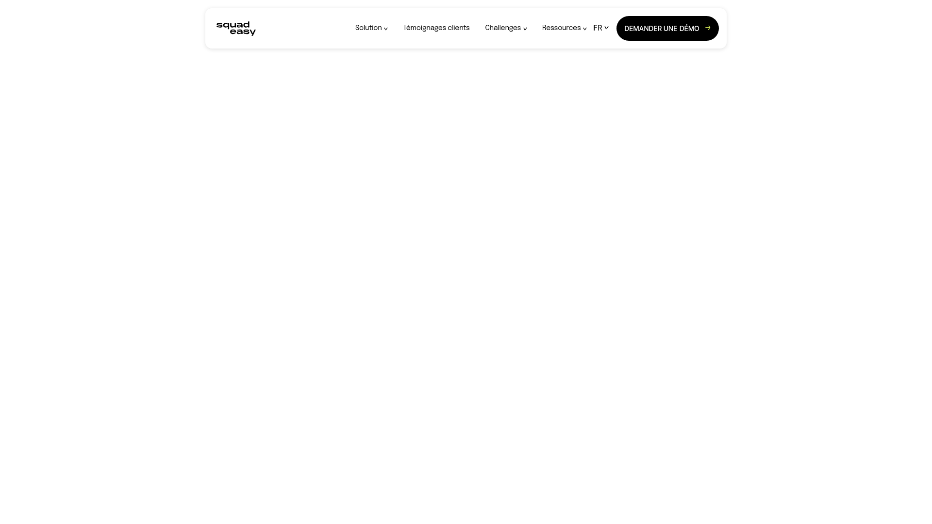
Squadeasy Employee Engagement SaaS Landing Page
A vibrant wellness platform layout featuring a sticky navigation bar, modular high-contrast sections, interactive testimonials slider, and animated data counting components.
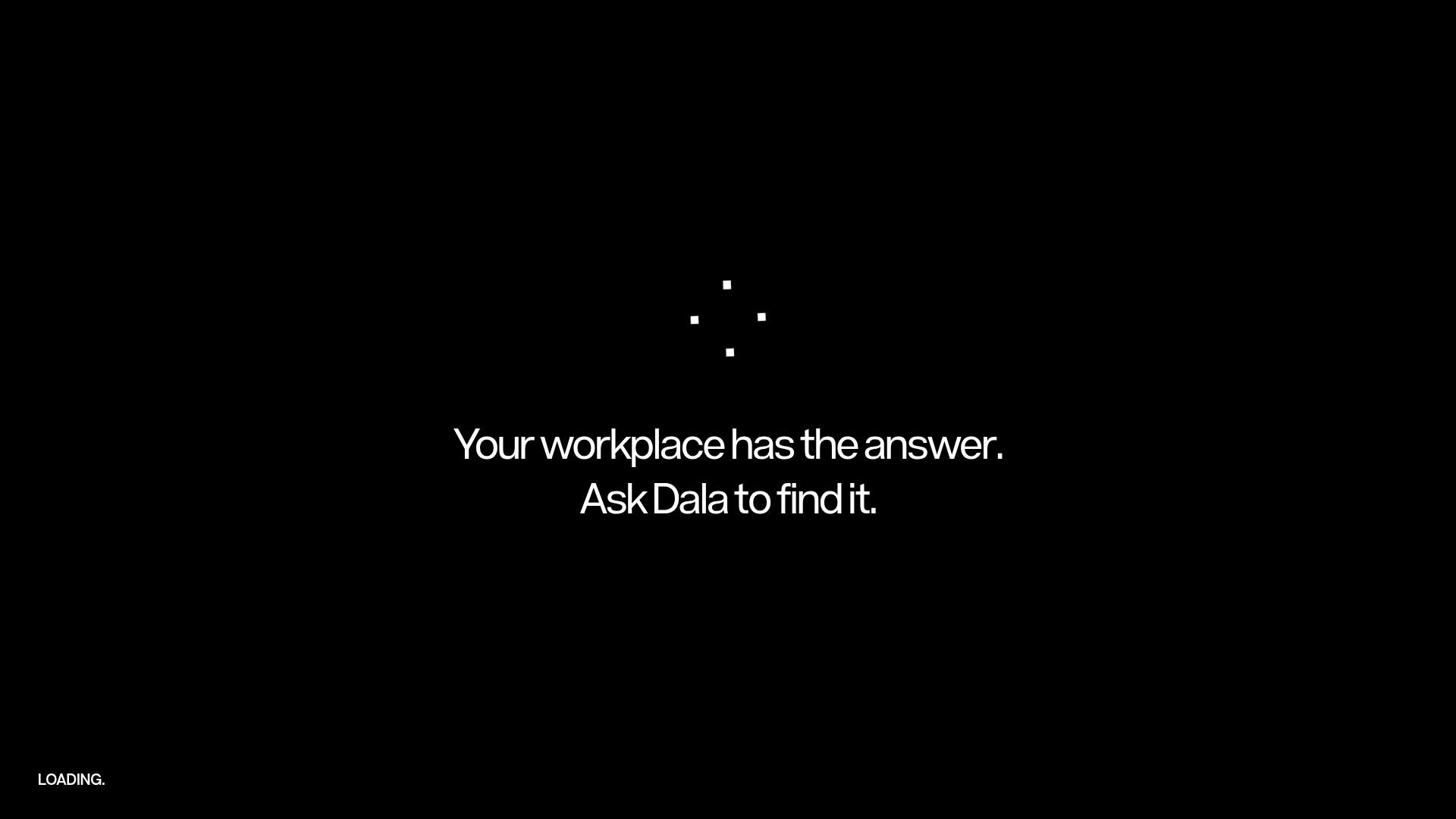
Dala AI Animated Loading Landing Page
A high-end dark mode landing page featuring a custom SVG spinner, smooth GSAP-driven scroll animations, horizontal team slider, and localized WebGL parallax effects.
