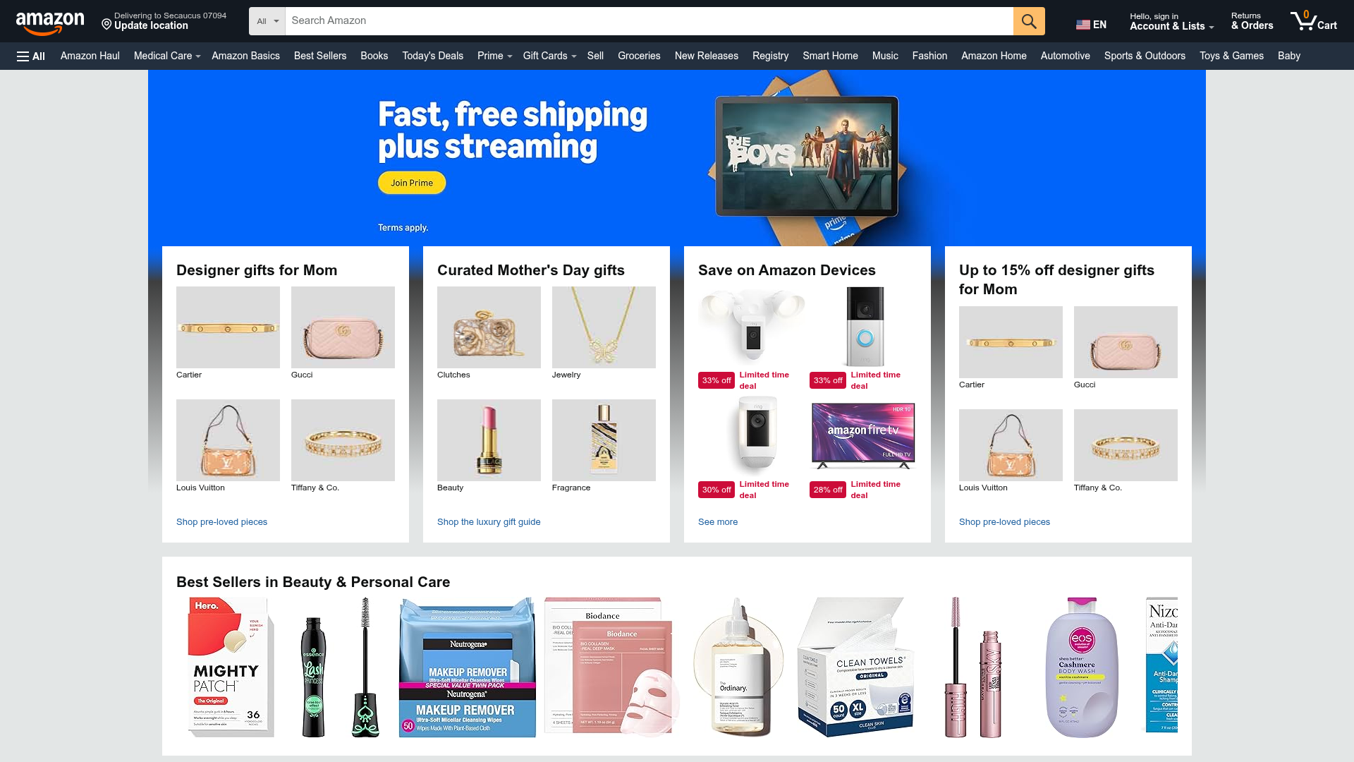
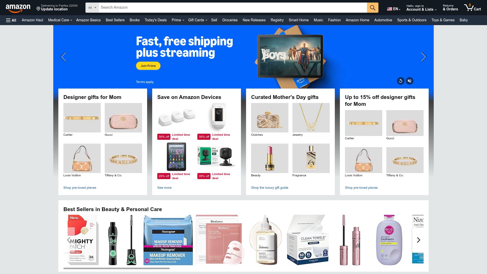
Amazon E-commerce Marketplace Dashboard
A complex retail layout featuring a video-enabled carousel hero, multi-column bento grids for categorized promotions, and a horizontal product slider for top sellers.
Overview
This dashboard is a high-density e-commerce marketplace layout designed to maximize product discovery and promotional conversion. It serves as an excellent reference for cloning complex, content-heavy interfaces that require sophisticated grid systems and multi-media hero sections to organize diverse product categories.
Design System
- Color Palette & Visual Hierarchy: The system uses a neutral off-white background (
#EAEDED) to create depth, allowing white content cards to pop. High-contrast elements like the "Amazon Yellow" (#FF9900) for call-to-actions and the vibrant blue Prime hero section create immediate focal points. Red is used sparingly but strictly for urgency, such as "Limited time deal" badges. - Typography System: Primarily uses sans-serif fonts with a clear scale. Card headers utilize a bold, large typeface (approx. 20px) for scannability, while product labels and metadata use smaller, secondary scales (12-14px). Navigation and links often use a subtle blue for interactivity.
- Page Structure: The layout follows a top-down hierarchy: a dense global navigation bar, a "tall-hero" video/image carousel with absolute-positioned overlays, a high-density 4-column "Bento" grid for category promotions, and a full-width horizontal scrolling slider for best-sellers.
- Reusable Components:
- Quad-Image Cards: A container that splits a promotion into four equal quadrants with individual labels and links.
- Video-js Hero: A wide extension carousel that supports background video playback with integrated CTA buttons.
- Product Shoveler: A horizontal overflow container for high-volume product listings (Visible in the "Best Sellers" section).
- Deal Badges: Dual-colored labels (
CC0C39red background) for discount indicators.
- Interaction Patterns: The hero section uses
data-autorotation-delayfor automatic transitions. The product slider indicates interactivity via hover states on navigation arrows. HTML classes like_cropped-image-link_suggest a focus on uniform aspect ratios for user-generated or vendor asset management. - Responsive Behavior: The HTML uses
data-grid-breakpoint="ws"andgw-colclasses, indicating a flexbox or grid-based system that collapses columns based on viewport width (switching from 4 columns to 1-2 on smaller screens).
Use Cases
- Target Audience: Desktop-first marketplaces, streaming service dashboards, and large-scale retail distributors needing to organize 100+ categories.
- Effective Remixes:
- Niche Marketplaces: Swap the generic Amazon branding for a luxury aesthetic by increasing white space and using serif typography while keeping the functional 4-quadrant grid.
- Content Portals: Utilize the video hero for featured trailers and the quad-cards for curated "Editors Picks" across different media types.
- Practical Directions: Reuse the "Quad-Image Label" pattern to group related sub-categories (e.g., Electronics > Headphones/Laptops/Cameras/Storage) within a single visual footprint.
- Clone Scope: For a fast win, clone the Bento Grid (the 4 cards under the hero). For a comprehensive project, clone the full page to master the management of global navigation state and high-density product carousels.
Related Inspirations
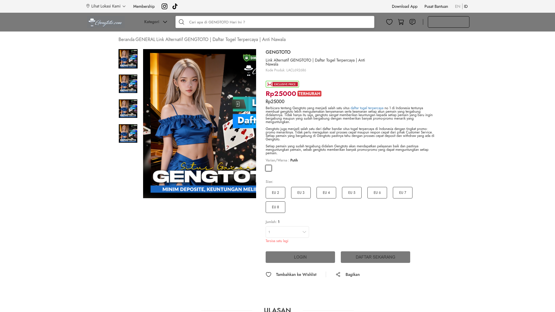
GENGTOTO Product Detail E-commerce Layout
A comprehensive product page featuring a vertical image gallery, detailed item specifications, color/size selection modules, and integrated user review and FAQ components.
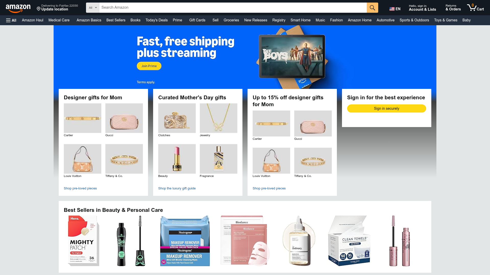
Amazon Marketplace E-commerce Homepage
A complex dashboard layout featuring a carousel hero banner, multi-column bento grids for categorized promotions, and a horizontal product recommendation slider.
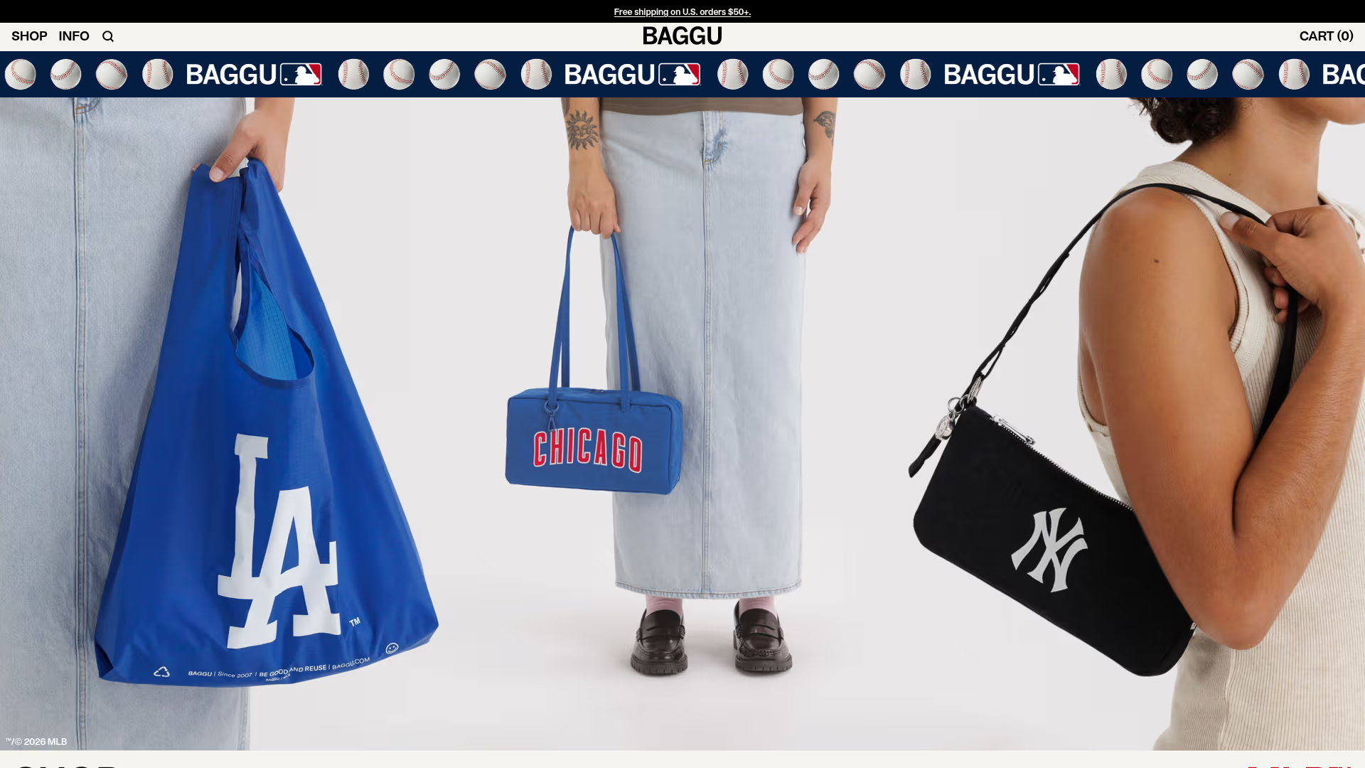
BAGGU Minimalist E-commerce Hero Template
A clean retail landing page layout featuring a full-width high-impact hero section, a sticky integrated banner, and a minimalist navigation header optimized for product launches.
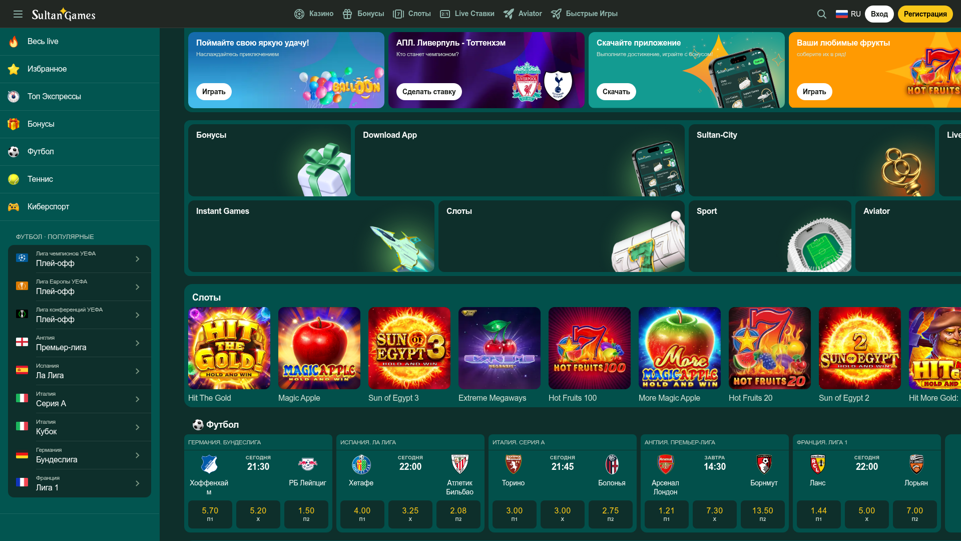
SultanGames Betting and Casino Dashboard
A dark-themed gambling UI featuring a multi-track sidebar, bento-style promotional grid, game tile horizontal scrollers, and compact sports betting card layouts.
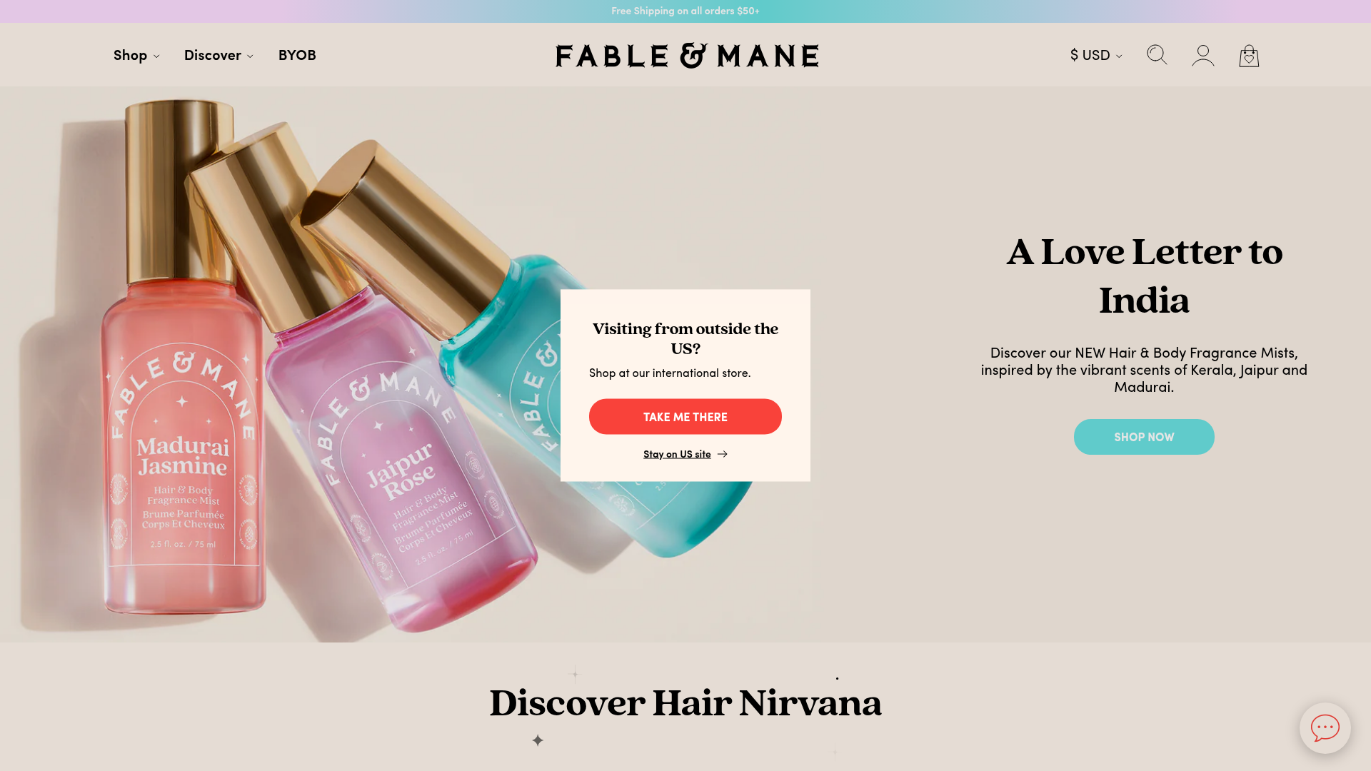
Fable & Mane Beauty Storefront
A clean e-commerce layout featuring a high-impact hero slider with localized entry popups and a product carousel with hover-triggered secondary images.
Amazon E-commerce Gateway Page
A dense retail layout featuring a video-enabled herotator, a quad-image bento grid for categories, and a horizontal product carousel for best sellers.
