Ivee Health Medical Landing Page
A healthcare service layout featuring an alternating split-screen hero, ticker-style marquee, interactive service accordions, and a structured memberships grid.
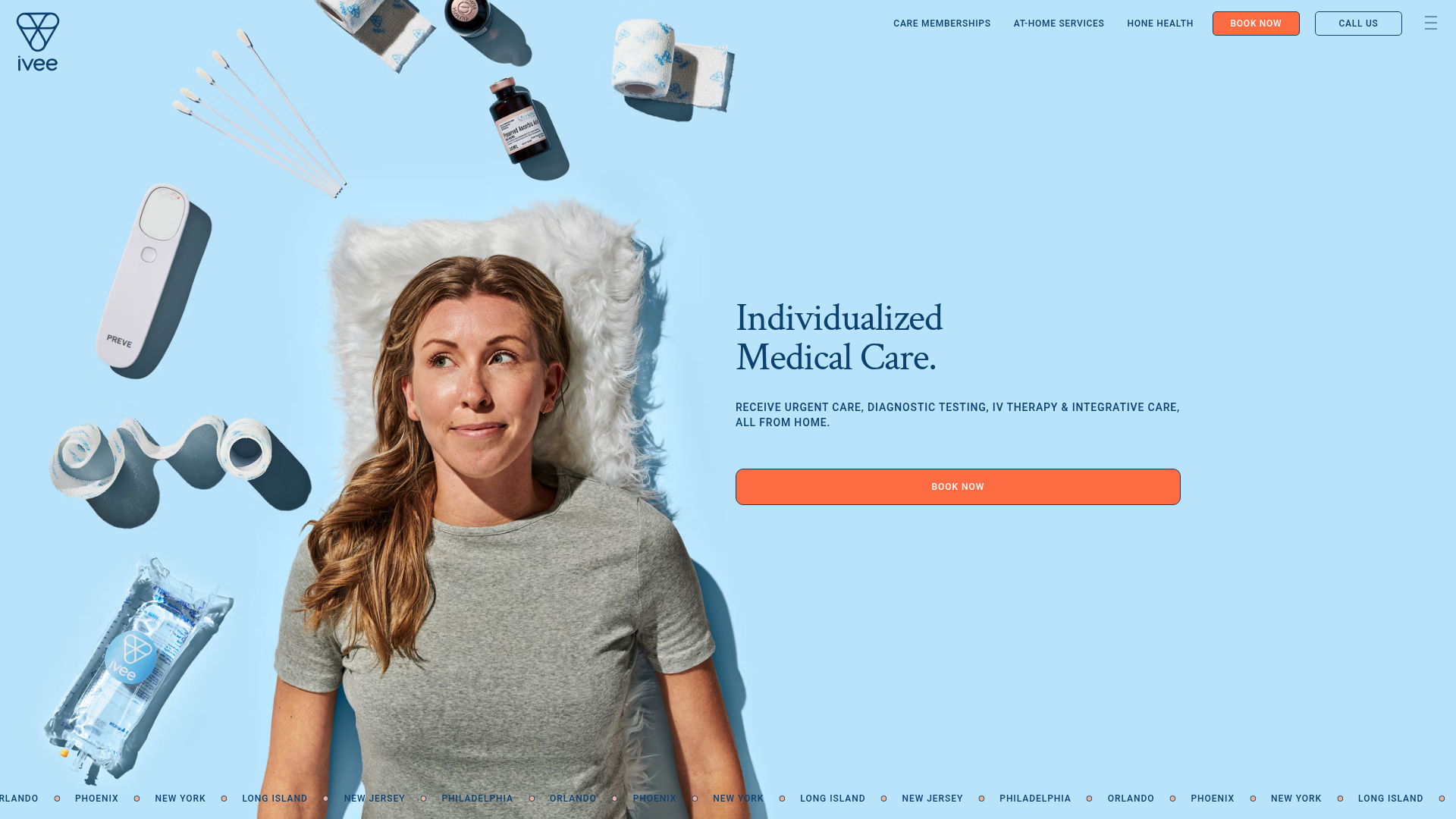
Overview
Ivee Health is a premium medical services landing page designed for on-demand healthcare. It is a strong reference for clone-and-remix builders because of its sophisticated use of high-key photography, soft color palettes, and structured content layouts that balance clinical trust with modern consumer technology aesthetics.
Design System
- Color Palette & Visual Hierarchy: The design uses a calming "Sky Blue" base (#C1E2F8) paired with a deep Navy (#001E42) for high-contrast typography. Vibrant Orange (#FF7245) serves as the primary action color for CTAs, creating a clear visual path for conversion. The hierarchy is established through over-sized serif headings and generous whitespace.
- Typography: The system mixes a classic serif for high-level headings (e.g., "Individualized Medical Care") with a bold, uppercase sans-serif for secondary headers and navigation. Utility text use a smaller, readable sans-serif scale.
- Page Structure: The layout follows a modular flow: an immersive hero section, a ticker-style marquee for locations, a trust-building counter section (30+ doctors, etc.), a split-view service selector, a team carousel, and a vertical accordion for process steps.
- Reusable Components:
- Ticker Marquee: A CSS-based horizontal scrolling list of locations.
- Interactive Accordions: Specialized for process steps with a vertical line-and-dot indicator that changes state as items open.
- Membership Cards: A grid system with a vertical image beside bulleted benefit lists.
- Ghost Buttons & Solid CTAs: High-contrast orange buttons for primary actions and navy/white buttons for secondary links.
- Interaction & Motion: The UI includes a progress bar at the top of carousels to indicate scroll position and parallax-lite effects on medical icons (floating drops) that move upon scrolling.
- Implementation Clues: Built using React/Next.js with Sanity.io as the CMS backend. Imagery is served via an image pipeline for optimization. The layout utilizes
flexboxandkeen-sliderfor the horizontal carousel components.
Use Cases
- Who should clone this: Health-tech startups, mobile wellness services, specialized clinics (dental, aesthetics), or high-end subscription-based physical goods.
- Effective Remixes:
- Veterinary Care: Swap the medical photography for pet care while keeping the membership tiers.
- Professional Services: Adapt the "Team" and "Process" accordions for a legal or consulting firm layout.
- Remix Directions: Replace the sky-blue background with organic greens for a sustainability brand; reuse the membership grid for SaaS pricing levels by replacing the images with icon sets.
- Clone Scope: The "Process" accordion and the membership grid are the most valuable standalone components to clone for quick integration into existing projects.
Related Inspirations
Alba Condos Real Estate Landing Page
A luxury property showcase featuring a full-bleed video hero, smooth scroll animations, and a time-stamped visual grid utilizing autoplaying video cards and hover-activated buttons.
Peggy Art Royalties Pitch Page
A clean storytelling layout featuring alternating image-text sections, a three-column testimonial grid with circular avatars, and a icon-based feature grid for brand values.
Airbnb.org Relief Housing Landing Page
A clean nonprofit landing page featuring a minimalist logo header, high-contrast CTA buttons, centered typography hero section, and an embedded video container.
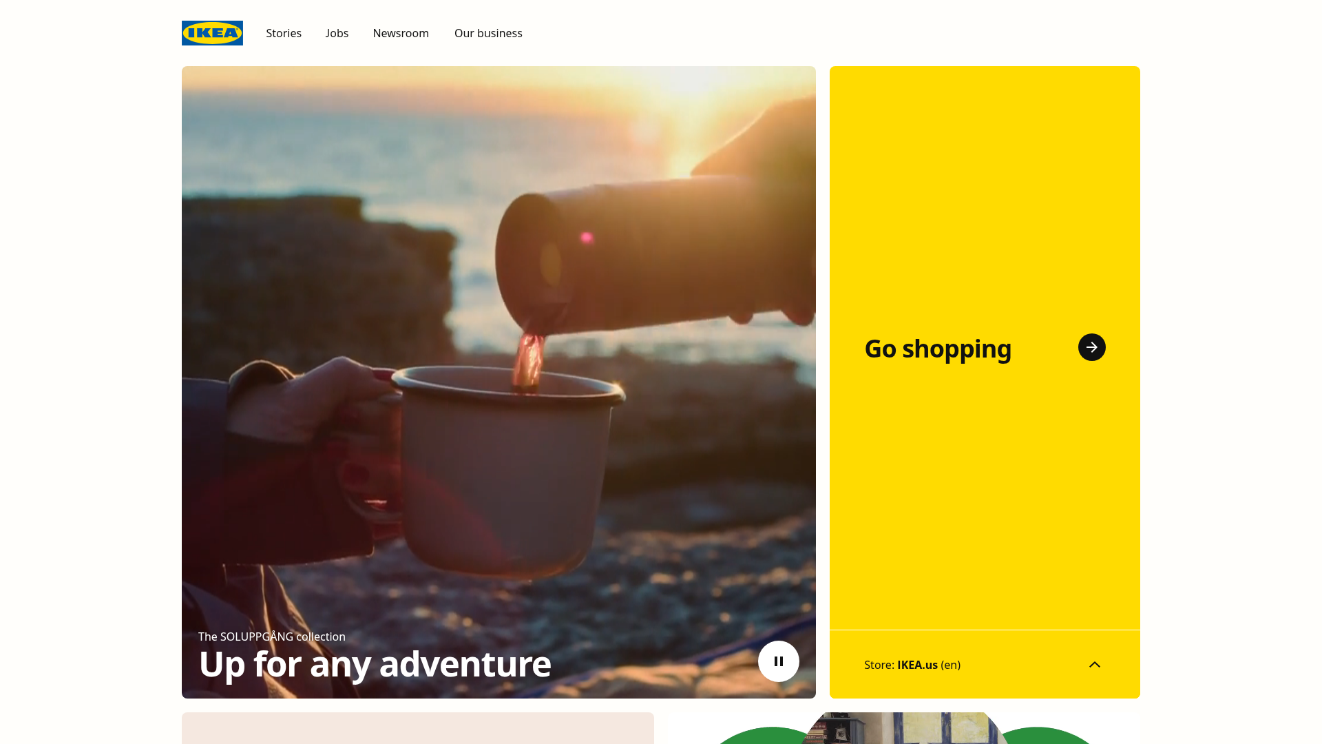
IKEA Corporate Landing Page Layout
A clean corporate portal featuring a large hero hero section with video playback, a split-screen call-to-action block, and a minimalist navigation bar.

Finn Pet Supplements Landing Page
An e-commerce landing page featuring high-contrast typography, a sticky brand logo banner, parallax scroll effects on product headers, and a clean product grid.
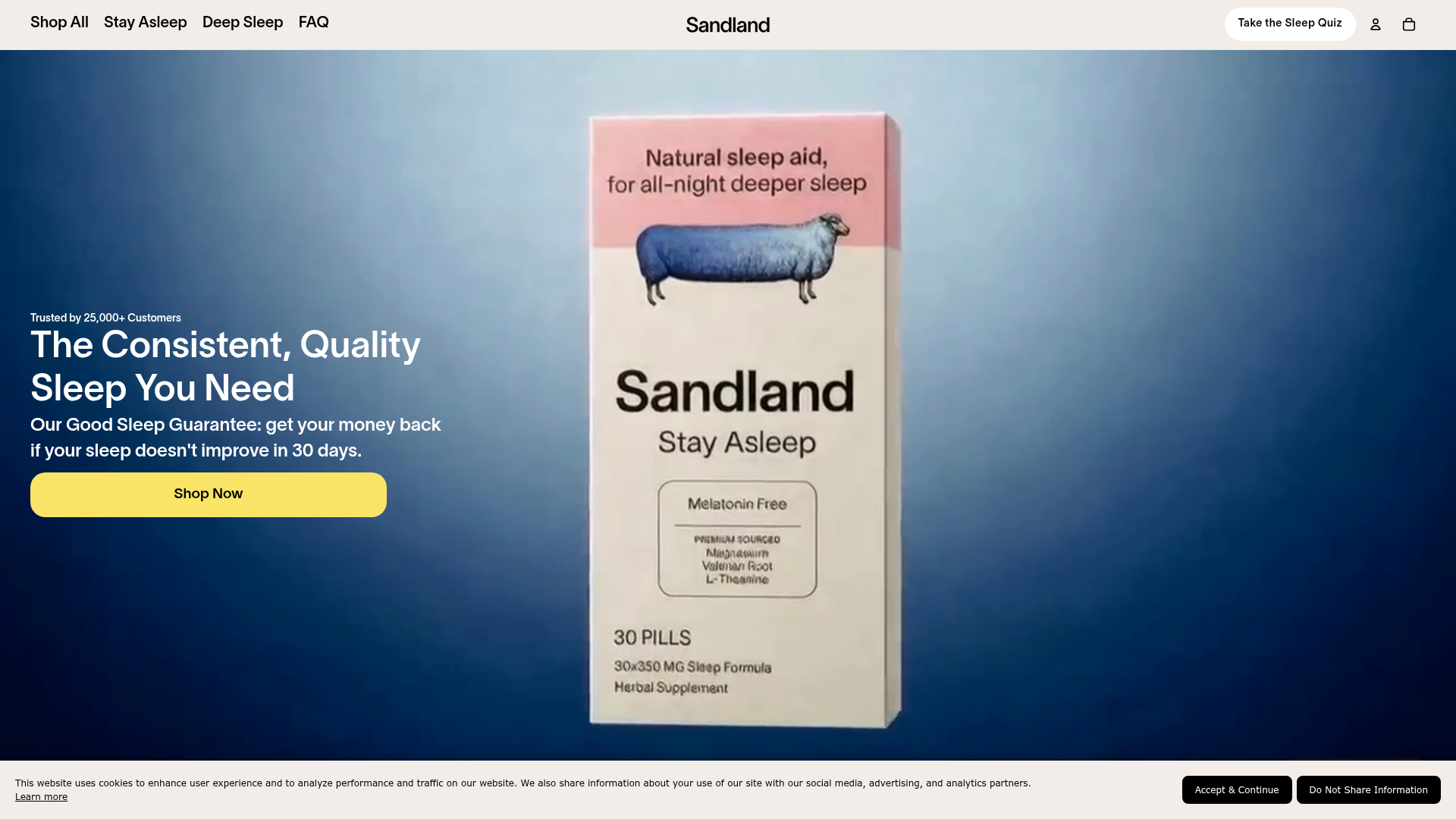
Sandland Sleep Product Landing Page
A high-conversion Shopify layout featuring split-video hero sections, logo-based social proof ribbons, and a testimonial slider integrated with biometric sleep tracker results.
