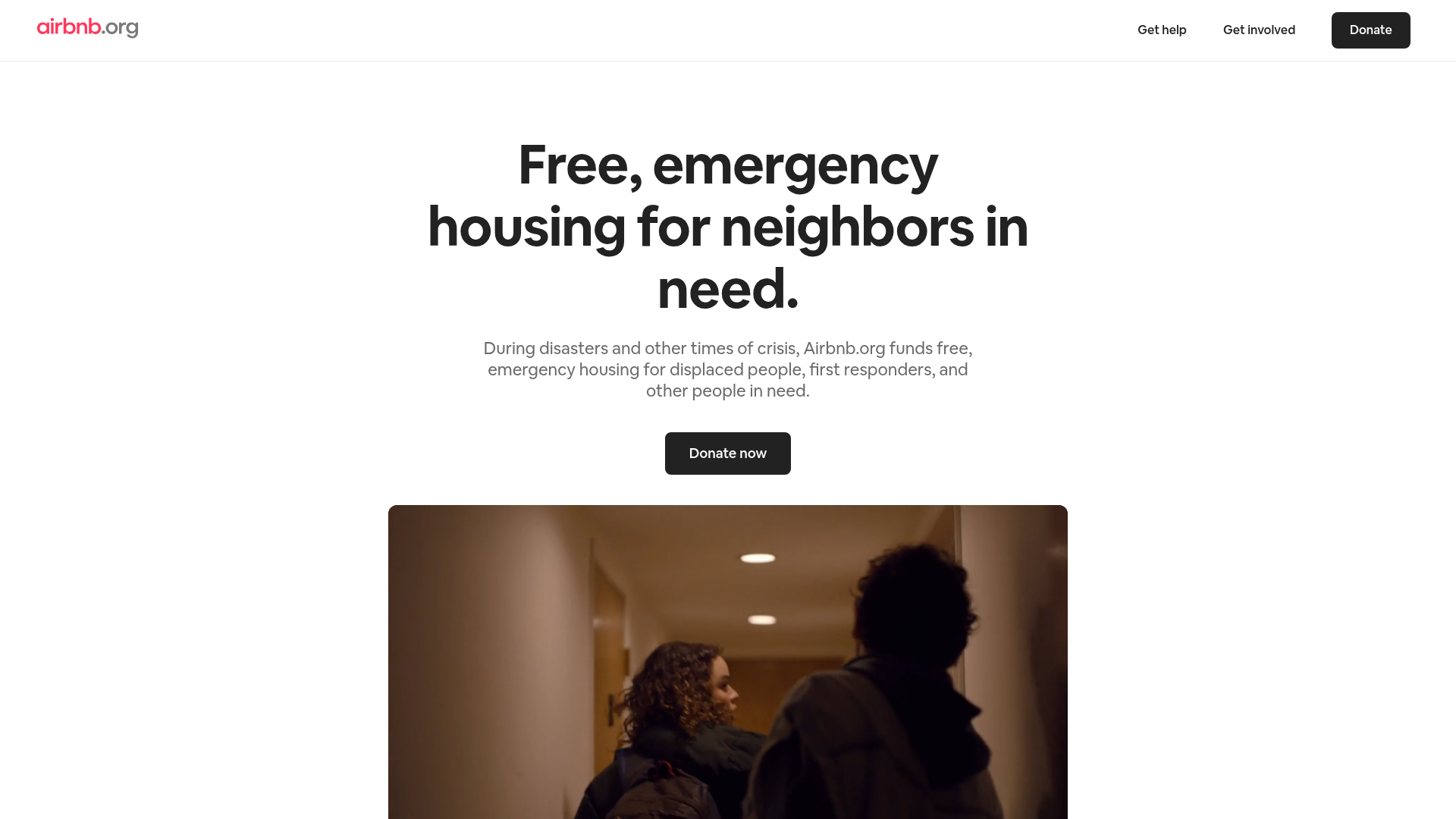
Airbnb.org Relief Housing Landing Page
A clean nonprofit landing page featuring a minimalist logo header, high-contrast CTA buttons, centered typography hero section, and an embedded video container.
Overview
This landing page for Airbnb.org is a masterclass in minimalist non-profit communication, focusing on mission-driven clarity and a clear emotional hook. It is an excellent clone reference for builders who need a high-trust, low-clutter interface that prioritizes a single Call to Action (CTA) while maintaining professional brand authority.
Design System
- Color Palette & Visual Hierarchy: The design uses a high-contrast monochromatic base (pure white backgrounds with dark off-black text/buttons). The primary emphasis is placed on the black buttons and the light-gray logo sub-brand, ensuring that the visual focus remains on the headline and primary functional links.
- Typography System: The site relies on a clean, geometric sans-serif (Airbnb Cereal). The hierarchy uses an extra-bold, large-scale heading for the h1, medium-weight bodies for subtext, and crisp, semi-bold weights for navigation and buttons for maximum readability.
- Page Structure & Flow: The layout follows a classic centered stack: a sticky-style header with navigation, a hero section with a centered text cluster, a primary CTA button, and a large-format media container (video) to provide narrative context.
- Reusable Components: The primary "Donate" buttons are the most valuable components to clone—note the pill-shaped border radius and high-contrast color. The navigation header is an efficient layout for sites with few top-level categories, utilizing a simple flexbox arrangement.
- Responsive Behavior: The large, centered headline and simple vertical stack suggest a mobile-first philosophy where elements will simply shrink or wrap while maintaining center alignment.
- Implementation Clues: The structure indicates a semantic HTML approach with a dedicated
<header>for navigation and a<main>container focusing on the hero section, likely utilizing utility classes for the significant vertical padding between sections.
Use Cases
- Who should clone this: Non-profits, individual crowdfunding campaigns, or disaster relief initiatives that need to establish immediate trust and present a single path to conversion.
- Remix potential: This pattern is highly effective for SaaS pre-launch pages or waitlists. By swapping the "Donate" functionality for an email capture form, the information architecture remains perfectly intact.
- Practical Remix Directions: Swap the monochromatic color scheme for a brand-specific primary color (e.g., blue for medical or green for environmental). You can also replace the hero video container with a high-fidelity screenshot carousel if used for a product demo.
- Suggested Scope: This is ideal for a full-page clone. The layout is simple enough that cloning the entire structure provides a complete framework for any mission-oriented landing page.
Related Inspirations
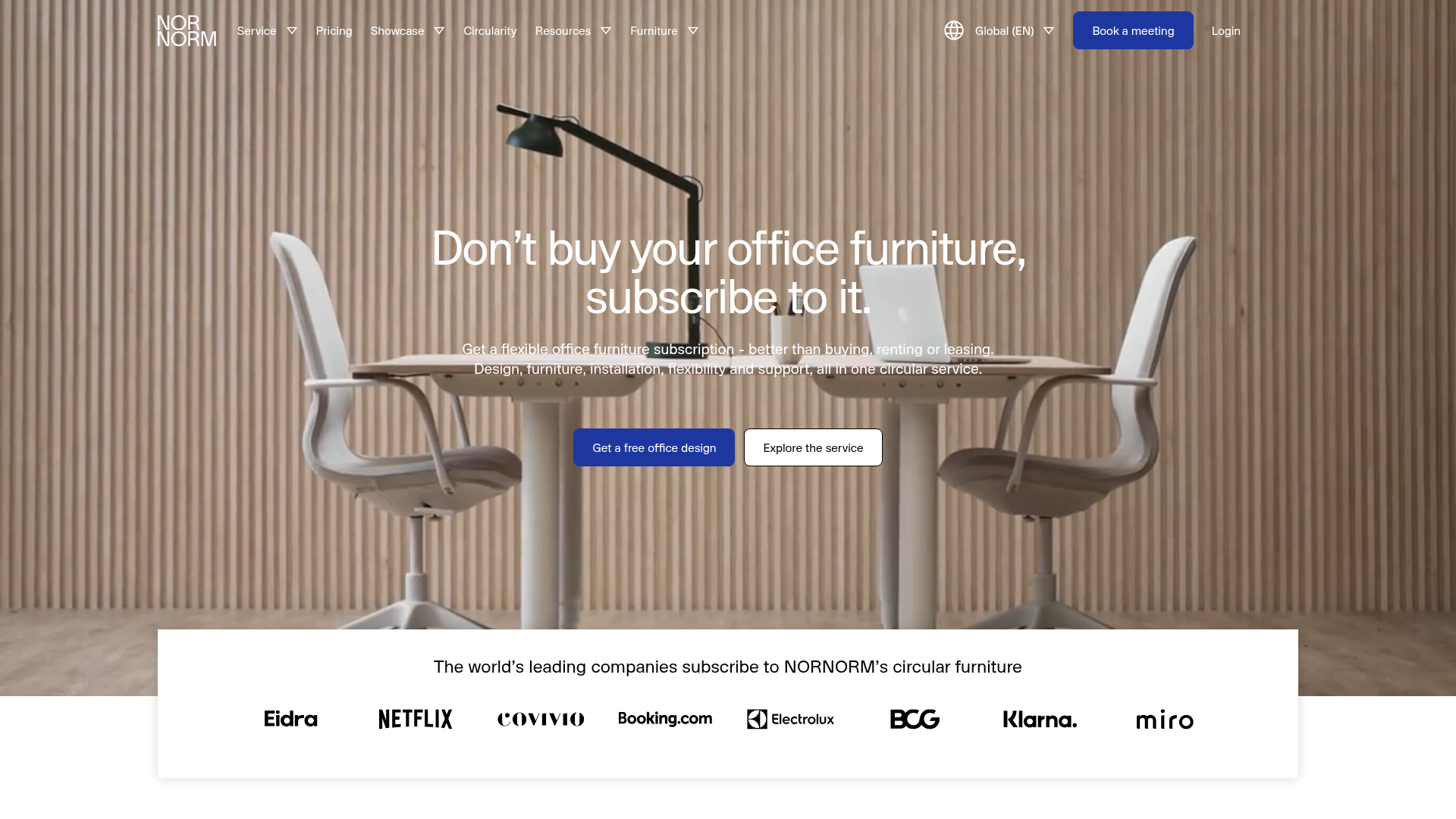
NORNORM Circular Furniture Subscription Homepage
A clean corporate landing page featuring a full-width hero with centered dual CTAs, a sleek brand logo marquee, and a minimalist navigation menu.
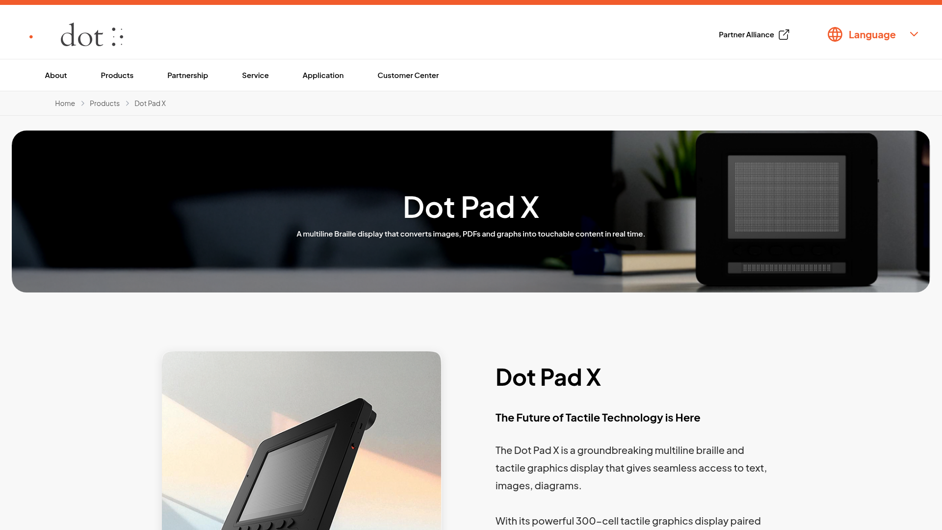
Dot Pad X Product Showcase Landing
A clean product page featuring a wide-screen hero banner, structured text blocks, and high-fidelity product imagery ideal for hardware or gadget portfolios.
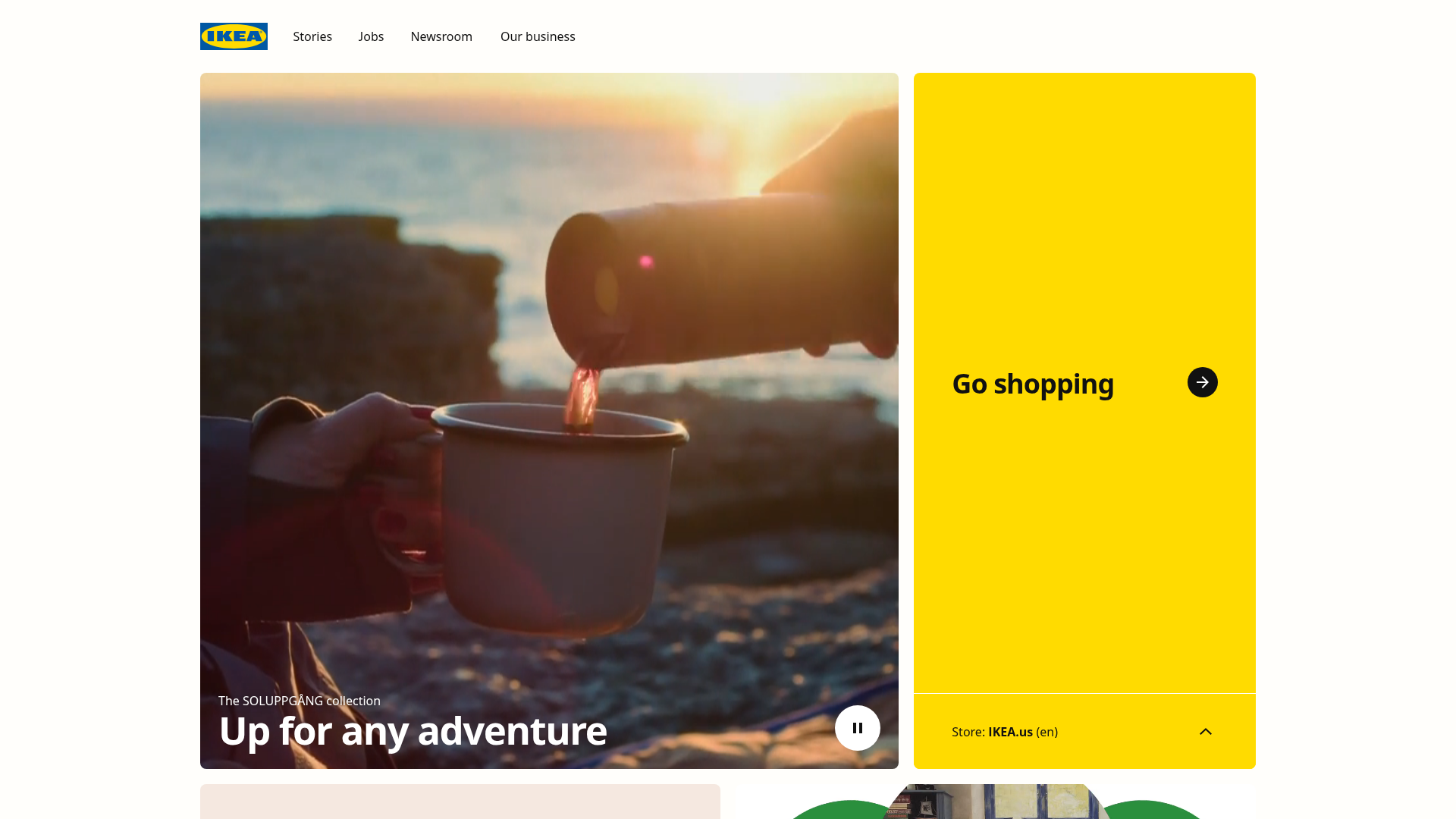
IKEA Corporate Landing Page Layout
A clean corporate portal featuring a large hero hero section with video playback, a split-screen call-to-action block, and a minimalist navigation bar.

Finn Pet Supplements Landing Page
An e-commerce landing page featuring high-contrast typography, a sticky brand logo banner, parallax scroll effects on product headers, and a clean product grid.
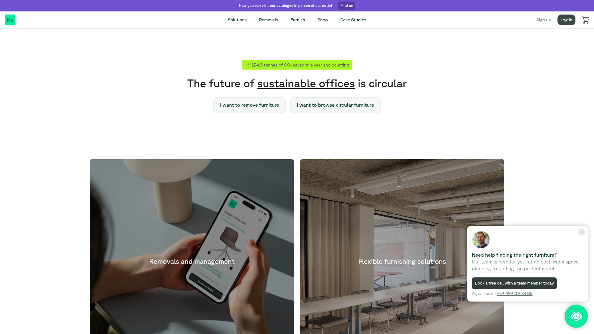
Relieve Furniture Sustainable Marketplace Landing Page
A clean sustainability-focused landing page featuring a hero with environmental impact stats, two-column visual category grid, horizontal logo slider, and a testimonial carousel.

OpenWeb B2B Service Landing Page
A professional landing page layout featuring a central animated hero area, data visualization counters, a client logo grid, testimonial slider, and tabbed lead generation forms.
