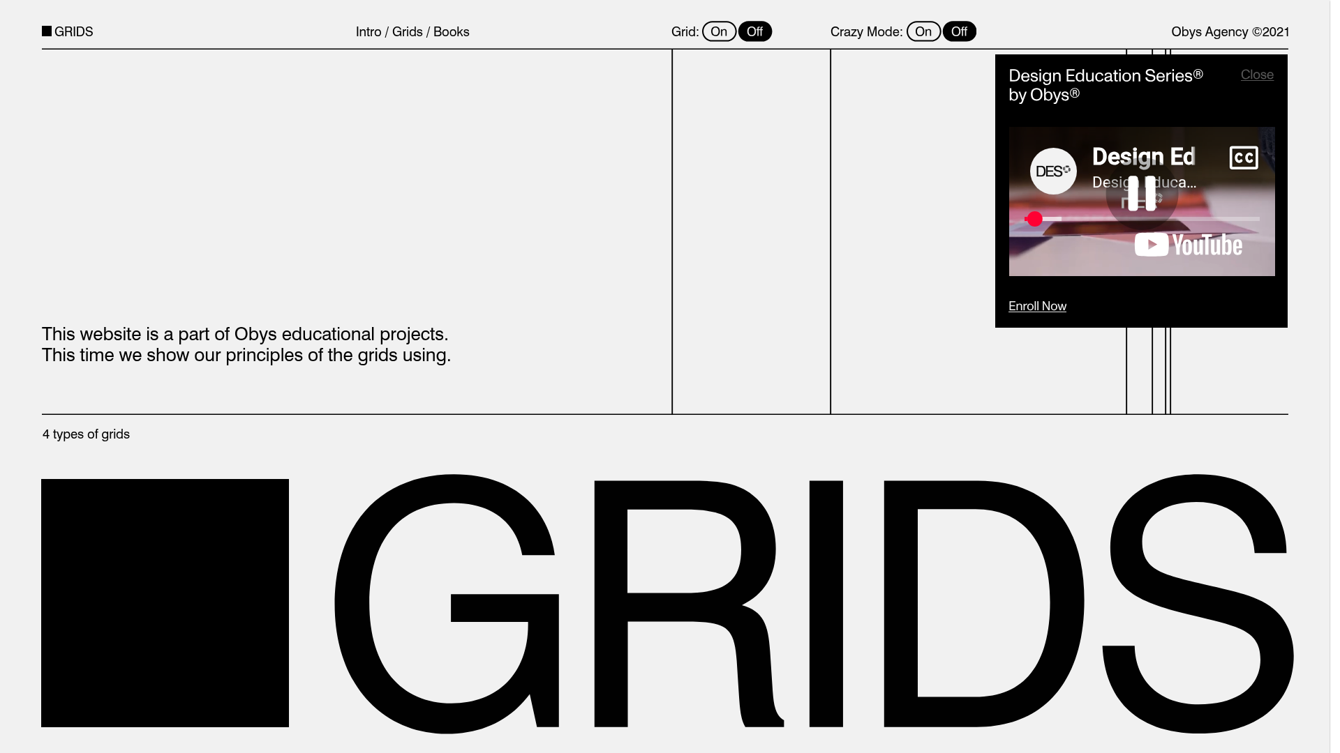
Grids Design Education Landing Page
A minimalist, typography-focused layout featuring technical grid overlays, interactive toggle switches, and an embedded video modal for educational content.
Overview
This landing page is a minimalist, high-concept educational site for Obys Agency, designed to showcase grid principles. It is an excellent clone reference for developers looking to implement technical typography layouts, custom utility toggles, and integrated video components.
Design System
- Color Palette & Visual Hierarchy: A strictly monochromatic (Black and White) palette. The design relies on high-contrast black lines and blocks against a light grey background to establish structural hierarchy.
- Typography System: Primarily uses a bold Neo-Grotesk sans-serif (resembling Helvetica or Inter). Extremely large display type is used for the header "GRIDS," while navigation and body text maintain a small, uniform scale to highlight the underlying structure.
- Page Structure & Section Flow: The layout is organized via a visible grid system. The header contains a logo and central navigation link, flanked by functional toggles. Below the horizontal fold line, an introductory paragraph occupies the left column, followed by a large heroic wordmark.
- Reusable Components:
- Grid Toggles: The "Grid" and "Crazy Mode" toggles are pill-shaped switches that act as great UI components for interactive state management.
- Video Modal/Card: A floating black-on-black card containing a YouTube embed and an "Enroll Now" call-to-action.
- Thin Borders/Dividers: Clean horizontal and vertical lines that define the layout boundaries.
- Interaction Patterns: The design features a "Grid Overlay" toggle that reveals construction lines on the page. The interface uses custom cursor behavior (indicated by the layout) and smooth modal transitions for educational content.
- Implementation Clues: Based on the HTML and visuals, the site uses
gsapfor animations and specializeddivstructures to handle the vertical layout lines independently of the content containers.
Use Cases
- Who should clone this pattern: Design studios, creative agencies, or technical educators who want to demonstrate their craft through their website's architecture.
- Effective Remixes: Portfolio sites, typography galleries, and technical documentation headers.
- Practical Remix Directions: Swap the monochrome for a brand accent color (e.g., neon green or blue) while maintaining the thin borders. The information architecture can be adapted for a minimalist blog or a product specification sheet.
- Suggested Clone Scope: Start by cloning the navigation bar and the toggle logic to handle page-wide state changes. The video modal is also a highly reusable standalone component for any marketing landing page.
Related Inspirations
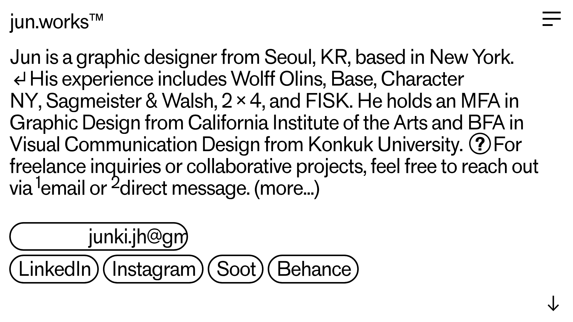
Jun Works Portfolio Landing Page
Minimalist graphic design portfolio featuring a text-heavy layout with image-on-hover tooltips, a pill-shaped marquee contact card, and a categorized hashtag tag cloud for project navigation.
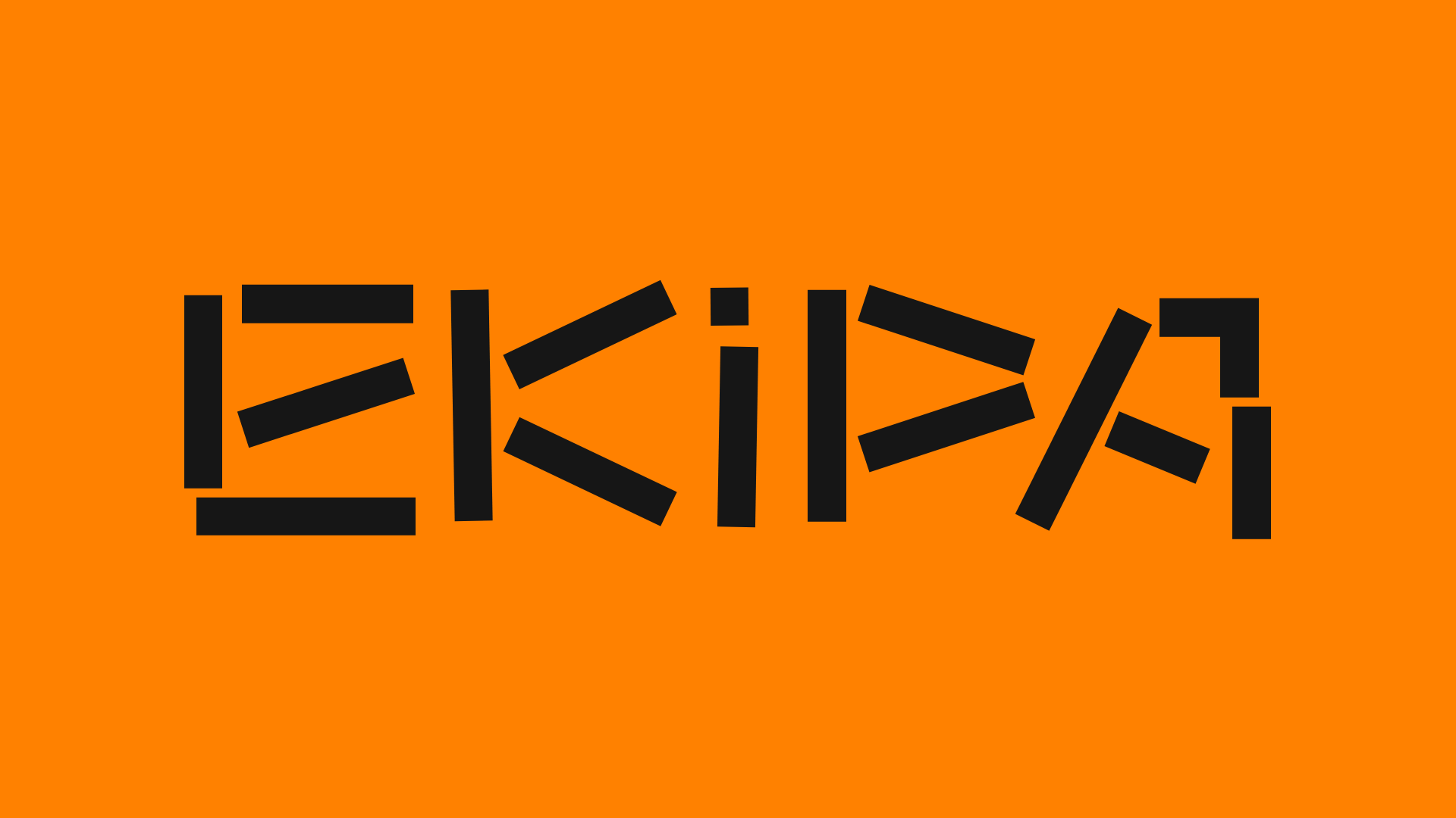
Ekipa Agency Artist Roster Site
A minimalist agency portfolio featuring a dynamic block-based logo, colorful background transitions, and a hover-activated image preview grid for an artist roster.
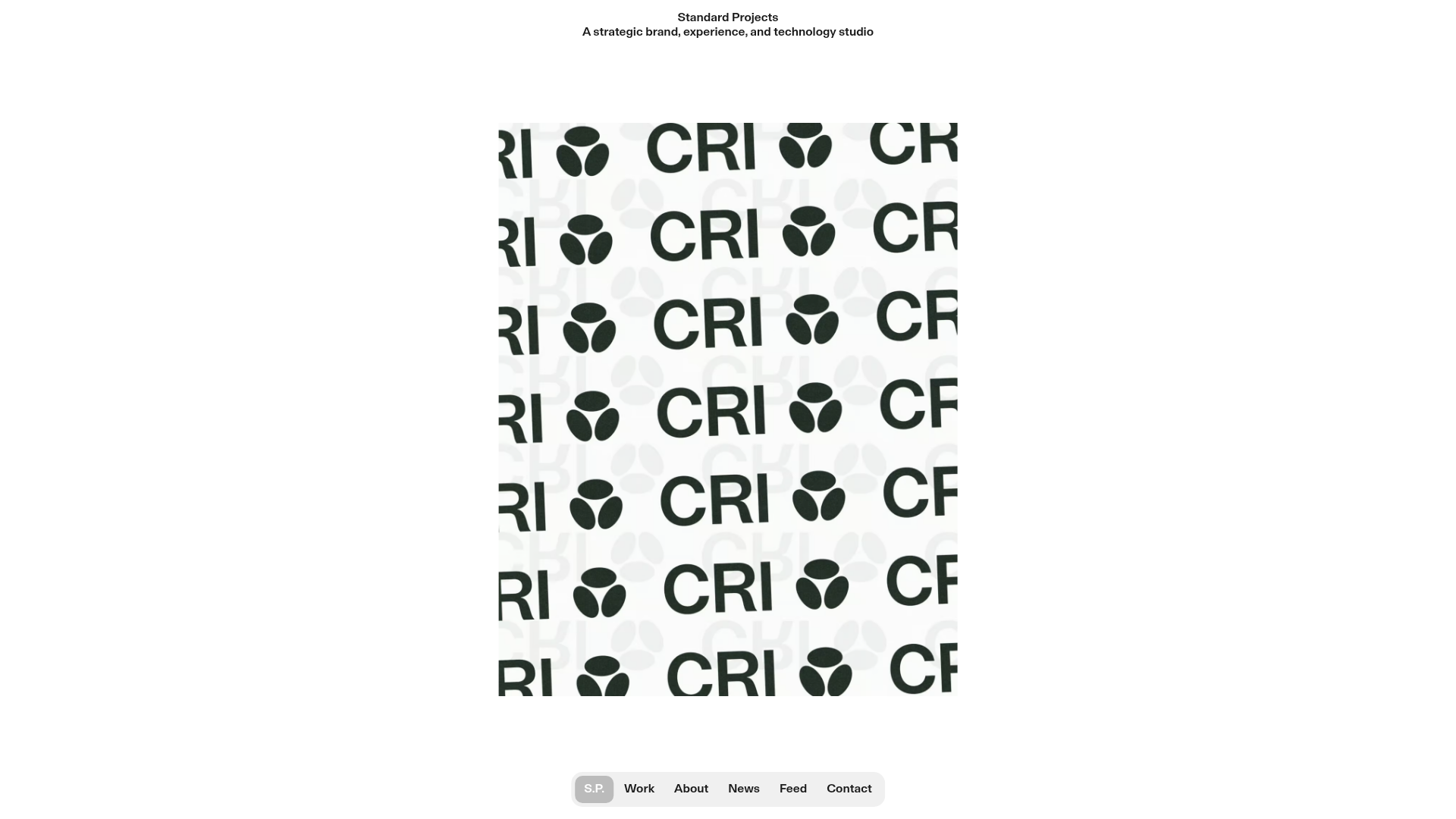
Standard Projects Portfolio with Sticky Hero
A minimalist studio layout featuring a full-height animated carousel, sticky header typography, and a dynamic masonry element grid for case studies.
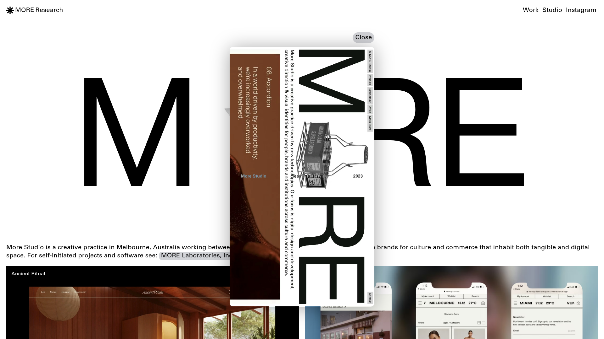
More Studio Creative Agency Portfolio
A high-end creative portfolio featuring oversized experimental typography, immersive video modals, accordion-based project lists, and unique cursor-following hover effects.

Mostlikely Architecture Portfolio Site
A minimalist portfolio layout featuring a multi-layered cube interaction, vertical image scrolling with lazy-loading, and a grid-based screensaver view for design and research projects.
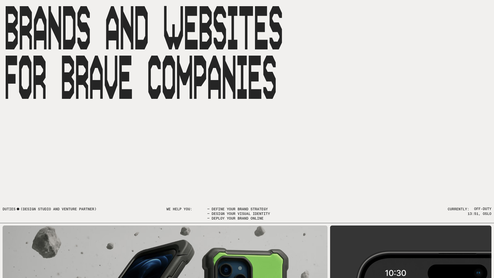
Duties Studio Agency Landing Page
A high-impact agency template featuring bold typography, a minimal technical footer, and a clean grid layout for visual case studies.
