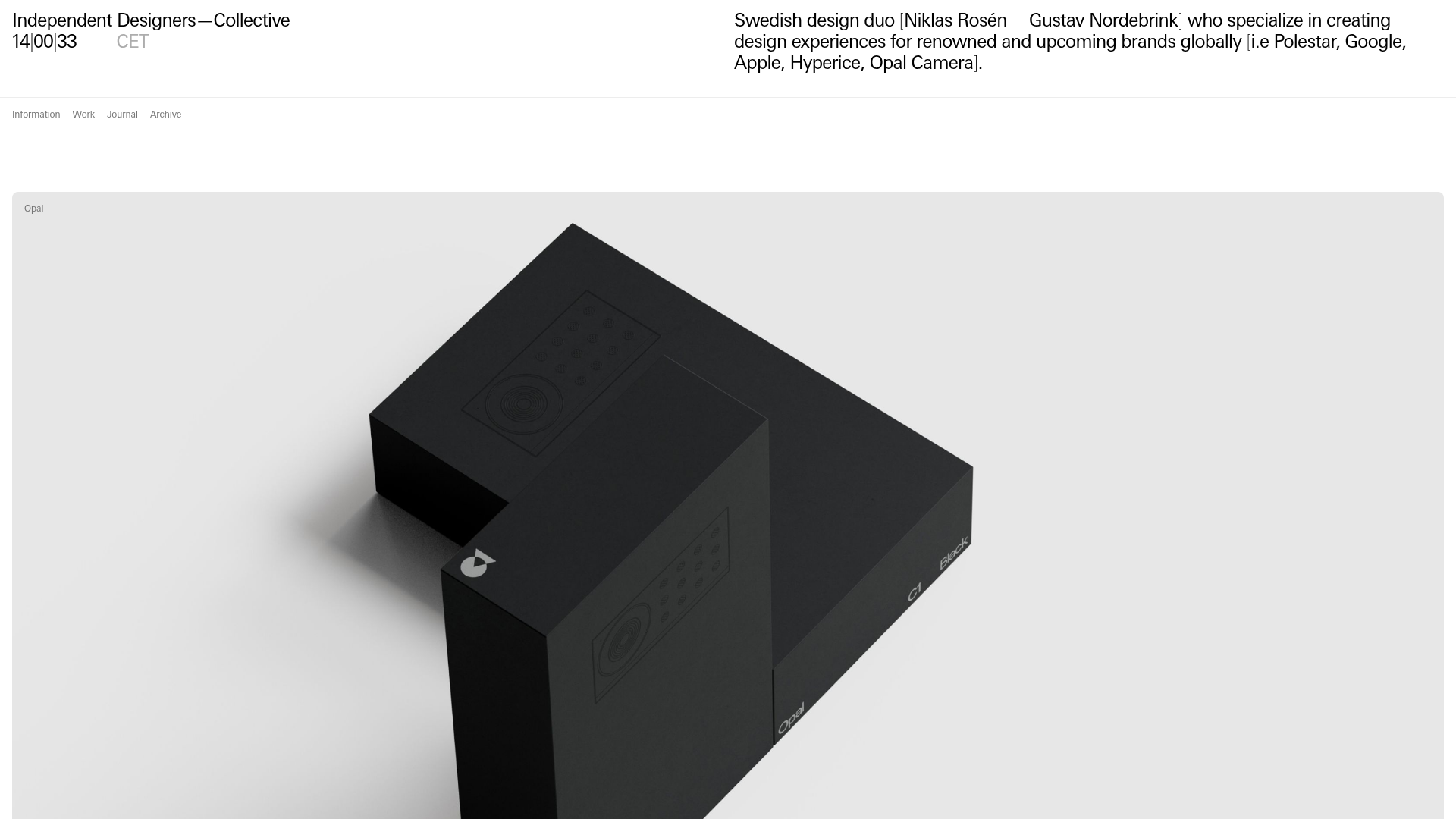
Independent Designers Collective Agency Portfolio
A minimalist studio portfolio featuring a large-scale imagery hero, modular project cards with subtle hover states, and a clean grid-based typography layout.
Overview
This website serves as a high-end portfolio for ID—C, a Swedish design duo. It is an exceptional clone reference because it demonstrates how to balance high-volume content with a spacious, minimalist aesthetic using a strict 12-column grid and modular components.
Design System
- Color Palette & Visual Hierarchy: The palette is strictly monochromatic, utilizing white backgrounds, deep black typography, and shades of grey (e.g.,
color-grey-60for metadata,color-grey-40for secondary links). Hierarchy is established through extreme scale shifts rather than color. - Typography System: The site uses a clean, utilitarian sans-serif. It features a stark contrast between
type-heading-largefor section headers andtype-detailfor metadata. The layout leans heavily on the character density of the text to act as a graphic element. - Structure & Flow: The page flows from a dense, wide-aspect "featured work" hero section (
featured-work-cards) into a structured grid of "Selected Work" cards, followed by a "Journal" section. The header remains fixed or minimal, prioritizing the content grid. - Reusable Components:
- Modular Cards: The
.work-listing-cardand.news-cardare standard containers that wrap media (video or images) and a two-line text info block. - Grid System: A rigorous layout evident in the
.grid-overlayand.columnsclasses, likely utilizing a 12-column CSS grid or flexbox framework. - Media Containers: The
.mediaclass handles both responsive images and auto-playing muted HTML5 videos seamlessly.
- Modular Cards: The
- Interactions & Motion: The HTML includes
swupfor smooth AJAX-based page transitions. Project cards feature subtle hover states (featured-work-card active) and lazy-loading with low-resolution placeholders (loader-image) for a premium loading feel. - Responsive Behavior: The site utilizes utility classes like
hide-smallandshow-smallto swap image aspect ratios for mobile devices, ensuring high-quality visuals across all screens.
Use Cases
- Who should clone this: Creative studios, independent architects, or product designers who need to showcase a vast body of work without overwhelming the user.
- Remix Directions:
- Swap Brand Style: The monochrome base is a blank canvas; applying a vibrant accent color to the
section-header-linkor card overlays can completely change the vibe. - Architecture Adaption: Reuse the
.col-2grid layout to display products or blog posts, as it manages small thumbnails with high clarity. - Info Architecture: The dual-column header (Title on left, Description on right) is a classic "anti-hero" layout pattern that can be remixed for service-based businesses.
- Swap Brand Style: The monochrome base is a blank canvas; applying a vibrant accent color to the
- Suggested Scope: A full-page clone is ideal for those wanting a comprehensive SPA (Single Page Application) feel, but the individual
work-listing-cardgrid is a perfect quick-clone for any existing gallery.
Related Inspirations

Clase Agency Branding Portfolio
A minimalist design agency portfolio featuring a typographic hero section, full-width image articles, sticky title bars, and integrated scrolling text marquees for a clean editorial layout.

Lundqvist & Dallyn Studio Portfolio
Minimalist design studio portfolio featuring a custom video loader, world clock navigation, and a fluid masonry-style grid for high-quality photography and type design showcases.

AcolorBright Design Agency Portfolio
Minimalist bento-style portfolio layout featuring numerical section headers, horizontally scrolling project teasers, and a clean grayscale client logo grid.
Manna Architects Minimalist Portfolio Grid
A clean, single-page architecture portfolio featuring a centered intro, a varied multi-column image gallery with captions, and a detailed project service breakdown.
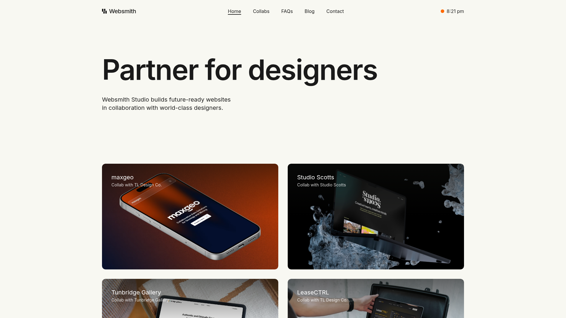
Websmith Studio Portfolio Site Template
A clean studio portfolio featuring a responsive bento-style project grid, interactive process cards, and a split-screen testimonial section built with Tailwind CSS.
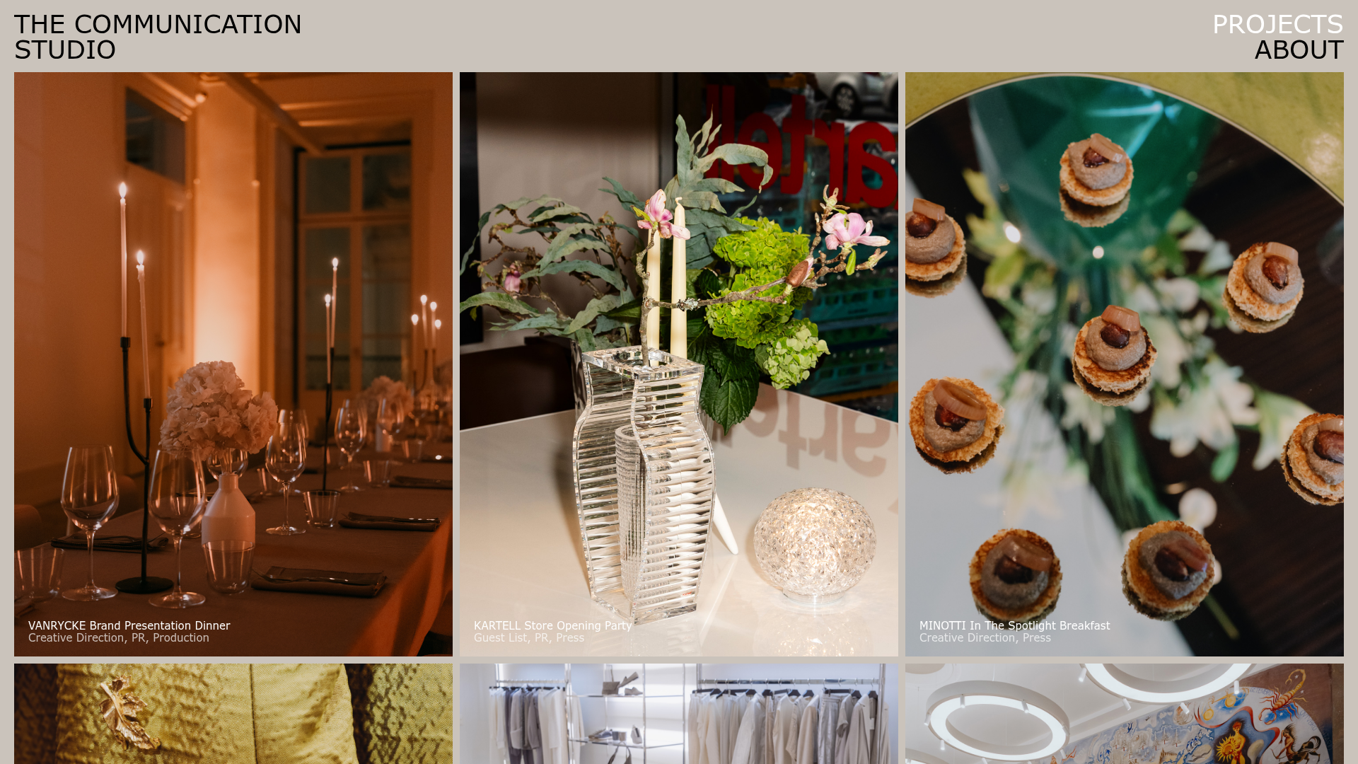
The Communication Studio Portfolio Grid
A minimalist creative agency portfolio featuring a gapless image grid with image-swap hover effects and Tailwind-based reveal animations.
