Heart Aerospace Landing Page
A minimalist industrial design featuring a full-screen video hero section, large-scale typography, high-contrast grid layouts, and an interactive partner logo gallery.
Overview
This landing page is a masterclass in industrial minimalism, using high-impact typography and cinematic video to establish a high-tech aero-corporate identity. It effectively balances large-scale branding with detailed technical specifications, making it an excellent reference for builders aiming to convey scale, precision, and sustainability.
Design System
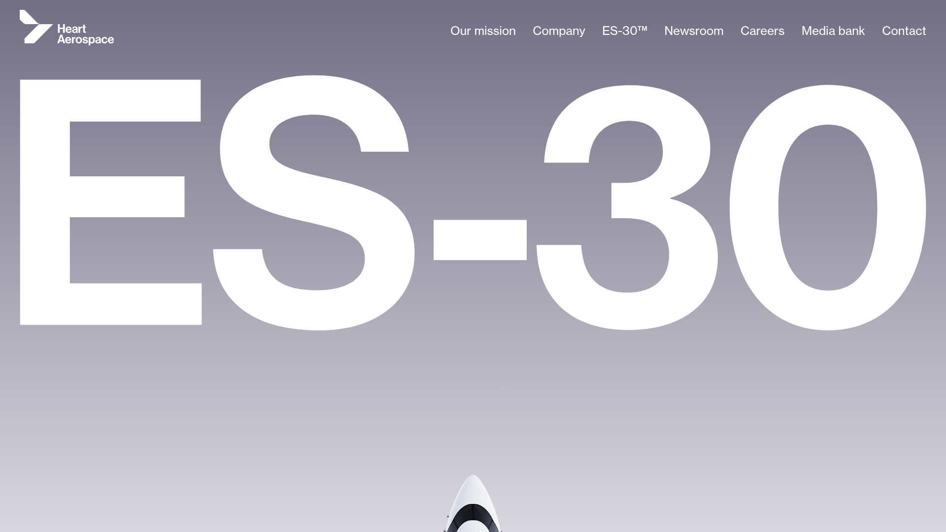
- Color Palette & Visual Hierarchy: The design uses a monochromatic foundation of muted greys (slate and charcoal shades) contrasted with stark white text. Hierarchical importance is established through extreme scale—the massive "ES-30" hero text acts as a background element, while functional navigation and subheaders occupy smaller, precise positions at the margins.
- Typography System: A clean, geometric sans-serif (resembling Inter or a custom variant of Helvetica) is used throughout. The scale varies from the oversized display type in the hero to highly legible, medium-weight body text in the technical USP columns.
- Page Structure: The flow transitions from high-level brand immersion (video hero) to product-specific diagnostics (interactive top-down plane view with data pins), followed by a three-column USP grid and finishing with a clean, 10-column logos grid for social proof.
- Reusable Components: Notable components include the responsive grid system (
grid__col--n-of-12), the video background container with fallback JPEG posters, and the information "pins" overlaid on technical illustrations to provide context-sensitive data points. - Interaction & Motion: The HTML reveals use of the
AOS(Animate On Scroll) library withfadeandpin-inattributes, used to reveal technical specs and partners as the user navigates. The video elements are configured withmuted,autoplay, andplaysinlinefor seamless background playback. - Implementation Clues: The layout relies on a custom grid-based utility system (
p-gutter--x,p-bottom--medium) and semantic HTML sections. The navigation is fixed or absolute positioned to the top right to maintain focus on the hero imagery.
Use Cases
- Who should clone this: This pattern is ideal for engineering-heavy firms, clean-tech startups, or luxury hardware manufacturers who need to showcase a flagship product's scale and technical superiority.
- Effective Remixes: A SaaS company could remix this by swapping the technical plane illustration for a high-fidelity dashboard architectural map, keeping the data pin system to explain feature modules.
- Practical Directions: For a quick win, clone the hero section's massive typography treatment to create a bold landing page brand statement. For a full-page clone, adapt the info architecture from "Product Specs" to "Solution Benefits."
- Clone Scope: Beginners should focus on the USP grid and partner logo section for their clean implementation; advanced builders should clone the interactive technical breakdown section (Section 2) to master overlay positioning.
Related Inspirations
Monotype Variable Fonts Resource Gallery
A clean masonry grid layout featuring content cards with hover-state overlays, category filtering, and responsive image scaling for a media-rich resource center.
Depanneur Beverage E-commerce Hero
A minimalist Shopify storefront featuring a full-screen background video hero, sticky translucent navigation, and integrated mobile menu components.
GT America Typography Tester
A layout-heavy landing page featuring interactive font testing toolkits with multi-language support, font-weight sliders, and content-editable text areas.
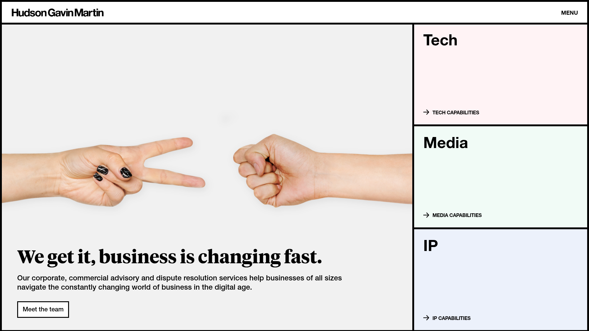
Hudson Gavin Martin Corporate Law Landing
A professional service homepage featuring a minimalist grid-based hero, color-themed navigation blocks, and a bento-style insights feed with subtle hover interactions.

Pa’lais Plant-Based Product Homepage
A food product landing page featuring an animated video hero, a recipe carousel with filtering icons, organic blob-shaped layout containers, and a parallax-scrolling decorative element system.
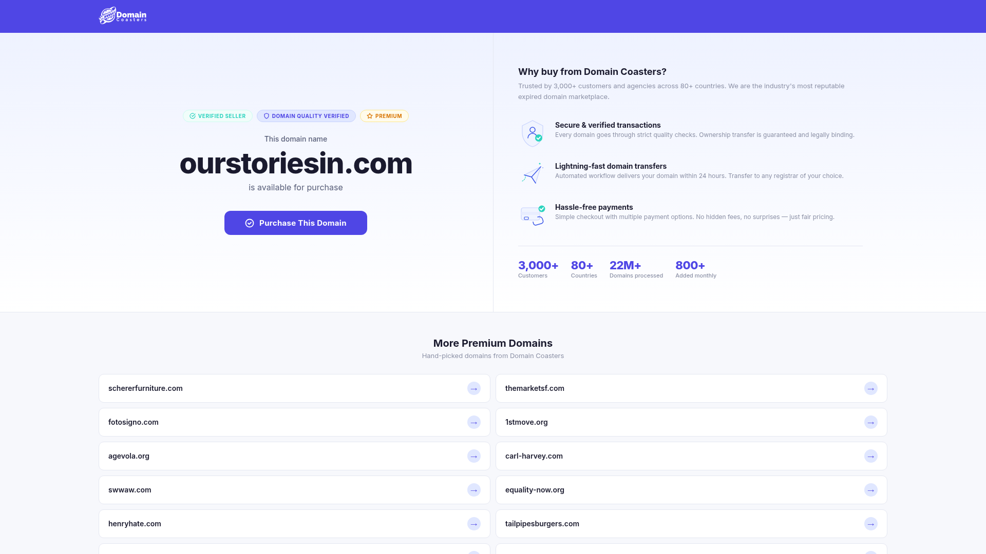
Domain Coasters Landing Page Layout
A clean domain marketplace landing page featuring a split-screen hero with trust badges, statistical counters, and a responsive grid of card-based links for additional inventory.
