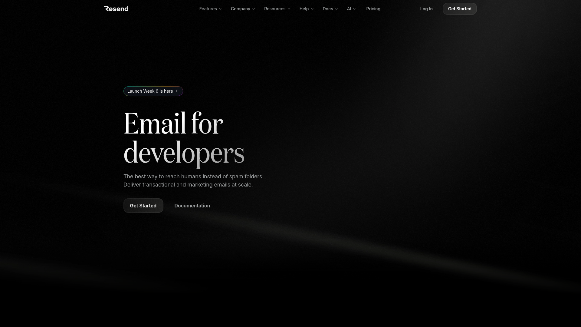
Resend Developer Content Landing Page
Dark-mode developer marketing layout featuring complex animated typography, tabbed code integration blocks, horizontal language selectors, and rich component previews for email analytics.
Overview
This landing page is a premier example of high-end developer marketing, utilizing a sophisticated dark-mode aesthetic to position a technical API as a premium service. It is an excellent clone reference for its seamless blending of static content with interactive code environments and rich component previews that visualize abstract data.
Design System
- Color Palette & Visual Hierarchy: The design uses a deep black background (
bg-black) with high-contrast white and silver-gray text (text-gray-9). Color is used sparingly but intentionally: emerald green for 'delivered' status, violet for 'clicks', and a vibrant yellow-to-orange gradient for key integration headlines. Subtle 'light ray' background images and radial gradients create depth without cluttering the UI. - Typography: The hierarchy is defined by a striking combination of a high-contrast serif font (Domaine) for large hero headers and a clean, legible sans-serif for body copy. Large scale is prioritized, with hero text reaching
6remon desktop, while code blocks use precise monospaced font families with custom syntax highlighting. - Page Structure: The flow follows a classic technical SaaS conversion path: 1) Hero with 'Rainbow Border' tag for news; 2) Trust bar with company logos; 3) Interactive multi-language integration tabs; 4) Modular feature 'bento' grid depicting Test Mode and Webhooks; 5) Full-width visual editor preview; 6) Side-by-side component analytics previews.
- Reusable Components:
- Interactive Code Tabs: A horizontal scroller of language icons (Node, Ruby, Go, etc.) that switches content panels.
- Bento Cards: Rounded-corner cards (
rounded-3xl) featuring internal glowing borders, top-centered gradients, and masked image overlays. - Texture Buttons: The primary 'Get Started' button uses an sophisticated stack of backdrop blurs, linear gradients, and a noise texture overlay (
after:bg-[url('/static/texture-btn.png')]).
- Interaction & Motion: The UI features heavy use of entry animations (
animate-hero-text-slide-up-fade) and smooth state transitions on buttons. Code blocks utilize a custom selection color (selection:bg-white/20) to maintain the dark-mode aesthetic. - Implementation Clues: The HTML confirms a modern stack using Tailwind CSS for utility-first styling and Radix UI primitives for accessible tabs and accessible components.
Use Cases
- Who should clone this: This pattern is ideal for developer-tooling startups (APIs, SDKs, Database-as-a-Service) that need to establish immediate technical credibility and high design standards.
- Effective Remixes: Technical SaaS products can effectively remix the 'Integrated this morning' tabbed code block to demonstrate their own multi-language support. The 'First-class developer experience' grid is perfect for highlighting specific platform features through simplified UI mockups rather than full screenshots.
- Practical Directions: Builders can swap the serif font for a modern monospaced headline to shift the brand from 'Premium' to 'Hard-Engineering' style. The bento-style feature cards can be extracted individually for smaller project landing pages.
- Suggested Scope: A full-page clone is recommended for high-intent marketing pages, while the individual interactive code-panel component is a high-value quick-clone for any documentation or feature landing page.
Related Inspirations
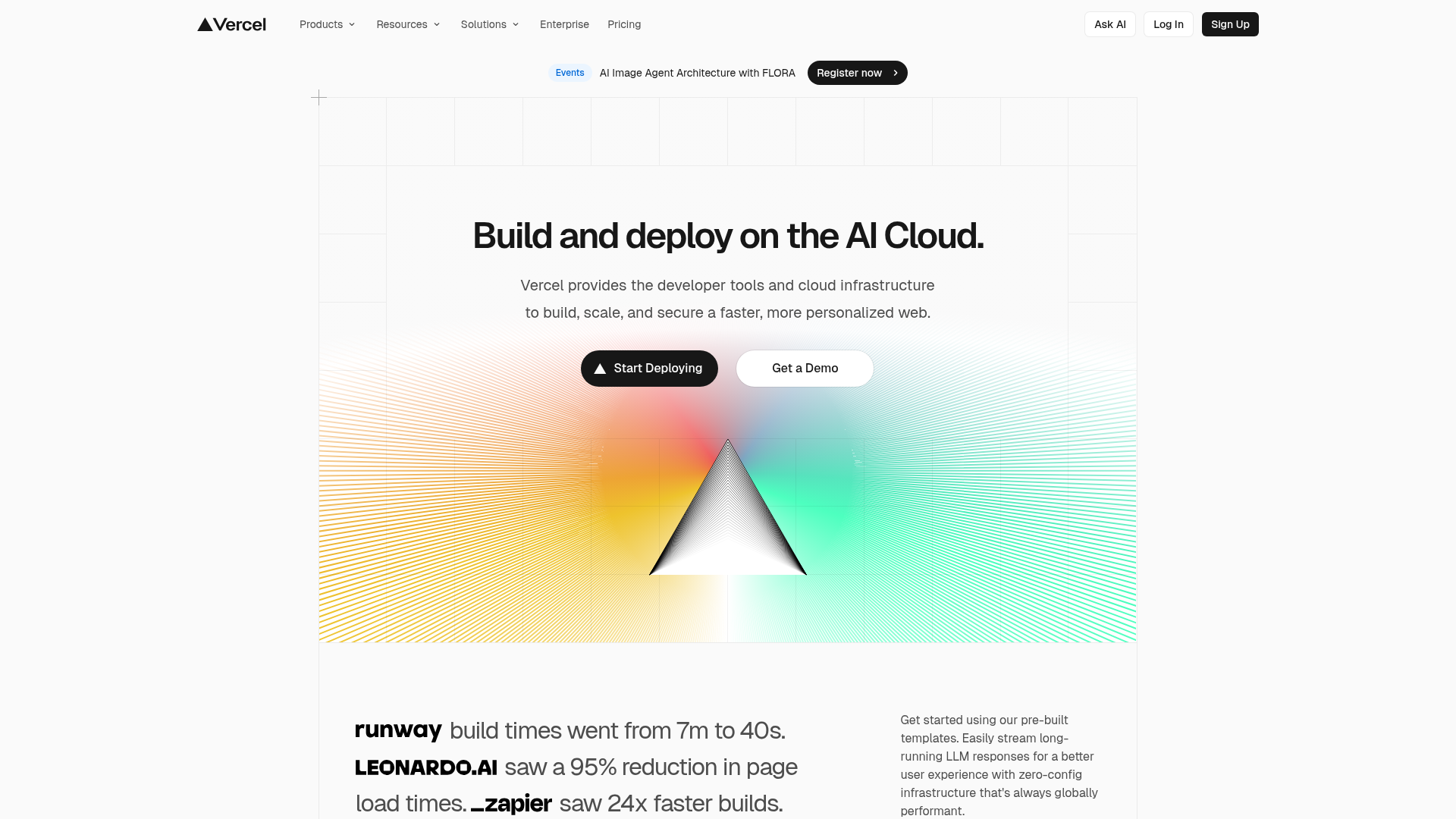
Vercel AI Cloud Landing Page
A modern landing page featuring a minimalist dark-themed navbar, a grid-overlay hero section with radial color gradients, and high-contrast typography for customer success stories.
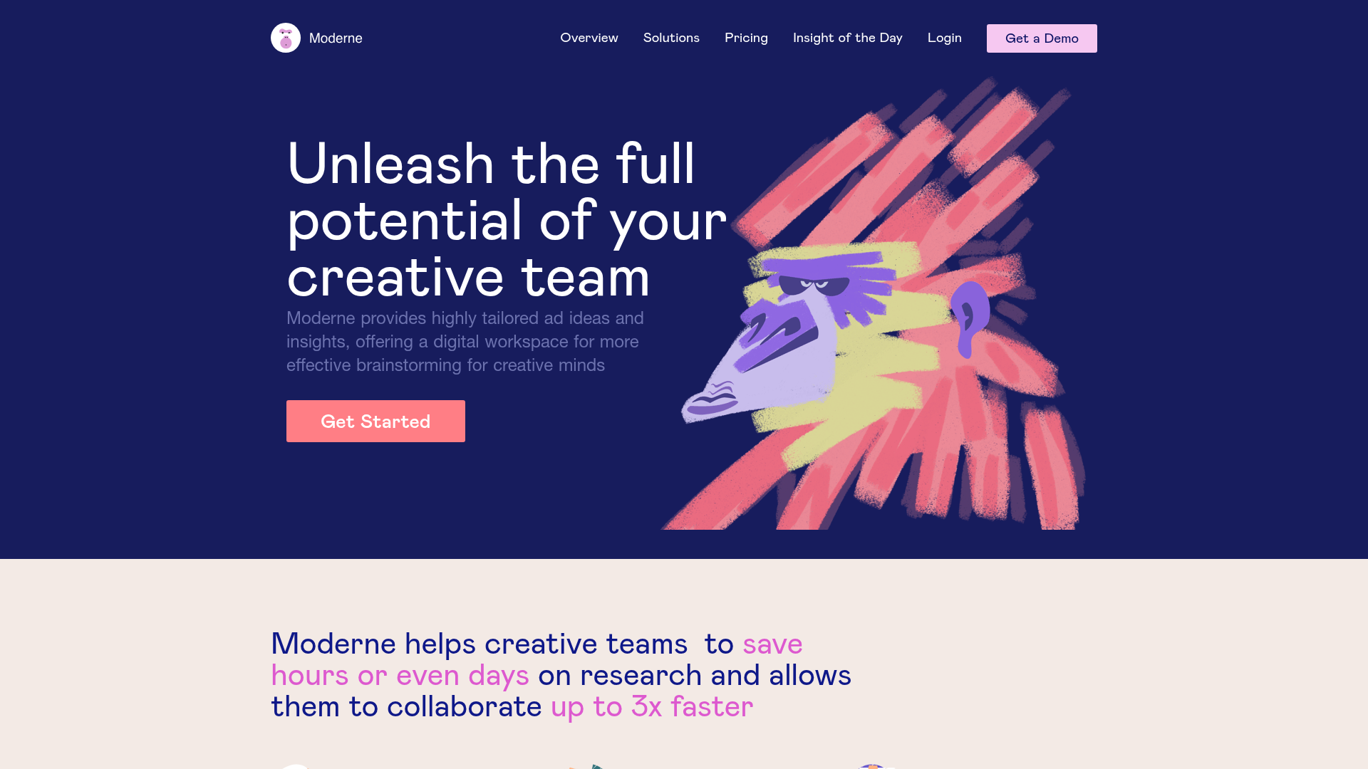
Moderne Creative Landing Page
A high-contrast landing page featuring a dark hero section with an artistic illustration overlay, distinct alternating content blocks, and a visual comparison bar chart component.
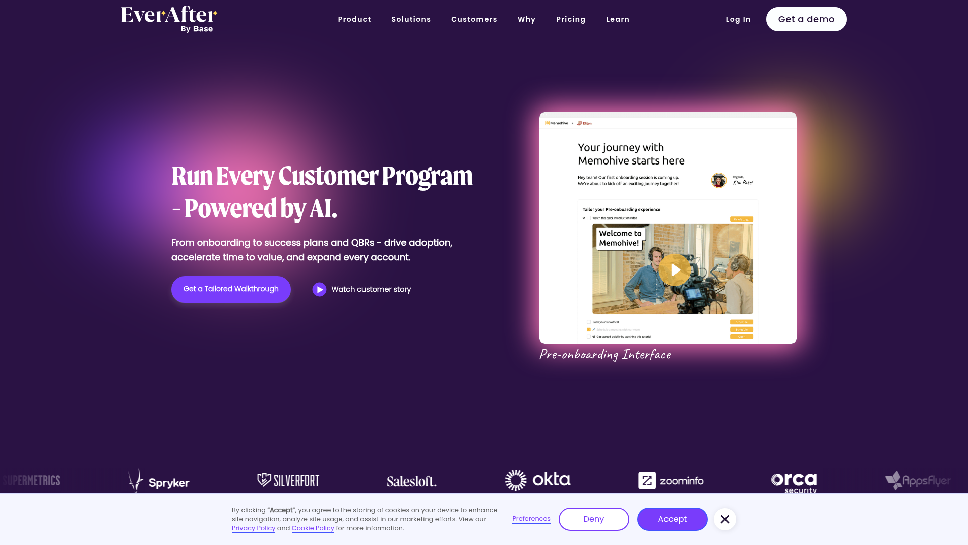
EverAfter AI Customer Portal Hero
A SaaS landing page template featuring a glowing product carousel, auto-scrolling logo marquee, accordion-based feature reveals, and an embedded scheduling widget.
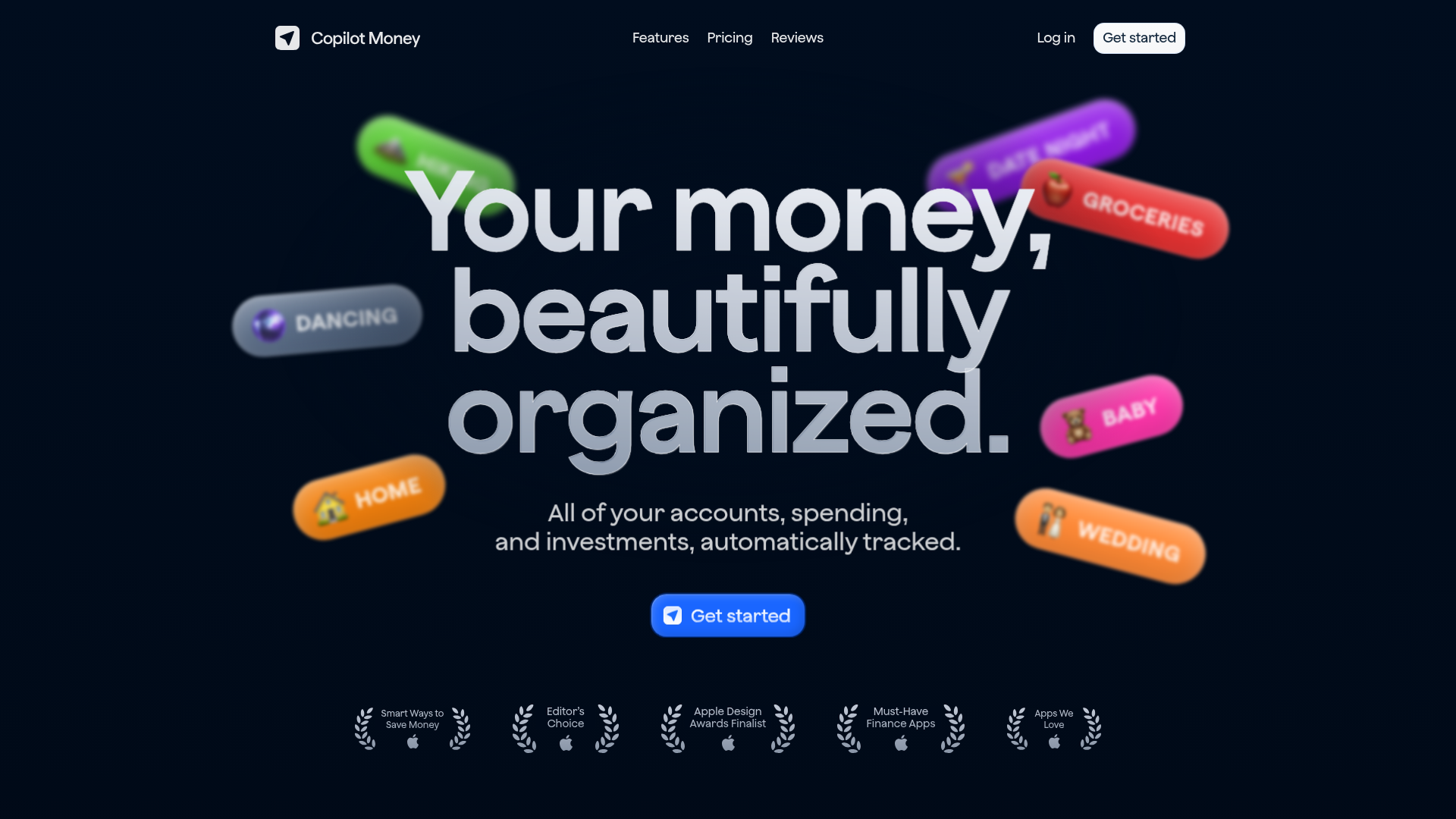
Copilot Money Finance Landing Page
A dark-themed finance landing page featuring a centered animated hero section with floating category badges, integrated trust badges, and a clean minimalist navigation bar.
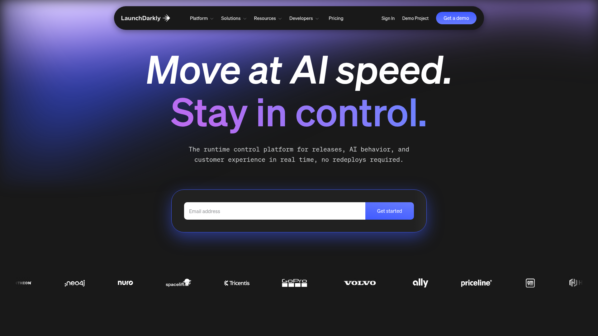
LaunchDarkly SaaS Landing Page Hero
A dark-themed developer marketing layout featuring a glowing blurred background, sticky pill-shaped navigation, tabbed feature showcases, and a horizontal logo marquee.
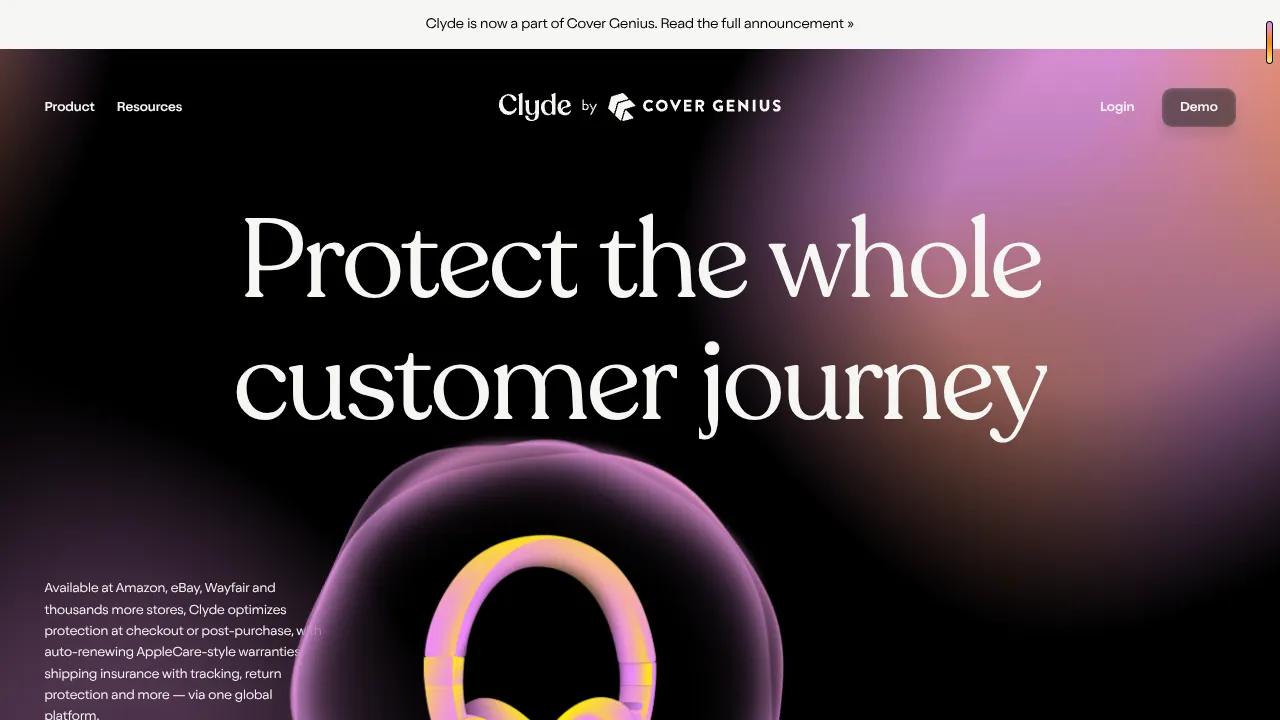
Clyde Insurance Landing Page with Animated Hero
A dark-themed landing page featuring a prominent serif headline, a product-focused animated blob hero, and a clean minimalist navigation bar.
