Transform Festival Event Landing Page
Features a full-width hero section, quote carousel for reviews, and a grid-based news listing using responsive card components and image-driven layout.

Overview
Transform Festival is an international performance event landing page that uses a high-impact, media-heavy design to drive engagement. It is an excellent reference for builders wanting to combine bold brand colors with a structured content grid, specifically effectively mixing full-screen immersive headers with functional text-based layouts.
Design System
- Color Palette & Visual Hierarchy: The site uses a high-contrast palette of deep purple (
#2e0066implied), vibrant beige, and white. Purple acts as a primary brand background, creating a moody, professional atmosphere for the arts, while beige and white provide legibility in card and button components. - Typography: Features a prominent sans-serif heading system. Headlines (
h1,h2) are bold and scaled large for impact, while body text uses a clean, readable scale. Buttons use uppercase or bold styling to signal actionability. - Page Structure: The flow begins with a large width hero section containing a high-contrast image and clear CTA. This is followed by a reviews carousel, a news grid (
home-news), and finally a dedicated 'Opportunities' section for jobs. - Reusable Components:
- Hero Section: Full-screen width with a
picturetag for responsive images and a centered content overlay. - Review Carousel: A Flickity-based slider including blockquotes and citations.
- Responsive Cards (
card--post): Vertically stacked on mobile and grid-aligned on desktop, featuring an image top, heading, body, and an icon-only button. - Job Cards (
job-card): A two-column horizontal layout for structured text data.
- Hero Section: Full-screen width with a
- Interactions & Motion: The HTML indicates a
js-load-inclass on most elements, triggering opacity transitions as the user scrolls. Buttons have distinct color variants (button--purple,button--beige). - Responsive Behavior: The design uses a flexible grid (
grid-container). Cards transition from a single-column layout on small screens to a two-column 50vw layout on larger viewports, as evidenced by thesizesattribute in thesourcetags.
Use Cases
- Target Audience: Event organizers, arts festivals, and creative agencies needing a portfolio-style landing page.
- Remix Ideas:
- Corporate/B2B: Swap the deep purple for a navy blue and the arts imagery for software screenshots to create a high-conversion SaaS dashboard overview.
- Non-Profit: Use the 'Opportunities' job card pattern for volunteering listings and the carousel for donor testimonials.
- Remix Directions: Reuse the news listing grid and the responsive card architecture while swapping the 'beige' button style for brand-specific primary colors.
- Clone Scope: A full-page clone is ideal for those needing a cohesive event narrative. However, the news card grid and the hero transition logic are the most valuable individual sections to clone for existing projects.
Related Inspirations
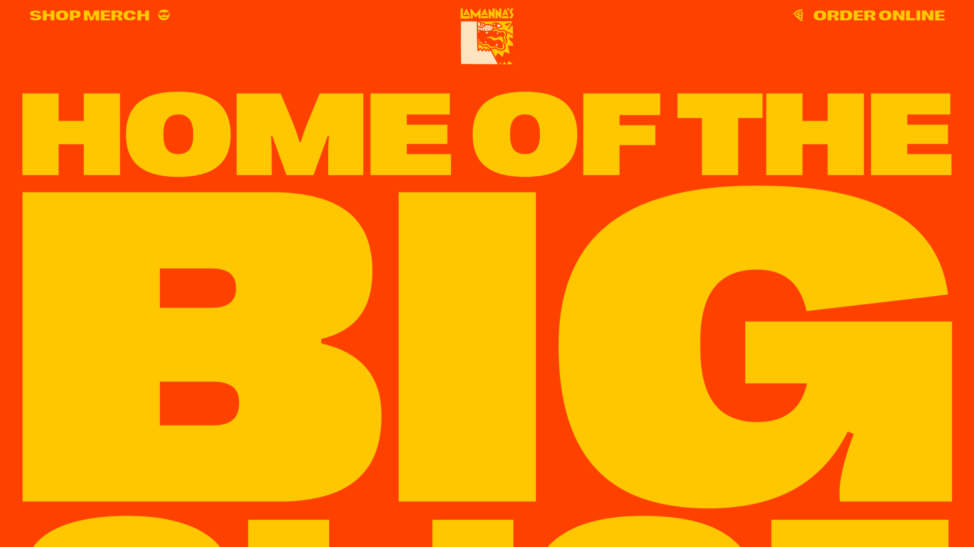
Lamanna's Bakery Vibrant Landing Page
A bold, high-contrast Italian bakery site featuring massive typography, parallax floating elements, marquee banners, and a flickity-powered product carousel.
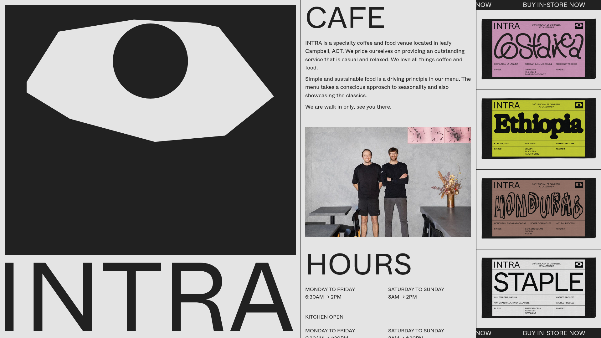
INTRA Specialty Cafe Landing Page
A brutalist-inspired single-page layout featuring a bold oversized hero graphic, a multi-column scrolling grid for store info, and an animated product ticker for retail items.
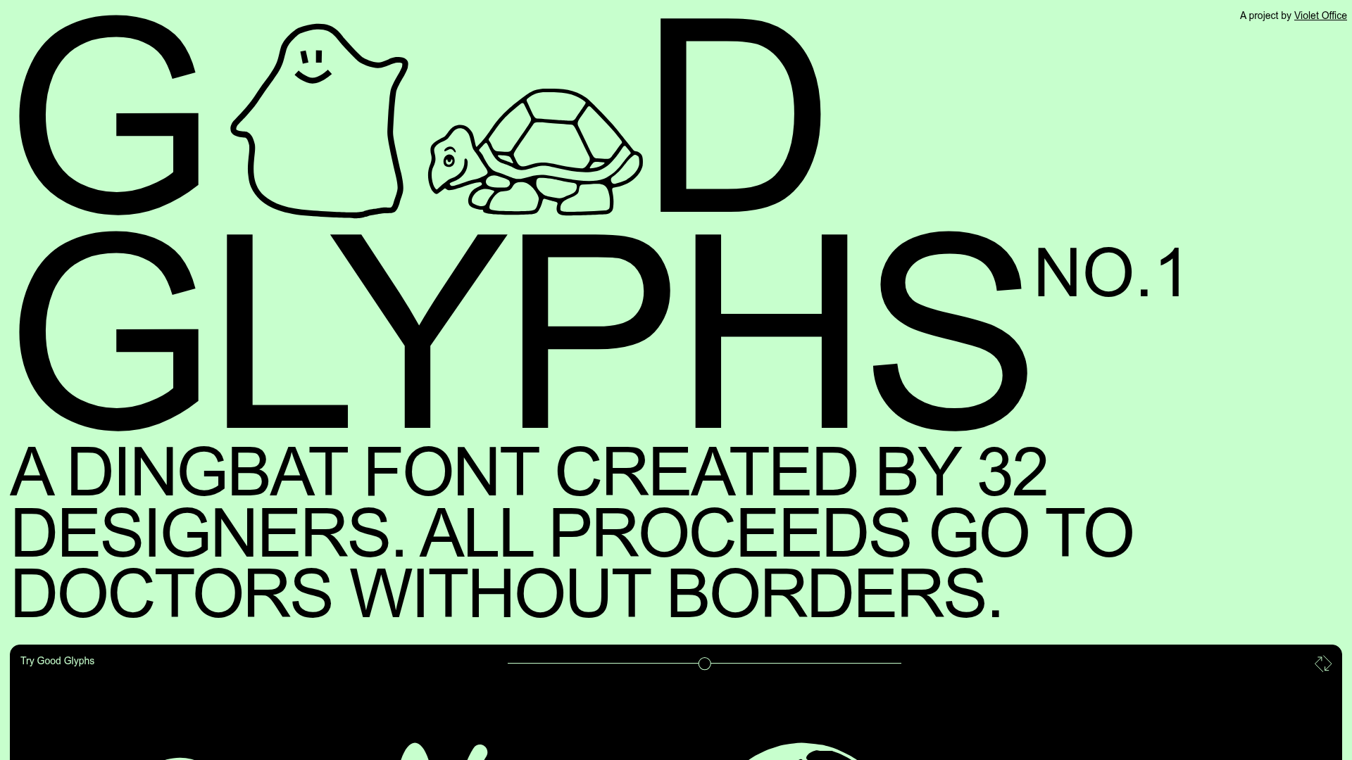
Good Glyphs Font Showcase Landing Page
A single-page layout featuring an interactive type tester, donation form with custom amount logic, and a contributor gallery using swiper-based glyph previews.
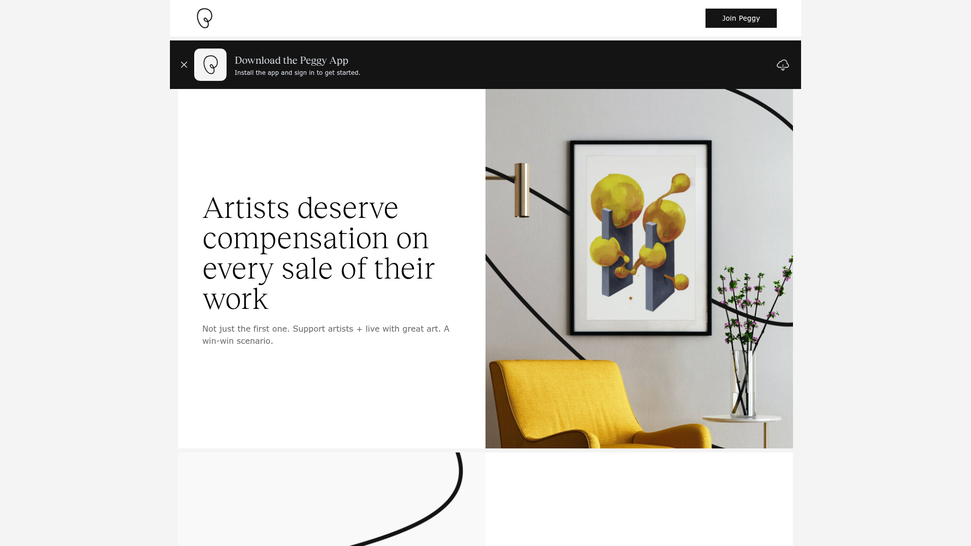
Peggy Art Royalties Pitch Page
A clean storytelling layout featuring alternating image-text sections, a three-column testimonial grid with circular avatars, and a icon-based feature grid for brand values.
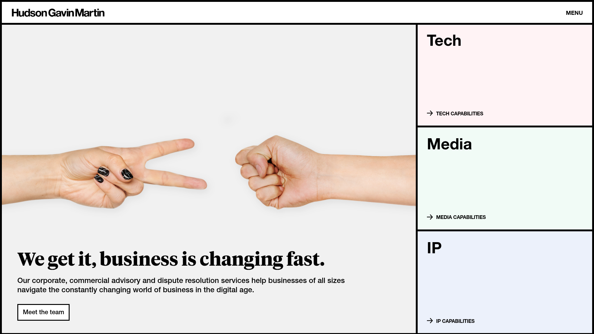
Hudson Gavin Martin Corporate Law Landing
A professional service homepage featuring a minimalist grid-based hero, color-themed navigation blocks, and a bento-style insights feed with subtle hover interactions.
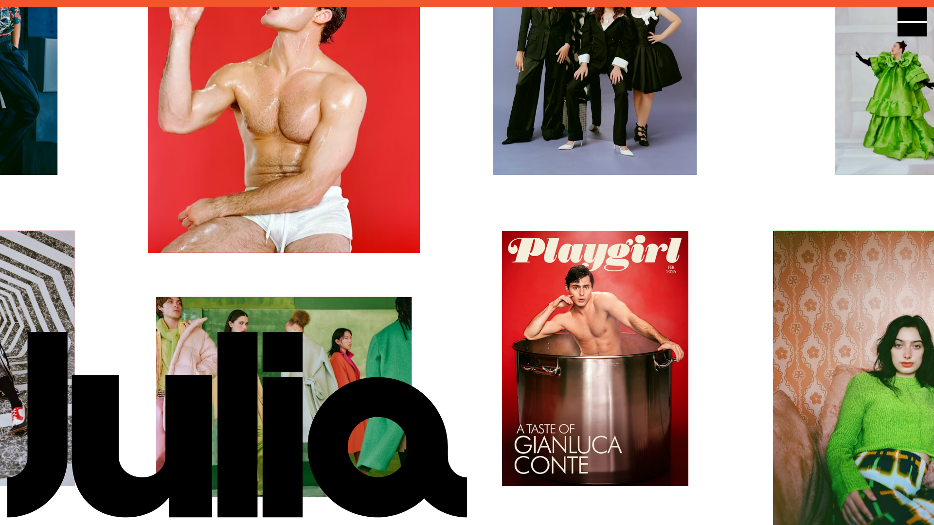
Julia Johnson Photography Portfolio Website
A creative portfolio featuring a masonry-style image grid, overlapping oversized typography, and a minimalist full-screen navigation overlay.
