INTRA Specialty Cafe Landing Page
A brutalist-inspired single-page layout featuring a bold oversized hero graphic, a multi-column scrolling grid for store info, and an animated product ticker for retail items.
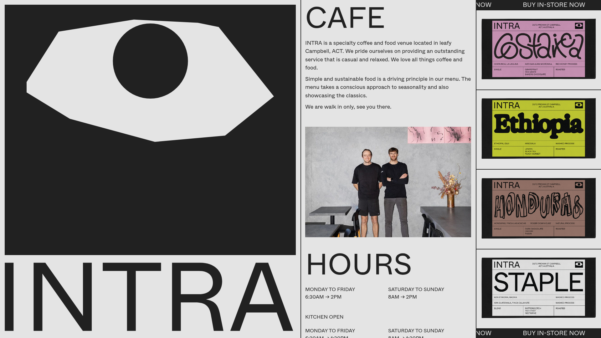
Overview
This single-page site for INTRA Specialty Cafe is an excellent example of brutalist web design, characterized by high-contrast aesthetics and a rigid, modular grid structure. Its efficient use of space—balancing giant decorative typography with dense informational blocks—makes it a perfect reference for small businesses looking to bridge the gap between architectural branding and functional e-commerce.
Design System
- Color Palette & Visual Hierarchy: The palette is grounded in high-contrast monochromatic tones (black and light gray) with high-saturation accent colors used exclusively for product packaging (pink, lime, and tan). The hierarchy is established through extreme scale shifts, pitting massive text against small, utilitarian copy.
- Typography System: The site uses a clean, sans-serif typeface (likely a variant of Helvetica or Inter) in various weights. Headers such as 'CAFE' and 'HOURS' are set in large, all-caps weight, while the 'INTRA' brand name occupies a significant portion of the viewport to establish immediate brand identity.
- Page Structure: The layout uses a classic three-column split on desktop. The leftmost column is a fixed or semi-fixed brand hero section with a large abstract eye graphic; the center is a scrollable informational feed covering 'Cafe', 'Hours', 'Find Us', and 'Menu'; the rightmost column is dedicated to a vertical product list flanked by horizontal tickers.
- Reusable Components:
- Animated Ticker: The
horizontal-scrolling-itemscontainer provides a seamless "Buy In-store Now" loop using CSS transforms. - Modular Info Blocks: The
wrapper-sectionpattern in the HTML demonstrates how to stack text, images, and lists (like operating hours) into a unified vertical column. - Product Cards: Simple, border-heavy
listing-coffeeitems that showcase retail packaging as decorative elements.
- Animated Ticker: The
- Interaction & Motion: The design utilizes horizontal scrolling animations for the retail calls-to-action and internal image sliders (via Slick Slider integration) for the kitchen and venue photography.
- Responsive Behavior: The HTML structure uses Bootstrap-style classes (
col-12,col-lg-4). On mobile, the multi-column desktop layout stacks vertically, transforming the sidebar graphics into hero elements above the text.
Use Cases
- Who should clone this: Specialty hospitality venues (cafes, roasteries, bistros) and boutique retail brands that want a "zinester" or architectural aesthetic rather than a traditional corporate look.
- Effective Remixes:
- Lookbook/Portfolio: Replace the coffee info with a creative professional's portfolio, using the ticker for current project status.
- Event Landing Page: Adapt the 'Hours' and 'Find Us' blocks for festival schedules and venue maps.
- Practical Directions: A builder can remix this by swapping the monochromatic base for a more vibrant brand color while keeping the rigid grid. The oversized logo area can be repurposed as a rotating gallery or a video background.
- Suggested Scope: A full-page clone is recommended to capture the specific balance of the three-column layout, as the grid's proportions are key to its minimalist impact.
Related Inspirations
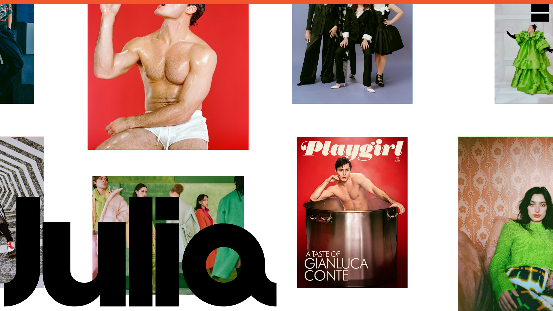
Julia Johnson Photography Portfolio Website
A creative portfolio featuring a masonry-style image grid, overlapping oversized typography, and a minimalist full-screen navigation overlay.
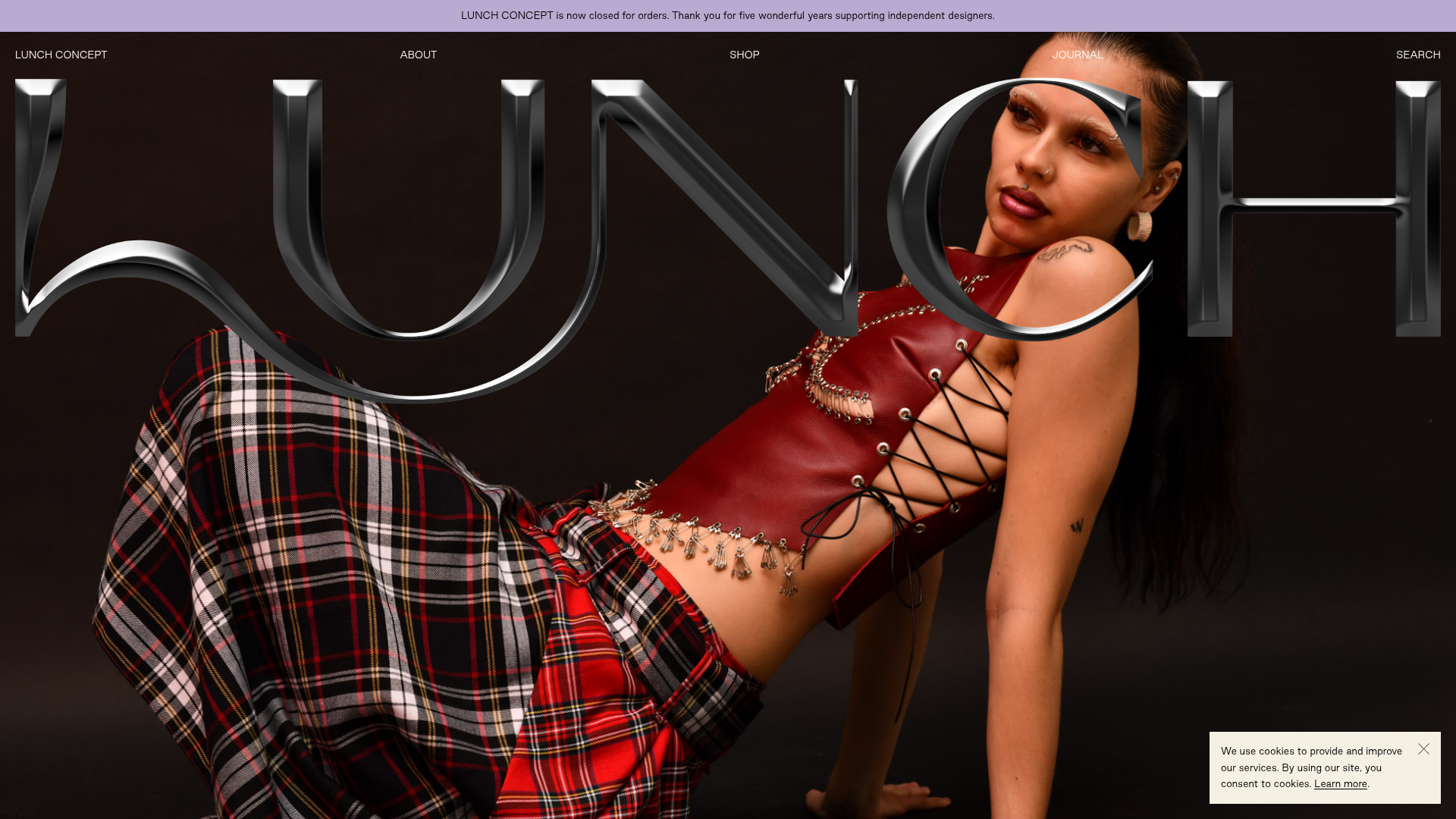
Lunch Concept Fashion E-commerce Showcase
A minimalist fashion store featuring a full-width chrome-effect typography overlay, high-impact hero imagery, and a clean product grid with hover-state image swapping.
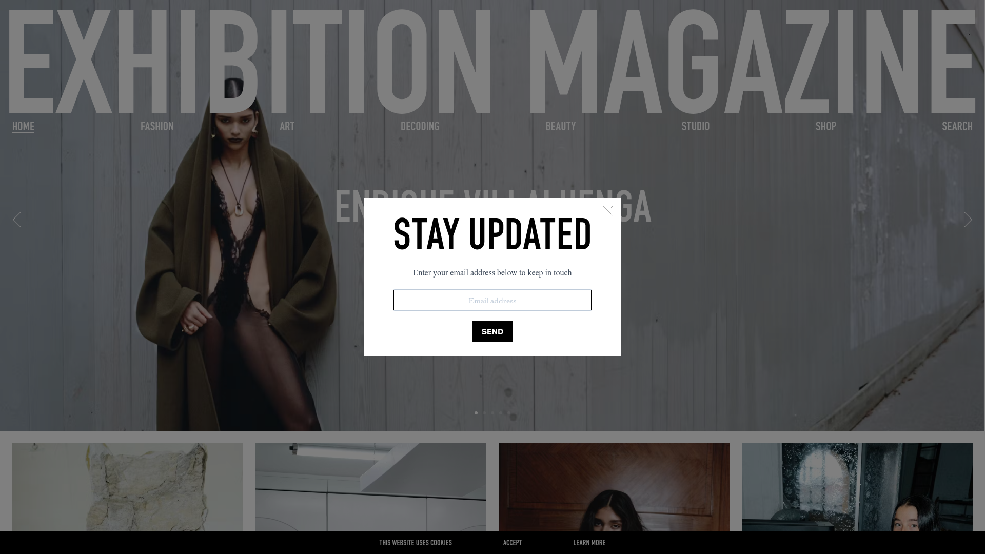
Exhibition Magazine Editorial Grid Gallery
A high-fashion magazine layout featuring a giant typographic header, full-width banner hero, and a responsive multi-column article grid with subtle hover transitions and a newsletter popup.

Transform Festival Event Landing Page
Features a full-width hero section, quote carousel for reviews, and a grid-based news listing using responsive card components and image-driven layout.
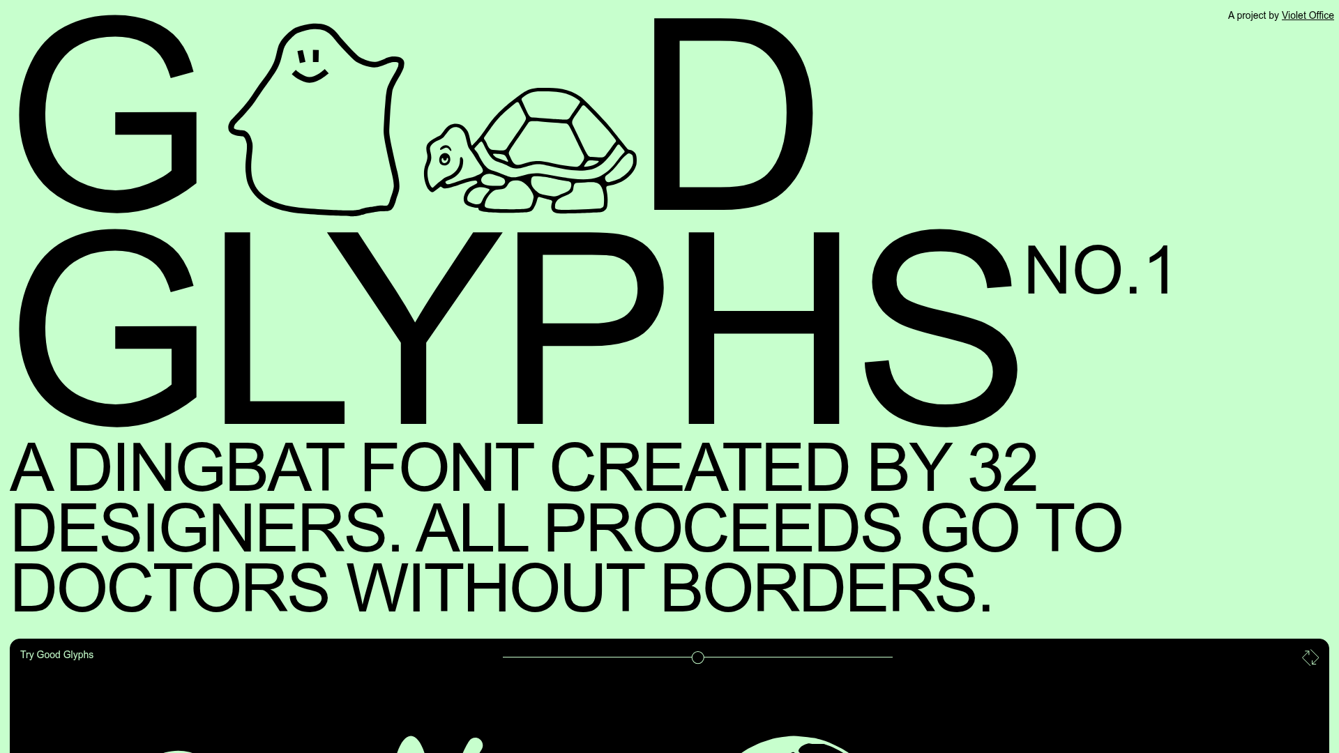
Good Glyphs Font Showcase Landing Page
A single-page layout featuring an interactive type tester, donation form with custom amount logic, and a contributor gallery using swiper-based glyph previews.
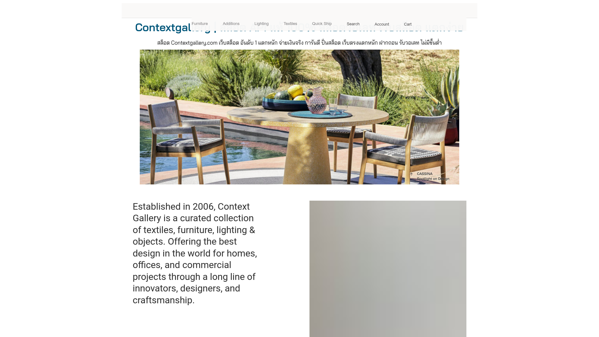
Context Gallery High-End Furniture Landing Page
A minimal editorial layout featuring a multi-column product carousel, designer biographies with image-text pairings, and a magazine-style content grid for curated design stories.
