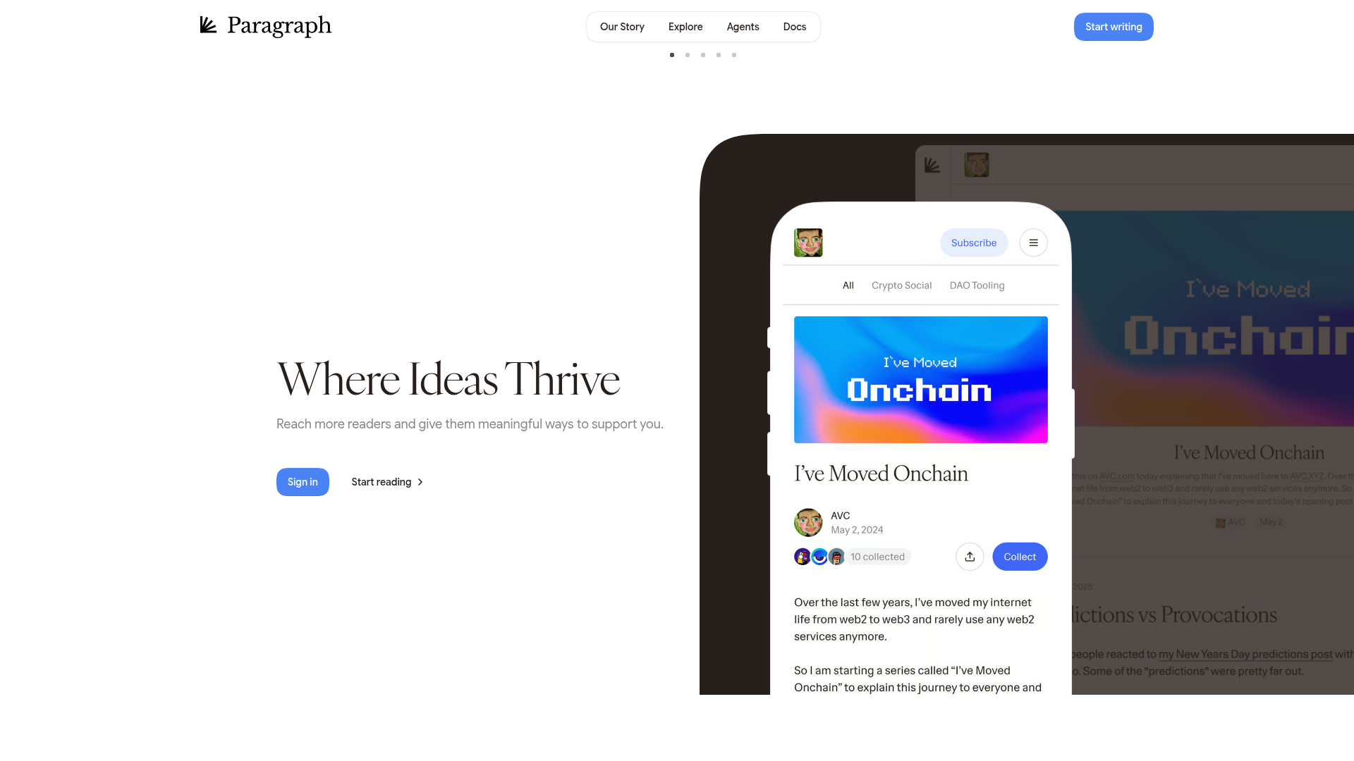
Paragraph Web3 Publishing Landing Page
Minimalist Web3 platform layout featuring a split-hero design with text-based calls to action and a mobile viewport mockup for content preview.
Overview
Paragraph is a decentralized publishing platform that combines a minimalist, high-end editorial aesthetic with Web3 functionality. It is an excellent clone reference for developers building content platforms, personal portfolios, or DAO landing pages that require a sophisticated balance between white-space-heavy typography and interactive media mockups.
Design System
- Color Palette & Visual Hierarchy: The design follows a strict minimalist 'Light Mode' palette, primarily utilizing pure white background (
#FFFFFF) with deep black/off-black text for high contrast. Royal blue (#4C82FB) is used as the primary action color for buttons, creating a clear focal point against the neutral background. - Typography: Features a sophisticated serif font for headings (as seen in "Where Ideas Thrive") to convey an editorial, high-trust feel. Navigation and body copy use a clean sans-serif for legibility. The hierarchy is clear: large H1 serif headlines, followed by medium-weight sans-serif sub-headlines and smaller utility text.
- Structure & Layout: The page uses a split-hero layout. The left side is dedicated to a clean value proposition and call-to-action (CTA), while the right side features a layered, overlapping media component that utilizes a 'picture-in-picture' effect with an iPhone mockup over a desktop site preview.
- Reusable Components:
- Pill Navigation: A centered, rounded navigation bar with subtle shadows.
- Action Buttons: Rounded-corner primary buttons with solid fills and secondary text-link buttons with directional arrows.
- Mobile Viewport Mockup: A detailed CSS/Image-based mockup of a mobile feed featuring article cards, 'Collect' buttons, and subscriber counters.
- Responsive Behavior: The landing page is designed for high-resolution desktop viewing with a large horizontal spread. The presence of a dedicated mobile mockup suggests the platform's core reading experience is optimized for vertical scrolling and mobile-first content consumption.
Use Cases
- Who should clone this: Independent writers, Web3 protocol teams, or developers building decentralized social media clients who need a professional, trustworthy landing page.
- Effective Remixes: This layout is perfect for a 'product tour' page where the left side describes a feature and the right side's mockup dynamically changes to show the UI.
- Remix Directions:
- Brand Swap: Replace the royal blue with a brand-specific accent color to instantly change the vibe from 'platform' to 'niche blog'.
- Component Reuse: The mobile mockup card is highly reusable for anyone needing to showcase a 'feed' or 'digital collectible' view.
- Suggested Clone Scope: Start with the hero section to master the split-layout and modern serif typography before expanding to the complex nested-preview components.
Related Inspirations
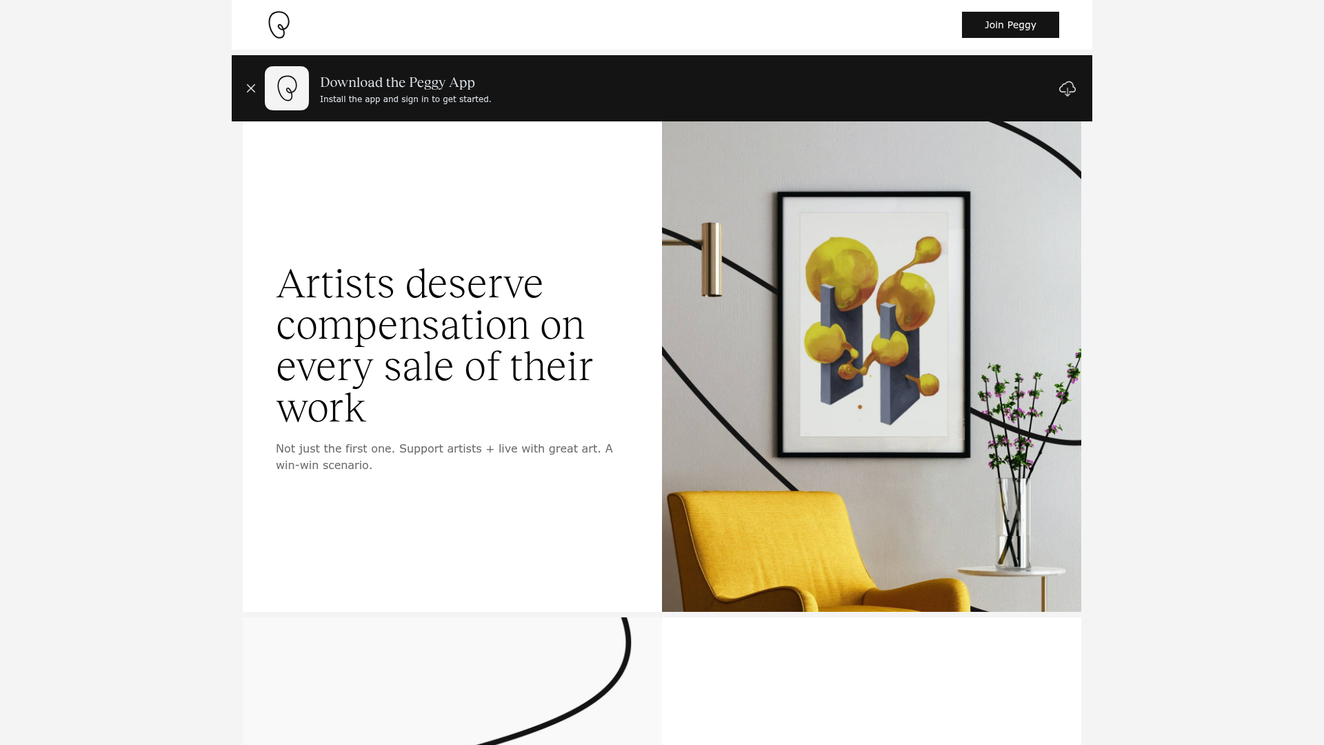
Peggy Art Royalties Pitch Page
A clean storytelling layout featuring alternating image-text sections, a three-column testimonial grid with circular avatars, and a icon-based feature grid for brand values.
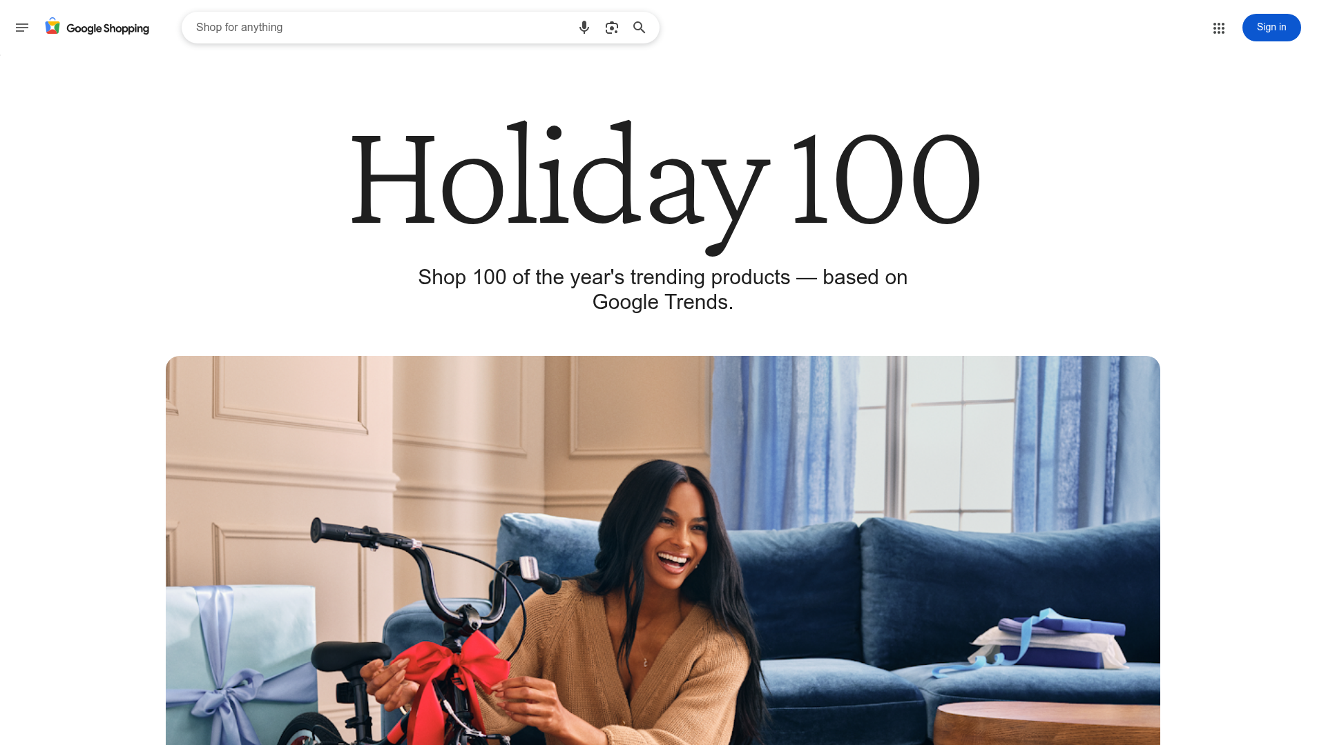
Google Holiday 100 Curator Landing Page
A minimalist e-commerce showcase featuring a wide hero section, clean search integration, and a bold typography-driven header designed for trending product collections.

Finn Pet Supplements Landing Page
An e-commerce landing page featuring high-contrast typography, a sticky brand logo banner, parallax scroll effects on product headers, and a clean product grid.
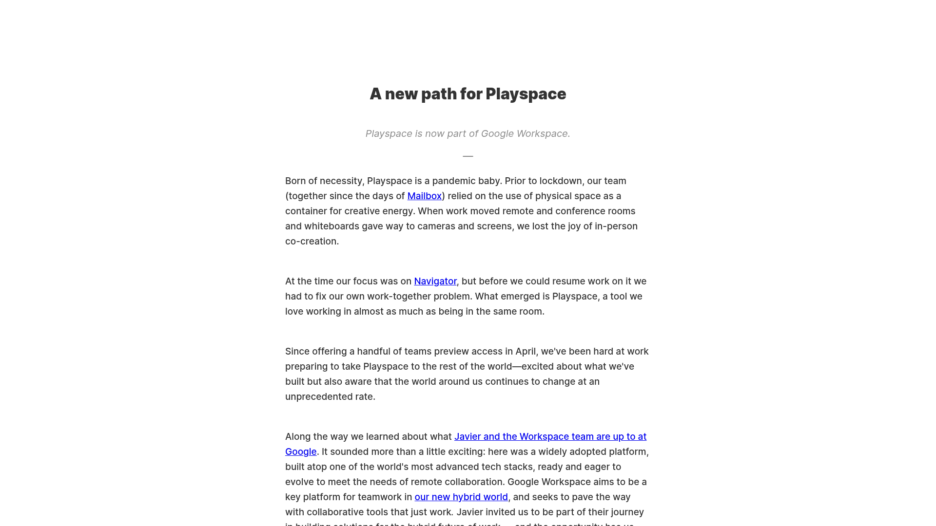
Playspace Acquisition Announcement Minimalist Layout
A clean, center-aligned announcement template featuring a vertical stack of rich text content and linked text elements on a neutral background.
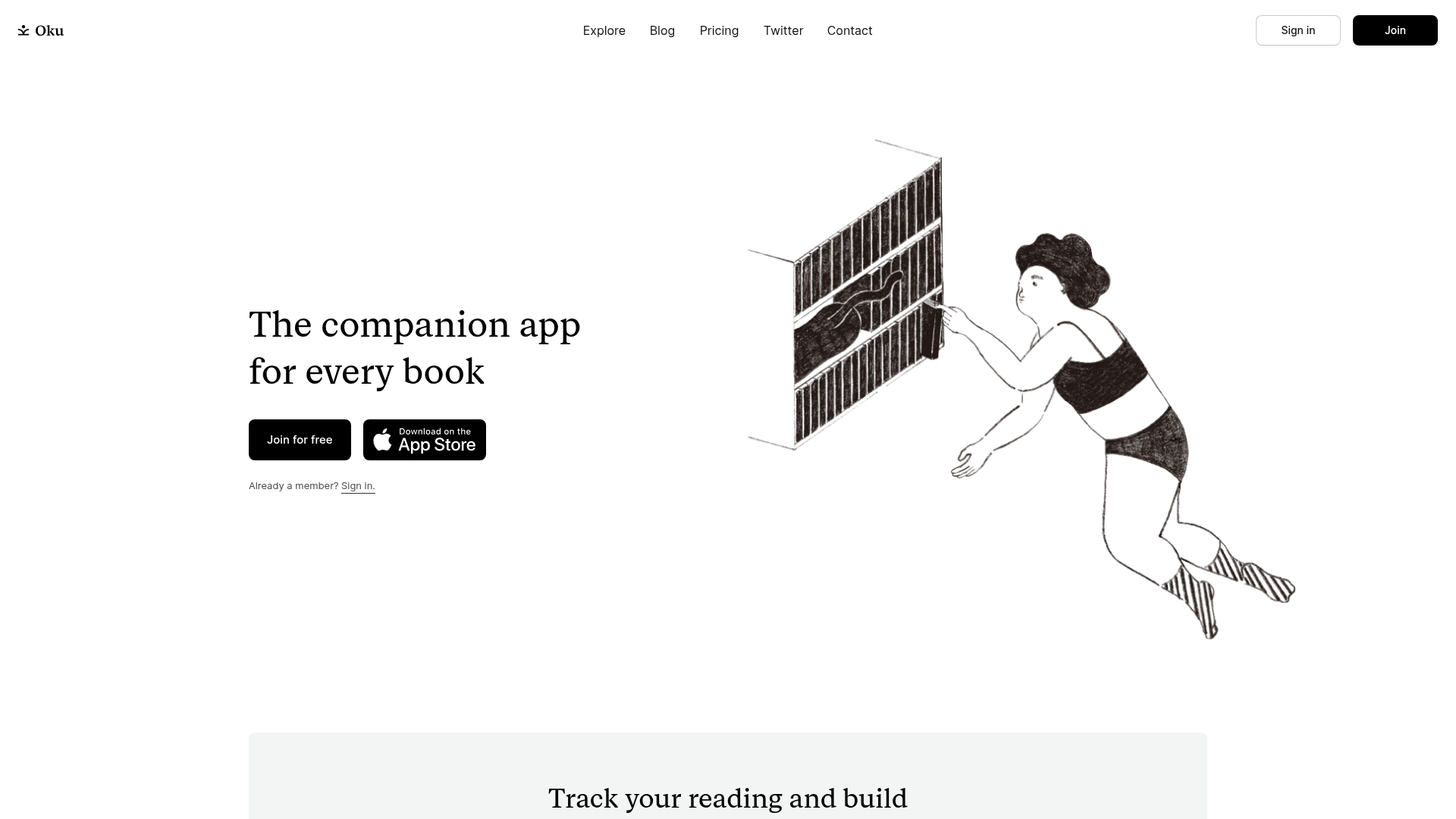
Oku Minimalist Book Tracking Landing Page
A clean, typography-focused landing page featuring a minimalist header, illustrated hero section, and clear call-to-action buttons for app downloads.
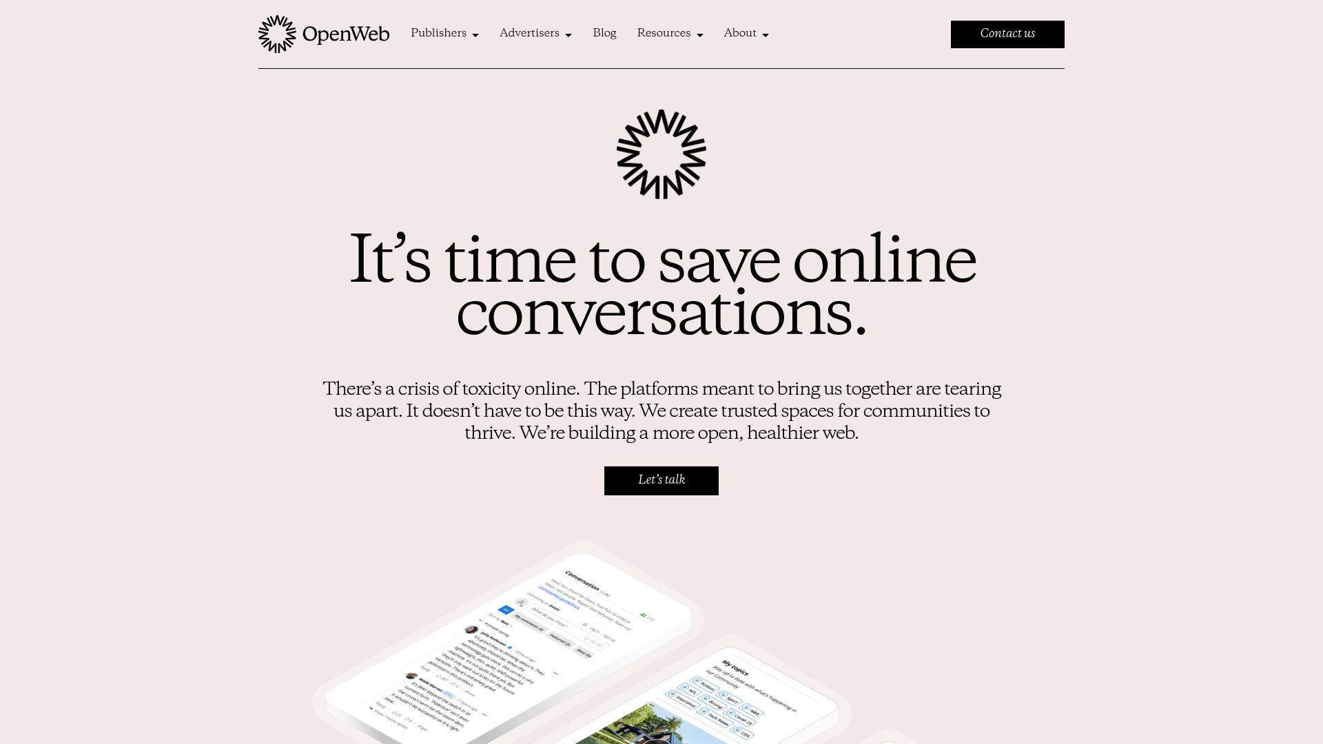
OpenWeb B2B Service Landing Page
A professional landing page layout featuring a central animated hero area, data visualization counters, a client logo grid, testimonial slider, and tabbed lead generation forms.
