Web Application Client Error Page
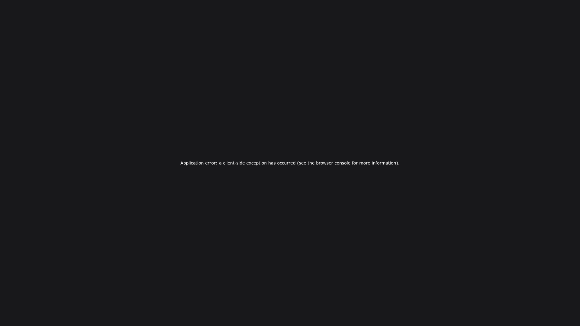
A minimal black-background error screen featuring centered text typography and flexbox alignment for handling client-side exceptions.
Overview
This project showcases a minimal, distraction-free error state designed for modern web applications built on framworks like Next.js. It serves as a perfect reference for developers needing a resilient "Global Error" or "Boundary" component that maintains functional layouts even when high-level client-side logic fails.
Design System
- Color Palette & Visual Hierarchy: The design uses a flat
#111111(dark gray/black) primary background with a high-contrast white foreground text. The hierarchy is extremely flat, focusing entirely on a single message to communicate failure without visual clutter. - Typography System: The layout utilizes a standard system-ui font stack (Segoe UI, Roboto, Helvetica, Arial) for native performance and reliability. The text size is small (14px) with a generous 28px line height, emphasizing the message's technical nature over decorative flair.
- Page Structure: A single-column flexbox container occupies
100vh(viewport height). It usesjustify-content: centerandalign-items: centerto position the error message in the exact geometric center of the screen. - Reusable Components: The implementation of the centering wrapper is the primary reusable element. This
flex-direction: columnwrap ensures that regardless of the view height, the content remains perfectly anchored. - Implementation Clues: The inline styles indicate a React-based application pattern (likely Next.js based on the specific error string), designed to be lightweight and load independently of external CSS files to ensure the error page itself doesn't fail to render.
Use Cases
- Who should clone this pattern: Developers building SaaS platforms or complex dashboards who need a professional "break glass" state for unexpected application crashes.
- What products can remix it effectively: Any technical platform where visual simplicity is required to convey a system message, such as API documentation sites, maintenance mode placeholders, or developer tool consoles.
- Practical remix directions: Swap the
#111111background for a brand-specific primary color, add a "Return to Home" button using the same flexbox centering, or insert a subtle SVG brand logo above the text to soften the user experience. - Suggested clone scope: A quick section clone of the flexbox container wrapper is recommended for creating any centered splash screen or error boundary.
Related Inspirations
Minimalist Dark Mode Loading Screen
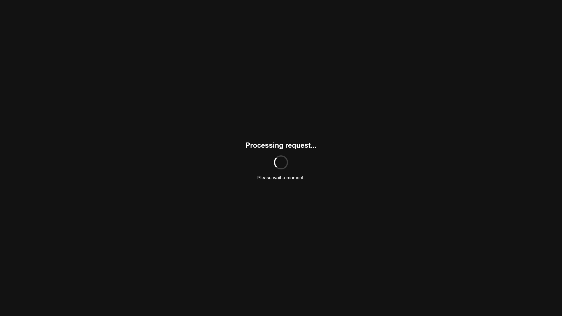
A clean, dark-themed redirection page featuring a centered typography layout and a CSS circular loading spinner for asynchronous processing states.
GoCardless Payments Platform Landing Page
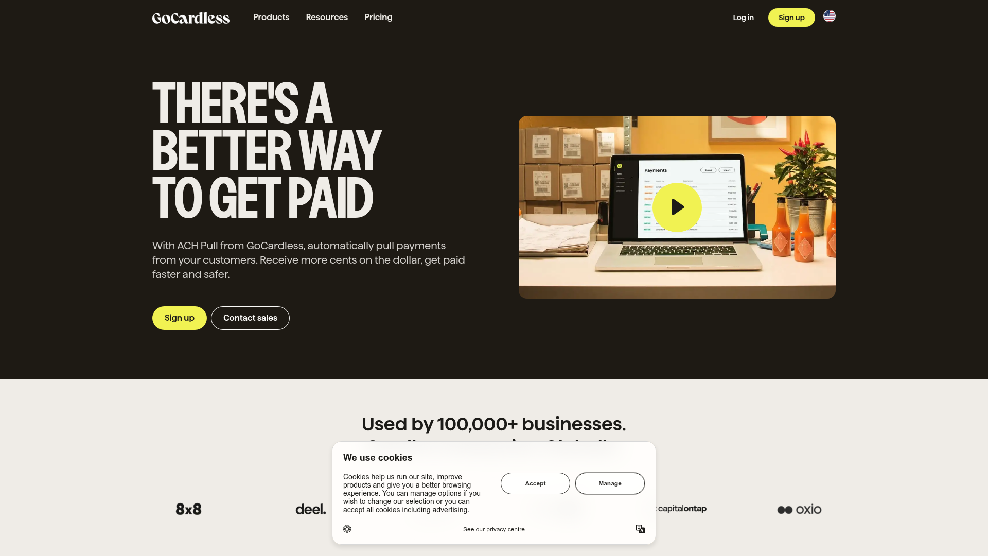
A dark-themed fintech landing page featuring a split-screen video hero, bento-style feature cards, a horizontal logo slider, and step-by-step accordion guides.
Domain For Sale Landing Page
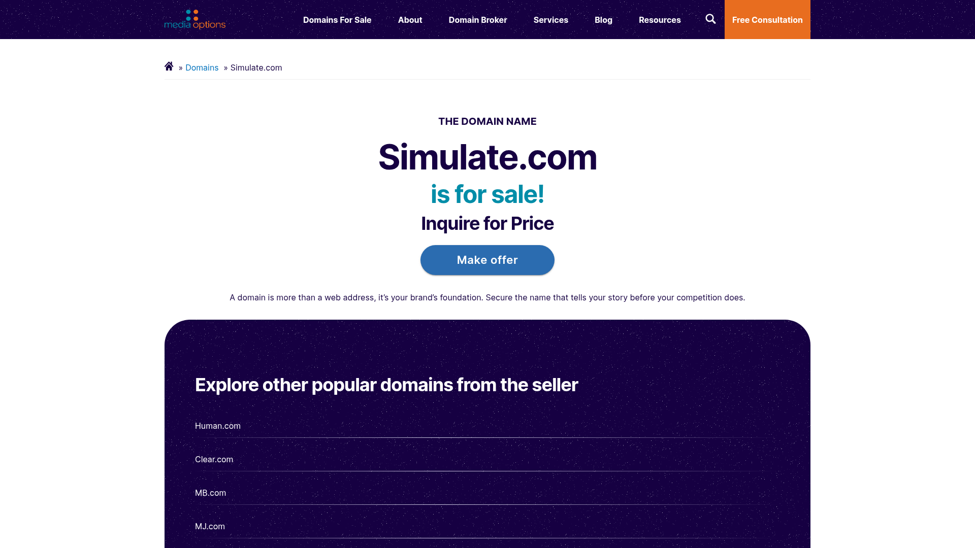
A clean, centered landing page layout featuring a hero section for asset sales, a prominent CTA button, and a list-based showcase of related items.
Dynadot Domain Parking Page
A minimalist domain registration placeholder featuring a branded sticky header banner and a full-height dark background layout.
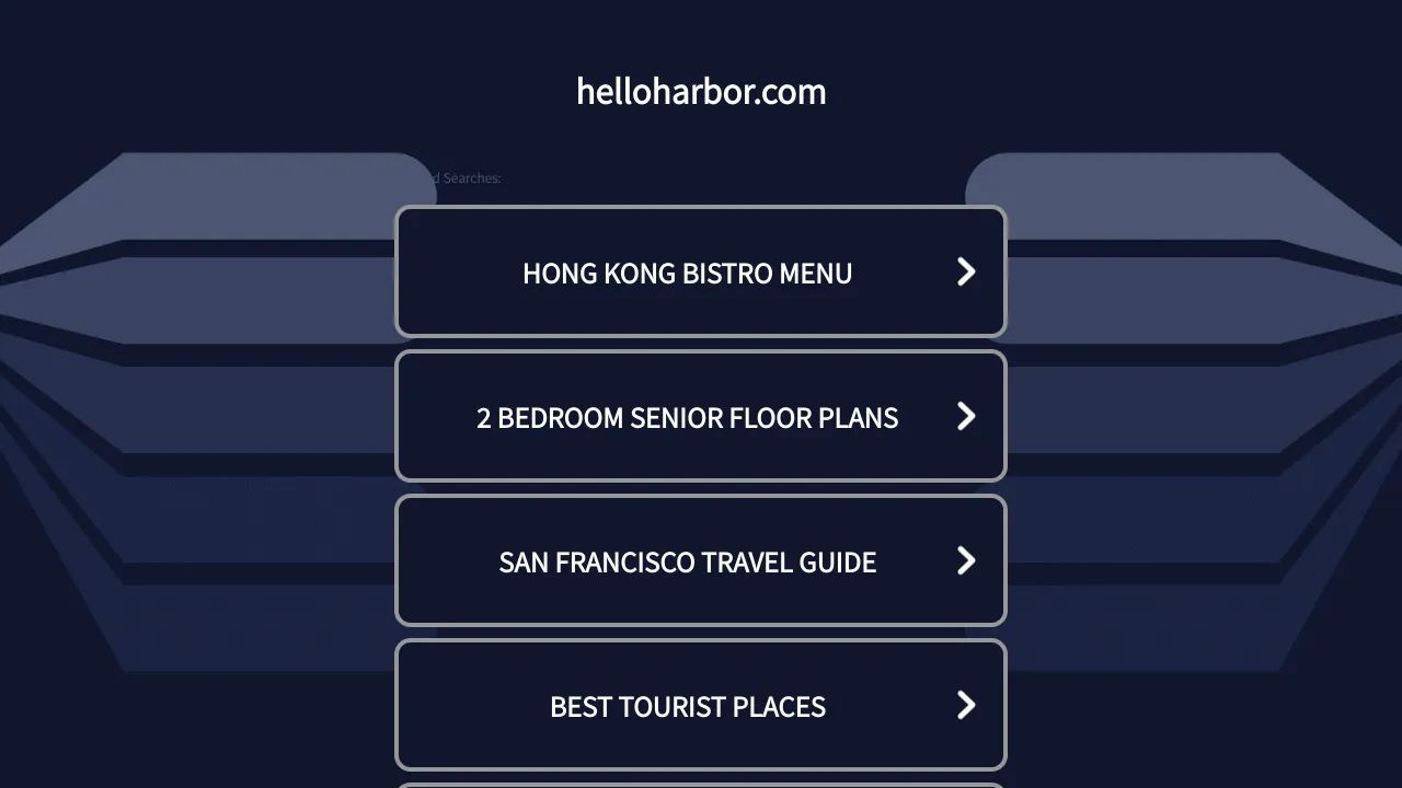
HelloHarbor Search Landing Page
A dark-themed mobile-responsive search portal featuring vertically stacked navigations cards with chevron indicators and simple header branding.
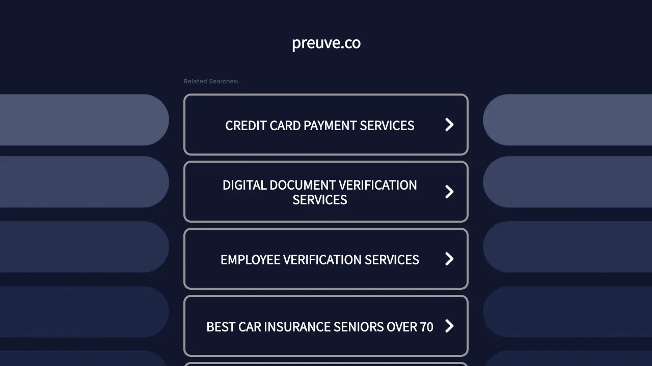
Preuve.co Search Index Landing Page
A dark-themed search directory layout featuring a centered brand header and vertically stacked rectangular navigation cards with chevron icons and hover effects.
