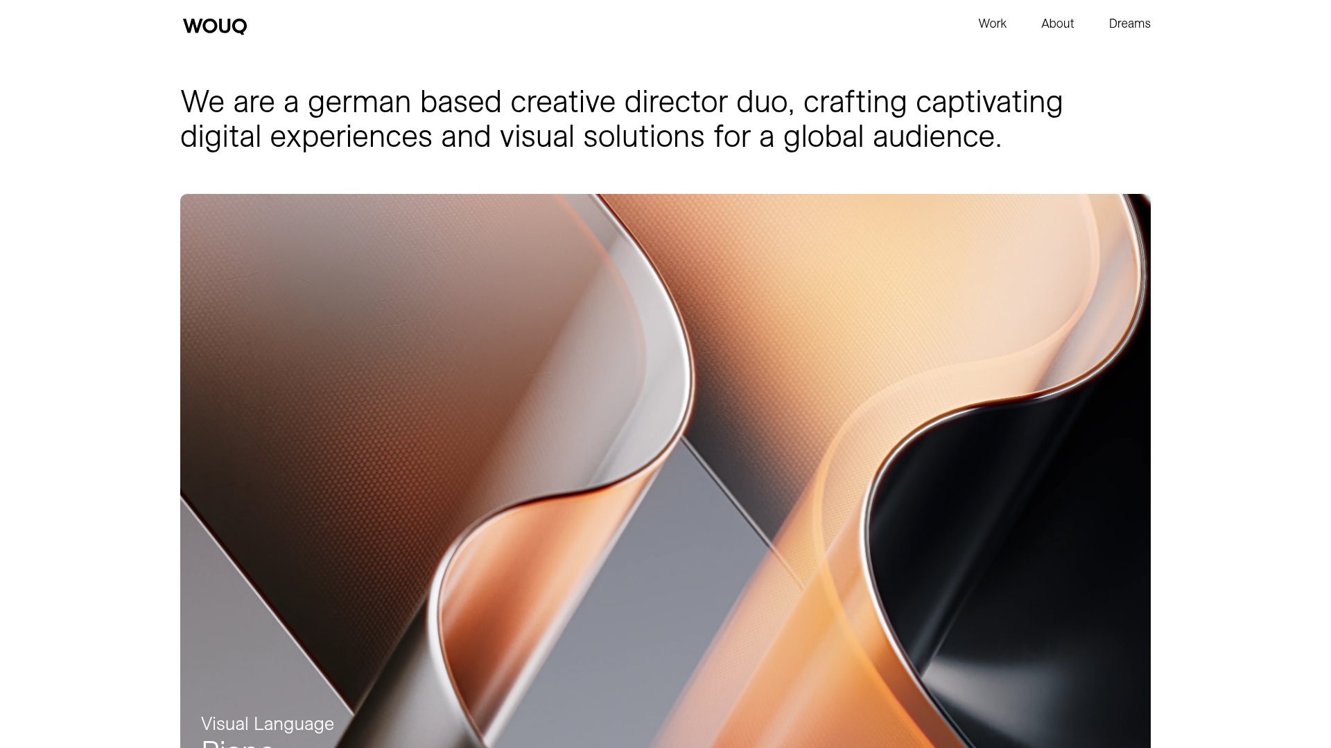
WOUQ Creative Portfolio Masonry Grid
A minimalist design features a large typographic intro, a dynamic masonry project grid with video-on-hover thumbnails, and a clean four-column footer with local time integration.
Overview
This creative director portfolio is a masterclass in minimalist visual storytelling, featuring a clean typographic intro and a flexible masonry grid. It serves as an excellent clone reference for its sophisticated use of whitespace and high-impact media presentation, specifically its video-on-hover interaction pattern. Developers can leverage this structure to build premium agency websites or artist portfolios that prioritize visual assets over heavy copy.
Design System
- Color Palette & Visual Hierarchy: The system uses a high-contrast monochromatic base (white background, deep black text) to ensure that the vibrant, high-fidelity project thumbnails remain the primary focus. Hierarchy is established through extreme scale shifts between the massive 2.5rem intro text and the smaller 1rem footer details.
- Typography: The design employs a clean sans-serif (ESAllianz-Light) with a focus on generous line heights (approx. 2.7rem for headers). The intro text uses a large font size (
data-font-size-xl="2.500rem") to act as a hero element without needing a background image. - Page Structure: The layout follows a linear narrative: a bold text-only hero section, followed by a dense masonry project grid (
data-module="portfoliogrid"), ending in a distinct 4-column footer containing metadata and social links. - Reusable Components:
- Masonry Grid: A responsive project grid that alternates between full-width (12-column) and half-width (6-column) items.
- Video-on-Hover Thumbnails: Project cards (
.video-hover) that contain a static.webpimage background which triggers a<video>overlay on hover. - Four-Column Footer: A clean utility footer that integrates a dynamic local time display (
.wc_time).
- Motion & Interaction: The primary interaction is the seamless transition from static image to looping video on hover. Portfolio items also use a 'bottom-left' meta-data reveal that appears on hover, keeping the initial grid view completely clean.
- Responsive Behavior: The HTML reveals a mobile-first column strategy (
data-column-mode-sm="single"), where the 2-column masonry items stack into a single vertical column on mobile devices.
Use Cases
- Who should clone this: Creative agencies, 3D artists, and motion designers who have high-quality video showreels or process clips to showcase.
- Effective Remixes: This pattern can be adapted for premium lifestyle brands by swapping the project grid for a lookbook, or for architectural firms to highlight different properties via looping drone footage on hover.
- Remix Directions: Replace the text-only hero with a subtle marquee or a split-screen layout. The 4-column footer can be repurposed for an e-commerce site to house shipping info, FAQs, and newsletter signups while maintaining the same typographic rhythm.
- Suggested Scope: A full-page clone is ideal to maintain the specific balance of white space and grid density. However, cloning just the
.video-hovermasonry block provides a high-value interaction for any existing portfolio project.
Related Inspirations
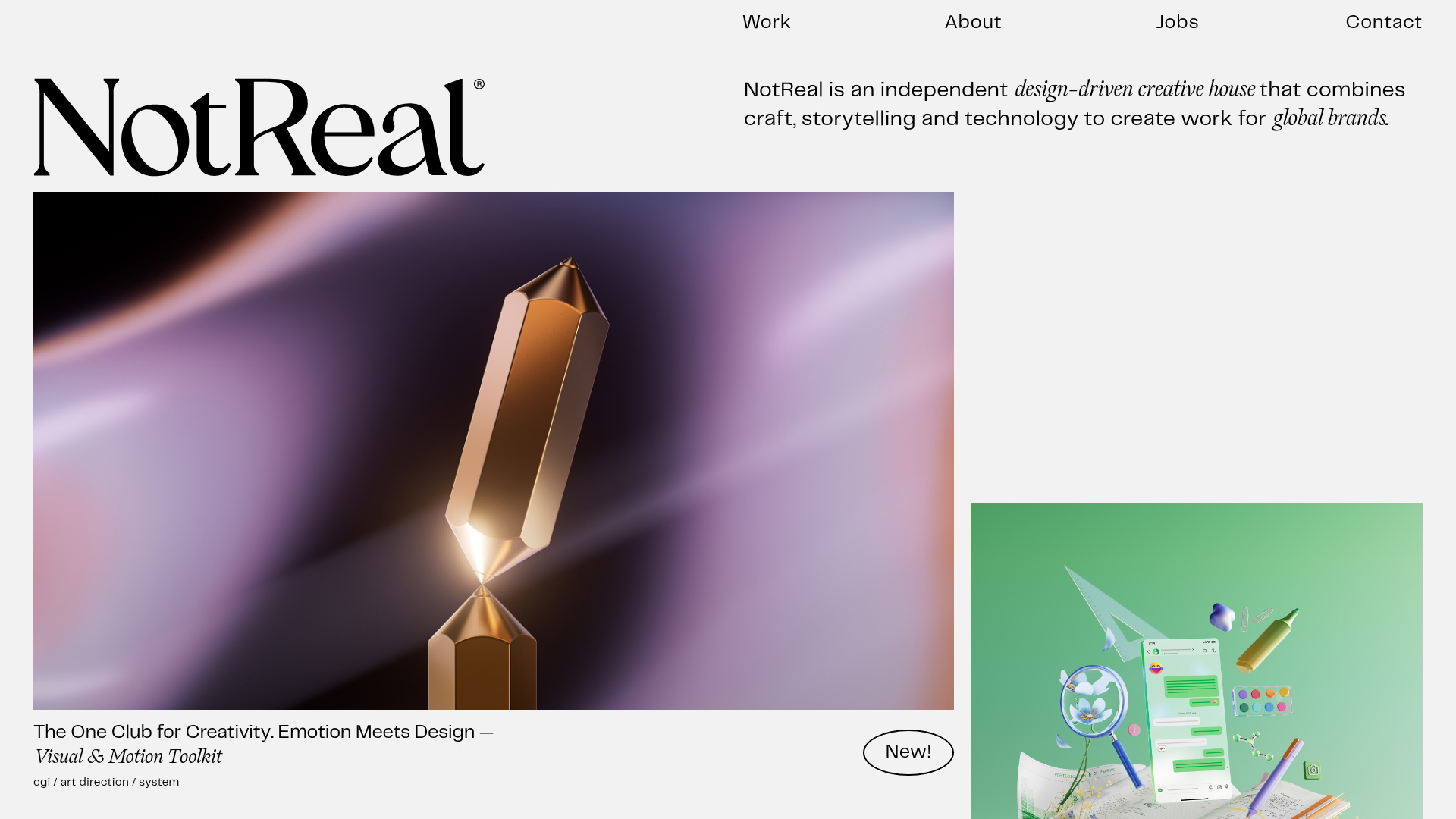
NotReal Design Agency Portfolio
An asymmetrical masonry grid layout featuring video-on-hover thumbnails, minimal minimalist typography, and a scrolling marquee footer.
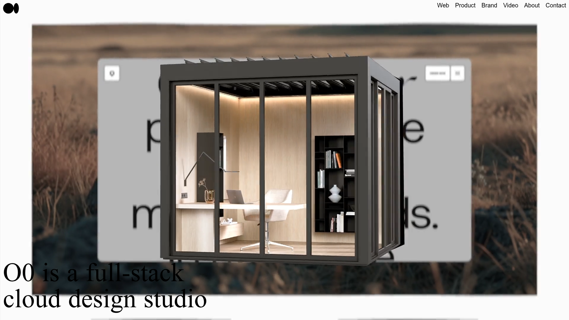
O0 Cloud Design Agency Portfolio
A high-end studio layout featuring an immersive video hero, a logo carousel, and a dynamic CMS project grid with award tag nesting and category filtering.
Studio Lathe Minimalist Portfolio List
A high-contrast, minimalist portfolio layout featuring a dense list-based project index with flexible category labeling and a full-screen yellow background.

Niklas Rosén Designer Portfolio Index
A minimalist, responsive grid-based portfolio index featuring a clean 16-column layout, typographic list components, and a custom dark mode transition.

Christopher Doyle Agency Portfolio Layout
A minimalist, typography-led portfolio featuring a wide-margin grid system, smooth fade-in animations, and simple image-focused project cards.
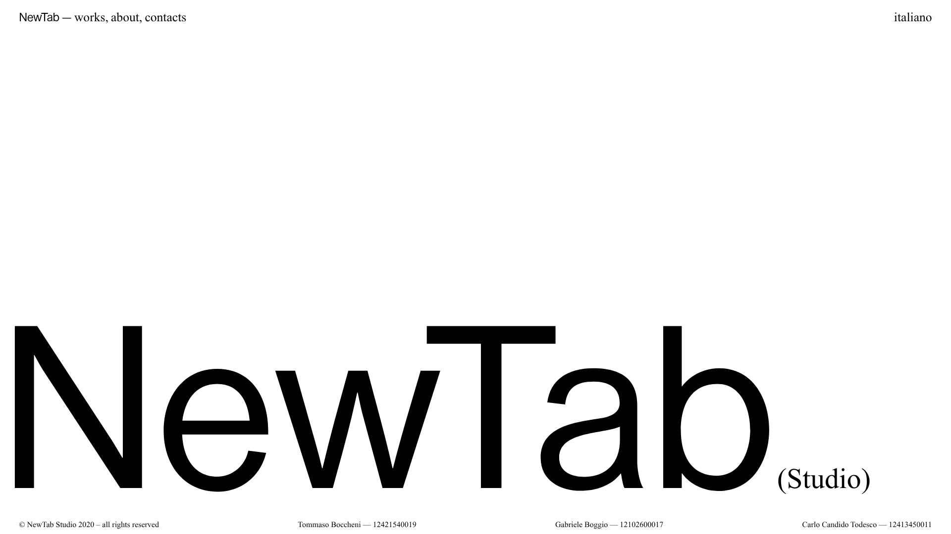
NewTab Studio Minimalist Portfolio Landing Page
A clean, typography-focused landing page featuring an oversized SVG/canvas hero title, a top-aligned navigation bar, and a minimalist footer layout.
