ThoughtLab Digital Studio Landing Page
A high-end dark-mode agency layout featuring scroll-triggered typography, a specialized capabilities grid, and clean blog article lists with smooth image hover effects.
Overview
ThoughtLab is a sophisticated agency landing page that demonstrates how high-end typography and dark-mode aesthetics can elevate brand positioning. It is an excellent clone reference for its mastery of "whitespace" (even in the dark), scroll-triggered reveal animations, and a minimal navigation structure that yields focus entirely to content.
Design System
- Color Palette & Visual Hierarchy: A classic dark-mode palette using absolute black (#000000) for the background with high-contrast white and muted grey text layers. Accent colors are sparse, featuring a deep red for the primary "Contact Us" button and logo mark to drive action without breaking the luxury aesthetic.
- Typography: The system uses a bold, large-scale serif or high-contrast sans-serif for headlines (e.g., "Become a Category of One") paired with a clean, monospaced or modern sans-serif for technical details and metadata. Text is often split into
<span>blocks to allow for staggered line animations. - Page Structure:
- Hero: Centered massive typography with a sub-label and a prominent "Contact Us" CTA in the header.
- Elevator Pitch: A text-heavy section using large body copy to introduce the studio mission.
- Capabilities Grid: A 2x2 grid layout (on desktop) featuring numbered cards with perspective-shifting entrance animations (
rotateY(60deg)visible in HTML). - News/Blog List: A horizontal row-based list where each item reveals a floating image blob on hover.
- Contact/Footer: A clean, multi-column directory layout with social links and location details.
- Interaction & Motion: The site relies heavily on GSAP or similar library patterns for reveal-on-scroll. Key elements like headlines and paragraph lines use
overflow: hiddencontainers to "slide" text into view from the bottom or left. The capabilities grid uses a 3D perspective effect, and the blog list uses dynamic image "blobs" that follow or snap to specific hover points. - Implementation Clues: The HTML reveals a
data-router-viewarchitecture suggesting a single-page application (SPA) feel with smooth transitions. Utility classes likedf(display: flex) andaic(align-items: center) indicate a custom utility-first CSS framework tailored for precision layout.
Use Cases
- Who should clone this: Creative agencies, luxury brand consultants, architectural firms, or high-end product studios that want to lead with authority and minimalism rather than visual clutter.
- Remix Directions:
- Quick Section Clone: The "Capabilities" 2x2 grid is highly reusable for any service-based business.
- Information Architecture: Use the vertical news article list for portfolios or case studies—it provides a cleaner look than traditional card grids.
- Style Pivot: Swap the background to a deep forest green or navy for a different "premium" feel while keeping the high-contrast white typography.
- Suggested Scope: This is best cloned as a full-page structure to preserve the rhythmic flow of the scroll animations, though the typography reveal patterns are excellent standalone components for smaller landing pages.
Related Inspirations
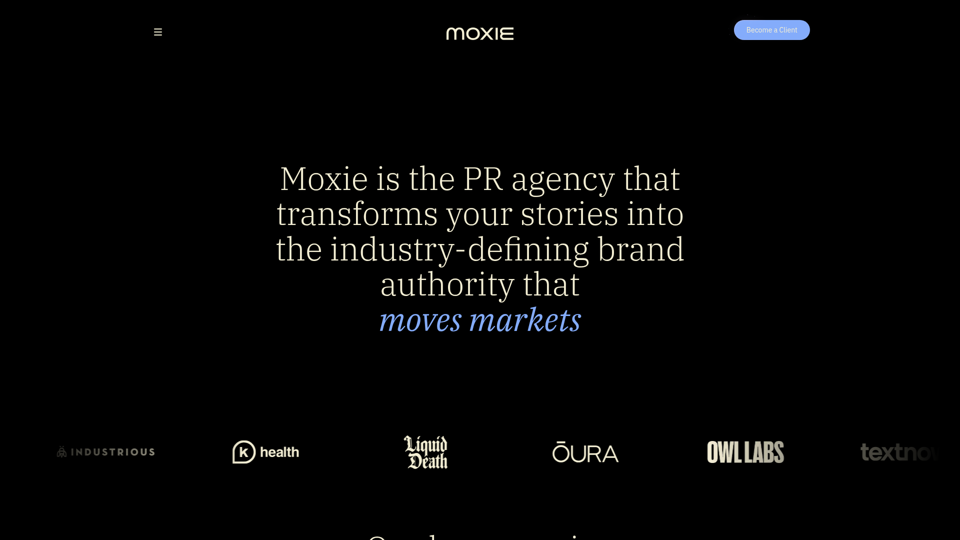
Moxie PR Agency Landing Page
A dark-themed agency site featuring an animated typewriter hero, ticker-style marquee, interactive case study cards with video backgrounds, and a vertical sticky services section.

Niklas Rosén Designer Portfolio Index
A minimalist, responsive grid-based portfolio index featuring a clean 16-column layout, typographic list components, and a custom dark mode transition.
AIR Studios Minimalist Navigation Landing
A dark, minimalist layout featuring a vertical text-based navigation menu, a full-screen background video wrapper, and a dynamic canvas-based interactive drawing layer.
Jakub Reis Portfolio Case Study Gallery
A dark-themed designer portfolio featuring a typography-focused loading animation and a staggered masonry grid for project case studies.
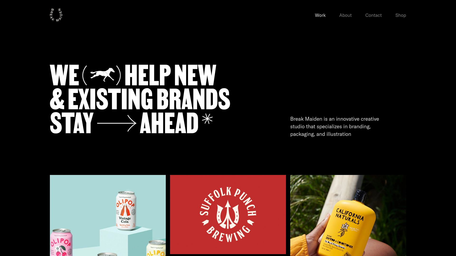
Break Maiden Agency Portfolio Hero
A high-impact dark mode hero section featuring oversized typography with inline GIF icons and a responsive grid for display-heavy case studies.
PostNew Moving Image Portfolio Gallery
A minimalist dark-themed portfolio featuring a full-screen vertical scroll layout, video-based grid sections, and blur-effect navigation components.
