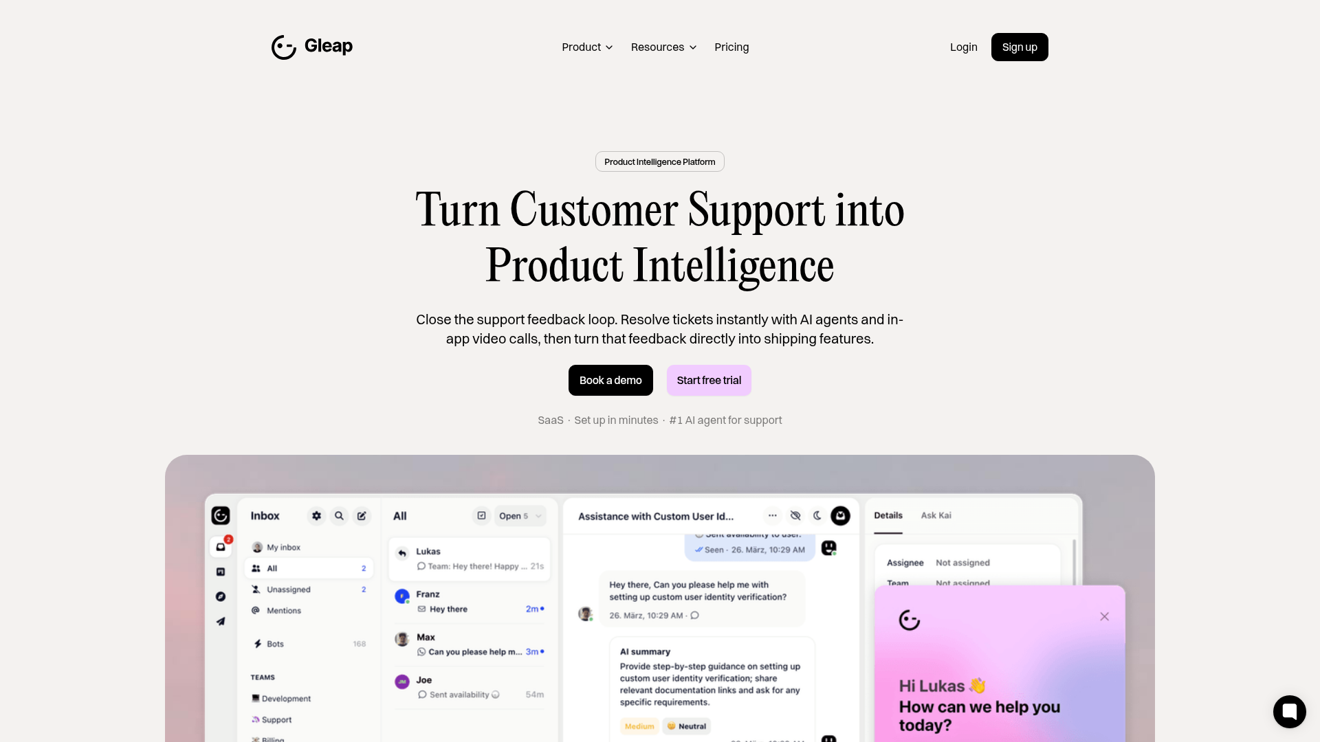
Gleap Product Intelligence Platform Landing
A SaaS template featuring a central video hero, comparison pricing tables, tabbed feature navigation, and a testimonial grid with major brand logos.
Overview
Gleap's landing page is a high-conversion SaaS template designed to bridge product management and customer support. It is an excellent clone reference for its clean execution of the 'Feature-Comparison' layout and its use of high-fidelity dashboard mockups to build immediate product trust.
Design System
- Color Palette & Hierarchy: Primarily a minimalist white-and-gray base punctuated by a vibrant #F2C1FF (light pink) for primary CTAs and secondary accents. The hierarchy uses dark neutrals for text and deep black for high-impact buttons to ensure clear actionable paths.
- Typography: Features a sophisticated Serif headline font (likely a custom variation of Playfair or similar) for hero sections and H2s, paired with a clean Sans-Serif (Inter/Geist style) for body copy and UI labels. This juxtaposition creates a 'premium tool' aesthetic.
- Page Structure: Follows a standard SaaS conversion flow: Hero with dual-button CTA -> Platform Screenshot -> Social Proof (Logo Cloud) -> Feature Comparison Cards -> Categorized Service Grid (Support/Onboard/Build) -> Comparison Pricing Table -> Testimonial Grid -> Tabbed Deep-Dive Feature Gallery.
- Reusable Components:
- Comparison Table: A specialized row-based layout (class
pricing-table) comparing Gleap costs directly against competitors. - Category Items: Cards utilizing different background colors (base, blue, gray) to distinguish product pillars.
- Tabbed Feature Browser: A robust vertical tabbed navigation system (
feature-grid-menu) that swaps high-resolution UI screenshots instantly. - Floating Action Button: A fixed-position help/AI widget in the bottom right corner.
- Comparison Table: A specialized row-based layout (class
- Interaction Patterns: Hover states on cards use subtle elevation or border-color shifts. The Tabbed gallery uses an
onhover: clicktrigger for fast exploration. Buttons utilize apinkvariant and a standardbaseblack variant. - Implementation Clues: The HTML reveals a Webflow-based structure using a
w-layout-blockcontainersystem with a clear naming convention fortitle-card,simple-card, andbreakersections.
Use Cases
- Who should clone this: B2B SaaS startups, AI-driven customer service platforms, or developer tool companies that need to emphasize both technical power and ease of use.
- Effective Remixes:
- Pricing Strategy: Replace the competitor comparison table with a standard 3-tier pricing model while keeping the clean row structure.
- Information Architecture: Adapt the 'Support/Onboard/Build' grid for any product that has three distinct phases of a user journey.
- Visual Style: Swap the Serif headlines for a bold Monospace font for a more 'developer-centric' or 'pro-code' look.
- Clone Scope:
- Quick Clone: The 'Why Teams Switch' testimonial grid and the logo cloud are highly reusable modules.
- Full Clone: Recommended for products with deep feature sets that require the tabbed image navigation to avoid a prohibitively long page scroll.
Related Inspirations
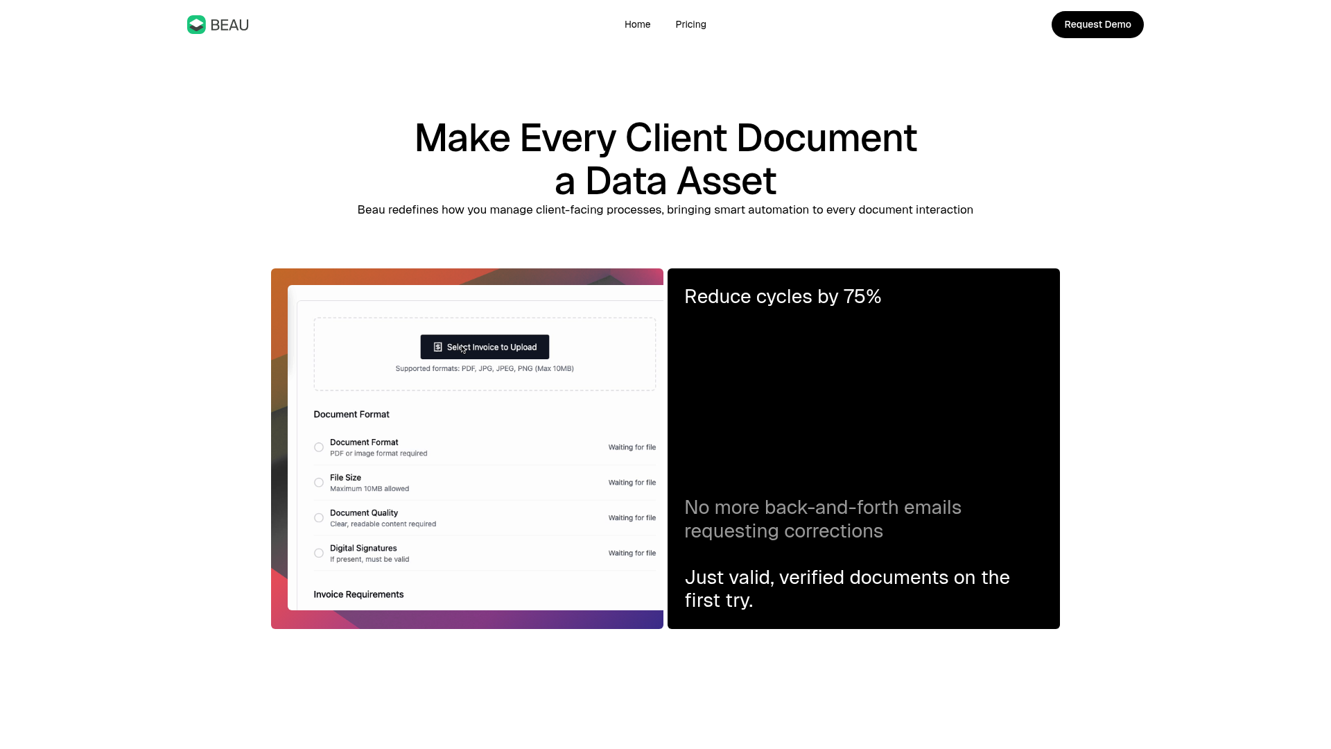
Beau Document Automation Landing Page
A modern software landing page featuring a bento-grid layout, split-screen hero assets with animated checkmarks, a step-by-step process guide, and a clean two-tier pricing table.
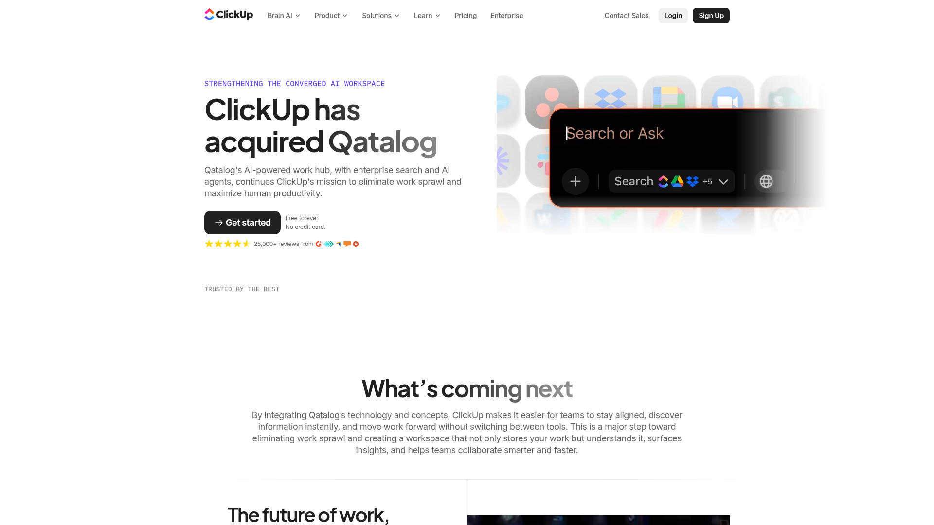
ClickUp Acquisition Hero Landing Page
Features a modern dark-themed hero section with a search UI graphic, bento-style feature grid, and a high-contrast CTA section with decorative gradients.
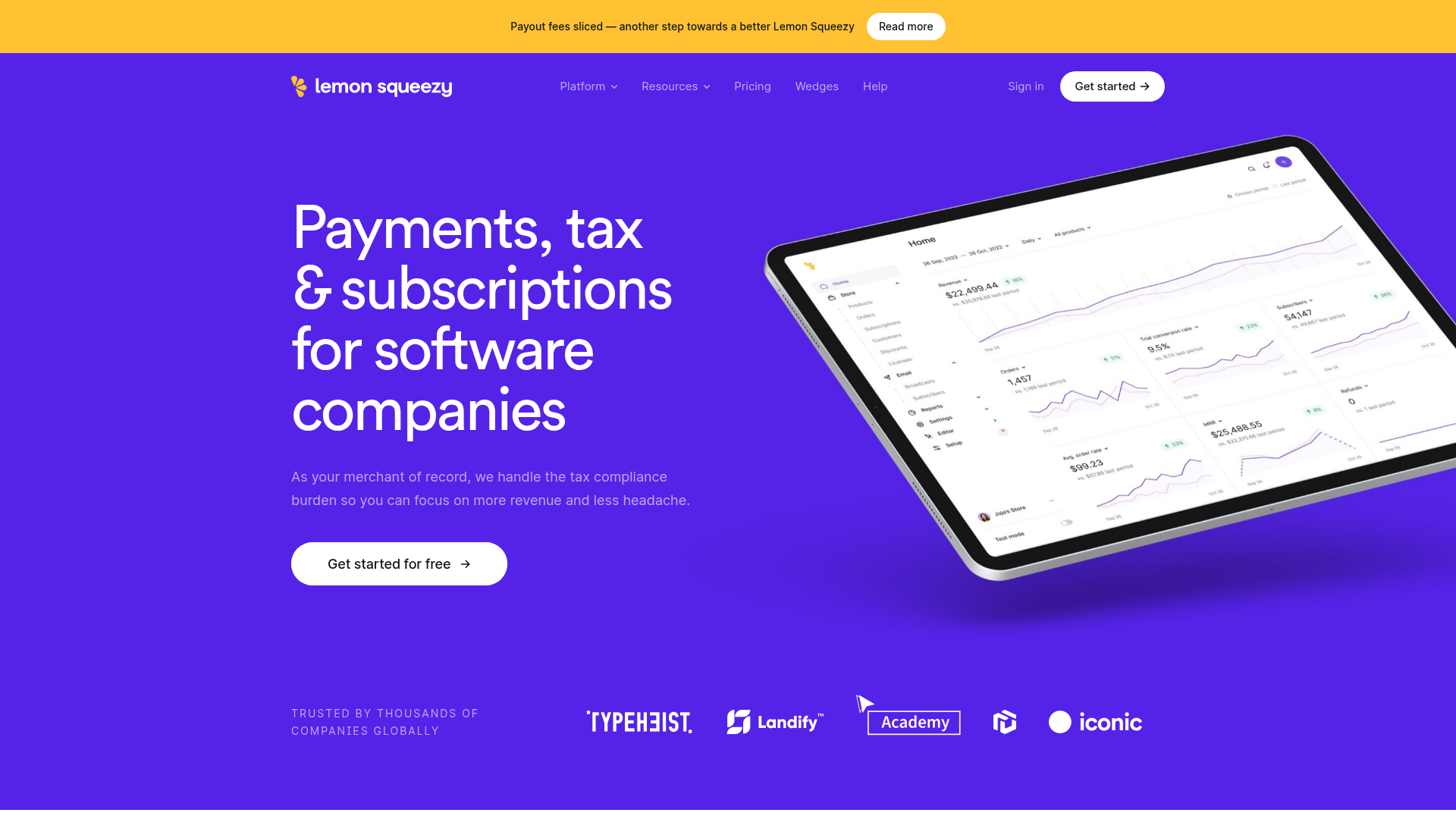
Lemon Squeezy SaaS Platform Landing Page
A high-conversion SaaS layout featuring a vibrant gradient hero, vertical tabbed feature sections, skewed device mockups, and a layered testimonial grid.
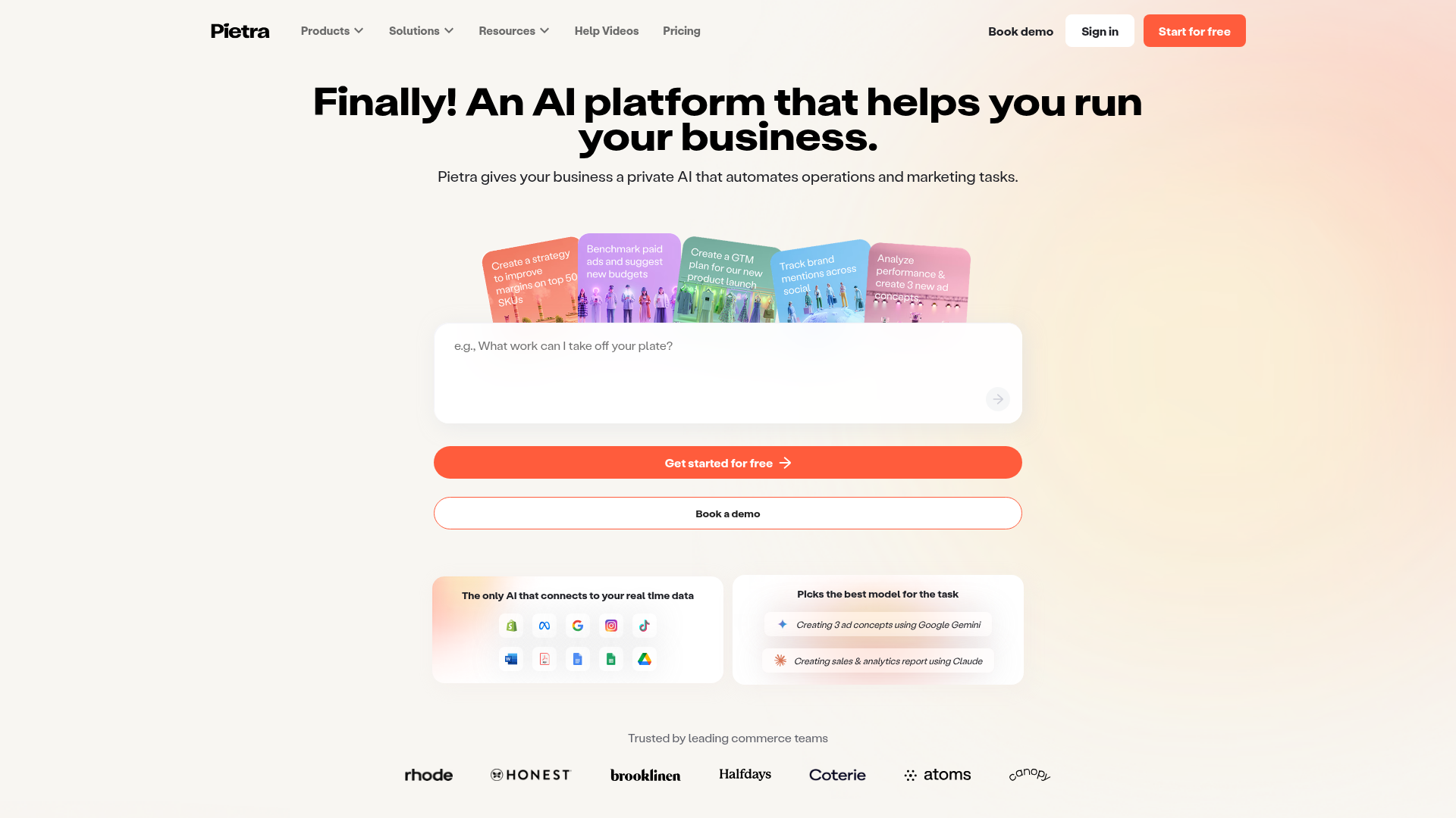
Pietra AI Platform Landing Page
A commerce-focused landing page featuring a centralized AI input hero, colorful floating value-prop cards, a bento-style integration showcase, and tabbed feature sections with side-by-side comparisons.
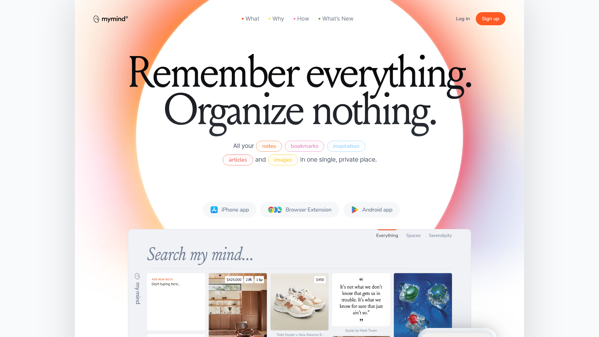
Mymind AI Tool Landing Page
A minimalist SaaS landing page featuring a soft-gradient hero section, custom pill-shaped text badges, and a dynamic bento-style search result preview grid.
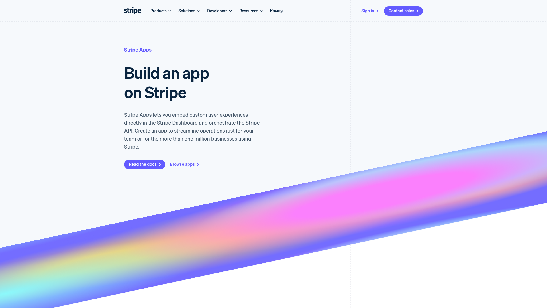
Stripe Apps Developer Portal Landing
A developer-focused landing page featuring a geometric animated gradient hero, multi-column feature sections, carousel components with code editors, and testimonial sliders.
