Kirifuda Inc. Minimal Portfolio Showcase
A clean, dark-mode agency portfolio featuring a typographic hero section, a high-contrast list-based works gallery with metadata, and a segmented multi-column footer for company details.
Overview
Kirifuda Inc. is a high-impact, minimalist portfolio for a creative digital studio. It serves as an excellent clone reference for its bold use of typography to create visual interest without relying on heavy imagery, effectively showcasing a professional output through clear information hierarchy.
Design System
- Color Palette & Visual Hierarchy: A strict high-contrast dark mode using solid blacks (
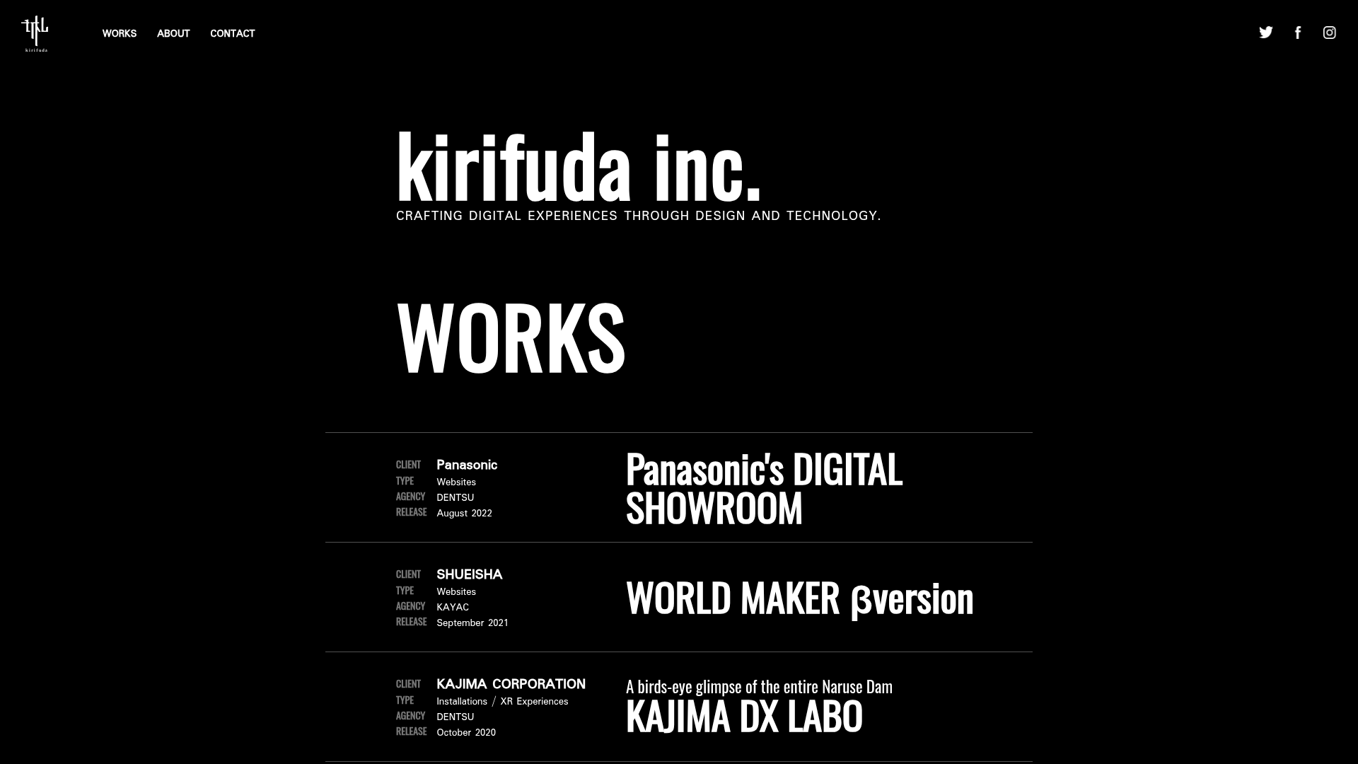
#000000) for the background and pure white for text. This creates a focused environment where the work titles and metadata are the primary focus. - Typography System: The site uses a heavy, condensed sans-serif for primary headings (
h1,WORKS, and work titles) to establish authority. Metadata labels like "CLIENT" or "RELEASE" use a smaller, capitalized sans-serif at lower opacity to differentiate secondary information. - Page Structure & Flow: The layout follows a linear vertical progression: a high-level hero tagline → an expansive list-based work gallery → long-form agency documentation ("ABOUT") → a split-view "CONTACT" and "JOIN US" footer section.
- Reusable Components:
- Works Box (
nogl_works_box): A unique horizontal list item that splits into metadata (left) and titled content (right), separated by subtle thin borders. - Minimal Header: A fixed or top-aligned navigation containing only essential links and social icons for maximum white space.
- Grid-based Awards Section: A simple list of monotone logos that maintains the aesthetic while providing social proof.
- Works Box (
- Interaction Patterns: The project entries are structured as full-width anchors (
<a>tags), suggesting a hover state that likely affects the entire row's opacity or text color. The metadata is grouped in columns (nogl_works_info_each) for easy scanning. - Implementation Clues: The HTML uses semantic
idanchors (e.g.,#works,#about) for a single-page scrolling experience. Class naming follows anogl_prefix, suggesting a custom-built, lightweight structure designed for fast loading and minimal external dependencies.
Use Cases
- Who should clone this: Independent developers, technical directors, or boutique design studios who want to showcase a high volume of work without the need for bespoke hero images for every project.
- Product Remixing: This layout is ideal for a "Log" or "Changelog" for a SaaS product, or a sophisticated "Resource Library" for content-heavy sites.
- Remix Directions: Replace the black-and-white theme with a brand-specific accent color while keeping the bold condensed headers. For a more visual approach, a builder could add a background-image hover reveal to each
nogl_works_boxrow. - Suggested Clone Scope: The "Works Gallery" section is the most valuable part to clone independently. It can be integrated into any existing minimalist design as a structured, information-rich alternative to standard image grids.
Related Inspirations

Niklas Rosén Designer Portfolio Index
A minimalist, responsive grid-based portfolio index featuring a clean 16-column layout, typographic list components, and a custom dark mode transition.

Break Maiden Agency Portfolio Hero
A high-impact dark mode hero section featuring oversized typography with inline GIF icons and a responsive grid for display-heavy case studies.
Norgram Minimalist Design Portfolio
A high-end, monochrome studio portfolio featuring a brutalist typography-led hero section, a clean asymmetrical masonry grid, and minimalist project navigation.
Marx Design Minimal Portfolio Grid
A high-end design portfolio featuring a synchronized image-hover grid layout, GSAP-powered transitions, and a hidden fullscreen menu with portrait image links.
Bareis + Nicolaus Design Portfolio
A split-screen portfolio featuring a fixed text-based sidebar alongside an edge-to-edge scrollable gallery of video and image project components.
Two Create Studio Minimalist Portfolio
A high-contrast, text-centric agency landing page featuring a bold typographic header and a dark-mode minimalist layout suitable for creative portfolios.
