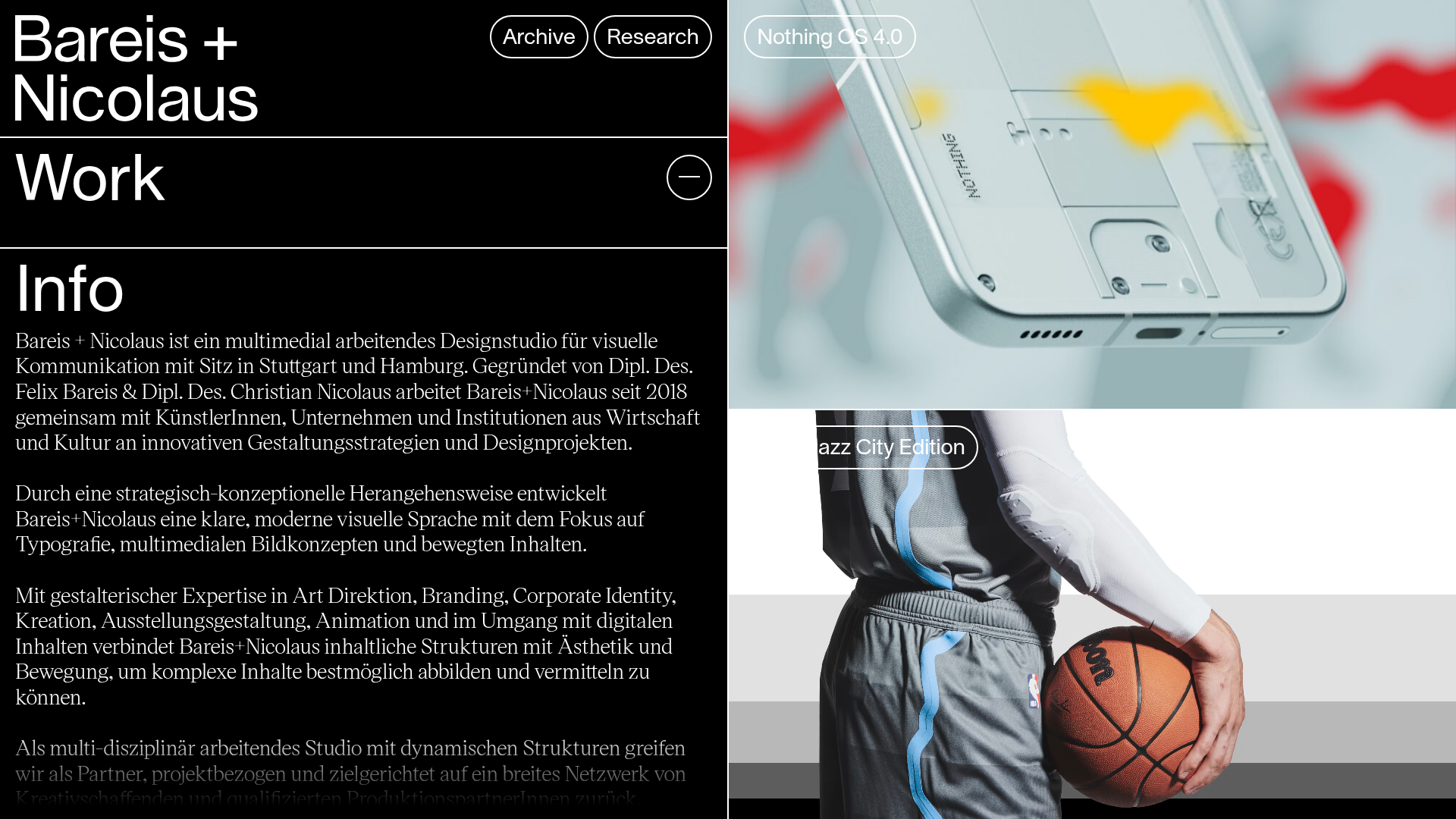
Bareis + Nicolaus Design Portfolio
A split-screen portfolio featuring a fixed text-based sidebar alongside an edge-to-edge scrollable gallery of video and image project components.
Overview
This portfolio design utilizes a sophisticated split-screen layout that pairs a robust, text-heavy informational sidebar with an edge-to-edge media gallery. It is a powerful reference for designers and studios because it maintains high readability of brand values and contact info while simultaneously showcasing visual work through immersive, full-bleed imagery and auto-playing video.
Design System
- Color Palette & Visual Hierarchy: The site uses a high-contrast monochromatic base (pure black backgrounds
#000with white text#FFF). Media content provides the only color, creating a gallery-like effect where work takes center stage. A classic horizontal line system separates distinct intellectual and visual sections. - Typography system: The site leverages two distinct families—a clean, large-scale sans-serif (Lausanne) for headings like "Bareis + Nicolaus" and "Work", and a sophisticated serif (Victor Serif) for the body text in the "Info" section. This contrast establishes a clear distinction between administrative navigation and professional storytelling.
- Page Structure & Section Flow: The layout is divided into a fixed-width left column containing the brand identity, navigation ("Archive", "Research"), a toggleable "Work" section, and a long-form "Info" bio. The right column consists of a continuous vertical stack of large-format
<article>elements containing project thumbnails. - Reusable Components:
- Project Cards: The
article.projectcomponent is highly reusable, combining an absolute-positioned floating button (.project__title) overlaid on a high-ratio media container. - Pill Buttons: The navigation at the top uses rounded-border buttons (
border-radius) that represent a modern, interactive call-to-action style. - Split-Screen Rail: The core structural framework of a static info panel versus a scrollable media feed.
- Project Cards: The
- Interaction Patterns: The design features floating labels for project titles that appear over the media. The HTML shows components for
<slider-wrap>and<slider-slides>, suggesting that clicking into projects leads to advanced interactive carousels. - Implementation Clues: The HTML structure reveals a component-based architecture (using tags like
> Component/Project/) and a custom grid system (Bun/Helper/Grid). It relies heavily on CSS variables for image aspect ratios (--ratio: 1.77).
Use Cases
- Who should clone this: Creative studios, motion designers, and architectural firms who have high-quality video content and a need to display extensive professional biographies alongside their portfolio.
- Effective Remixes:
- Content creators: Replace the business info with live stream feeds or social links in the sidebar while keeping the large-scale video grid on the right.
- Fashion Lookbooks: Utilize the edge-to-edge media for photography while using the sidebar for material details and pricing.
- Practical Directions: A builder could remix this by swapping the monochromatic theme for a vibrant brand color or converting the sidebar info into a collapsible menu for more media-centric focus.
- Suggested Clone Scope: Start with the split-pane CSS layout and the responsive media article component (
.project-inner). Cloning the fixed sidebar behavior is the key UX pattern to replicate first.
Related Inspirations

Niklas Rosén Designer Portfolio Index
A minimalist, responsive grid-based portfolio index featuring a clean 16-column layout, typographic list components, and a custom dark mode transition.
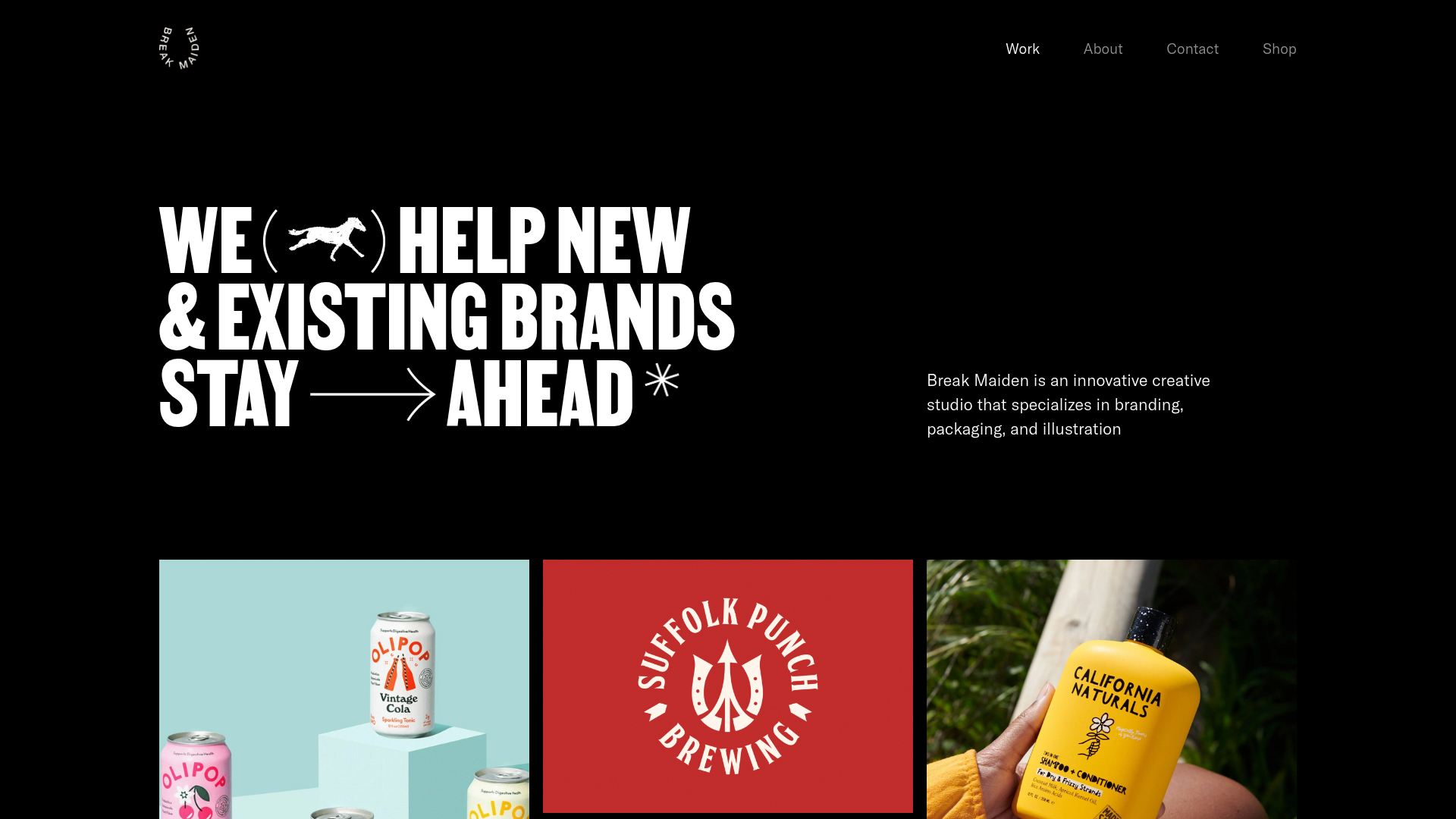
Break Maiden Agency Portfolio Hero
A high-impact dark mode hero section featuring oversized typography with inline GIF icons and a responsive grid for display-heavy case studies.
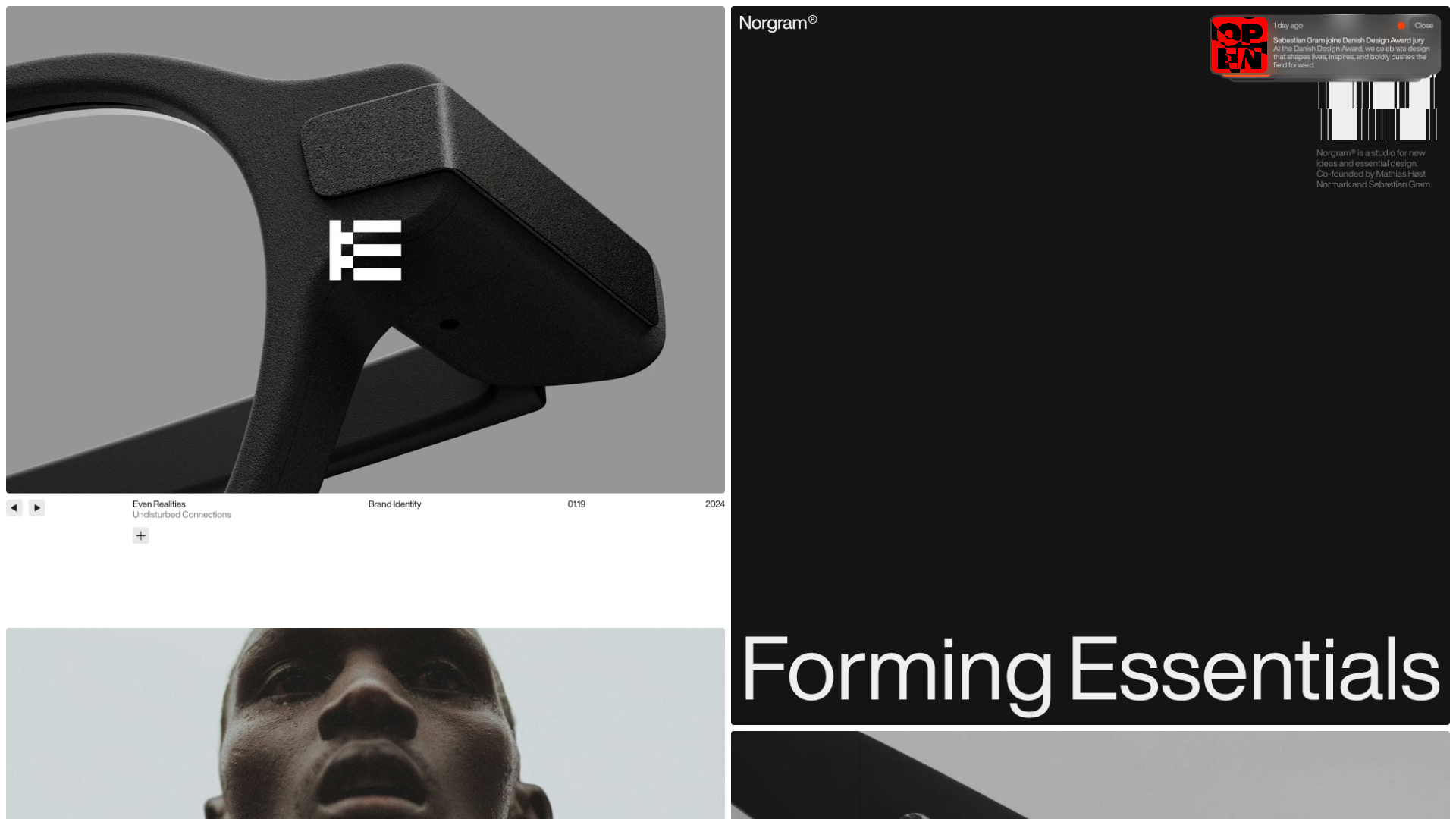
Norgram Minimalist Design Portfolio
A high-end, monochrome studio portfolio featuring a brutalist typography-led hero section, a clean asymmetrical masonry grid, and minimalist project navigation.
Marx Design Minimal Portfolio Grid
A high-end design portfolio featuring a synchronized image-hover grid layout, GSAP-powered transitions, and a hidden fullscreen menu with portrait image links.
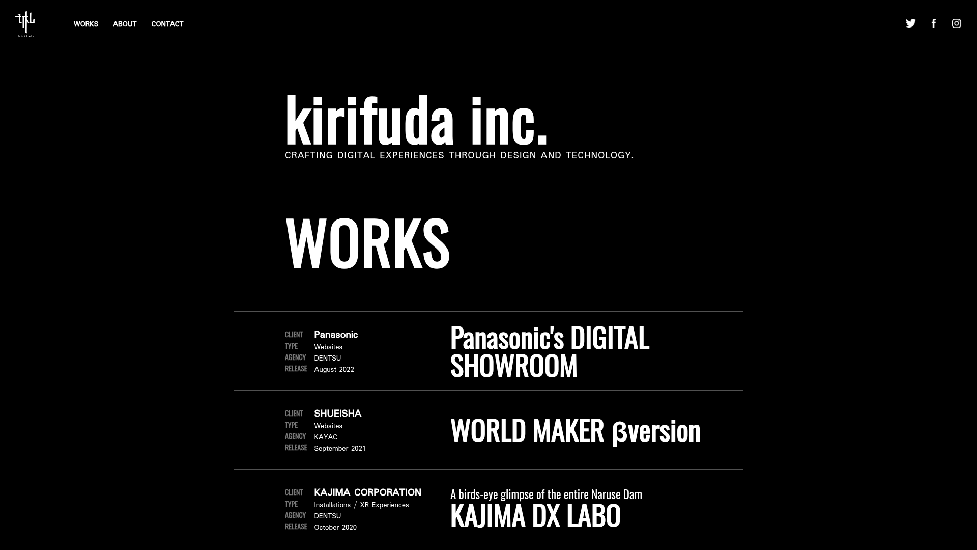
Kirifuda Inc. Minimal Portfolio Showcase
A clean, dark-mode agency portfolio featuring a typographic hero section, a high-contrast list-based works gallery with metadata, and a segmented multi-column footer for company details.
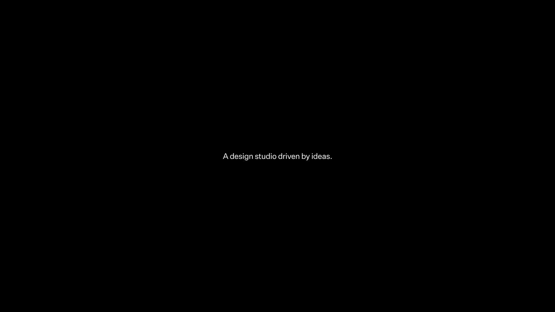
Two Create Studio Minimalist Portfolio
A high-contrast, text-centric agency landing page featuring a bold typographic header and a dark-mode minimalist layout suitable for creative portfolios.
