Two Create Studio Minimalist Portfolio
A high-contrast, text-centric agency landing page featuring a bold typographic header and a dark-mode minimalist layout suitable for creative portfolios.
Overview
This portfolio for Two Create Studio is a masterclass in high-contrast minimalist design, prioritizing bold typography and large-scale media over traditional UI decorative elements. It serves as an excellent reference for builders looking to create an impactful, "dark mode" first agency site that relies on a structured grid and a sophisticated font aesthetic.
Design System
- Color Palette & Visual Hierarchy: The site uses a strict monochromatic palette (deep black backgrounds, white text). Visual hierarchy is established through extreme shifts in type scale rather than color, and the project images/videos provide the only vibrant accents.
- Typography System: The design features a bold, sans-serif Grotesque-style typeface (likely an Inter or Helvetica variant). The header employs massive uppercase styling for branding, while the body copy utilizes lowercase for a modern, approachable feel. Headers use
<span>wrapping for precise layout control and line breaks. - Page Structure:
- Masthead: A large typography-driven title section (
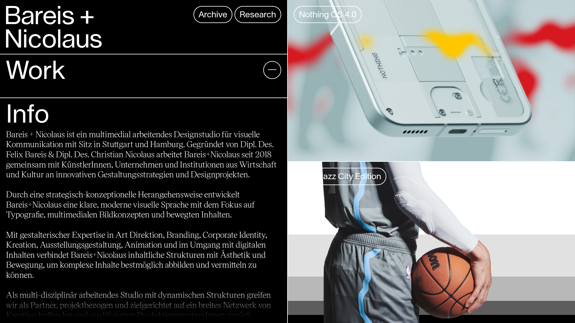
c-masthead). - Selected Work: A staggered grid of project cards featuring auto-playing videos and high-quality stills.
- Clients Section: A dense, interactive list with a "More Work" toggle.
- Work Index: A comprehensive library of project thumbnails with a dual-image hover/stack effect.
- Contact Footer: Simple text-based contact info with large clickable mailto/tel links.
- Masthead: A large typography-driven title section (
- Reusable Components: The
c-project-listing__itemis the most valuable component to clone; it features a container for multiple media sources (video and picture) and a clean text overlay. The "Work Index" cards, which use ac-project-listing__index-item-media-wrapperto stack multiple images, are ideal for showing project variety in a compact space. - Interaction & Motion: The HTML reveals a
is-loaderclass andjs-media-visibilityhooks, suggesting scroll-triggered reveal animations. Project entries use auto-playing, looping, and muted videos (autoplay,loop,playsinline) to create a dynamic but silent "living" gallery. - Implementation Clues: Built using Gatsby, it leverages Prismic as a headless CMS for media delivery and uses a BEM-like (Block Element Modifier) CSS naming convention (e.g.,
c-project-listing__item--layout-1).
Use Cases
- Who should clone this: Creative agencies, industrial designers, and high-end fashion portfolios that want a "brutalist-lite" look that feels expensive and curated.
- Remixing the design: The staggered layout (
layout-1,layout-2,layout-4classes in HTML) can be easily remixed by shifting the grid proportions. Swapping the black background for a deep navy or dark forest green can change the brand mood without losing the structural elegance. - Practical Directions: Builders can reuse the "Work Index" component as a standalone secondary gallery. For a quicker project, cloning just the
c-mastheadand the tiered project grid provides 80% of the site's visual impact. - Clone Scope: A full-page clone is recommended for those wanting to maintain the seamless transition between the bold intro and the detailed project index, as the continuity of the typography is key to the design's success.
Related Inspirations

Niklas Rosén Designer Portfolio Index
A minimalist, responsive grid-based portfolio index featuring a clean 16-column layout, typographic list components, and a custom dark mode transition.

Break Maiden Agency Portfolio Hero
A high-impact dark mode hero section featuring oversized typography with inline GIF icons and a responsive grid for display-heavy case studies.
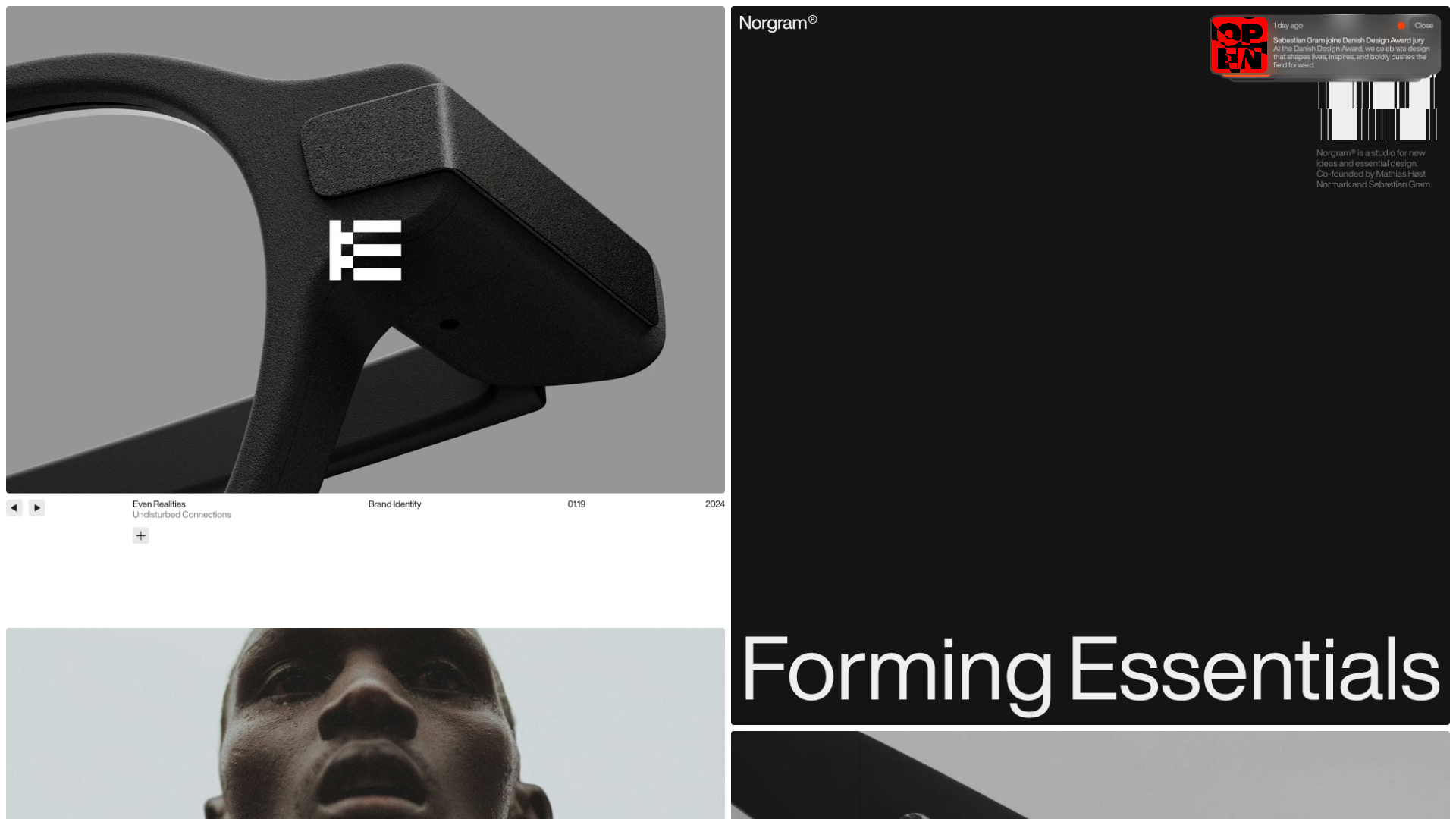
Norgram Minimalist Design Portfolio
A high-end, monochrome studio portfolio featuring a brutalist typography-led hero section, a clean asymmetrical masonry grid, and minimalist project navigation.
Marx Design Minimal Portfolio Grid
A high-end design portfolio featuring a synchronized image-hover grid layout, GSAP-powered transitions, and a hidden fullscreen menu with portrait image links.
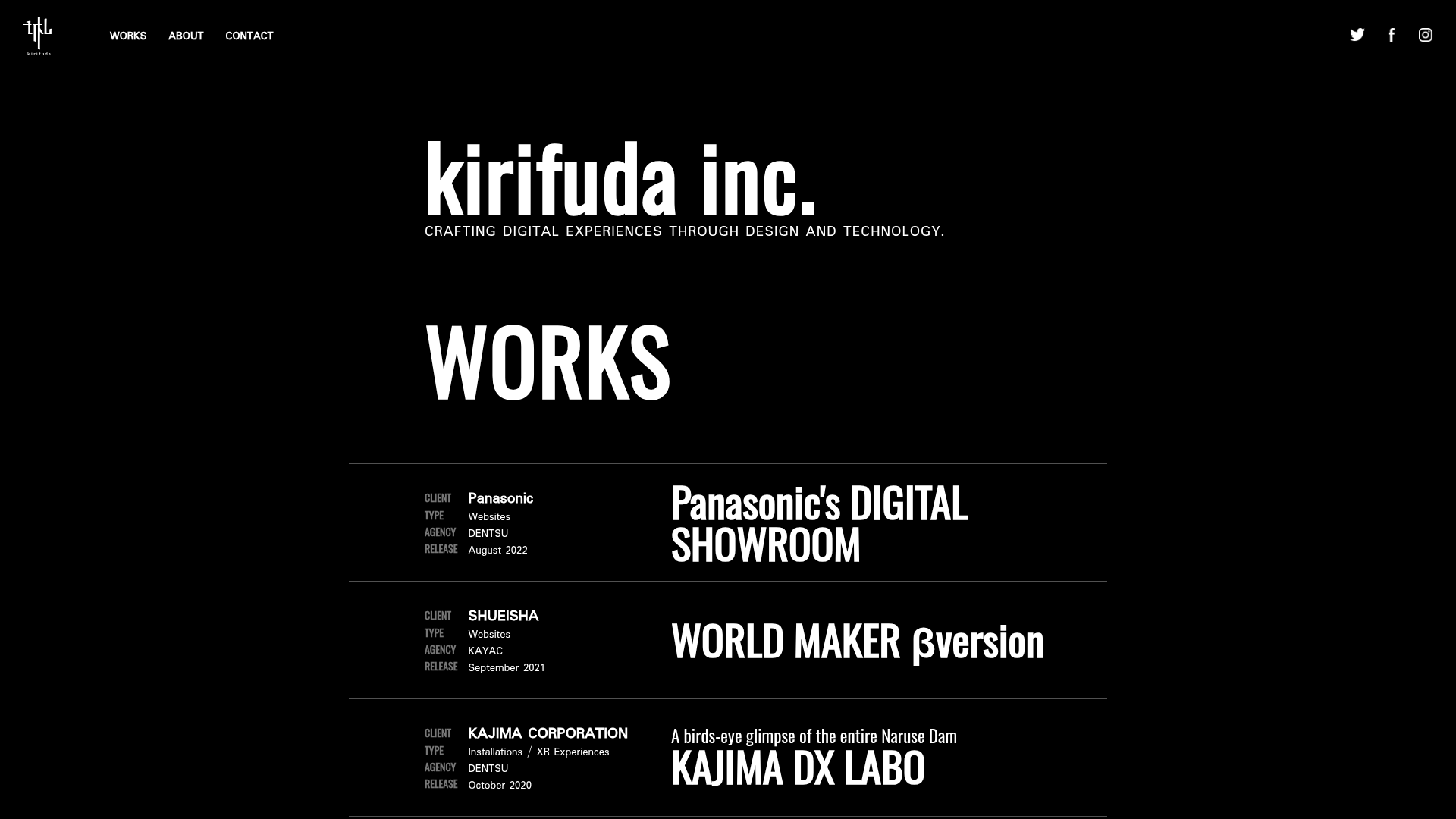
Kirifuda Inc. Minimal Portfolio Showcase
A clean, dark-mode agency portfolio featuring a typographic hero section, a high-contrast list-based works gallery with metadata, and a segmented multi-column footer for company details.
Bareis + Nicolaus Design Portfolio
A split-screen portfolio featuring a fixed text-based sidebar alongside an edge-to-edge scrollable gallery of video and image project components.
