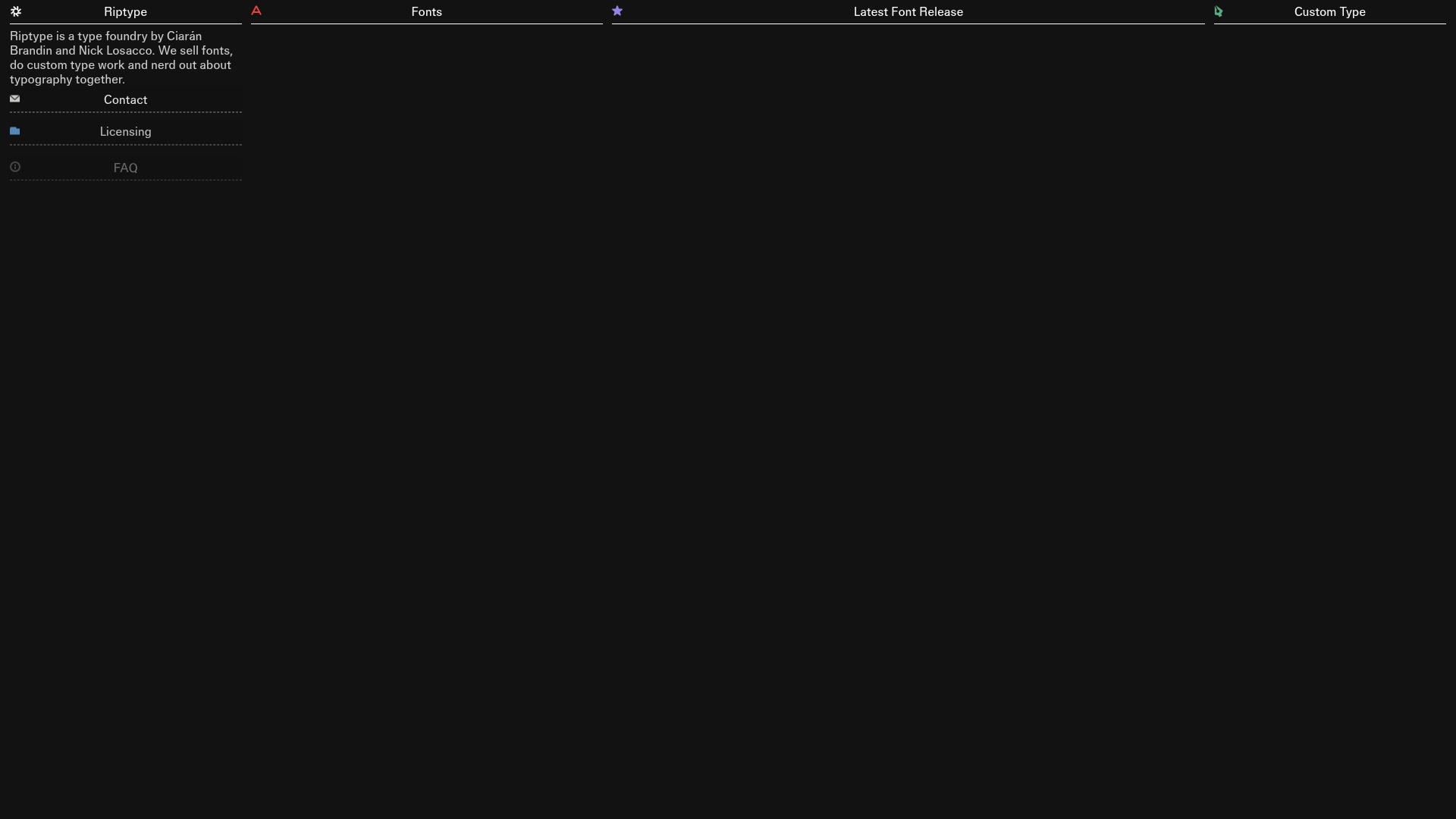
Riptype Typography Portfolio Bento Grid
A dark-themed, four-column bento grid layout for a font foundry with expandable accordion drawers for licensing, FAQ, and contact information.
Overview
Riptype is a type foundry portfolio featuring a sophisticated four-column bento grid layout set against a deep black background. It is a strong reference for clones because of its high-density information architecture that uses vertical accordion drawers to manage content without leaving the single-page view.
Design System
- Color Palette & Visual Hierarchy: The site uses a high-contrast dark mode with a #000000 background and off-white/grey text. Primary accents are monochromatic, with subtle use of icons to distinguish grid categories. The hierarchy is defined by horizontal borders that separate headers from content.
- Typography: As a foundry site, typography is central. It uses a clean, sans-serif font throughout with a clear scale: large H2 headers for section titles and licensing prices, and smaller, lower-opacity text for body descriptions to maintain a technical, utilitarian feel.
- Page Structure: The layout is a fixed 4-column grid (on desktop). The columns are: Foundry Info/About, Font List, Latest Release, and Custom Type Portfolio. The first column contains the primary interactive expansion points.
- Reusable Components:
- Content Drawers: Vertical accordions for 'Contact', 'Licensing', and 'FAQ' that expand within the flow of the first column.
- Font Buttons: Custom list items for typefaces that feature an SVG glyph preview alongside the font name.
- Square Image Cards: A masonry-like vertical scroll for custom type projects using high-quality image assets.
- Interactions & Motion: The site utilizes 'stagger-up' entry animations for content blocks (seen in the
page-loadattributes). Hover states on font buttons include subtle translate effects, and the licensing section uses a structured grid to compare tiers. - Responsive Behavior: The HTML indicates
desktop-hideandtablet-hideclasses, showing that the 4-column layout collapses into a single-column stack on mobile devices, with the latest release promoted to the top of the feed. - Implementation Clues: Built using Webflow, the site relies on a
master-gridclass and specializedw-nodeattributes for grid placement, paired with a commerce wrapper for font licensing transactions.
Use Cases
- Creative Portfolios: Graphic designers or studios can clone this to showcase project archives alongside service tiers and FAQs in a compact, single-view space.
- Digital Product Sales: E-commerce sites selling software, assets, or presets can remix the licensing grid and the 'Latest Release' spotlight to drive conversions.
- Practical Remix Directions: Swap the dark theme for a high-key 'Swiss' style (white background, red accents) to change the vibe from tech-noir to modernist. The information architecture can be adapted by turning the 'Fonts' column into a 'Services' list or 'Case Studies' feed.
- Suggested Clone Scope: High value is found in cloning the first-column accordion structure for information-heavy FAQs or pricing pages. The full-page clone is ideal for 'Link-in-bio' style landing pages that require more depth than a standard list of links.
Related Inspirations

Niklas Rosén Designer Portfolio Index
A minimalist, responsive grid-based portfolio index featuring a clean 16-column layout, typographic list components, and a custom dark mode transition.

Break Maiden Agency Portfolio Hero
A high-impact dark mode hero section featuring oversized typography with inline GIF icons and a responsive grid for display-heavy case studies.
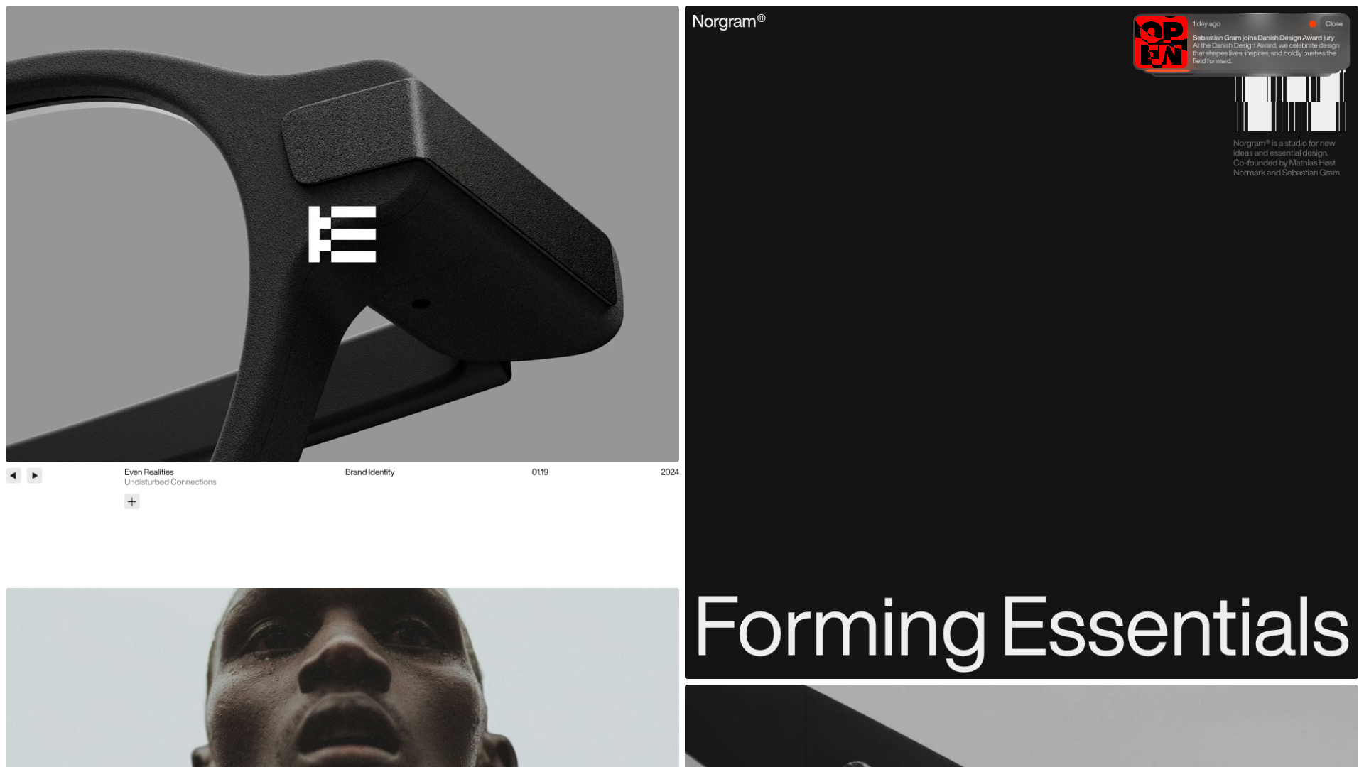
Norgram Minimalist Design Portfolio
A high-end, monochrome studio portfolio featuring a brutalist typography-led hero section, a clean asymmetrical masonry grid, and minimalist project navigation.
Marx Design Minimal Portfolio Grid
A high-end design portfolio featuring a synchronized image-hover grid layout, GSAP-powered transitions, and a hidden fullscreen menu with portrait image links.
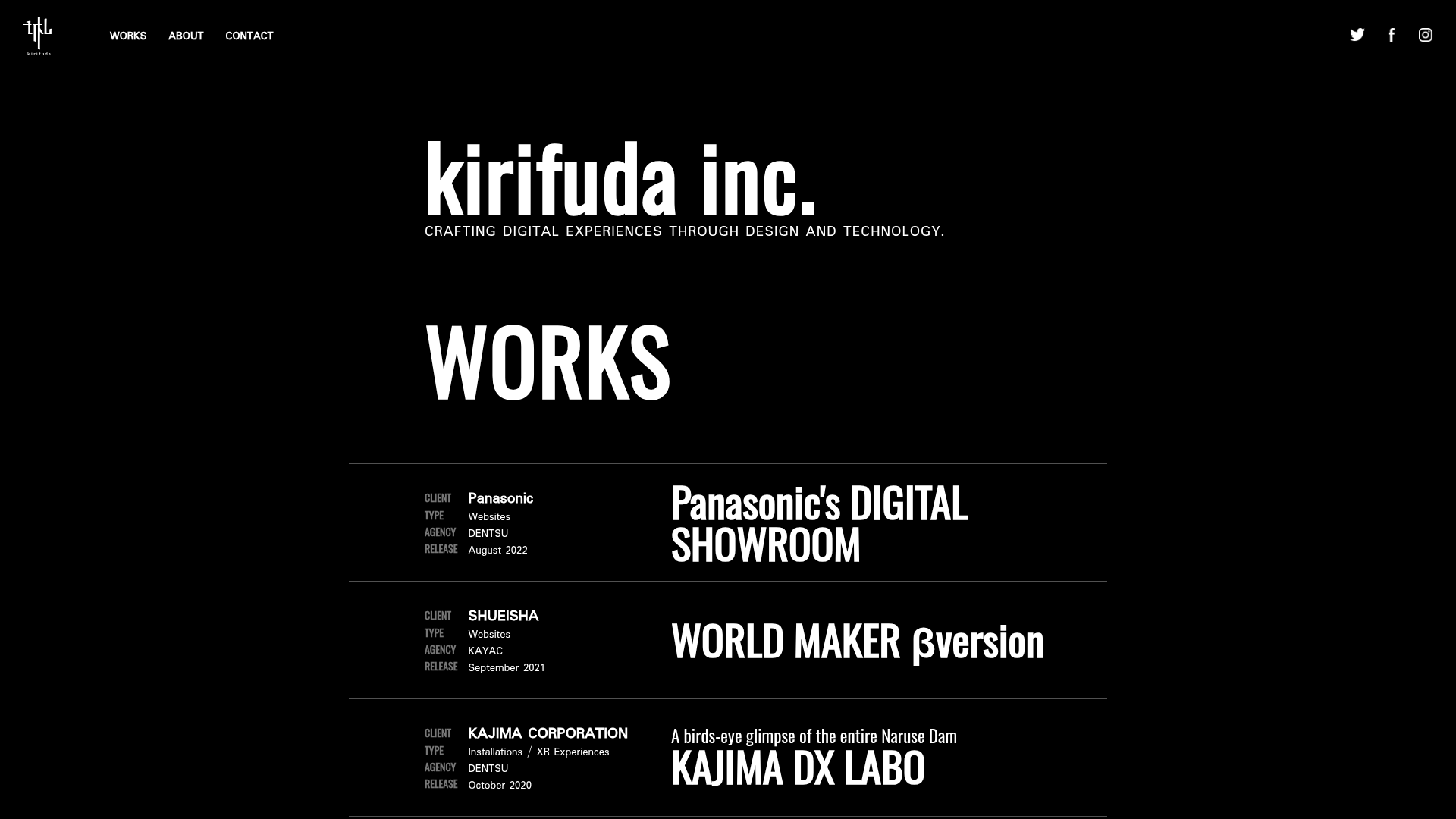
Kirifuda Inc. Minimal Portfolio Showcase
A clean, dark-mode agency portfolio featuring a typographic hero section, a high-contrast list-based works gallery with metadata, and a segmented multi-column footer for company details.
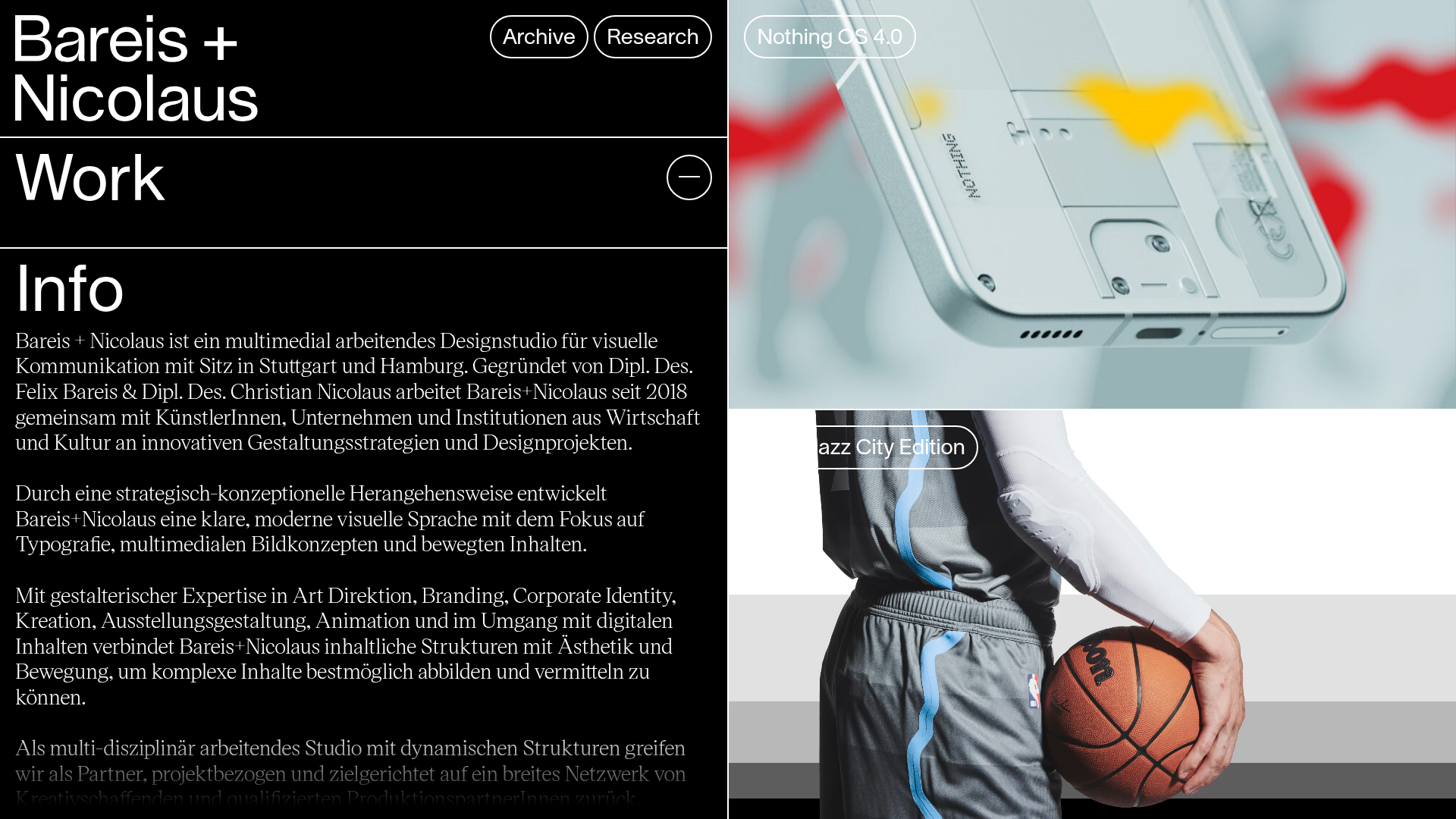
Bareis + Nicolaus Design Portfolio
A split-screen portfolio featuring a fixed text-based sidebar alongside an edge-to-edge scrollable gallery of video and image project components.
