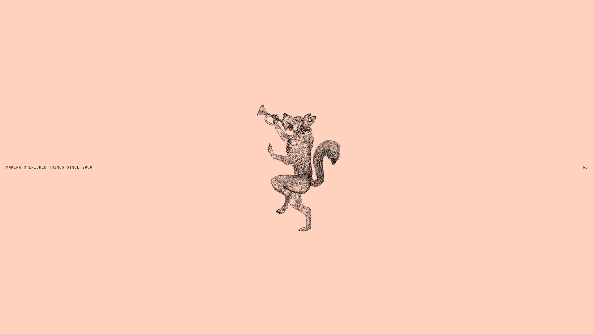
Smiling Wolf Minimalist Portfolio Landing
A refined, ultra-minimalist layout featuring a centered vintage illustration, subtle typography, and a spacious monochromatic aesthetic ideal for a high-end brand splash page.
Overview
This website is a sophisticated, ultra-minimalist portfolio landing page for a creative agency. It serves as an excellent clone reference for its masterclass in negative space, its use of high-contrast monochromatic aesthetics, and a unique "layered" scrolling experience that transitions from a digital-first brand identity to a tactical, grounded studio overview.
Design System
- Color Palette & Visual Hierarchy: The primary palette uses a distinctive soft peach/coral background (
rgb(255, 210, 191)) contrasted with a deep charcoal text (rgb(19, 23, 19)). This creates a high-end, editorial feel that prioritizes a single, centered vintage illustration as the initial focal point. - Typography: The system relies on a clean, monospaced aesthetic using "General Grotesque Mono." It utilizes a small scale for metadata (9px) and large, impactful headings for the intro statement, creating a hierarchy that feels both technical and artistic.
- Page Structure: The layout flow begins with a stark, atmospheric splash screen, followed by a full-bleed video header, a project grid (Featured Grid), an expertise section using large typography, a journal/blog horizontal stack, and finally a high-contrast dark-mode footer.
- Reusable Components:
- Project Cards: Flexible grid items using varied aspect ratios (1:1, 3:2, 16:9) to break the monotony.
- Outline Buttons: Subtle
Light - Outlinebuttons with 1px borders and 4px radius. - Logo Marquee: A smooth, horizontal scrolling conveyor of client logos (
Google,Adidas,Tate). - Dark-Mode Footer: A robust "active" footer containing distinct columns for contact paths, partnerships, and social links.
- Interaction & Motion: The HTML reveals extensive use of Framer's motion library, specifically staggered character entry animations for the H1 text and scroll-triggered opacity/translate shifts (
translateY(15px)) on project cards. - Implementation Clues: Built with Framer, the site uses a responsive design with multiple breakpoints ranging from mobile to 2560px, utilizing CSS variables (tokens) for color consistency and
will-change: transformto optimize scroll-based animations.
Use Cases
- Who should clone this: Independent designers, high-end boutique agencies, or architecture firms looking for an "anti-template" look that feels custom and prestigious.
- Effective Remixes: Ideal for luxury fashion splash pages or art gallery websites where the visual asset (the wolf illustration) can be swapped for a product shot or a hero sculpture.
- Remix Directions:
- Typography Swap: Change the mono font to a high-contrast Serif (like Didot) to move from "tech-minimalist" to "luxury-editorial."
- Color Logic: Reuse the layout but flip the colors to a dark charcoal background with white text for a more aggressive, modern-dark aesthetic.
- Clone Scope: The splash screen and the unique character-by-character text reveal animation are the most valuable components to clone for quick impact. For a complete brand overhaul, the full-page transition from light mode (body) to dark mode (footer) provides a powerful narrative structure.
Related Inspirations
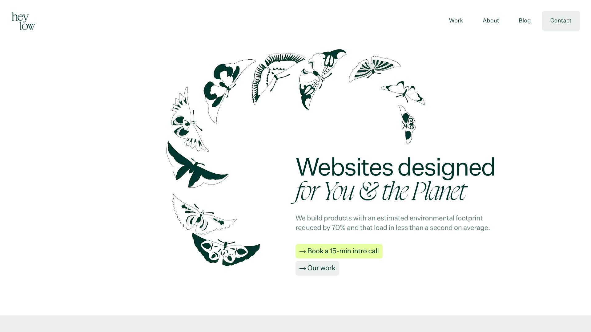
Heylow Portfolio Landing Page
A minimalist, eco-conscious portfolio featuring an animated butterfly hero section, Bento-style feature grid, and project cards with carbon rating and speed metrics.

Christopher Doyle Agency Portfolio Layout
A minimalist, typography-led portfolio featuring a wide-margin grid system, smooth fade-in animations, and simple image-focused project cards.

NewTab Studio Minimalist Portfolio Landing Page
A clean, typography-focused landing page featuring an oversized SVG/canvas hero title, a top-aligned navigation bar, and a minimalist footer layout.
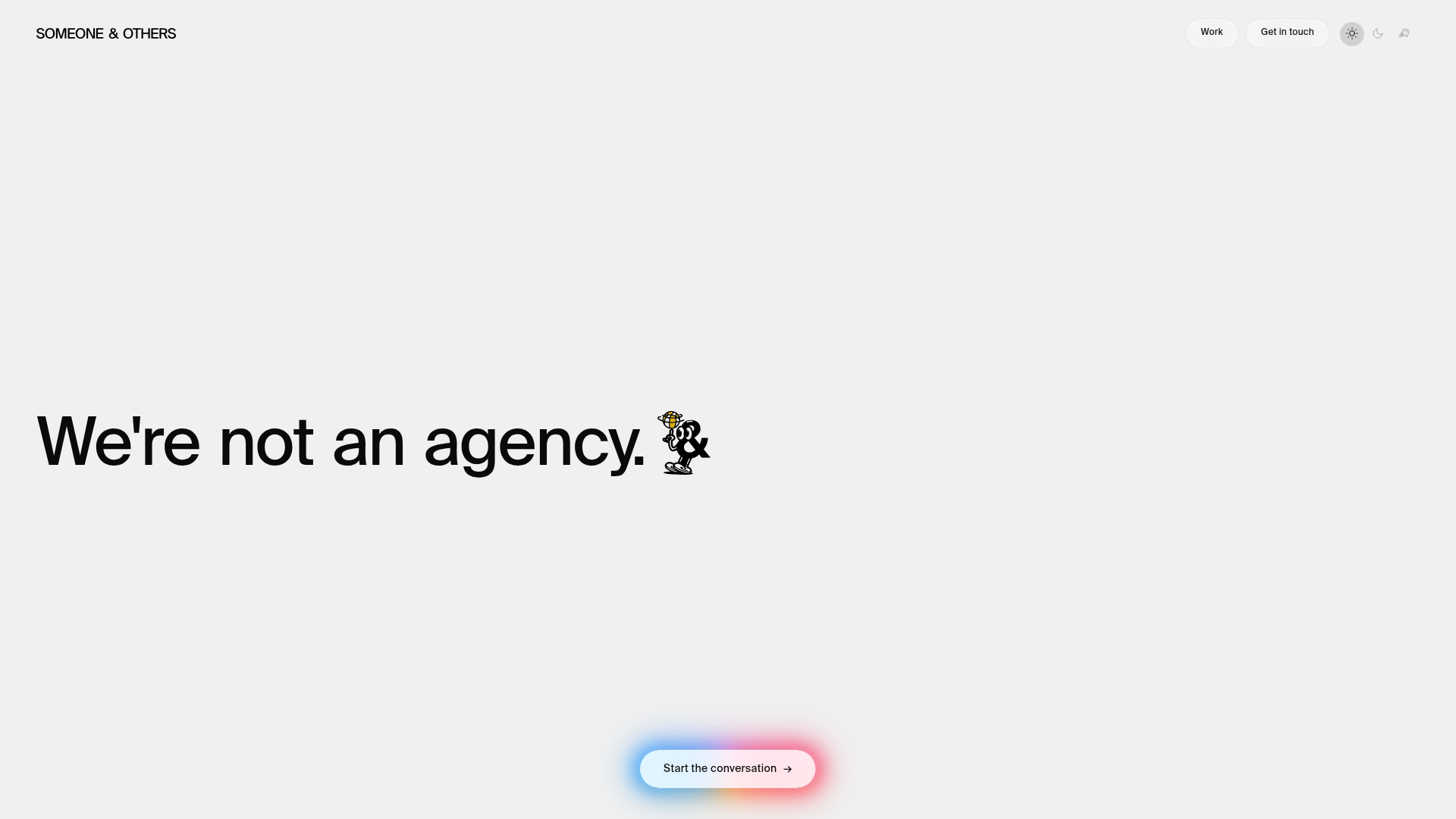
Someone & Others Studio Landing Page
A minimalist studio portfolio featuring scroll-reveal typography, overlapping sticky case study cards, and a vibrant glassmorphism CTA with animated glow rings.

Play Studio Minimalist Portfolio Landing
A high-impact agency layout featuring a oversized typography header, a full-width integrated Vimeo video background, and a unique expandable accordion list for industry showcases.

Baubauwerk Minimal Agency Portfolio Homepage
A clean studio site featuring a centered text hero, scatter-plot filterable project gallery, and full-bleed image sections for case studies.
