Heylow Portfolio Landing Page
A minimalist, eco-conscious portfolio featuring an animated butterfly hero section, Bento-style feature grid, and project cards with carbon rating and speed metrics.
Overview
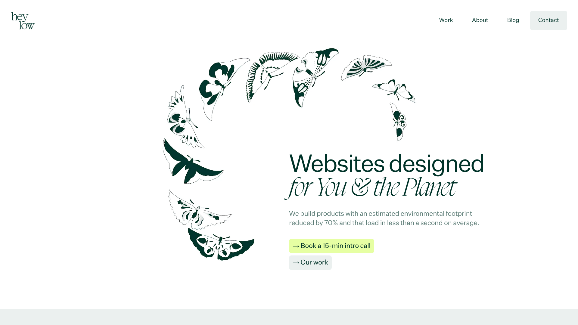
Heylow is a minimalist, eco-conscious portfolio for a digital agency that prioritizes low-carbon web design. It is an excellent clone reference for its clean aesthetic, sophisticated use of whitespace, and specialized data-driven project cards that highlight performance metrics (carbon rating and speed index).
Design System
- Color Palette & Visual Hierarchy: The palette is dominated by a "greenwhite" (
#f1f5f2) background and a deep "darkgreen" for text, providing high contrast without the harshness of pure black. A vibrant "greenflash" (neon lime) is used sparingly for primary call-to-action buttons and feature cards to draw immediate attention. - Typography: The system uses a high-contrast serif for emphasis (seen in the "for You & the Planet" italicized header) alongside a clean, modern sans-serif for body copy and UI elements. The hierarchy uses
body-xxlandbody-3xlclasses for large, impactful section headers. - Page Structure:
- Hero: Centered text content with an absolute-positioned, illustrated butterfly graphic acting as a visual anchor.
- Trust Bar: A simple horizontal logo row with CSS filters (
brightness(0) invert(...)) to unify different brand logos into the site's dark green color. - Feature Grid: A 3-column Bento-style layout using the
greenflashbackground for service highlights. - Project Showcases: Large-scale project cards featuring a layered image approach—a screenshot overlaying a custom background texture.
- Blog & CTA: A 3-column article grid followed by high-contrast footer sections.
- Reusable Components:
- Project Cards: The
info-projectdiv includes a uniquespecs-projectblock with specific badges for "Carbon Rating" and "Speed Index." - Buttons: A standard pill-shaped button class with specific modifiers like
greenflashandwhitefor different backgrounds. - Bento Features: The
.featureclass handles transitions and responsive stacking for value propositions.
- Project Cards: The
- Interactions & Motion: The site uses the
AOS(Animate On Scroll) library extensively, withfade-upandfadeattributes to stagger the entrance of grid items and headers. - Implementation Clues: Built with utility-first CSS (Tailwind classes like
flex-col,gap-8, andmd:translate-x-1/2are prominent). It utilizes a responsivepictureelement strategy with multiplewebpsources to maintain the low-carbon/high-speed promise.
Use Cases
- Who should clone this: Independent designers, creative agencies, and environmental consultants who want to signal sustainability and performance through their visual identity.
- Effective Remixes:
- SaaS Landing Pages: Replace the project cards with product feature screenshots while keeping the performance badge logic to show off platform speed.
- Non-Profit Portfolios: Adaptive info architecture by swapping the "Our Work" focus for "Impact Reports," utilizing the clean, readable typography for long-form mission statements.
- Practical Directions: Reuse the CSS filter technique in the logo bar to quickly unify mismatched client logos. The Bento-style feature grid is highly modular and can be extracted for use in any landing page.
- Clone Scope: A full-page clone is best for those needing a cohesive, high-end portfolio. Alternatively, the project card component is a valuable standalone piece for any performance-focused showcase.
Related Inspirations
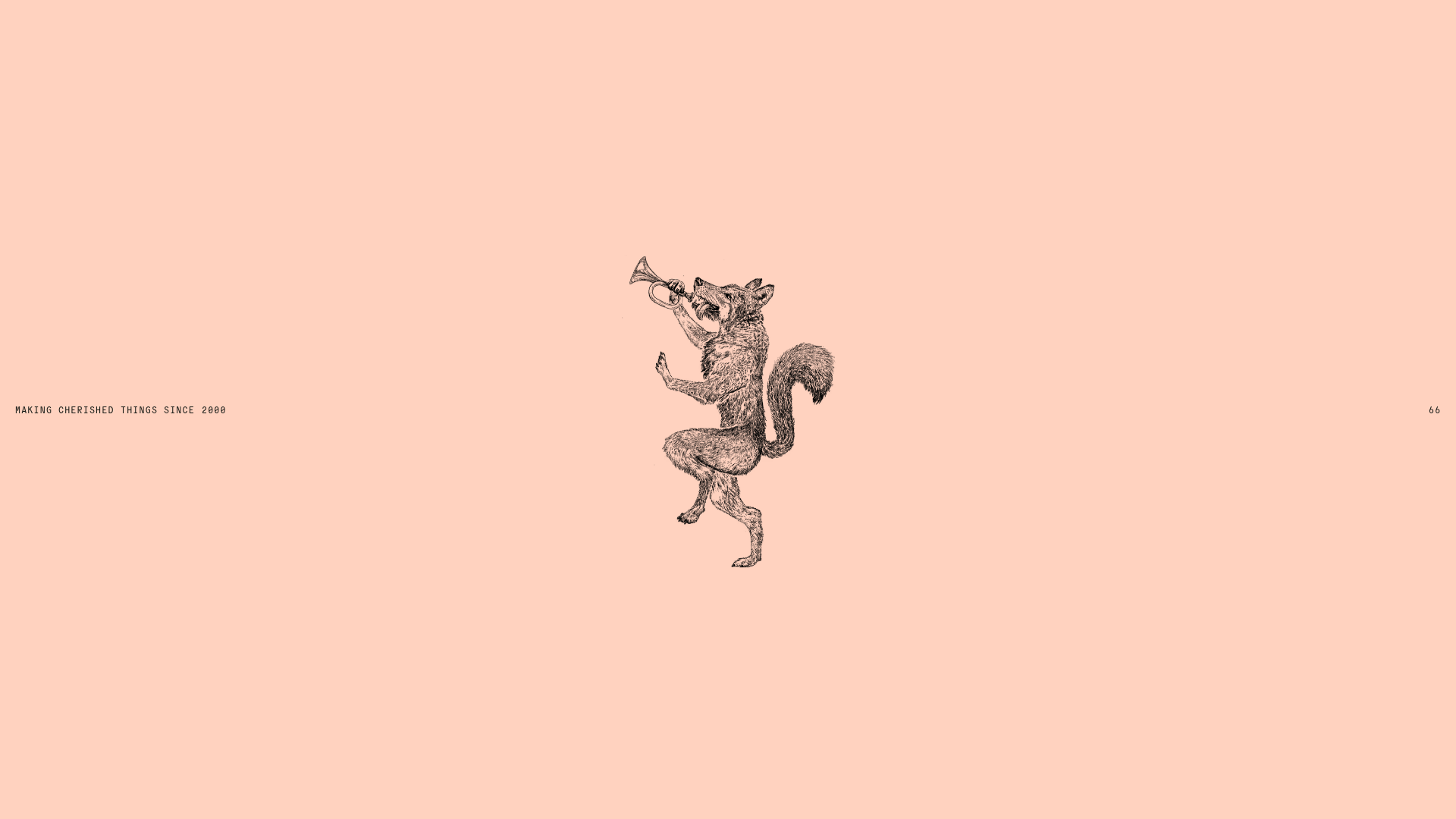
Smiling Wolf Minimalist Portfolio Landing
A refined, ultra-minimalist layout featuring a centered vintage illustration, subtle typography, and a spacious monochromatic aesthetic ideal for a high-end brand splash page.

Christopher Doyle Agency Portfolio Layout
A minimalist, typography-led portfolio featuring a wide-margin grid system, smooth fade-in animations, and simple image-focused project cards.

NewTab Studio Minimalist Portfolio Landing Page
A clean, typography-focused landing page featuring an oversized SVG/canvas hero title, a top-aligned navigation bar, and a minimalist footer layout.
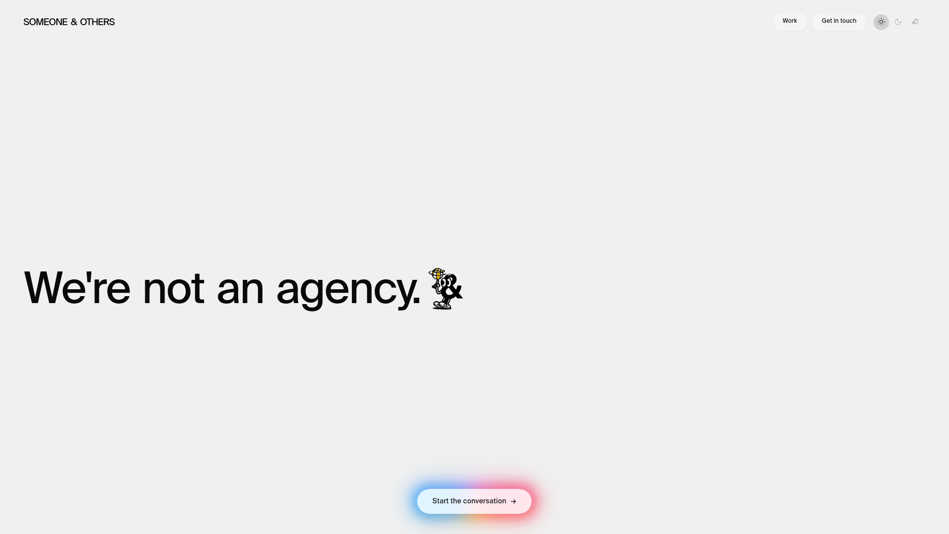
Someone & Others Studio Landing Page
A minimalist studio portfolio featuring scroll-reveal typography, overlapping sticky case study cards, and a vibrant glassmorphism CTA with animated glow rings.

Play Studio Minimalist Portfolio Landing
A high-impact agency layout featuring a oversized typography header, a full-width integrated Vimeo video background, and a unique expandable accordion list for industry showcases.

Baubauwerk Minimal Agency Portfolio Homepage
A clean studio site featuring a centered text hero, scatter-plot filterable project gallery, and full-bleed image sections for case studies.
