WGSN Trend Forecasting Landing Page
Features a dark-themed collage hero section, a four-column benefits grid, alternating image-text features, and a clean brand logo marquee.
Overview
WGSN’s landing page is a masterclass in high-end B2B positioning, blending editorial aesthetics with analytical data visualization. It serves as a strong reference for creators looking to build a premium, authority-driven brand presence through a mix of layered imagery and clean, structured content layouts.
Design System
- Color Palette & Visual Hierarchy: The design centers on a high-contrast 'Dark/Light' interplay. It uses a deep black (#000000) for the hero section to create an immersive, premium feel, transitioning into a soft off-white/beige background (#f6f2eb) for the content body. This distinction clearly separates 'Brand Inspiration' from 'Actionable Benefits.'
- Typography: The system relies on a clean, modern Sans Serif. Headings use large font sizes (up to 48px) with tight tracking for a bold, authoritative look. Body text stays comfortably at 20px for high readability, using weight to establish hierarchy in the benefit cards.
- Page Structure & Section Flow:
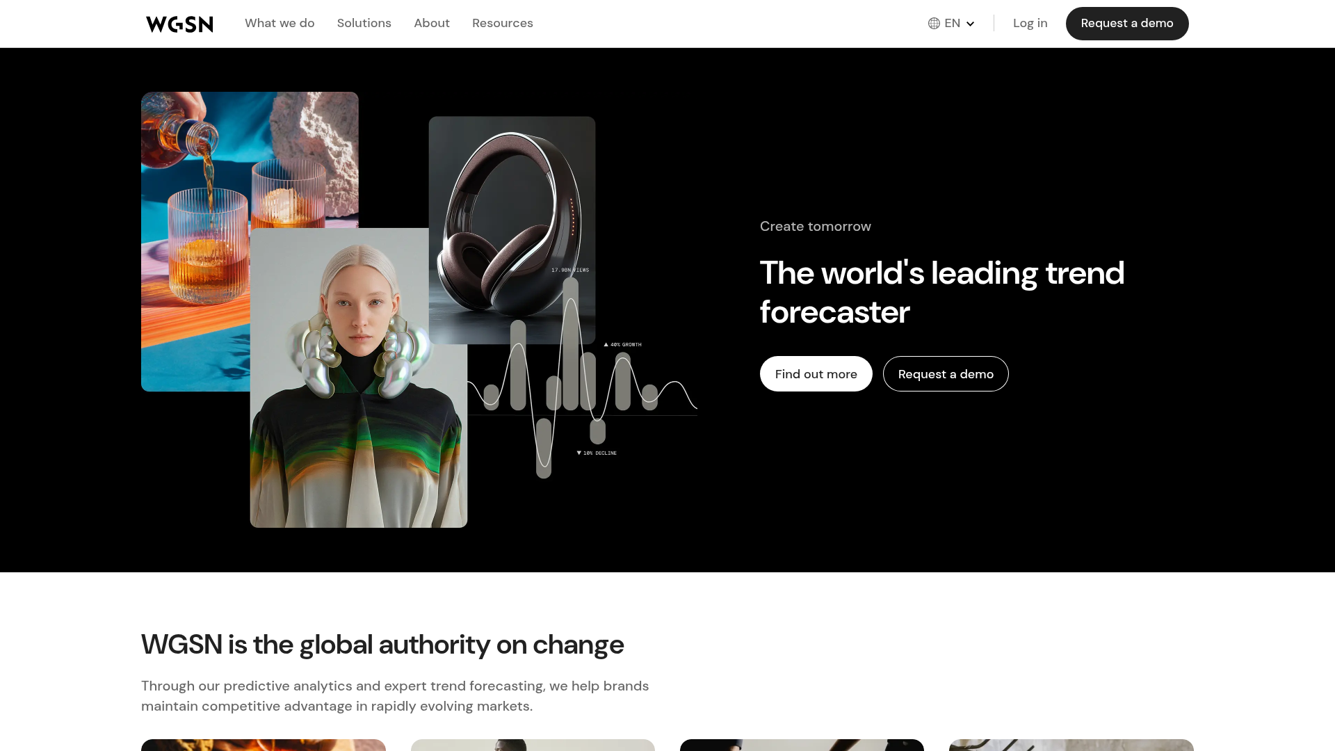
- Hero: Overlapping collage imagery paired with a strong left-aligned value proposition.
- Benefit Grid: A four-column layout (
layout--fourcol) using vertical 'Content Cards' to link outcomes to users. - Feature Alternation: Large-format horizontal image-text blocks that flip-flop their orientation for visual rhythm.
- Trust Signals: A minimal logo grid and a centered call-to-action (CTA) section.
- Conversion: A clean newsletter signup form integrated near the footer.
- Reusable Components:
- Collage Hero: The overlapping image arrangement (glasses, headphones, fashion model) with integrated data visualizations (trend lines) is a standout reusable design pattern.
- Button System: Uses high-contrast pill-shaped buttons—primary (solid white) and secondary (outlined/ghost).
- Vertical Cards: Standardized card components with image headers and structured text bodies.
- Implementation Clues: Based on the HTML classes (e.g.,
col-lg-6,col-12,d-flex), the site utilizes a grid-based framework (likely Bootstrap) for layout management, ensuring predictable responsive stacking.
Use Cases
- Target Audience: Agencies, SaaS platforms, and data-driven consultancy firms wanting to appear both creative and rigorous.
- Effective Remixes: Ideally suited for AI startups or creative production houses where showcasing physical products (via the hero collage) alongside abstract data (trend graphs) is necessary.
- Remix Directions: Replace the fashion-centric imagery with tech hardware or software dashboards. The 'Trend Forecasting' alternators can be adapted into 'Product Features' or 'Service Tiers.'
- Recommended Scope: The hero section is a perfect high-impact 'quick clone' to elevate an existing minimalist landing page. The benefit cards offer a standard, reliable pattern for a full-page architectural rebuild.
Related Inspirations
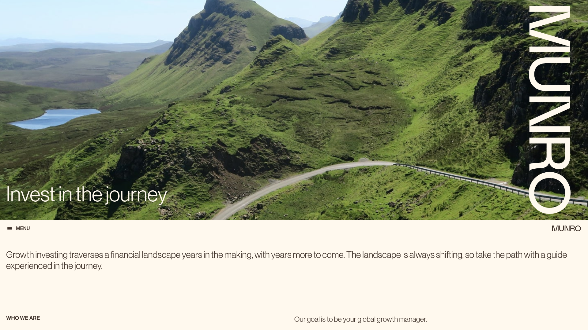
Munro Partners Financial Growth Landing Page
A professional financial services layout featuring a vertical typographic hero, animated stat counters, a data-driven fund performance table, and a colorful grid for news and investment themes.
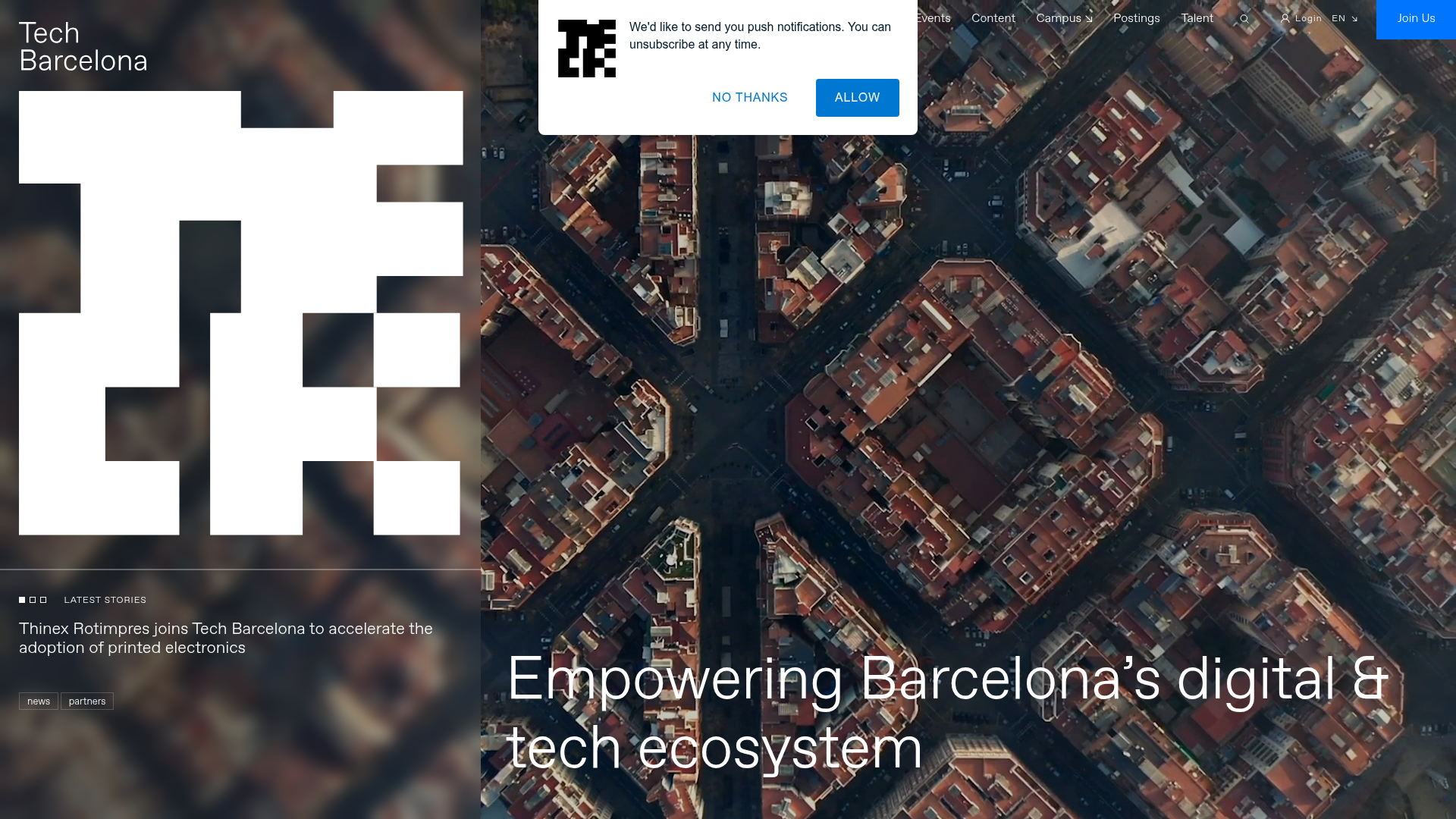
Tech Barcelona Ecosystem Hub Landing Page
A refined landing page layout featuring an immersive video background hero, marquee-style scrolling badges, and card-based sections for events and community projects.

Context Gallery High-End Furniture Landing Page
A minimal editorial layout featuring a multi-column product carousel, designer biographies with image-text pairings, and a magazine-style content grid for curated design stories.

Glein Minimalistic Bento Grid eCommerce
A clean, modular layout using a bento-style responsive grid of text teasers and large-scale product imagery for lookbooks and collection browsing.
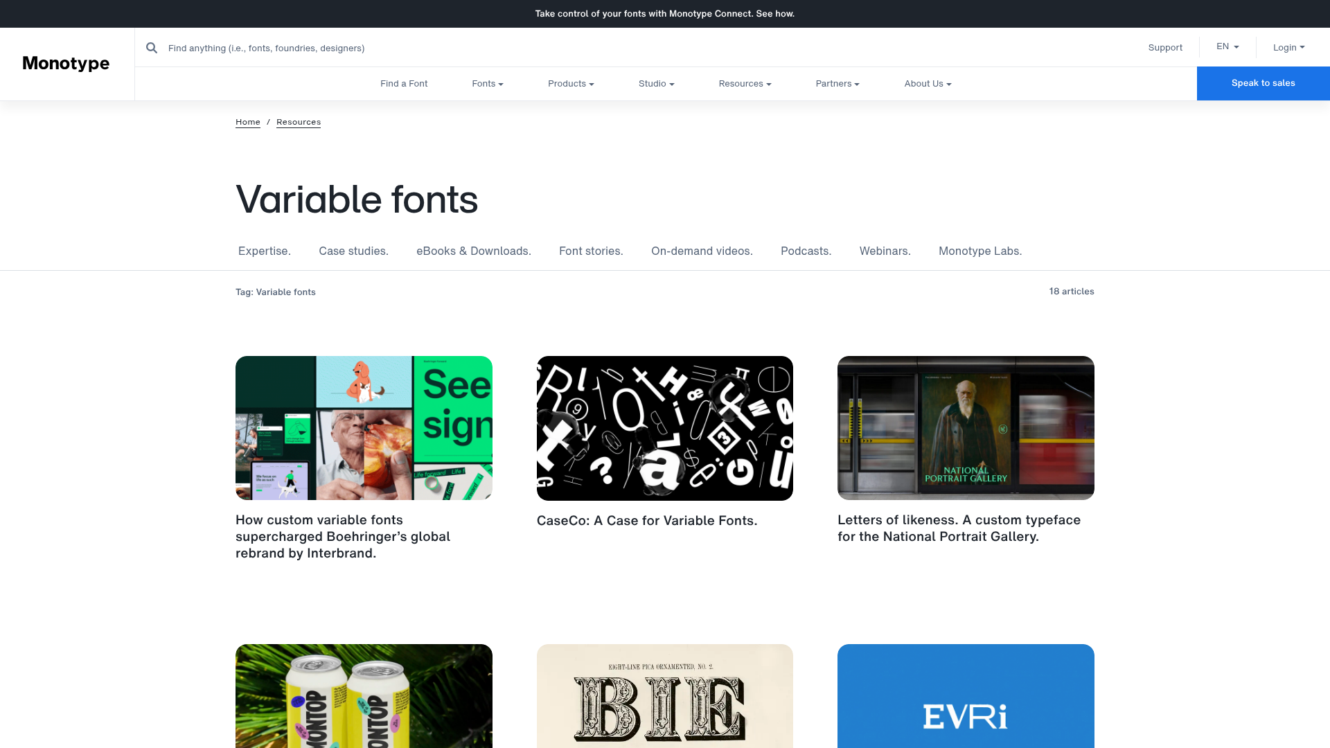
Monotype Variable Fonts Resource Gallery
A clean masonry grid layout featuring content cards with hover-state overlays, category filtering, and responsive image scaling for a media-rich resource center.

Basic.Space E-commerce Gallery Clone
A minimalist product marketplace featuring a clean sticky navigation bar, nested flyout menus, and a horizontally scrollable product carousel with hover-state image switching.
