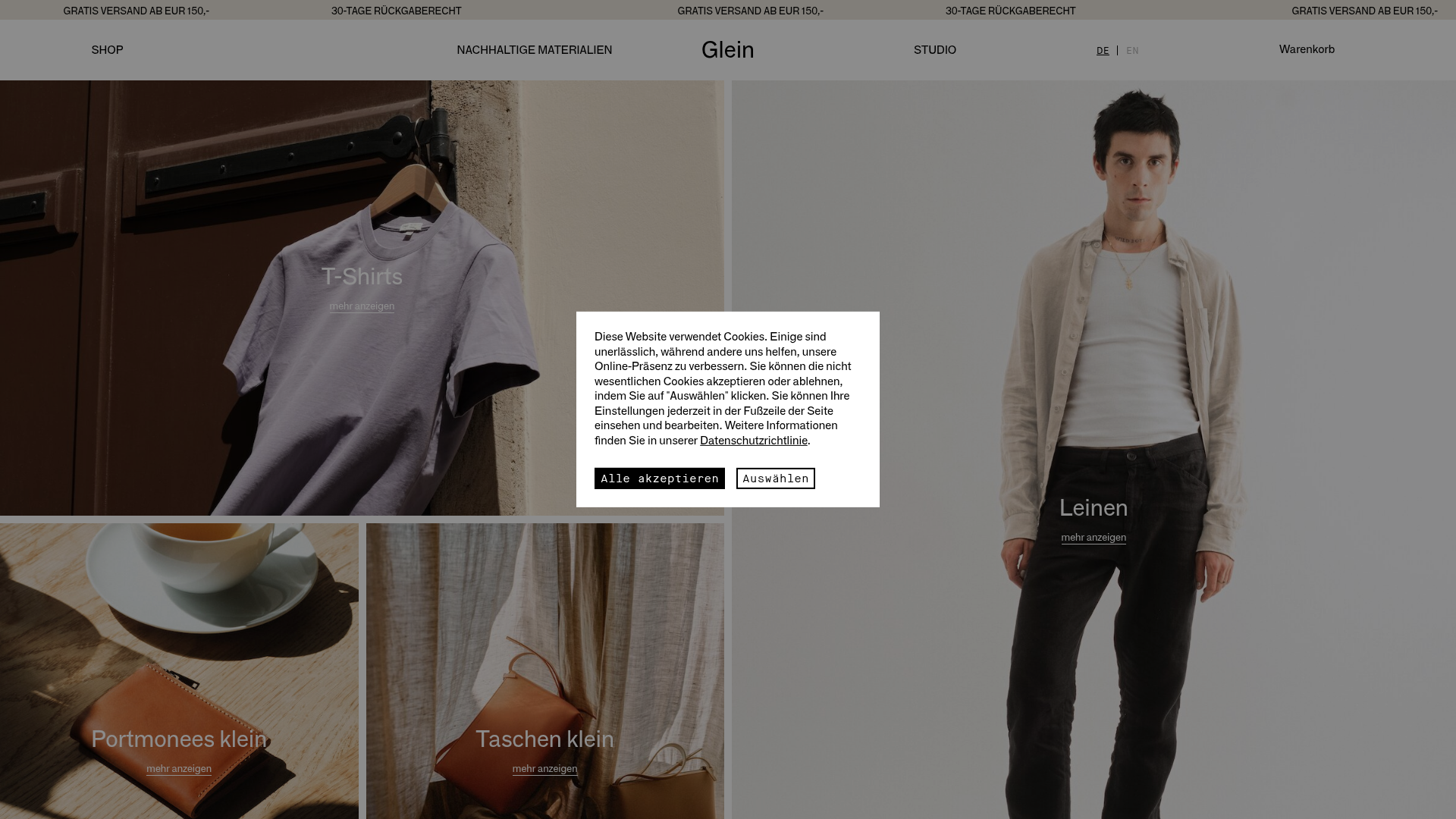
Glein Minimalistic Bento Grid eCommerce
A clean, modular layout using a bento-style responsive grid of text teasers and large-scale product imagery for lookbooks and collection browsing.
Overview
Glein is a sophisticated eCommerce site for a Vienna-based fashion atelier, characterized by a clean, modular aesthetic. It serves as a prime reference for builders looking to implement a "bento box" grid that seamlessly mixes product photography with editorial text, creating a digital lookbook experience that feels high-end yet functional.
Design System
- Color Palette & Visual Hierarchy: The palette is ultra-minimalist, relying on a neutral background (light grey/muted tones) that allows colorful product photography to define the mood. Hierarchy is established through image scale rather than bold colors, with primary focus on full-bleed and large-format imagery.
- Typography: A clean, sans-serif font is used throughout. Captions are understated, often using a standard weight with small-caps or lowercase "mehr anzeigen" (show more) links to maintain a quiet, gallery-like interface.
- Page Structure: The layout uses a CSS grid-based "Bento" system. Items are categorized by
data-sizeattributes (1x1, 2x1, 2x2), allowing blocks to span different widths and heights for a dynamic, non-linear browsing flow. - Reusable Components:
- Grid-Item Teasers: Modular blocks containing a lazy-loaded image (
lazylqip), a text label, and a subtle text link. - Minimalist Navigation: A transparent top bar with centered branding and utility links (Shop, Studio, Basket) that avoids clutter.
- Cookie Consent: A stark, monochrome modal centered on the screen with high-contrast buttons (
cm-btn-successin black).
- Grid-Item Teasers: Modular blocks containing a lazy-loaded image (
- Interaction Design: Hover states on grid items trigger subtle transitions. The site uses
swup.jsfor smooth, PJAX-style page transitions (page-transition-fade), creating a seamless app-like feel between collections. - Implementation Clues: The HTML reveals a custom-built structure using a
data-controller="navigation"pattern and heavy use ofdata-sizeattributes to manage the responsive grid logic. Images are served via a comprehensivesrcsetsystem for optimized delivery across devices.
Use Cases
- Who should clone this: Designers building luxury or craft-focused eCommerce stores, architecture portfolios, or editorial-heavy lifestyle brands.
- Effective Remixes: This pattern is ideal for high-ticket items where visual storytelling (lookbooks) is more important than a dense product list. It works well for furniture, high-end skincare, or artisan workshops.
- Remix Directions: Replace the muted grey background with a bold brand color to shift the vibe from "minimalist" to "streetwear." One could also adapt the info architecture by replacing the text-only grid blocks with video loops or newsletter sign-up forms while maintaining the bento structure.
- Suggested Clone Scope: Start by cloning the
grid-itemcontainer and the CSS Grid logic to create a responsive gallery. A full-page clone is recommended to capture the elegant navigation andswuppage transitions that define the site's premium feel.
Related Inspirations

Context Gallery High-End Furniture Landing Page
A minimal editorial layout featuring a multi-column product carousel, designer biographies with image-text pairings, and a magazine-style content grid for curated design stories.

Basic.Space E-commerce Gallery Clone
A minimalist product marketplace featuring a clean sticky navigation bar, nested flyout menus, and a horizontally scrollable product carousel with hover-state image switching.

Ashley & Co Lifestyle E-commerce
An elegant Shopify-based storefront featuring a split-screen animated hero, horizontal ticker-tape collection carousel, and dynamic mega-menus with scent-specific color switching and image previews.
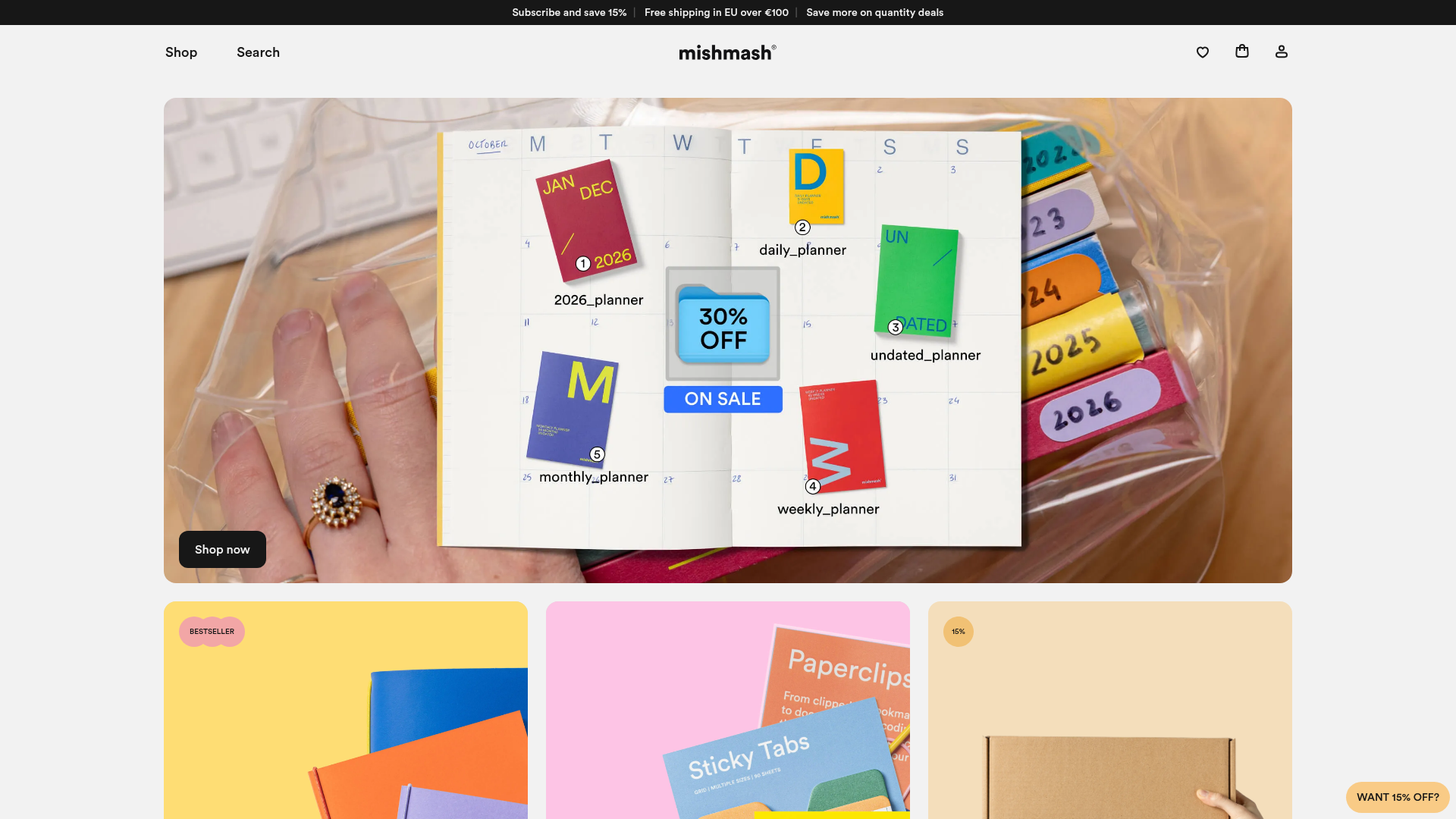
Mishmash Stationery E-commerce Layout
A clean retail template featuring rounded image grids, a multi-column comparison section with custom iconography, and a responsive products carousel.
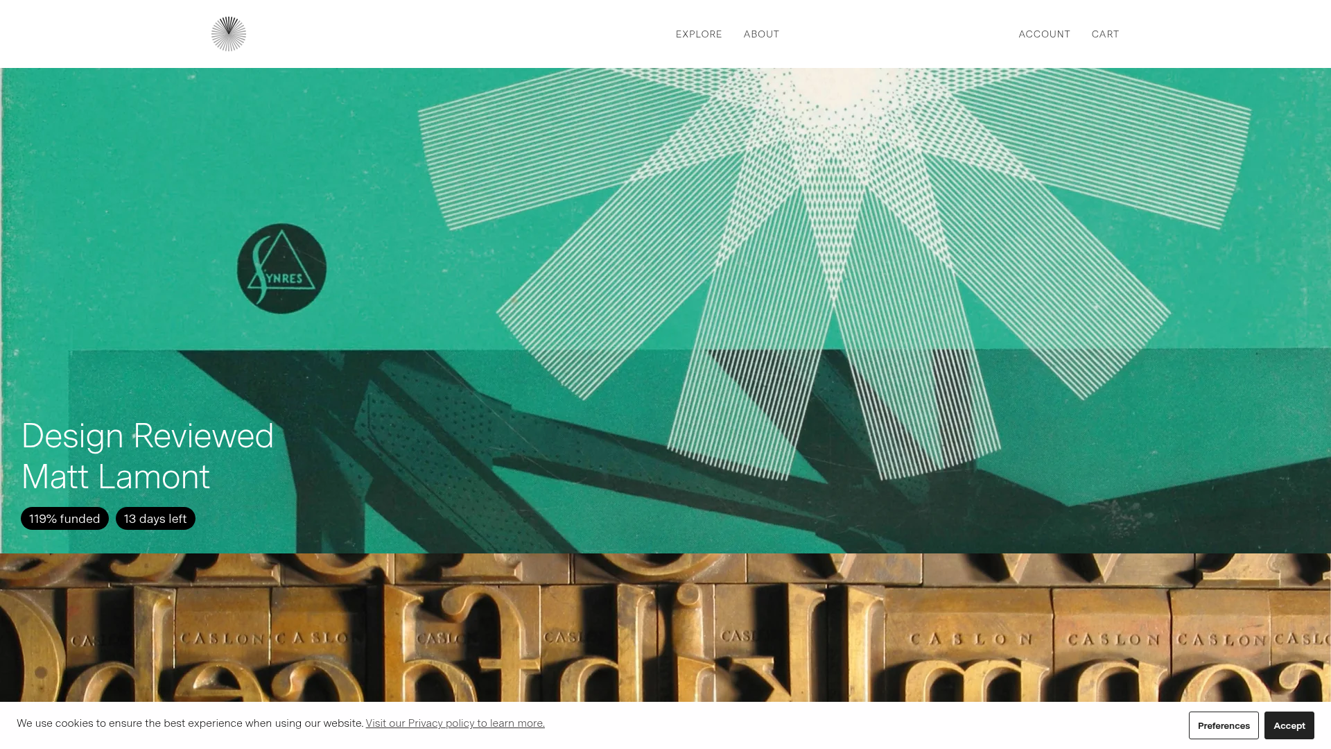
Volume Crowdfunding Book Gallery
A minimalist editorial storefront featuring full-width high-resolution image cards, status pills for campaign progress, and a clean typography-focused navigation layout.
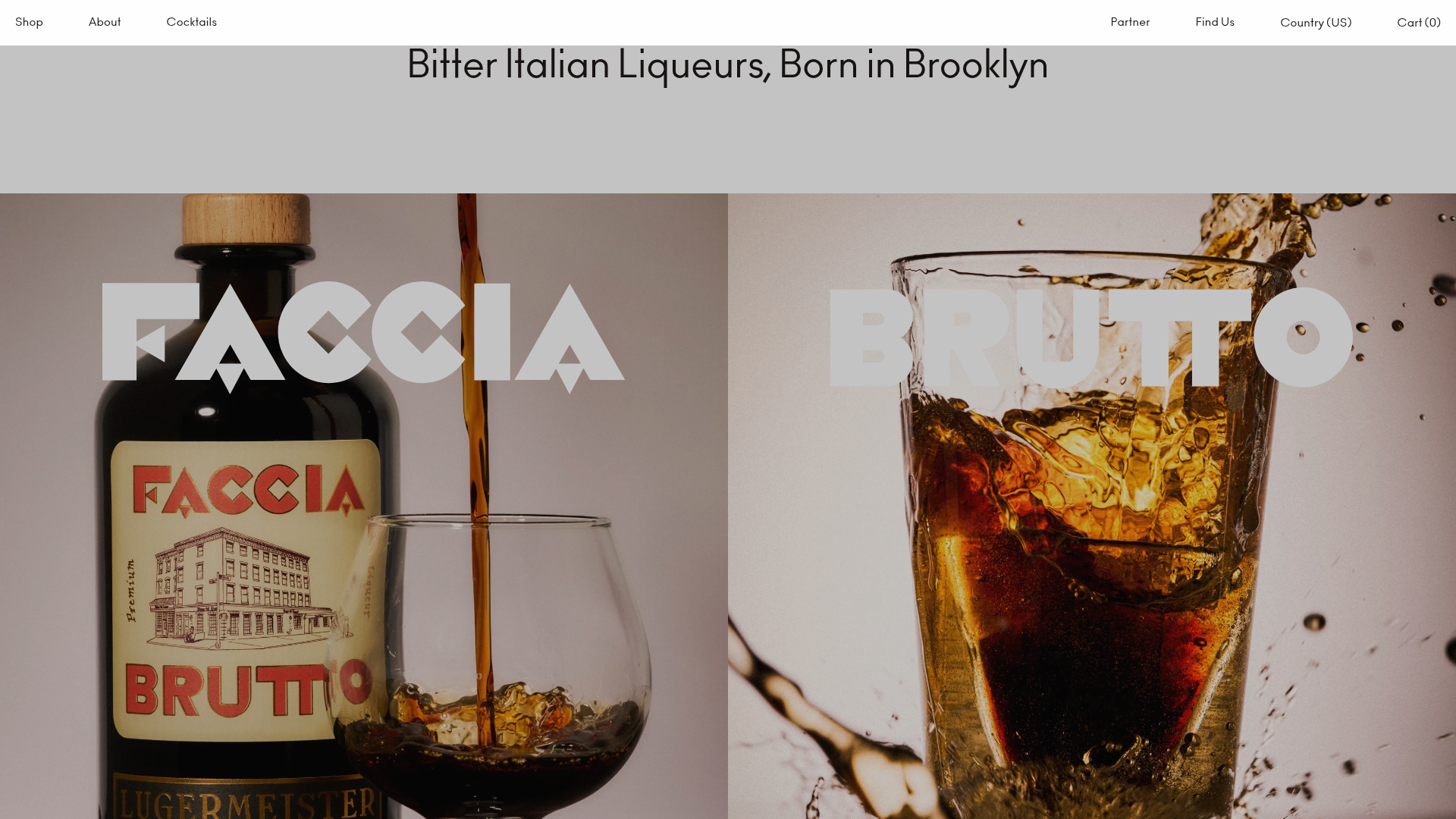
Faccia Brutto Spirits E-commerce Showcase
A refined Shopify layout featuring a split-hero landing, monochromatic bento grid product layouts, and a slide-out cart interaction with a heavy focus on typography-driven design.
