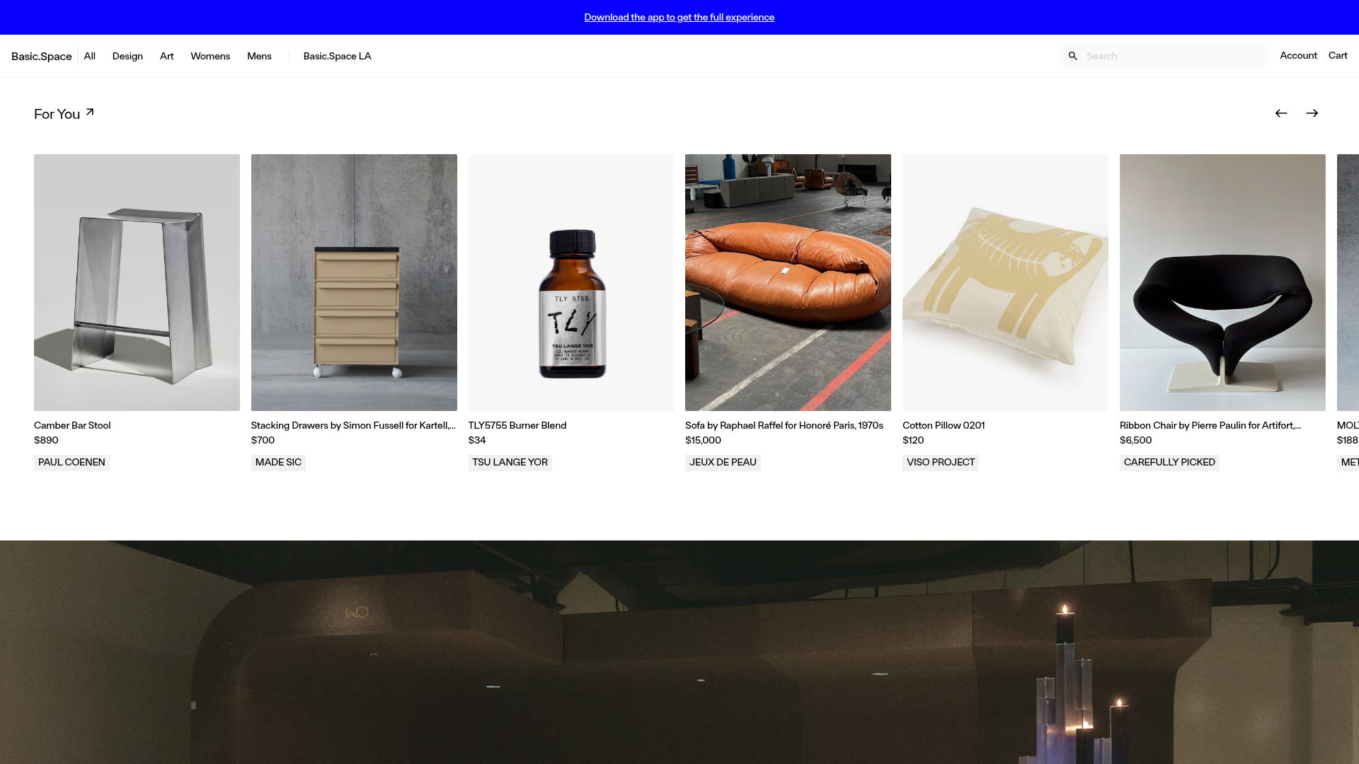
Basic.Space E-commerce Gallery Clone
A minimalist product marketplace featuring a clean sticky navigation bar, nested flyout menus, and a horizontally scrollable product carousel with hover-state image switching.
Overview
Basic.Space is a minimalist e-commerce platform that expertly balances high-end art gallery aesthetics with a functional marketplace. It is an excellent reference for builders wanting to showcase curated, premium products using a high-contrast, spacious layout that prioritizes high-resolution imagery and clear typography.
Design System
- Color Palette & Visual Hierarchy: The system is rooted in a high-contrast monochromatic base (#FFFFFF and #000000) with a signature high-energy blue (FY Blue) used for hover states and links. Visual hierarchy is established through ample white space and consistent padding, allowing product images to serve as the primary visual focus.
- Typography: The site uses a clean, geometric sans-serif (evidenced by classes like
ftb-medium-14andftb-20). Text is used sparingly, primarily in uppercase for labels (e.g., brand names in light gray boxes) and sentence case for product titles. - Page Structure: The layout starts with a sticky, multi-layered navigation bar, followed by horizontally scrollable product carousels ("For You") and full-bleed hero sections. It then transitions into specialized collection blocks that use background images with semi-transparent overlays.
- Reusable Components:
- Sticky Nav: Features a nested flyout menu system with tertiary levels (e.g., Womens -> Accessories -> Belts).
- Product Cards: A square/portrait aspect ratio card (
aspect-[4/5]) that features a clean label for the seller/brand at the bottom. - Search Overlay: A sophisticated search input that, upon focus, triggers a full-page content overlay using Tailwind-style utility classes.
- Interaction & Motion: The standout pattern is the hover-triggered image swap in product cards (
group-listing-card-hover:block), which provides a dynamic look at products without user clicks. Carousels utilizeHorizontalPaginationhooks for smooth X-axis scrolling. - Mobile Behavior: The site shifts to a 2-column grid or single-column scroll on mobile. Navigation collapses into a hamburger menu, and search expands into a full-height utility view to maintain usability on small screens.
- Implementation Clues: Built with a utility-first CSS approach (Tailwind CSS) and Phoenix LiveView, as indicated by the
phx-attributes and class naming conventions likeflex,hidden, andpx-6.
Use Cases
- Who should clone this: This pattern is ideal for boutique retailers, luxury fashion brands, or independent art galleries who need to present items as "finds" rather than just commodities.
- Product Remixing: While built for furniture and fashion, this layout effectively hosts any high-visual-interest products like skincare, high-tech gadgets, or vinyl records.
- Remix Directions: Builders can adapt the blue accent to a brand-specific primary color or replace the square-grid product cards with staggered masonry layouts to lean further into an "editorial" feel.
- Clone Scope: For a quick win, clone the horizontal scrollable carousel and the hover-state image switching for product cards. For a full project, the deep-nested navigation architecture is a robust foundation for complex catalogs.
Related Inspirations

Context Gallery High-End Furniture Landing Page
A minimal editorial layout featuring a multi-column product carousel, designer biographies with image-text pairings, and a magazine-style content grid for curated design stories.

Glein Minimalistic Bento Grid eCommerce
A clean, modular layout using a bento-style responsive grid of text teasers and large-scale product imagery for lookbooks and collection browsing.

Ashley & Co Lifestyle E-commerce
An elegant Shopify-based storefront featuring a split-screen animated hero, horizontal ticker-tape collection carousel, and dynamic mega-menus with scent-specific color switching and image previews.
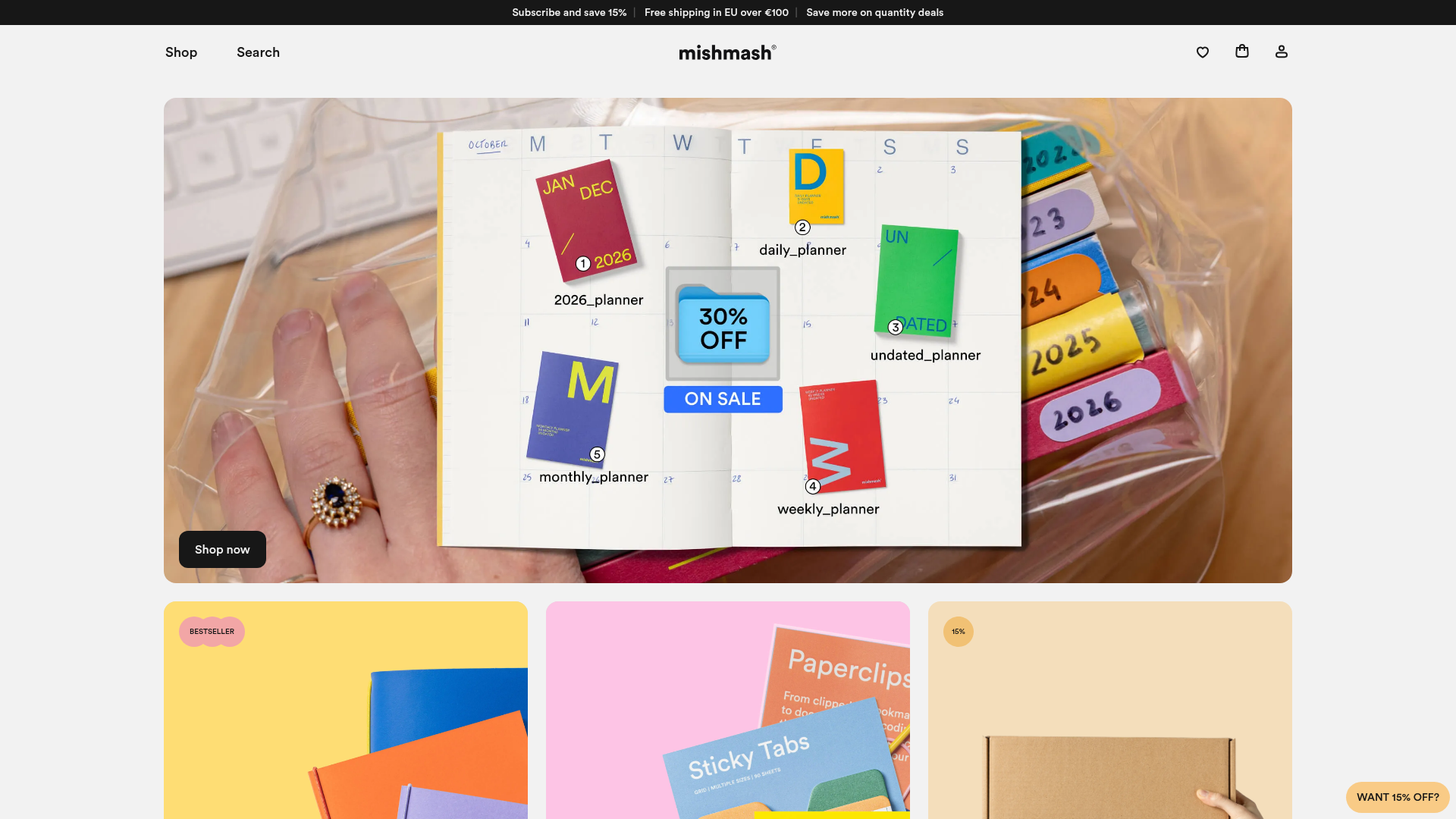
Mishmash Stationery E-commerce Layout
A clean retail template featuring rounded image grids, a multi-column comparison section with custom iconography, and a responsive products carousel.
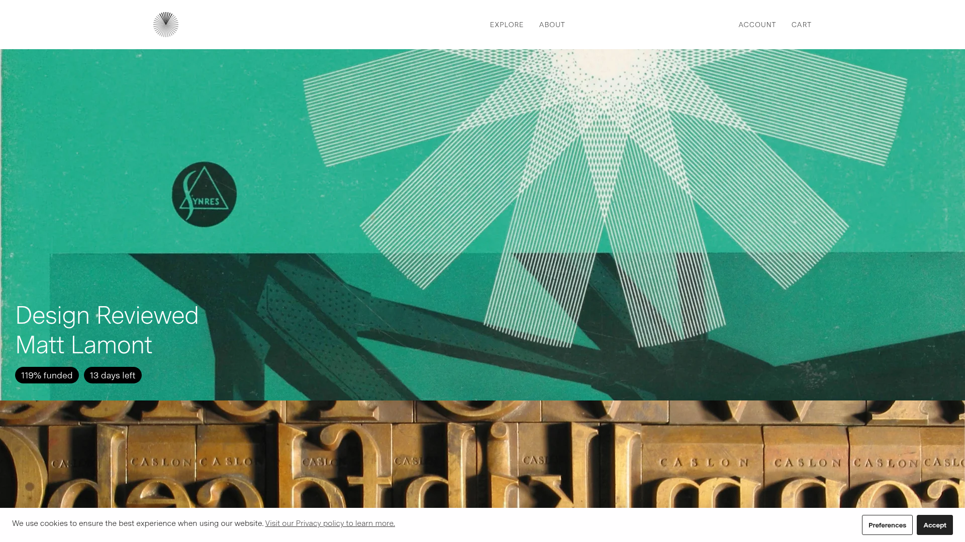
Volume Crowdfunding Book Gallery
A minimalist editorial storefront featuring full-width high-resolution image cards, status pills for campaign progress, and a clean typography-focused navigation layout.
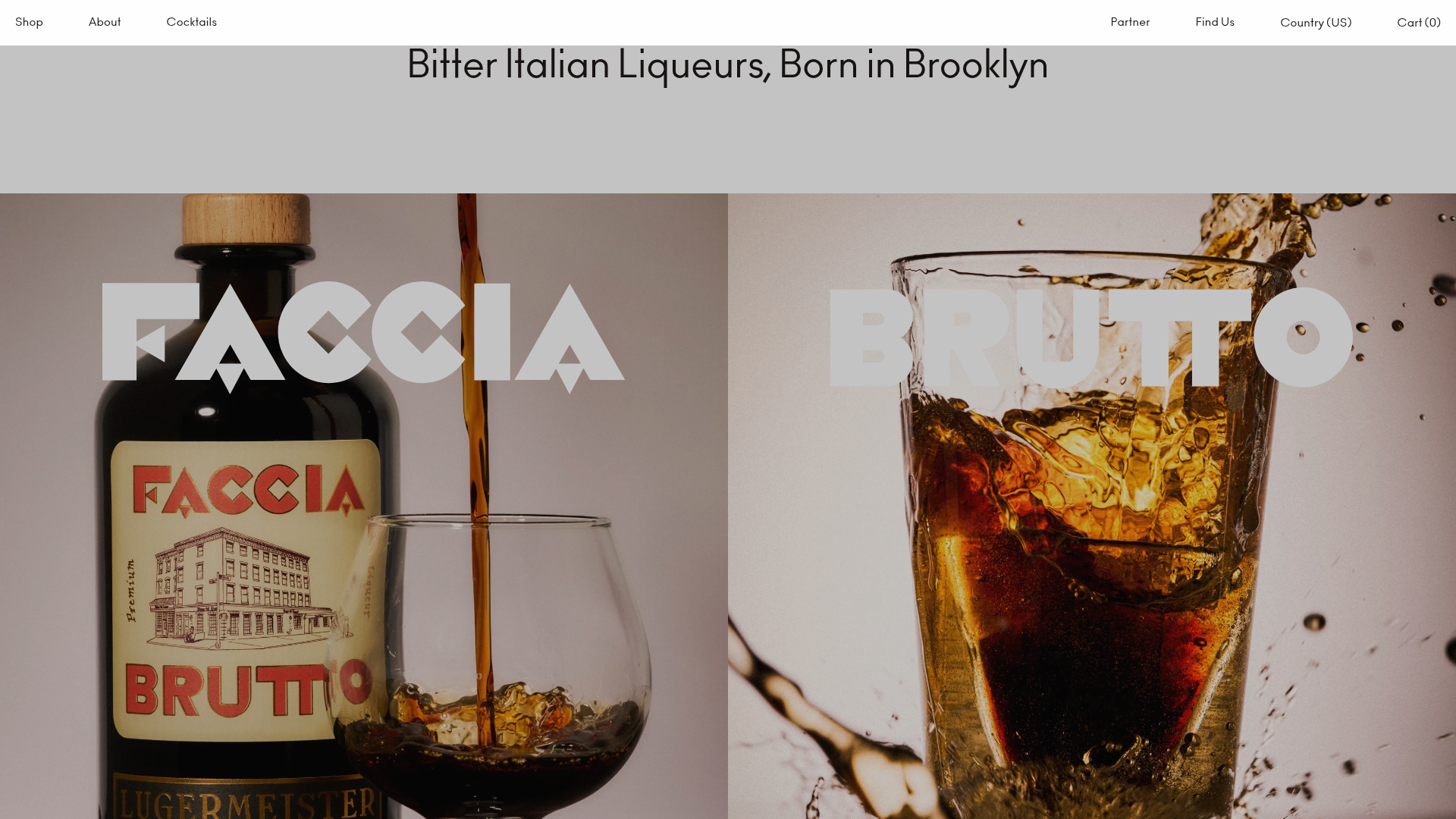
Faccia Brutto Spirits E-commerce Showcase
A refined Shopify layout featuring a split-hero landing, monochromatic bento grid product layouts, and a slide-out cart interaction with a heavy focus on typography-driven design.
