Miranda Biondi Minimal Maintenance Page
A single-image centered layout suitable for a simple coming-soon page or minimalist landing page using a basic HTML table for vertical and horizontal alignment.

Overview
This is a minimalist 'Under Construction' or brand placeholder page featuring a single centered graphic via an HTML table layout. It is a strong reference for builders who need a fool-proof, cross-client compatible landing page that ensures perfect vertical and horizontal centering with zero external dependencies.
Design System
- Color Palette and Visual Hierarchy: The design uses a high-contrast binary scheme consisting of a solid #FFFFFF (white) background and a single centered image. Professional white space is the primary design element, focusing all user attention on the central logo.
- Typography System: No text is rendered as live HTML; all branding and messaging are embedded within the image asset itself.
- Page Structure and Section Flow: The structure is a single-cell grid. The page consists of a 100% width and height table container that serves as the viewport frame, with a single table row (
<tr>) and cell (<td>) to hold the content. - Reusable Components: The core component to clone is the legacy HTML table centering trick. By using
height="100%"on the table andalign="middle"plusalign="center"on the cell, the layout achieves centering that works in every browser and email client since the 1990s. - Interaction and Motion: No interactive states (hover, transitions, or scroll effects) are present in this minimal implementation.
- Responsive/Mobile Behavior: The design is inherently fluid; since the table cells use percentage-based widths and heights, the logo will remain centered regardless of device orientation or aspect ratio.
- Implementation Clues: The HTML utilizes inline attributes (
width="100%",align="center") rather than CSS classes, indicating a focus on maximum compatibility and simplicity.
Use Cases
- Who should clone this pattern: Developers needing a quick, robust maintenance mode page or a temporary brand placeholder while a main site is under development.
- What products can remix it effectively: Personal portfolios, luxury brand landing pages, or pre-launch marketing sites for mobile apps.
- Practical remix directions: Replace the static
.pngwith a high-resolution SVG logo for sharper display on retina screens, or add a single CTA link below the image for a newsletter signup. - Suggested clone scope: This is a full-page clone. The code is so concise that the entire structure (table, row, and cell) should be reused as a single layout template.
Related Inspirations
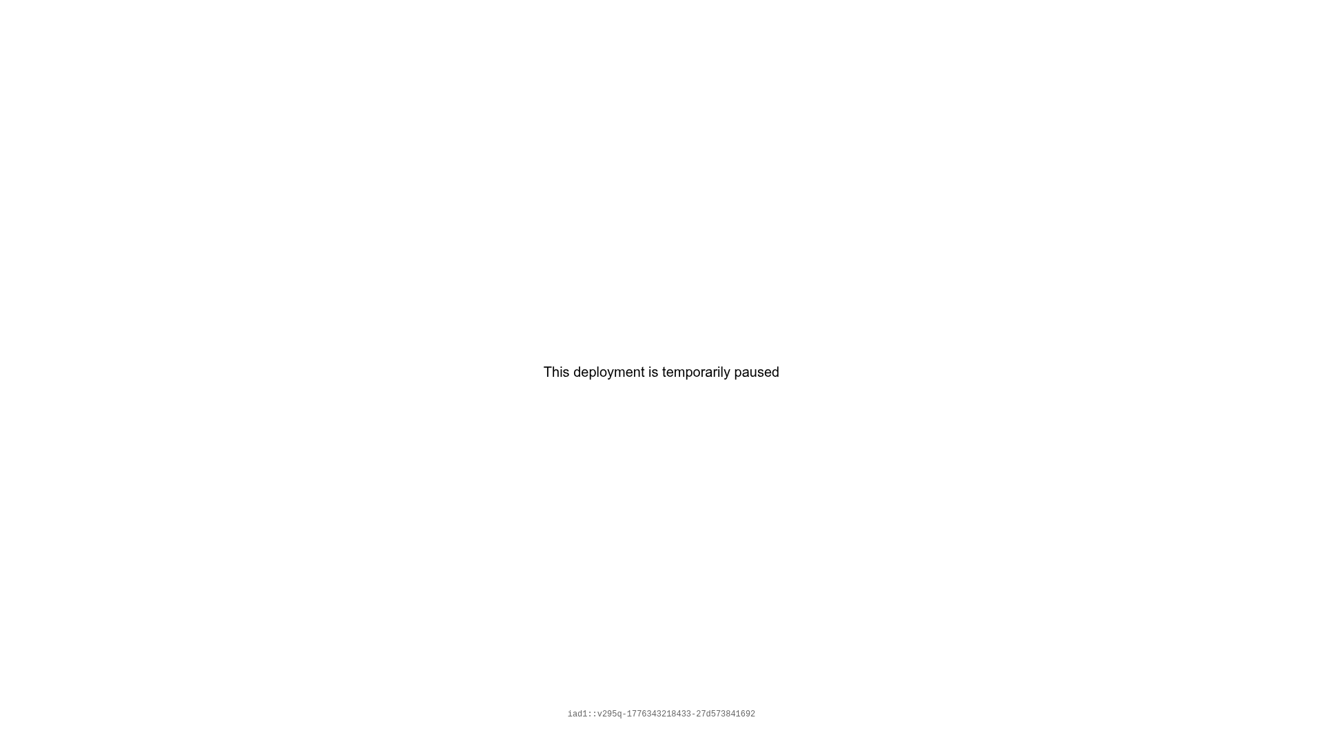
Read.cv Paused Deployment Placeholder
A minimalist, centered status page layout with a simple text message and system ID footer.

Egstad Minimalist Design Portfolio
A refined Nuxt.js portfolio featuring bold variable typography, interactive canvas elements, and a clean grid-based layout for showcasing design work.
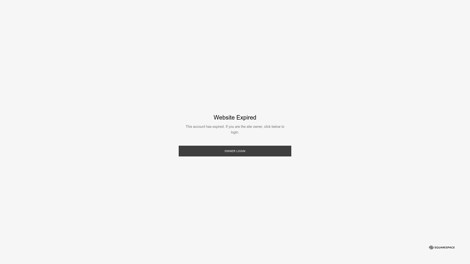
Squarespace Website Expired System Page
A minimal system error page layout featuring a centered modal box, dark overlay, and a primary call-to-action button for account recovery.

Bruno Arizio Designer Portfolio Website
A minimalist creative director portfolio featuring a clean typographic layout, side-aligned image previews, and high-contrast spacing patterns suitable for luxury or design showcases.

Isla Beauty Skincare E-commerce Store
A clean Shopify-based storefront featuring a split-hero landing page, a step-by-step product system carousel, and a split-screen testimonial section with localized product image sidebars.

Christopher Doyle Agency Portfolio Layout
A minimalist, typography-led portfolio featuring a wide-margin grid system, smooth fade-in animations, and simple image-focused project cards.
