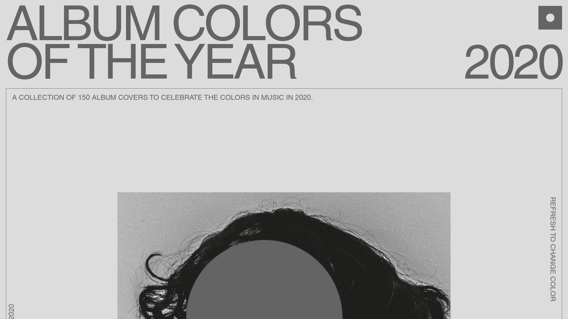
Album Colors 2020 Curation Gallery
A minimalist, scroll-based grid layout featuring sticky typography, color-coded item cards with hex code copy buttons, and smooth parallax interaction patterns.
Overview
This site is a high-end curation gallery that showcases 150 album covers from 2020 through a color-centric lens. It is an excellent reference for builders looking to implement minimalist portfolios or product catalogs that focus on high-quality imagery, smooth scroll interactions, and a clean, typographic-heavy aesthetic.
Design System
- Color Palette & Visual Hierarchy: The system uses a neutral greyscale background (approx.
#646464or light grey) as a canvas. Hierarchy is established through extreme contrast in font sizing and vibrant accent colors derived from the album art. Each card dynamically displays its dominant color's hex code, creating a functional tool for designers within the curation. - Typography: The site utilizes a bold, grotesque-style sans-serif for the headline (
ALBUM COLORS OF THE YEAR) with tight letter spacing. Smaller, all-caps metadata and body text maintain the minimalist Swiss-design feel. Horizontal and vertical text orientations (e.g., "REFRESH TO CHANGE COLOR" on the-right edge) break traditional layout rules to add editorial flair. - Page Structure:
- Header Section: Large sticky typography accompanied by a brief site intro and a "refresh" CTA.
- Grid Gallery: A staggered grid layout where items occupy varying widths (standard vs
--biggerclasses in HTML). - Hall of Fame/Featured Section: A spotlight on "Album Cover of the Year" and "Color of the Year."
- Social & Playlist Footer: Streamlined links to external platforms like Spotify and Apple Music.
- Reusable Components:
- Color Cards: Specifically the
sc-eCssSgcontainers which house an image placeholder, artist name, and a hex-code copy button. - Sticky Typography Sidebar: A side-scrolling or fixed-position vertically oriented text element (
sc-hBEYos). - Floating Year Marker: The large, translucent "2020" background element.
- Color Cards: Specifically the
- Interactions: Based on the HTML data attributes (
data-scroll-speed), the site uses the Locomotive Scroll or AsScroll library for smooth parallax effects. Elements move at different speeds while scrolling, creating depth. Buttons include a clipboard copy function (data-clipboard-text). - Implementation Clues: The HTML reveals a React-based structure using Styled Components (indicated by the
sc-class prefixes). The layout uses a custom smooth-scroll wrapper (asscroll-container).
Use Cases
- Who should clone this: Creative directors, agencies, and photographers wanting a high-fashion, editorial archive for their work.
- Effective Remixes:
- Design Tooling: Adapt the grid into a color palette generator or brand asset library.
- E-commerce: Remix the grid for a minimalist streetwear or home decor catalog where visual color filtering is more important than text descriptions.
- Year-in-Review: Use the sticky header and parallax grid for annual reports or "Best of" year-end lists.
- Practical Directions: To remix, swap the monochromatic grey background for a vibrant brand color. Developers can reuse the staggered grid logic to handle mixed-aspect ratio images without breaking the visual flow.
- Clone Scope: Start with a full-page clone to capture the sophisticated interplay between the smooth scrolling and sticky typography, as the interaction design is as important as the visual layout.
Related Inspirations
Waka Waka Furniture Portfolio
A minimalist design showcase featuring a custom cursor, parallax scroll effects, and a vertical image grid layout for high-end product displays.
Sociotype Foundry Design Showcase
A high-concept typography site featuring large-scale horizontal hero sliders, interactive type testers, and an offset grid layout for case studies and font previews.
Unknown Untitled Design Portfolio Screensaver
A minimalist, experimental design agency website featuring an automated image-layout screensaver and oversized typography overlays.
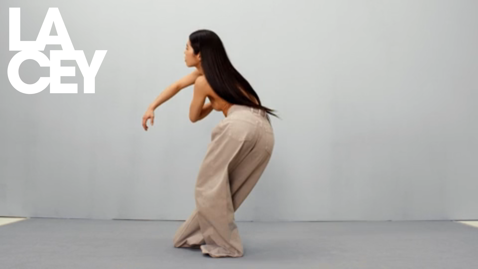
Lacey Studio Creative Portfolio Portfolio
A minimalist director's portfolio featuring a full-screen video hero, masonry-style grid with auto-playing video previews, and a sophisticated overlay navigation system.
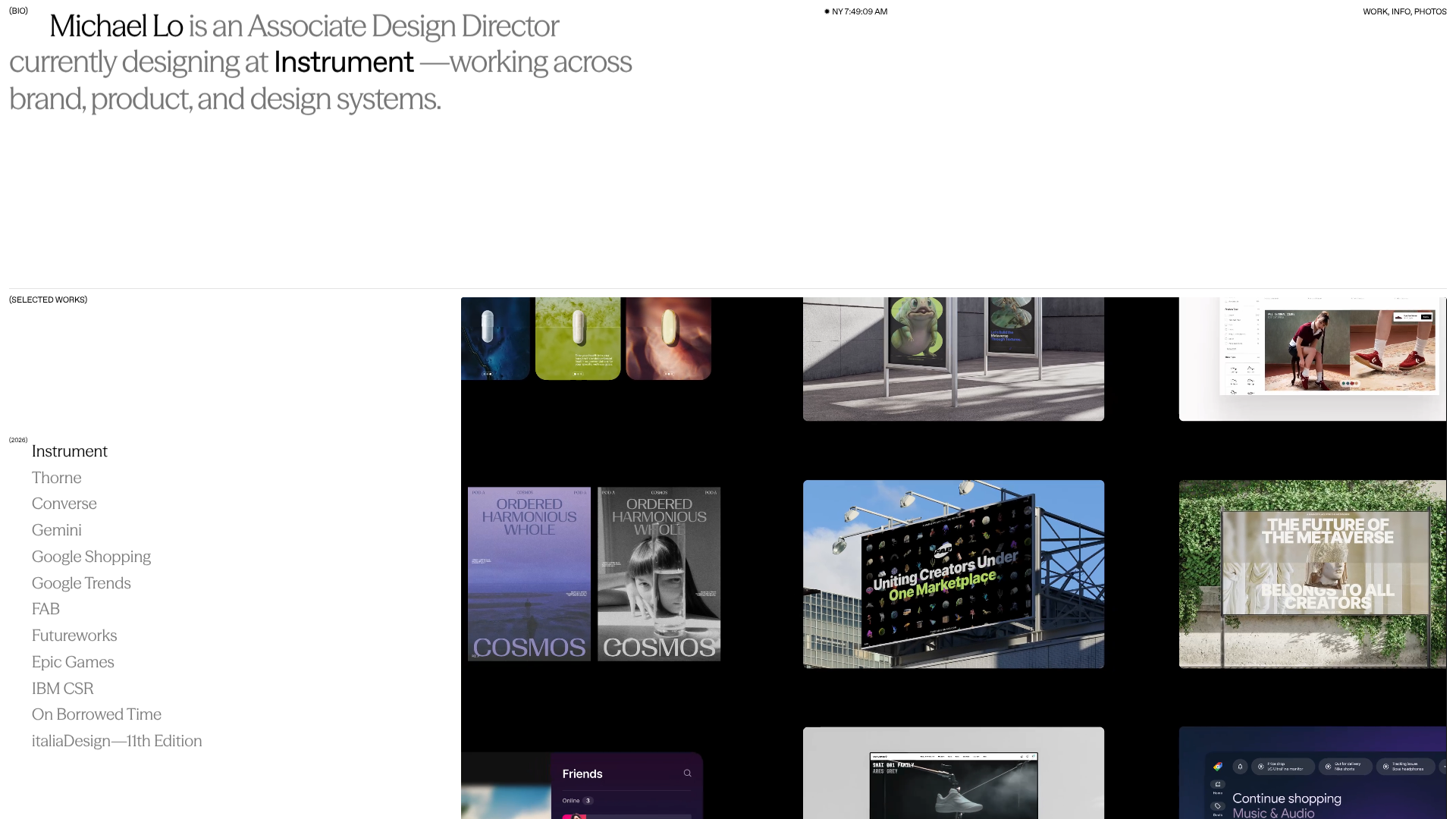
Michael Lo Interactive Portfolio
A high-end design portfolio featuring a horizontal scroll layout, dynamic typography remix controls, and a dual-view project index with sleek grid and list transitions.
Linus Rogge Portfolio Work Gallery
A minimal, full-bleed case study grid featuring sticky typography, mix-blend-mode text effects, and integrated Mux video layers for high-impact project showcases.
