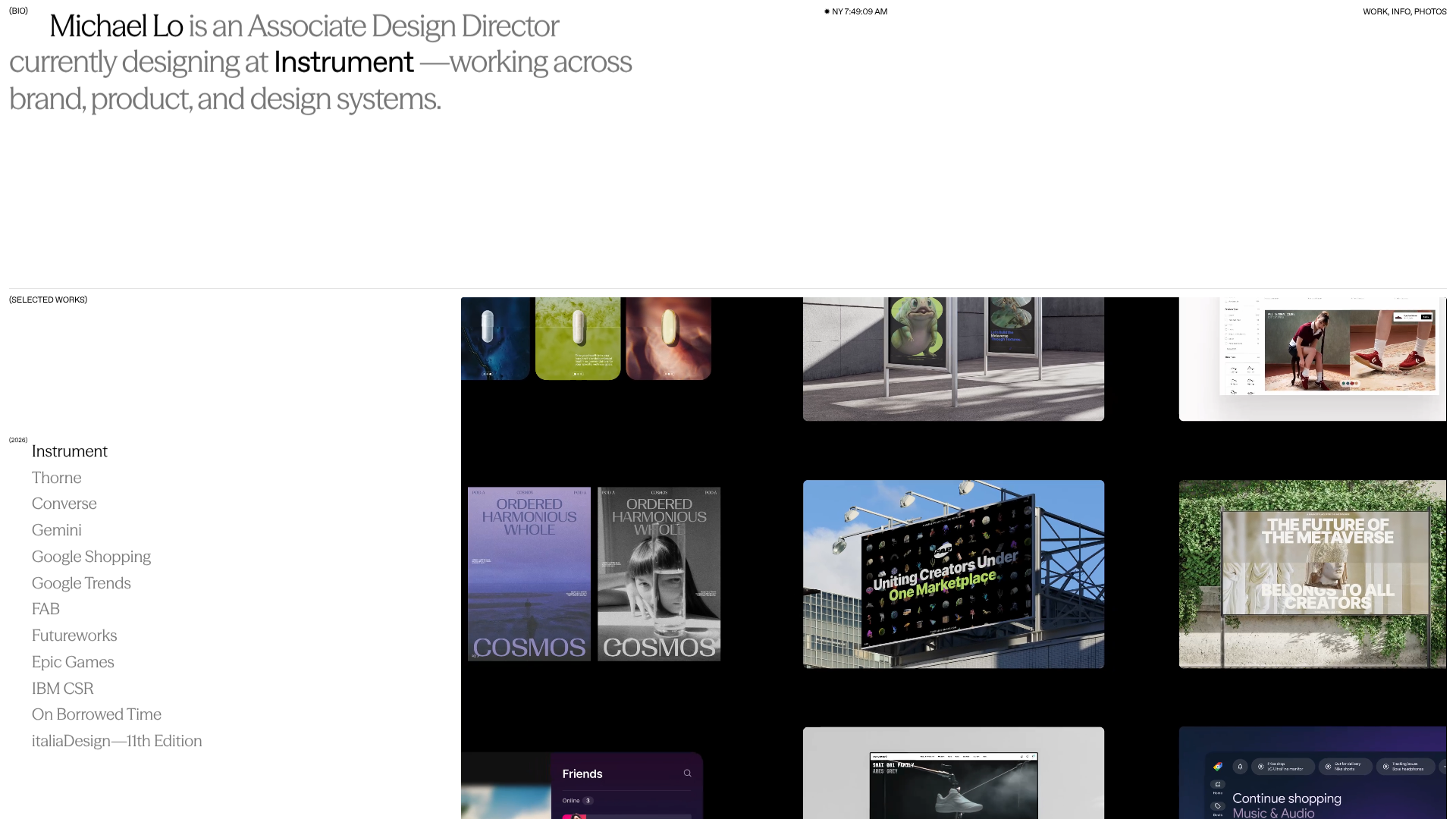
Michael Lo Interactive Portfolio
A high-end design portfolio featuring a horizontal scroll layout, dynamic typography remix controls, and a dual-view project index with sleek grid and list transitions.
Overview
Michael Lo’s portfolio is a sophisticated example of an experimental, high-end interactive experience that blends horizontal scroll dynamics with a dual-view project index. It is an excellent clone reference for designers wanting to implement variable typography controls and fluid grid-to-list transitions within a minimalist aesthetic.
Design System
- Color Palette & Visual Hierarchy: A high-contrast monochrome base (white backgrounds with black text) allows the colorful project thumbnails and video previews to dominate the visual weight. The layout uses a strict grid with horizontal rules (
rule top-rule,rule bottom-rule) to anchor segments. - Typography System: The site heavily utilizes the Newsreader variable font. It features a large, expressive hero header with variable weight and optical sizing. Small, monospaced-style labels are used for technical metadata (e.g.,
(SELECTED WORKS),2026,WEIGHT), creating a professional, archival feel. - Page Structure & Flow: The desktop experience is built on a horizontal
trackwithin aboard-shell. It flows from a high-level Bio introduction to a multi-state Portfolio section (containing a List view, a Grid view, and a focused Billboard frame), concluding with Contact links and a interactive Typography lockup at the footer. - Reusable Components:
- Project Row/Grid Card: Media-rich containers (
figure.grid-card) that support both lazy-loaded images and auto-playing muted videos. - Interactive Type Controls: A set of sliders and a
(REMIX)button that adjust CSS variables (--hero-newsreader-wghtand--hero-newsreader-opsz) in real-time. - Index List: A clean, data-heavy project directory (
index-body) perfect for information-dense portfolios.
- Project Row/Grid Card: Media-rich containers (
- Interaction Design: The site uses a "snap" interaction model (
data-interaction="snap") for section transitions. Hovering over the project list dynamically updates the largebillboard-framemedia, creating an immediate visual connection between the text and work. - Responsive Behavior: The HTML structure includes a dedicated
responsive-trackfor tablet and mobile, which collapses the horizontal desktop elements into vertical sections and simplifies the grid into single or double-column rows.
Use Cases
- Portfolio for Creative Directors & Studios: Ideal for showcasing diverse projects ranging from brand identities to product design where high-quality media is the priority.
- Agency Landing Pages: The "Index View" is highly effective for agencies with long client lists who want to provide a searchable, organized directory without sacrificing visual impact.
- Variable Font Showcases: Developers looking to implement real-time variable font manipulation can clone the
hero-variation-controlslogic. - Remix Directions:
- Quick Clone: Reuse the
index-bodyandbillboard-framelogic to create a sleek, interactive "Services" or "Product Features" section. - Brand Adaptation: Swap the serif Newsreader for a bold sans-serif to shift the vibe from "archival/editorial" to "tech/startup."
- IA Adaptation: The horizontal track can be adapted into a linear product roadmap or a chronological brand history timeline.
- Quick Clone: Reuse the
Related Inspirations
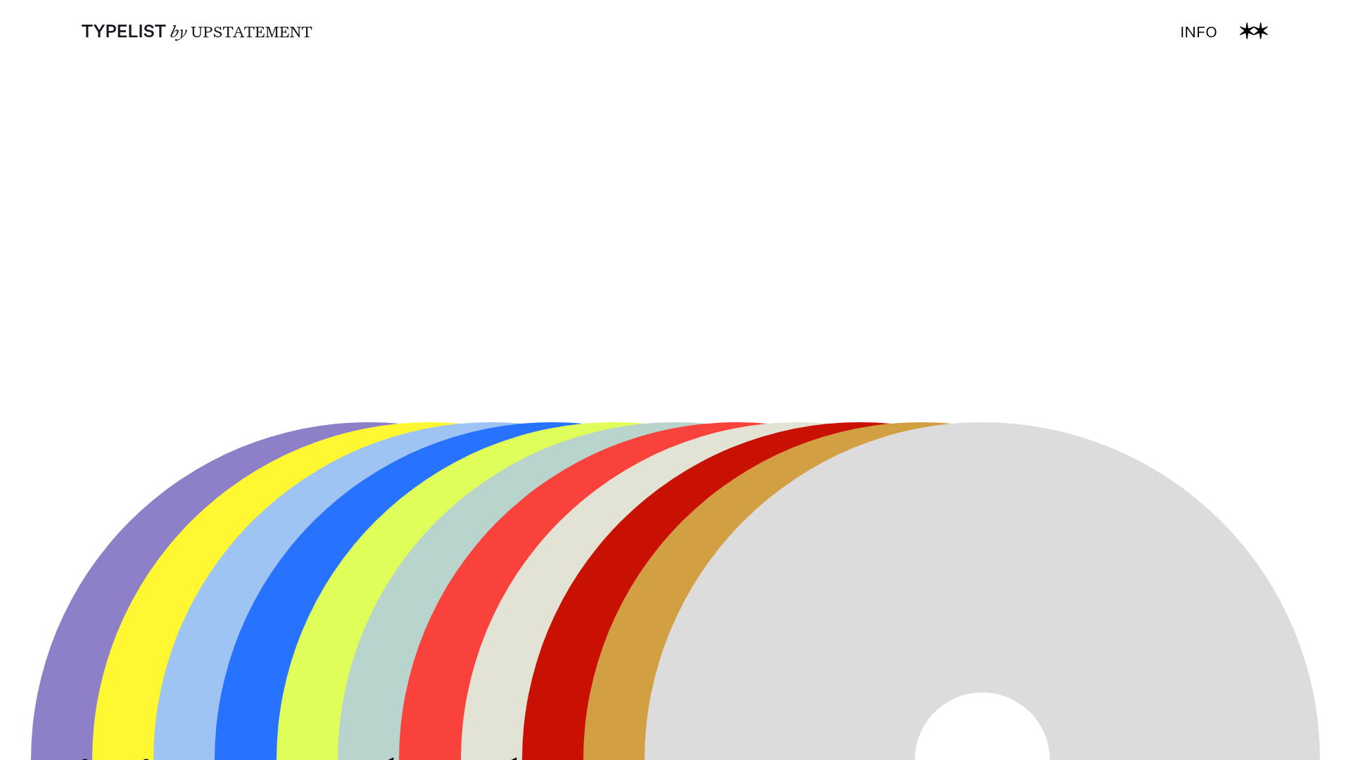
Typelist Typography Playlist Gallery
A creative curated gallery featuring a horizontal overlapping disc navigation pattern, CSS-driven theme color shifting, and smooth page transitions for showcasing design collections.
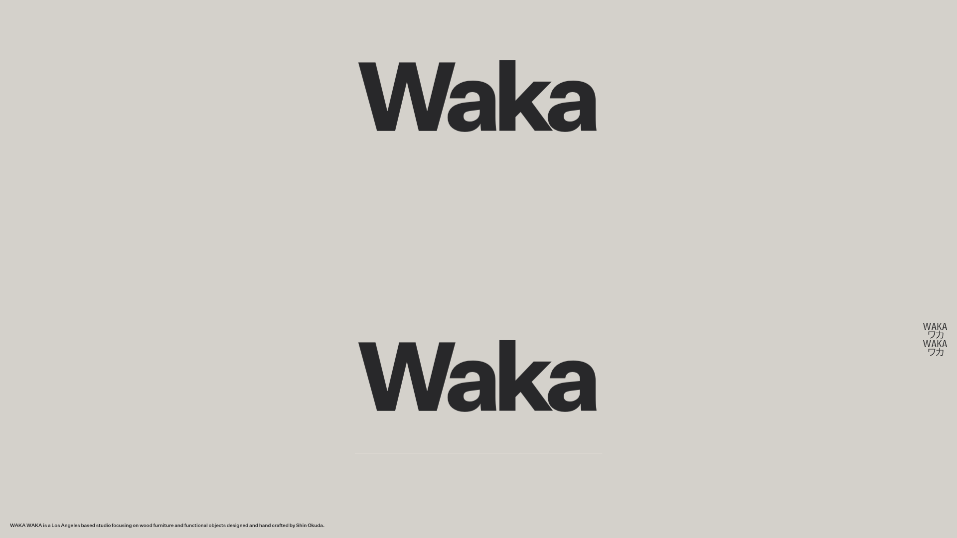
Waka Waka Furniture Portfolio
A minimalist design showcase featuring a custom cursor, parallax scroll effects, and a vertical image grid layout for high-end product displays.
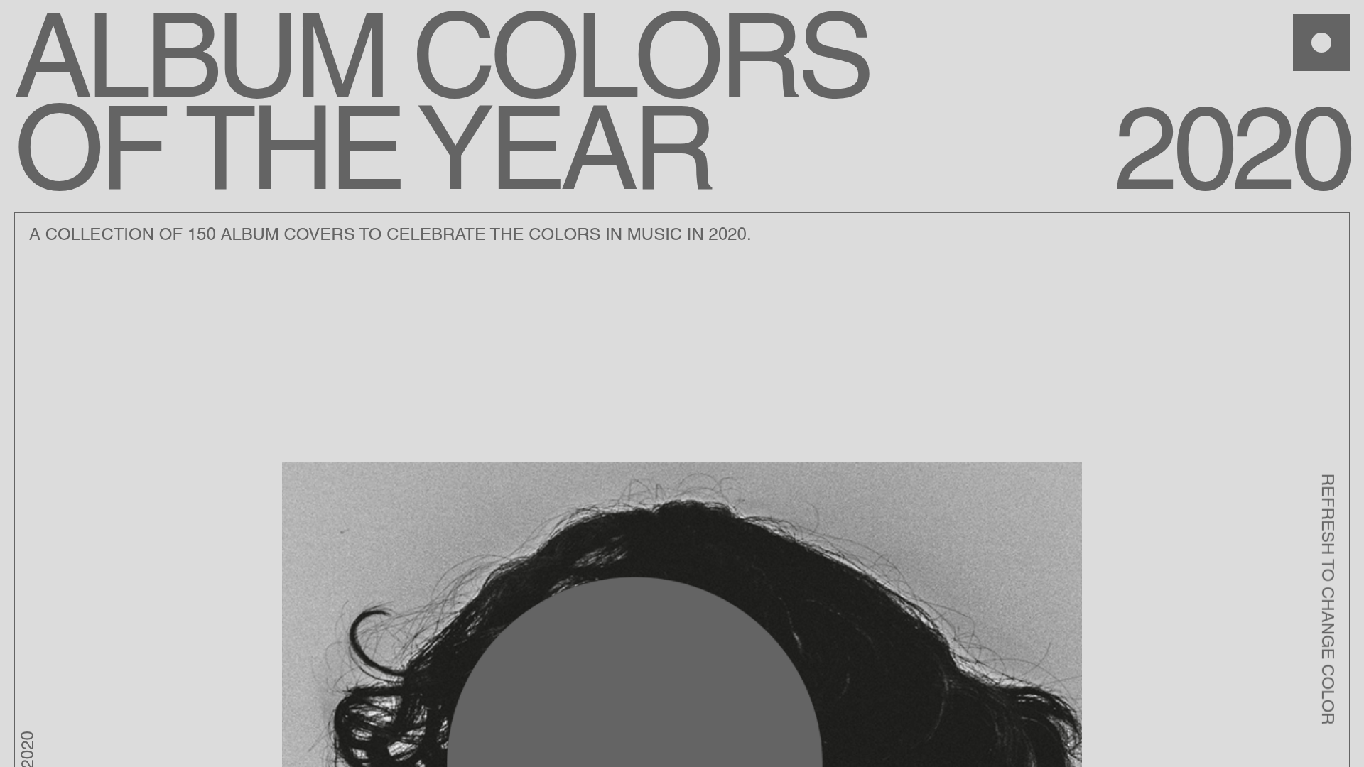
Album Colors 2020 Curation Gallery
A minimalist, scroll-based grid layout featuring sticky typography, color-coded item cards with hex code copy buttons, and smooth parallax interaction patterns.
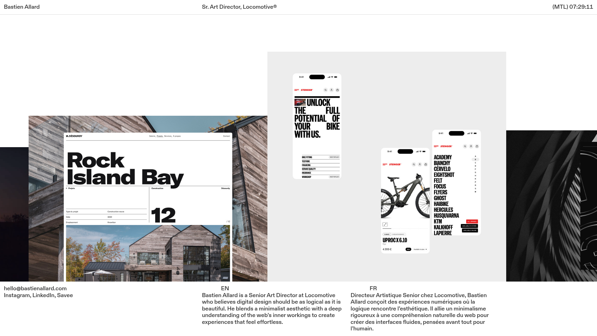
Bastien Allard Minimalist Portfolio Gallery
A clean, horizontal marquee-based portfolio featuring a sticky header/footer layout, digital clock integration, and responsive bilingual text columns for minimalist art director showcases.
KeepsMeSane Minimalist Portfolio Slideshow
A dark, ultra-minimalist landing page featuring a full-screen image slideshow with fixed corner text labels and a subtle progress bar.
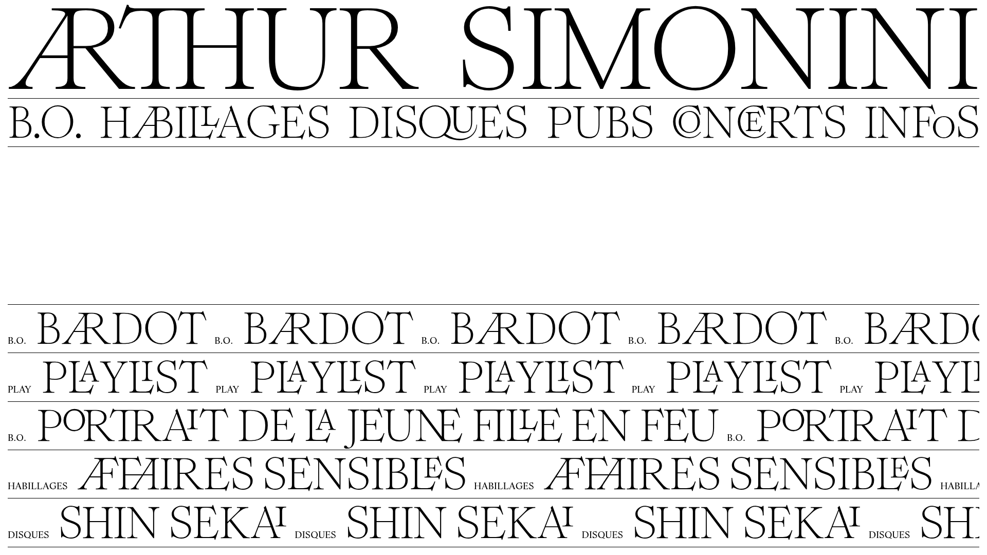
Arthur Simonini Portfolio Layout
A minimalist musical portfolio featuring horizontal scrolling marquees, a persistent audio player with progress tracking, and expandable accordions for project credits and video reels.
