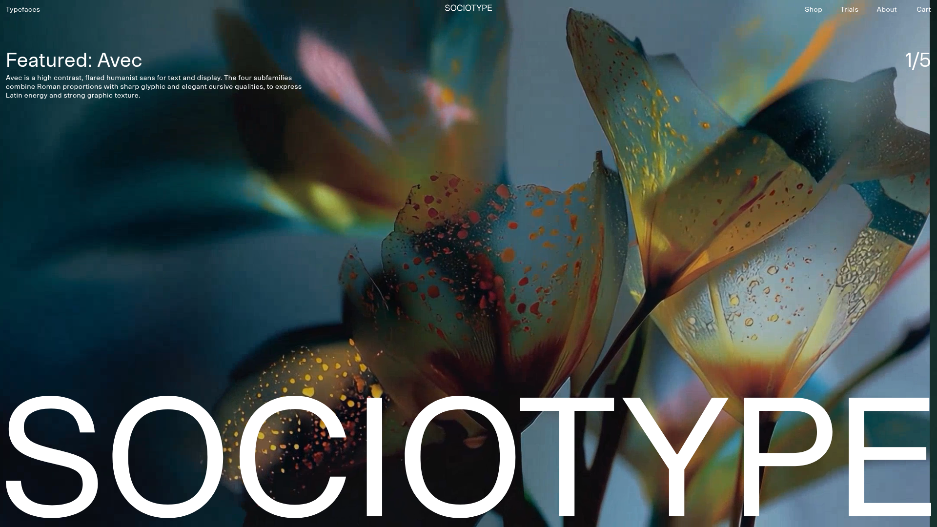
Sociotype Foundry Design Showcase
A high-concept typography site featuring large-scale horizontal hero sliders, interactive type testers, and an offset grid layout for case studies and font previews.
Overview
Sociotype Foundry is a high-concept typography website that blends editorial aesthetics with interactive digital tools. It is an exceptional reference for cloning due to its sophisticated horizontal and vertical grid-based layout, oversized typography, and seamless integration of immersive video backgrounds with live-editable text components.
Design System
- Color Palette & Visual Hierarchy: The site uses a neutral foundation (white, black, and subtle greys like
warm-greyorlighter-gray) to allow font textures and high-saturation floral imagery to stand out. Hierarchy is established through massive contrast in type scale, where font names serve as both branding and navigational anchors. - Typography System: As a foundry site, the typography is the core product. It features a varied scale from massive hero headlines (approx. 336px) to micro-scale technical data. Styles include high-contrast flared sans-serifs (Avec), grotesque families (Onsite), and modern serifs (Gestura).
- Page Structure & Section Flow: The layout follows a modular
FontIntroductoryBlockpattern. A full-screen video hero slider (using Swiper.js) transitions into alternating sections. Each section contains a mega-scale live type tester, a left-aligned navigation list for styles, and an offset grid of specimen images and descriptions. - Reusable Components:
- Interactive Type Tester: A
contenteditable="true"sandbox that allows visitors to test fonts live. - Themed Blocks: Reusable section wrappers with CSS variables managing dynamic spacing and background colors (
theme="beige",theme="dark"). - Captioned Image Swipers: Carousel blocks with lettered controls (A, B, C, D) used for font specimens.
- Interactive Type Tester: A
- Interaction & Motion: The site utilizes horizontal sliders for feature showcases and subtle dotted-underline hover effects on text links. Scroll-based theme switching suggests a smooth transition between section background colors.
- Implementation Clues: The HTML reveals a Nuxt.js framework using Vue.js components. It utilizes CSS custom properties for responsive font sizes (e.g.,
--desktop-font-size) and grid spans (e.g.,span-12,t:span-8) for an asymmetrical layout.
Use Cases
- Who should clone this: Independent type foundries, high-end editorial magazines, and design agencies looking for a portfolio structure that feels like a physical art book.
- Effective Remixes: Creative portfolios can swap font previews for project titles, using the type-tester logic to allow users to interact with brand assets. The editorial grid is ideal for fashion lookbooks or architecture firms.
- Remix Directions: Keep the asymmetrical grid logic but simplify the navigation for mobile; adapt the background video logic to use high-quality cinemagraphs relevant to a different industry (e.g., product manufacturing or luxury hospitality).
- Clone Scope: A high-impact "Quick Section Clone" of the
FontIntroductoryBlockis highly recommended for any landing page needing a bold, interactive feature area. A full-page clone is best for sites with deep content hierarchies and a strong focus on visual storytelling.
Related Inspirations
Patrick Miller Photography Portfolio Template
A minimalist, full-bleed photography portfolio featuring a split-screen grid, scroll-triggered section transitions, and integrated Swiper.js image carousels for project galleries.
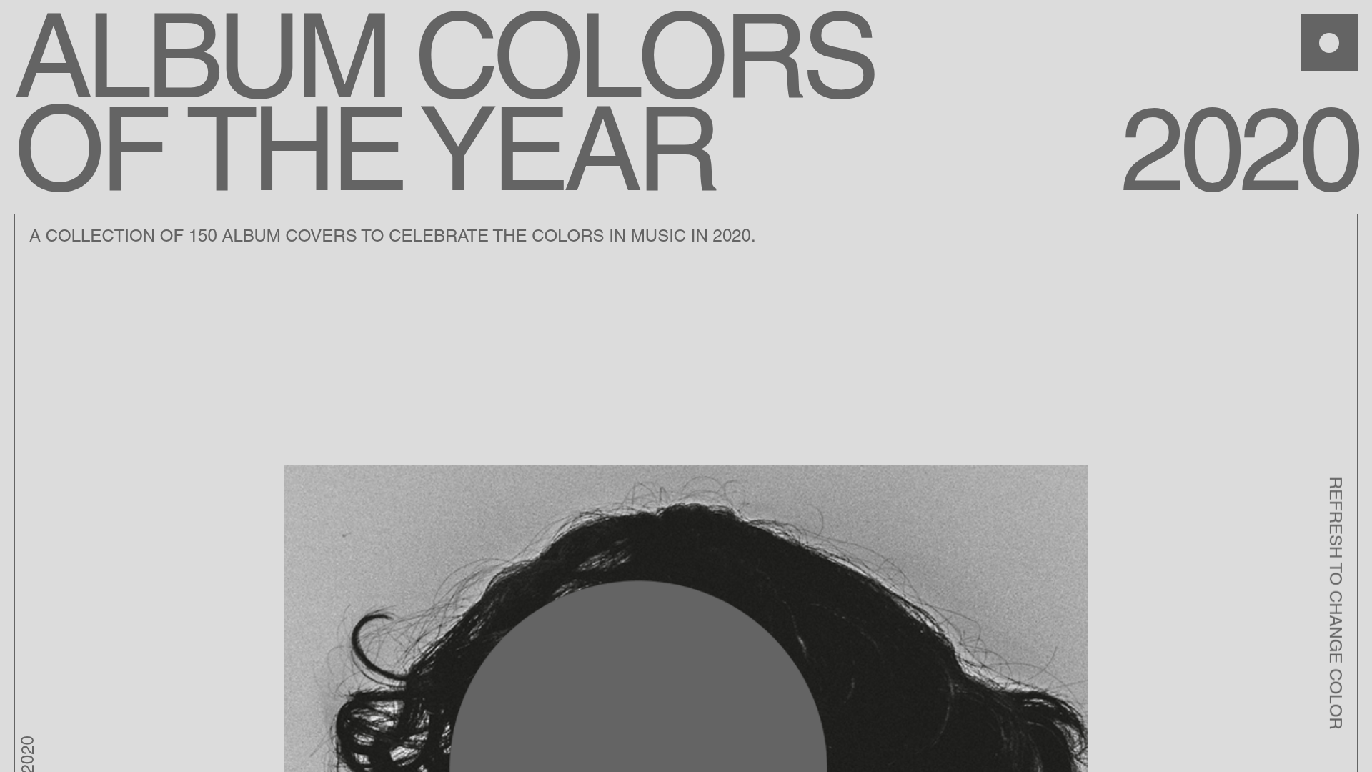
Album Colors 2020 Curation Gallery
A minimalist, scroll-based grid layout featuring sticky typography, color-coded item cards with hex code copy buttons, and smooth parallax interaction patterns.
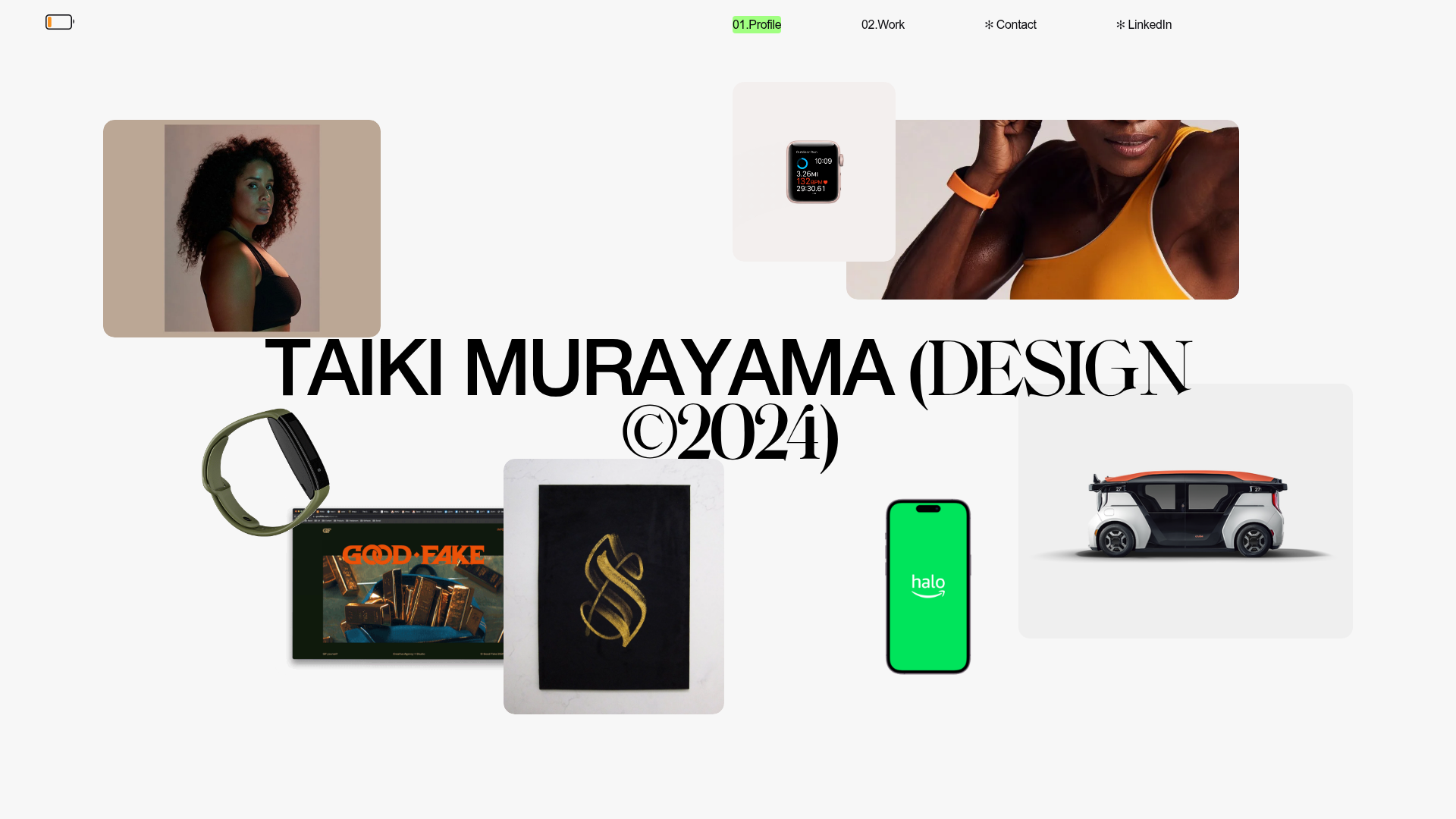
Taiki Murayama Portfolio Bento Grid
A minimalist designer portfolio featuring a dynamic bento-style layout for project imagery, integrated accordion project lists, and high-contrast typography.
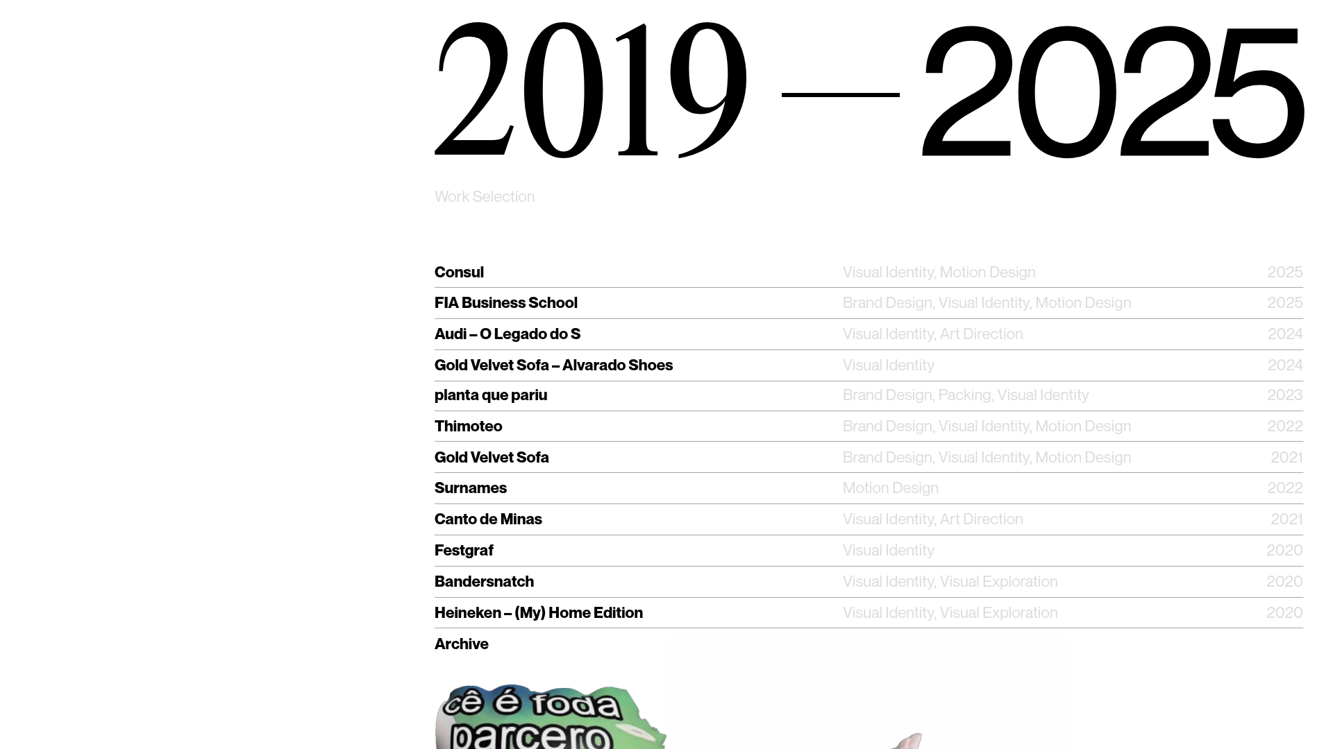
Gustavo Faria Minimalist Portfolio Index
A clean, list-based portfolio layout featuring hover-triggered image previews, a sticky sidebar with biography, and a typography-driven project archive.
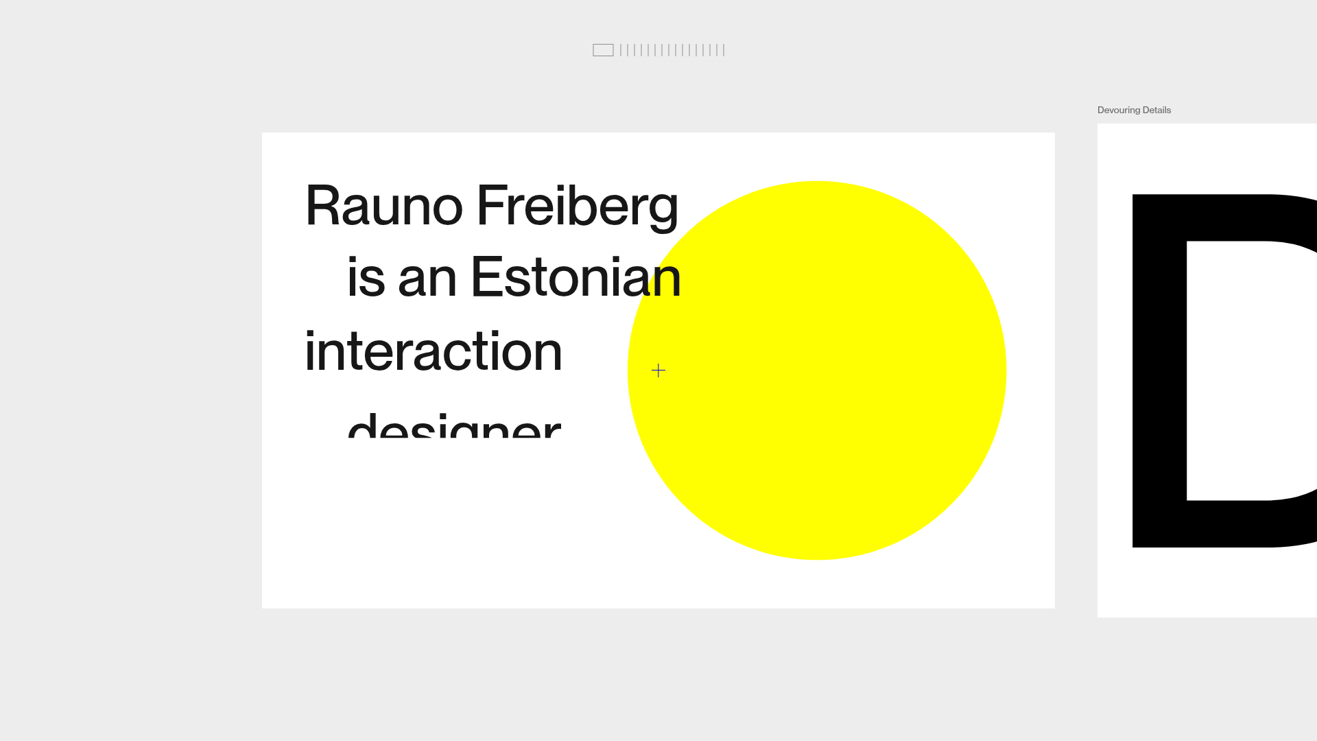
Rauno Freiberg Horizontal Scroll Portfolio
Minimalist horizontal deck layout featuring frame-based navigation, smooth clip-reveal text animations, and a top-bar progress minimap.
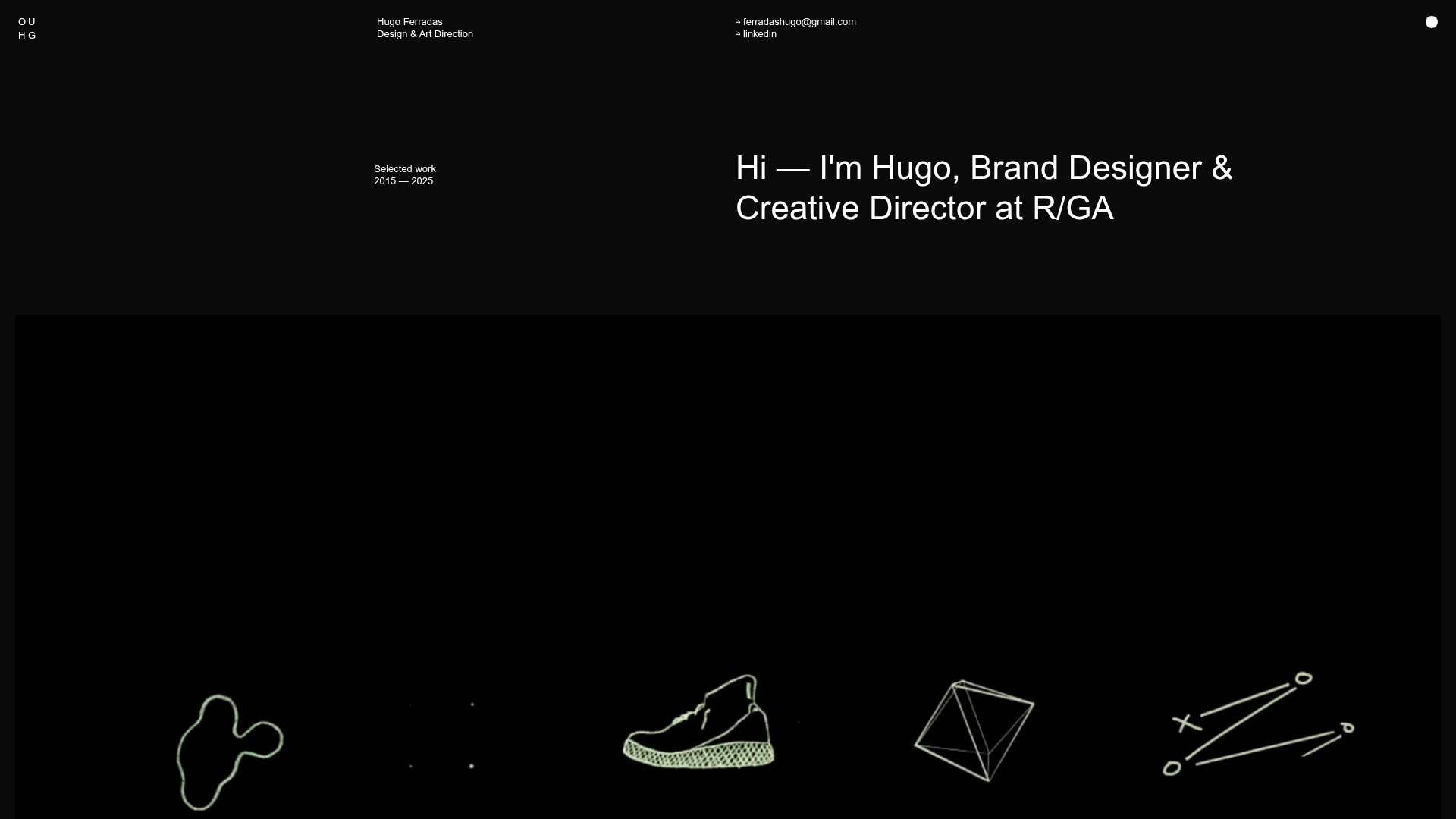
Hugo Ferradás Portfolio Site
A dark-themed portfolio featuring a creative director bio, sticky sidebar navigation, and a dynamic asymmetric grid of case study cards with animated hover reveals.
