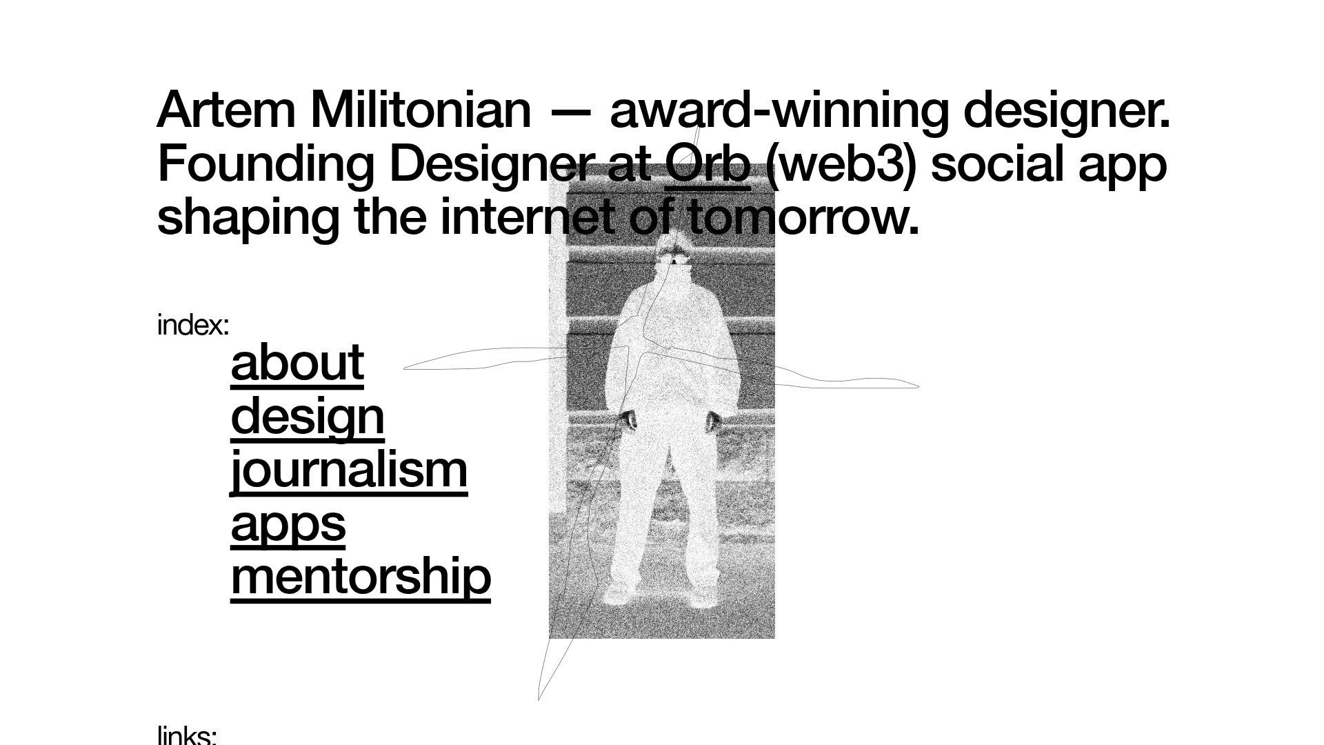
Artem Militonian Portfolio Landing Page
A minimalist, typography-focused designer portfolio featuring a layered grayscale hero image, staggered vertical navigation links, and a fixed header with utility data.
Overview
This project is a minimalist, high-impact portfolio landing page for a creative professional, designed with a focus on editorial typography and raw visual textures. It serves as an excellent reference for builders looking to create a personal brand presence that balances large-scale display text with a sophisticated, monochromatic aesthetic.
Design System
- Color Palette & Visual Hierarchy: The site utilizes a high-contrast grayscale palette (pure black
#000000on a white#ffffffbackground). Hierarchy is established through extreme variations in font size rather than color, with a primary large-scale introduction followed by secondary utility text. - Typography System: The design relies on a grotesque sans-serif (likely custom-loaded via
custom_87914in the HTML). It employs tight letter-spacing (-1.5px) for large headers to create an editorial look, while utility links and meta-data use a much smaller scale (8px to 34px) with wider letter-spacing (0.5px) for readability. - Page Structure: The layout features a fixed utility header containing location and version data, a central hero section with an overlapping grain-textured image, and a vertically staggered navigation menu. Below the fold, links are categorized under 'index' and 'links' labels using a clear vertical flow.
- Reusable Components:
- Utility Header: A four-column fixed bar at the top for metadata (location, version, platform credits).
- Staggered Text Links: Navigation items with standard and indented text alignments that create a rhythmic vertical scan.
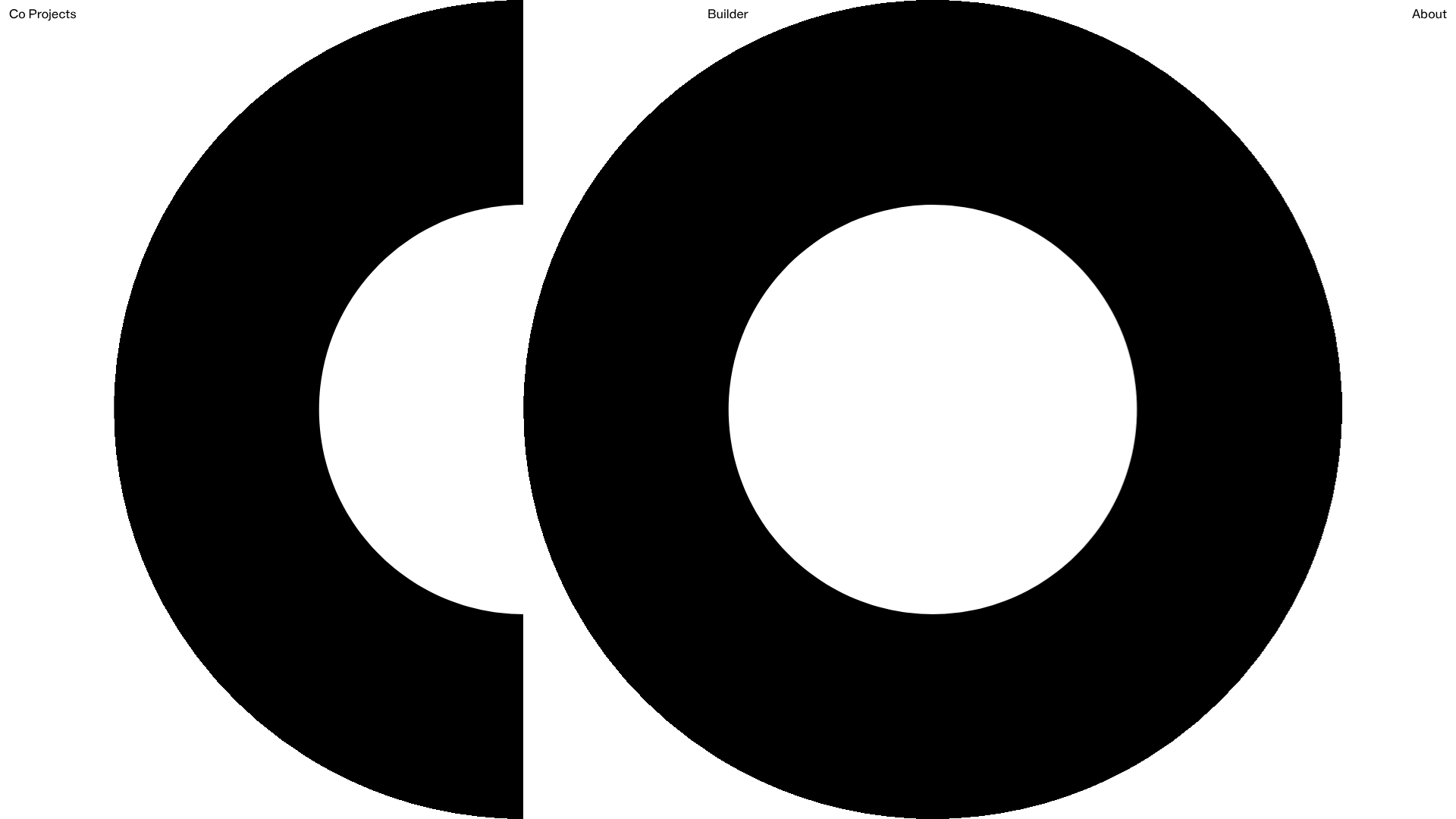
- Layered Hero: A multi-layered image stack (ID
677011b8...and677011a5...) with transparency and noise textures that sit behind and between text blocks.
- Interaction & Motion: Text links use a
fade-hoverinteraction characterized by subtle shadow changes (data-shadow-interactions="fade-hover"). The HTML indicates a vertical scroll container with accelerated scrolling for a smooth, app-like feel. - Implementation Clues: The site is built using Readymag, an no-code editorial tool. It uses absolute positioning within a scaled container (
zoom: 1.26984) to maintain precise layout ratios across different screen sizes.
Use Cases
- Who should clone this pattern: Creative directors, designers, and visual artists who want a "brutalist-lite" aesthetic that prioritizes their personal brand statement over a traditional project grid.
- Effective Remixes: This layout works well for design studios, fashion lookbooks, or high-end architectural landing pages where white space and typography carry the brand identity.
- Remix Directions:
- Info Architecture Adaption: Replace the 'index' section with a list of recent case studies or a services price list.
- Brand Style Swap: Transition from grayscale to a high-saturation duo-tone palette while keeping the oversized grotesque type.
- Visual Layering: Reuse the layered hero image logic (floating PNGs with transparency) to create a parallax-style depth effect even on static pages.
- Suggested Clone Scope: A quick section clone is recommended for the utility header and staggered navigation links, which can be easily integrated into any existing minimalist layout.
Related Inspirations
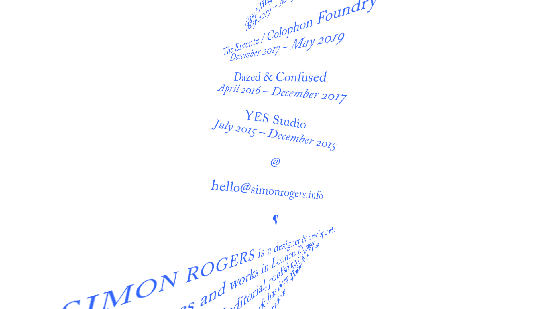
Simon Rogers Rotating Text Portfolio
A minimalist single-page layout featuring a CSS-transformed rotating text column with a repeating biography and career timeline sections.
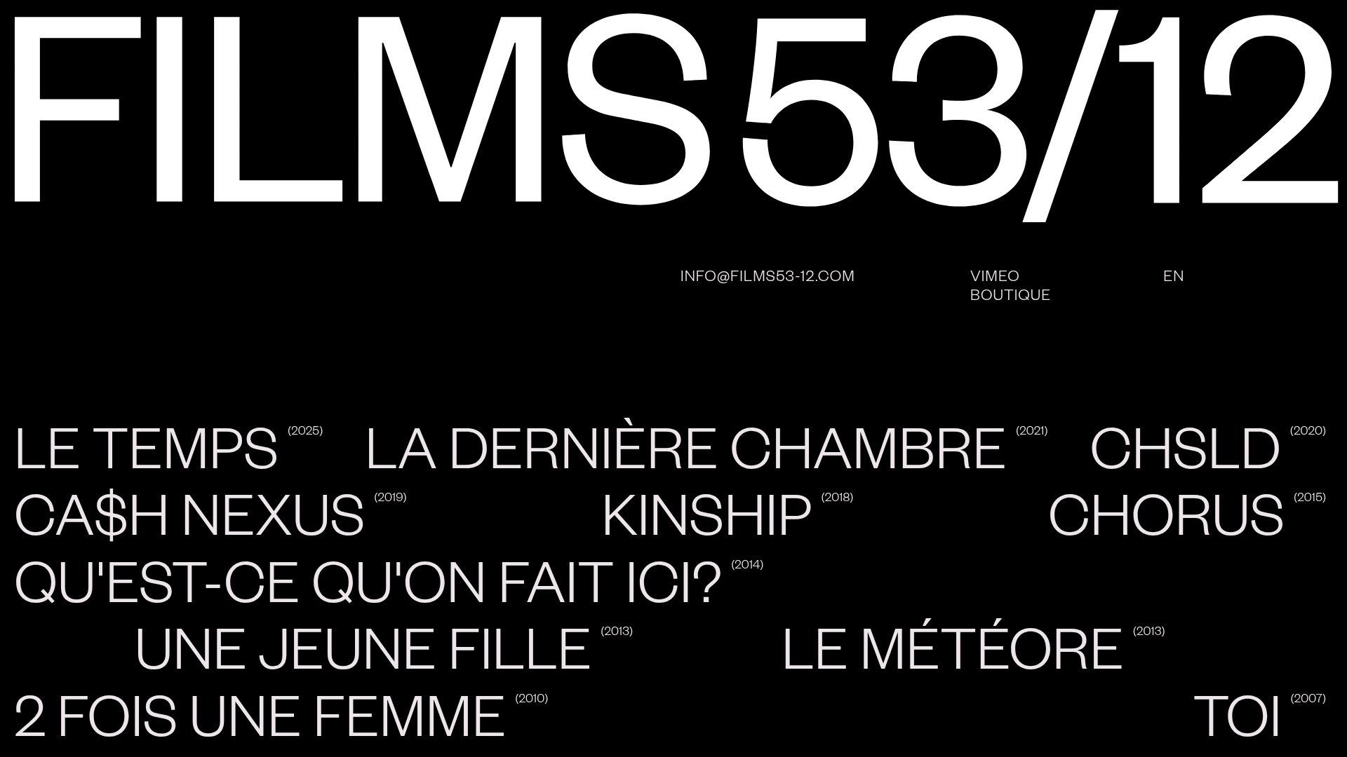
Films 53/12 Cinematographic Portfolio Layout
A minimalist dark-mode production site featuring a scattered typography grid, interactive hover-to-reveal image states, and a clean list-based film catalogue.
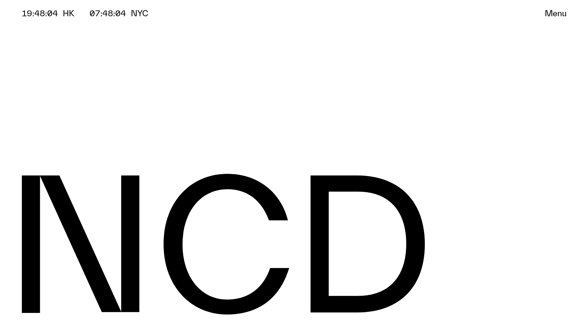
NCDA Architecture Studio Portfolio Template
A minimalist design featuring a bold typography splash screen, real-time dual-city clocks, and a discipline-based vertical scroll layout with hover-triggered overlays.
Co Projects Design Portfolio
Minimalist case study layout featuring a bold kinetic typography landing state, responsive staggered grid, sticky section headers, and a scroll-triggered image revealing interaction pattern.

Egstad Minimalist Design Portfolio
A refined Nuxt.js portfolio featuring bold variable typography, interactive canvas elements, and a clean grid-based layout for showcasing design work.

Bruno Arizio Designer Portfolio Website
A minimalist creative director portfolio featuring a clean typographic layout, side-aligned image previews, and high-contrast spacing patterns suitable for luxury or design showcases.
