Co Projects Design Portfolio
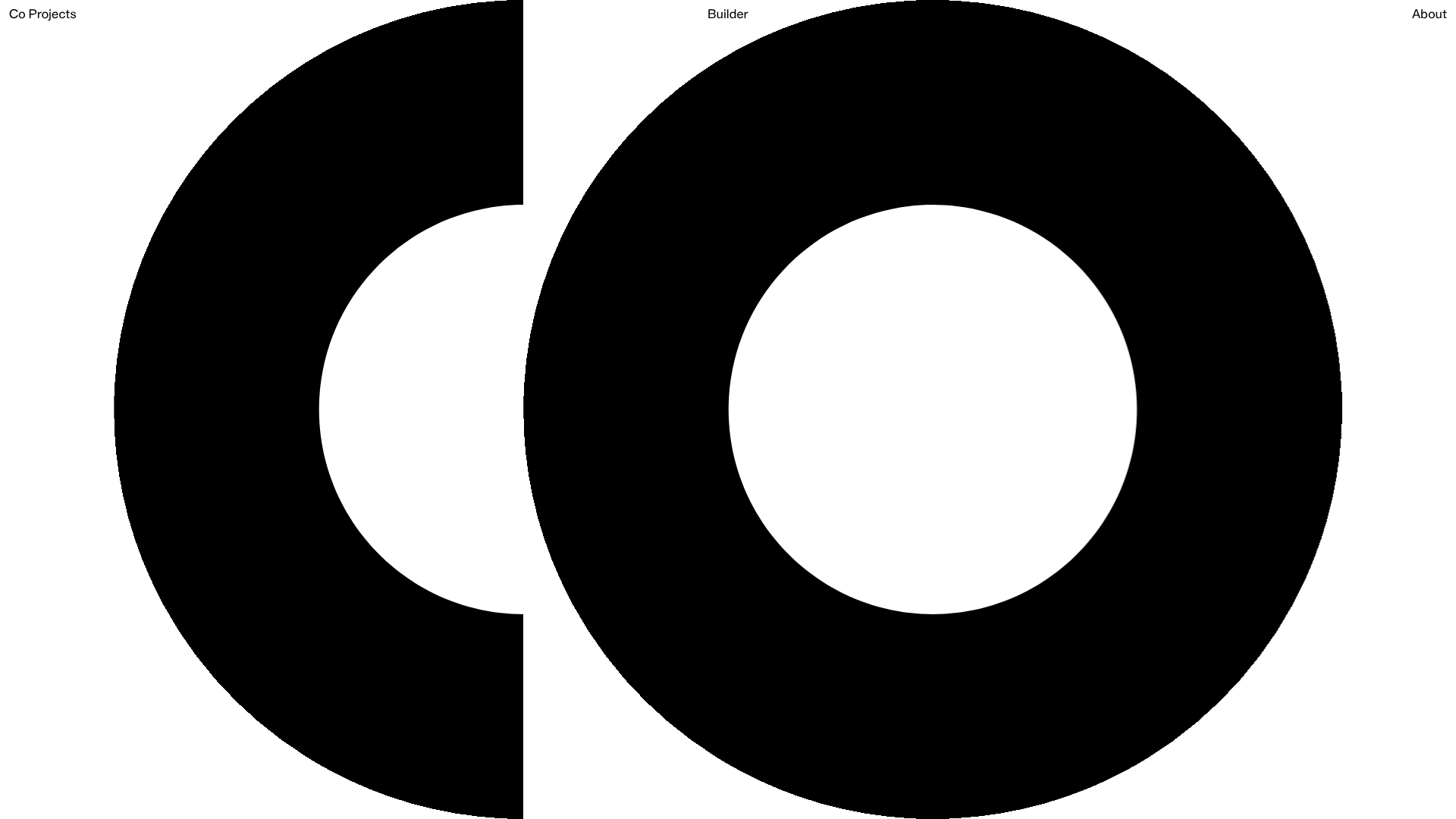
Minimalist case study layout featuring a bold kinetic typography landing state, responsive staggered grid, sticky section headers, and a scroll-triggered image revealing interaction pattern.
Overview
Co Projects Design Portfolio is a highly minimalist, editorial-driven website that prioritizes high-impact typography and staggered imagery to showcase industrial design case studies. It is an excellent clone reference for creatives seeking to build a professional archive that balances brutalist raw aesthetics with sophisticated, scroll-triggered storytelling.
Design System
- Color Palette & Visual Hierarchy: The site uses a high-contrast monochromatic base (pure black on white) with utility-focused accent colors like
selection:bg-orange-200. Hierarchy is established through extreme scale shifts—massive kinetic landing characters contrast with tiny, mono-spaced technical metadata. - Typography: A dual-layered system featuring a large-scale Sans-serif for section headers (reaching
text-7xlor6xlvia Tailwind classes) and a technical Monospaced font for photo credits, numbering, and descriptive captions to reinforce an industrial/architectural feel. - Structure & Flow: The initial state is a full-viewport landing screen with kinetic typography. Upon scrolling, the landing characters translate upward (
translate-y-[100vh]), revealing a dense, single-column or staggered grid of project imagery and text blocks. Section titles like "Brick" and "Smoke" utilizesticky top-16positioning to remain visible as users scroll through nested content. - Reusable Components:
- Sticky Headers: Large typographic markers that pin to the top of the viewport.
- Staggered Image Grid: Figure elements using varying widths and margins (e.g.,
width:60%,margin-top:30%) to create a non-linear browsing experience. - Technical Captains: A standardized
figurestructure combining responsive images with mono-spaced caption blocks containing bracketed numbering (e.g.,[01]).
- Interactions & Motion: The standout feature is a scroll-triggered image reveal pattern where elements utilize
transform: translateY(10vw)to create a parallax-like entry. The landing page features a multi-part letterform button that usesrotateYandtranslateXfor subtle 3D hover effects. - Implementation Clues: Built with React and Tailwind CSS, the site uses utility classes for responsive gaps (
gap-4 md:gap-8) and complex grid logic (grid-flow-row-dense). Imagery is handled via Sanity.io CDN, suggesting a headless CMS architecture.
Use Cases
- Who should clone this: Industrial designers, architects, and studio photographers who want a content-first portfolio that feels like a physical art book.
- Effective Remixes:
- Digital Agencies: Replace industrial stills with high-fidelity UI prototypes, keeping the staggered grid for a "lab" aesthetic.
- Architectural Portfolios: Use the sticky section headers to categorize phases of a build (Site, Foundation, Completion).
- Remix Directions: Swap the monochrome palette for muted Earth tones; replace the mono font with a serif for a more traditional editorial feel; or isolate only the sticky header and image grid logic for specific case study sub-pages.
- Clone Scope: A full-page clone is recommended for a cohesive brand identity, specifically to capture the seamless transition from the landing "hero" characters into the content-heavy grid.
Related Inspirations
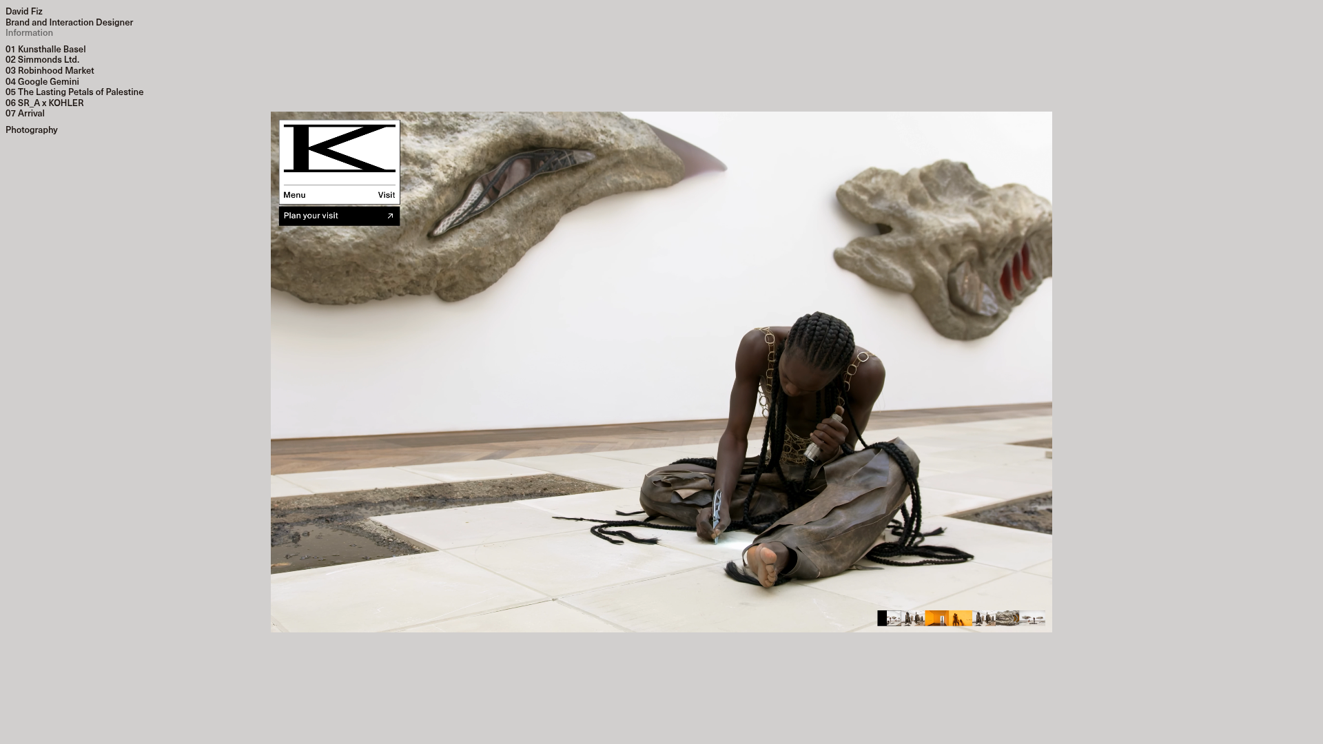
David Fiz Visual Design Portfolio
A minimalist portfolio featuring a fixed sidebar navigation paired with an immersive, full-screen media showcase and interactive project-specific image carousels.
Vita Architecture Portfolio Landing Page
A minimalist, high-end architecture portfolio featuring a custom canvas-based image gallery, split-text animations, and a project slider with dynamic image masks.
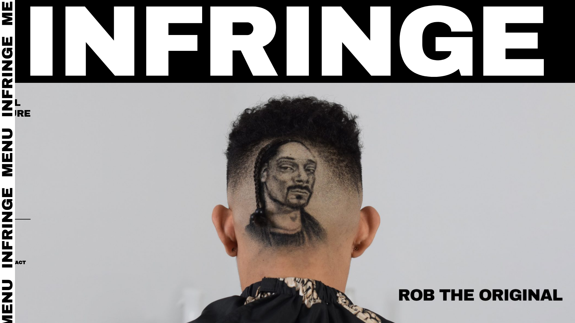
Infringe Hair Culture Portfolio Gallery
A minimalist, high-impact portfolio featuring a vertical sticky marquee sidebar and full-screen image scrolls that toggle between desktop and mobile assets.
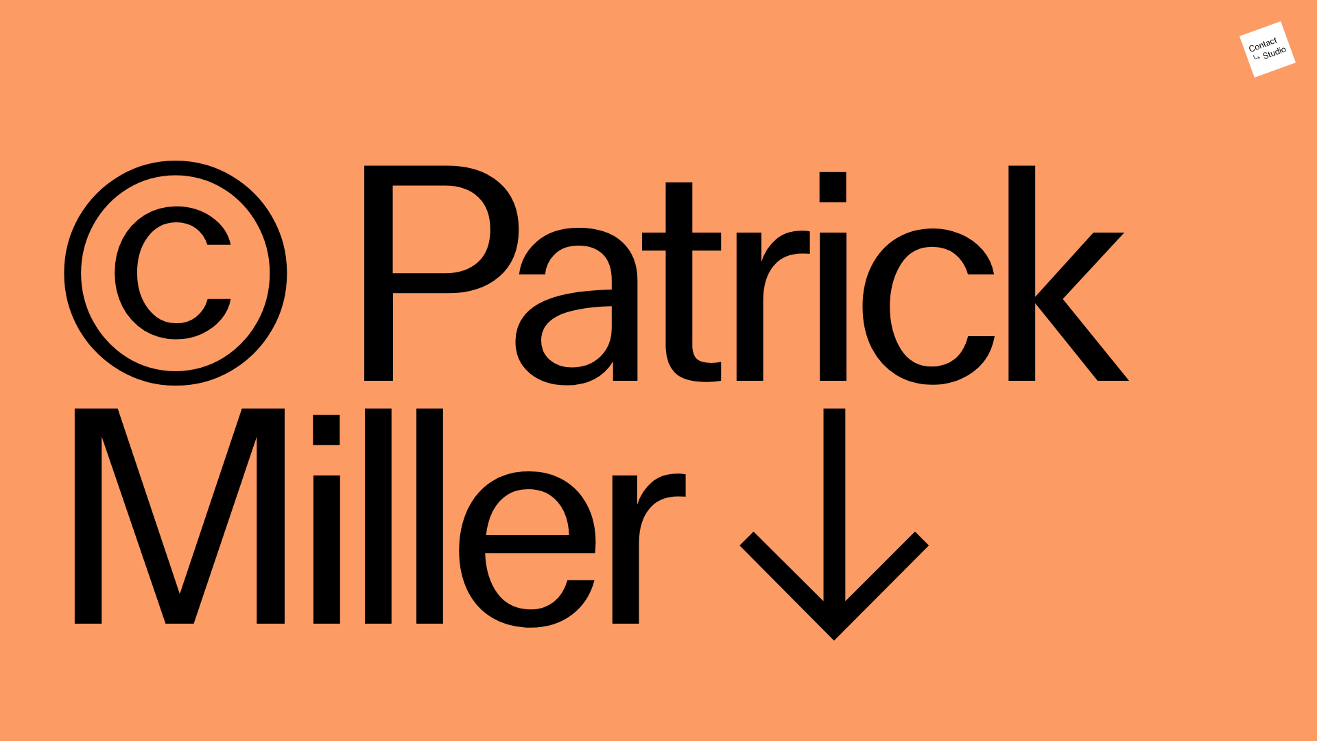
Patrick Miller Photography Portfolio Template
A minimalist, full-bleed photography portfolio featuring a split-screen grid, scroll-triggered section transitions, and integrated Swiper.js image carousels for project galleries.
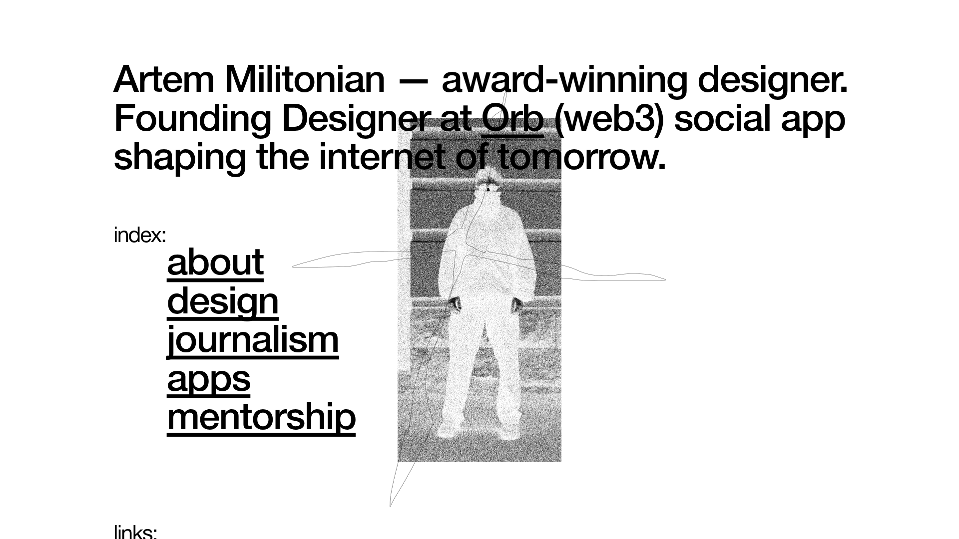
Artem Militonian Portfolio Landing Page
A minimalist, typography-focused designer portfolio featuring a layered grayscale hero image, staggered vertical navigation links, and a fixed header with utility data.
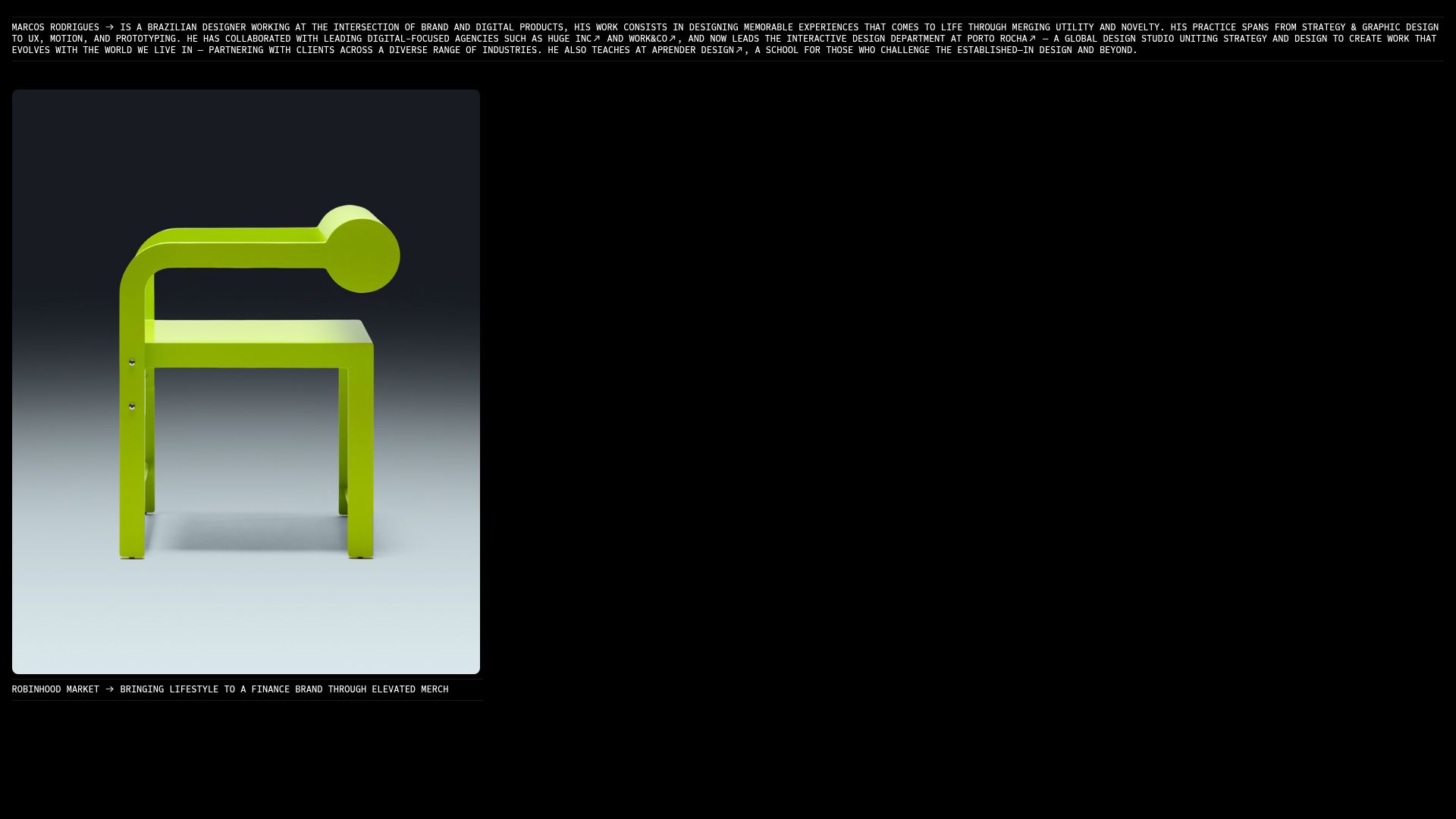
Marcos Rodriguez Minimalist Design Portfolio
A dark-themed personal site featuring a high-contrast monospaced header, a full-height centered image/video slideshow, and minimal thin-rule horizontal dividers.
