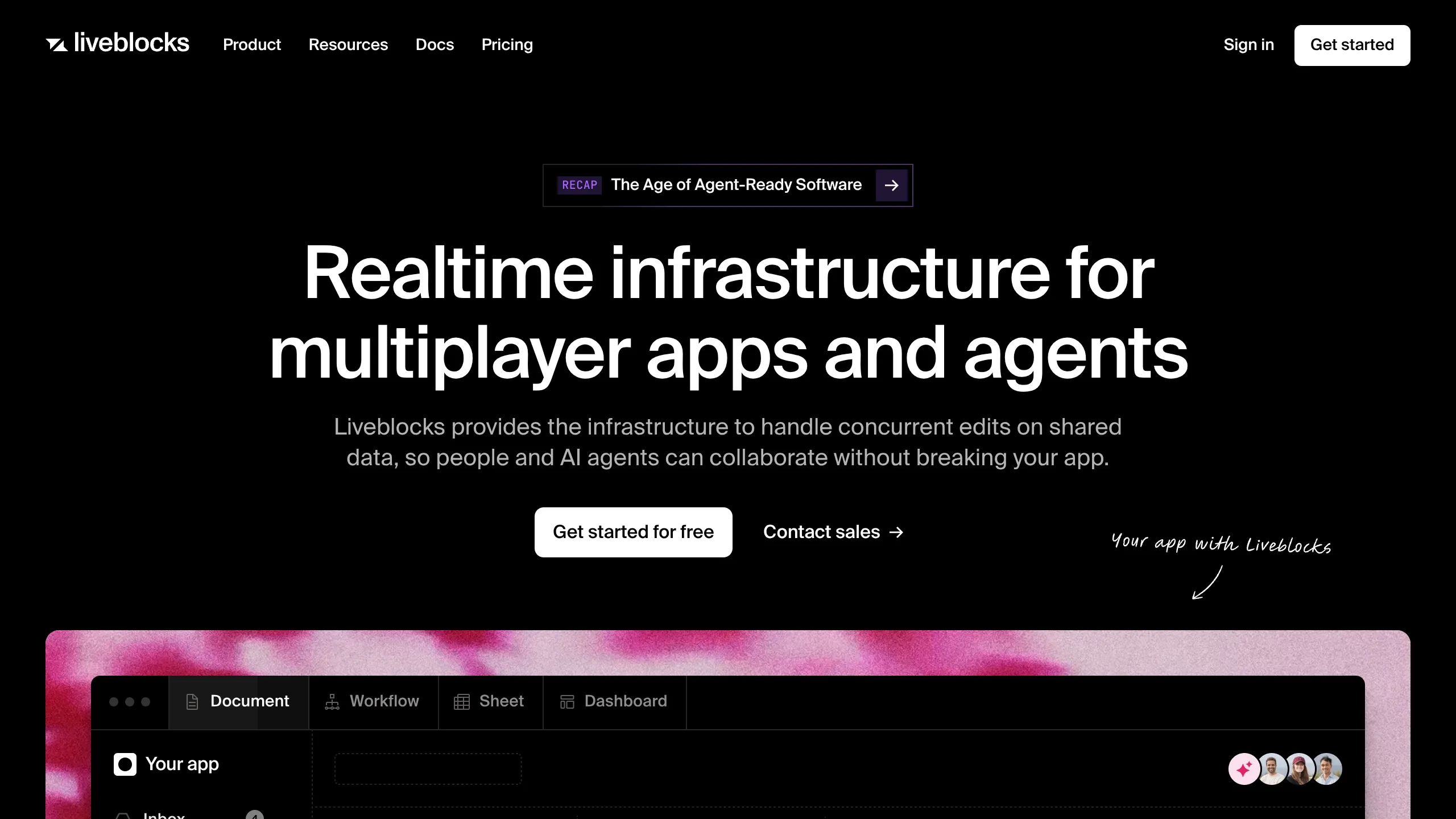
Liveblocks SaaS Landing Page Layout
A high-conversion developer marketing page featuring a dark-themed hero section, sticky navigation, and a tabbed interface for demonstrating product workflows.
Overview
This landing page is a premier example of a developer-focused SaaS design, focusing on clarity, technical authority, and live product demonstration. It provides a high-conversion framework that balances a minimalist aesthetic with high-impact visual components, making it an excellent reference for anyone building infrastructure or developer tool marketing pages.
Design System
- Color Palette & Visual Hierarchy: The design utilizes a 'Deep Space' dark theme, primarily using a
#000000background to create high contrast with white primary text. Subtle grays and muted borders (likely around#ffffff1a) define structure without visual clutter. Call-to-action buttons use a pure white background with black text to command maximum attention. - Typography: A bold, modern sans-serif typeface (likely Inter or a custom geometric font) is used with heavy weights for headlines to establish hierarchy. The scale ranges from massive hero titles to readable, high-contrast body text. Small caps and accented 'Recap' badges add technical detail.
- Page Structure & Flow: The sequence follows a 'Problem-Solution-Proof' funnel. It begins with a sticky global navigation, moves to a centralized hero section with a primary CTA, and transitions into a tabbed UI demo that provides immediate visual proof of the product's capabilities.
- Reusable Components:
- Pill Badges: The 'Age of Agent-Ready Software' link uses a sophisticated transparent pill with a subtle border.
- Tabbed Interface: A structured menu (Document, Workflow, Sheet, Dashboard) designed for switching views within a single frame.
- Primary Button: Rounded-rect white buttons with high-contrast text.
- Secondary Link: Underlined text links with directional arrows (e.g., 'Contact sales →').
- Interaction Patterns: The design suggests a hover-heavy navigation. The tabbed interface implies a state-change mechanism where clicking a category updates the central visual asset without a page reload.
- Implementation Clues: Based on the DOM, the site uses a semantic header structure with a clear separation between navigation and the main hero content. The layout relies on flexbox for alignment and a fixed-width container for the hero messaging to ensure readability.
Use Cases
- Who should clone this: Developers launching API-first products, infrastructure services, or real-time collaboration tools that need a professional, 'enterprise-ready' look.
- Effective Remixes: This layout is perfect for AI agents, cloud hosting platforms, or project management software.
- Remix Directions: Replace the dark theme with a high-contrast 'light mode' (white background, navy text) for a different brand feel. Adapt the tabbed demo section to show code snippets or dashboard previews instead of workflow types.
- Suggested Clone Scope: Start by cloning the Hero Section and the Tabbed Workflow component first, as these provide the most immediate value for communicating complex product features visually.
Related Inspirations
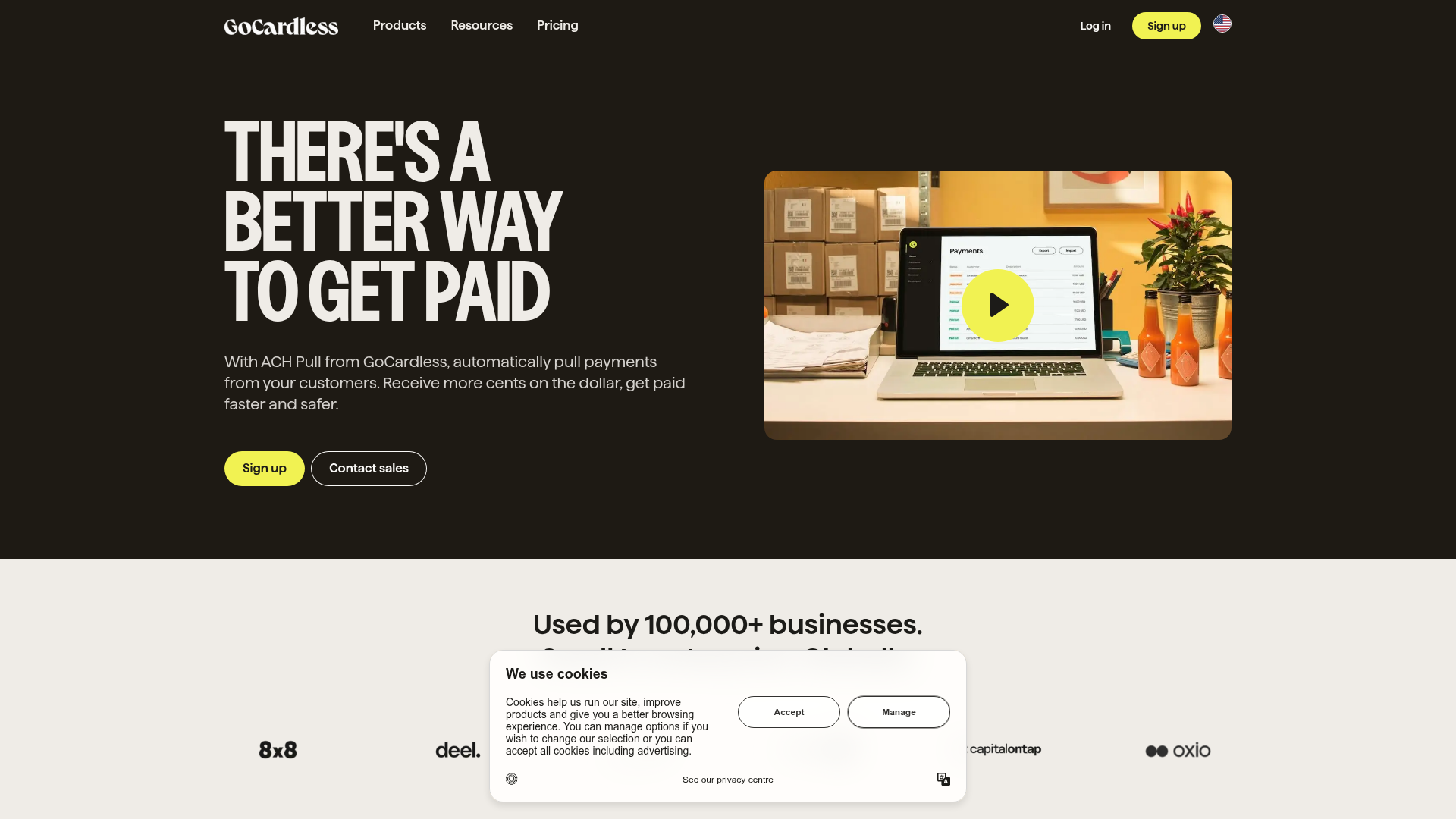
GoCardless Payments Platform Landing Page
A dark-themed fintech landing page featuring a split-screen video hero, bento-style feature cards, a horizontal logo slider, and step-by-step accordion guides.
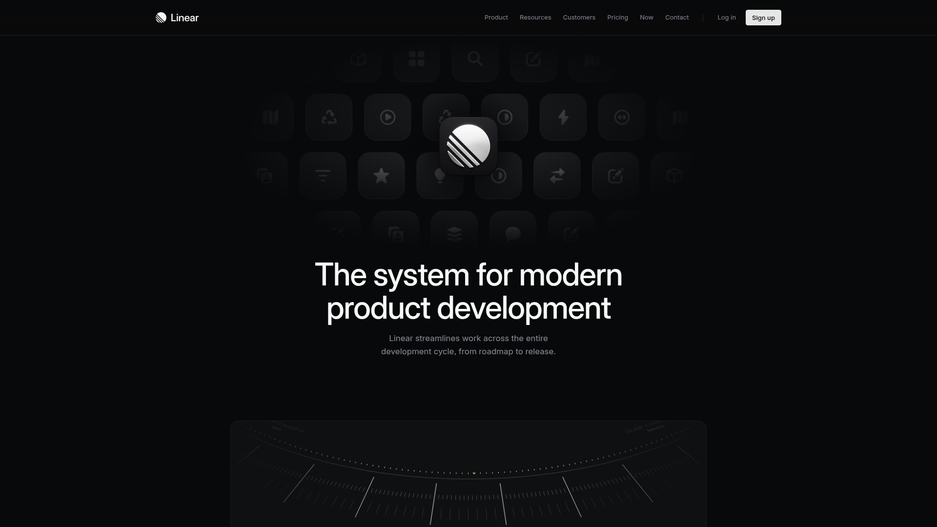
Linear Product Features Landing Page
A premium dark-themed landing page featuring a minimalist aesthetic, bento style icon grids, sleek typography, and high-contrast call-to-action buttons.
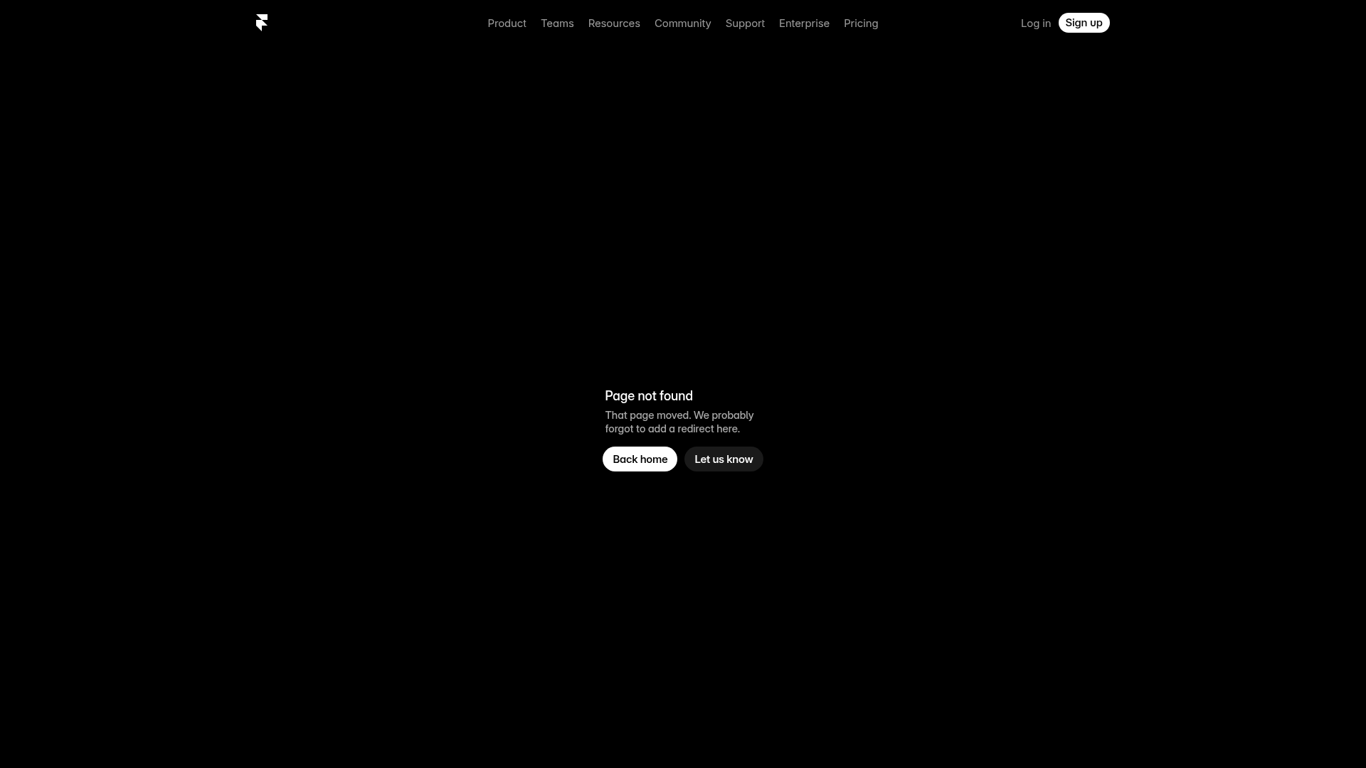
Framer Dark 404 Error Page
A minimalist dark mode error page featuring a clean centered layout, monochromatic navigation, and pill-shaped call-to-action buttons.
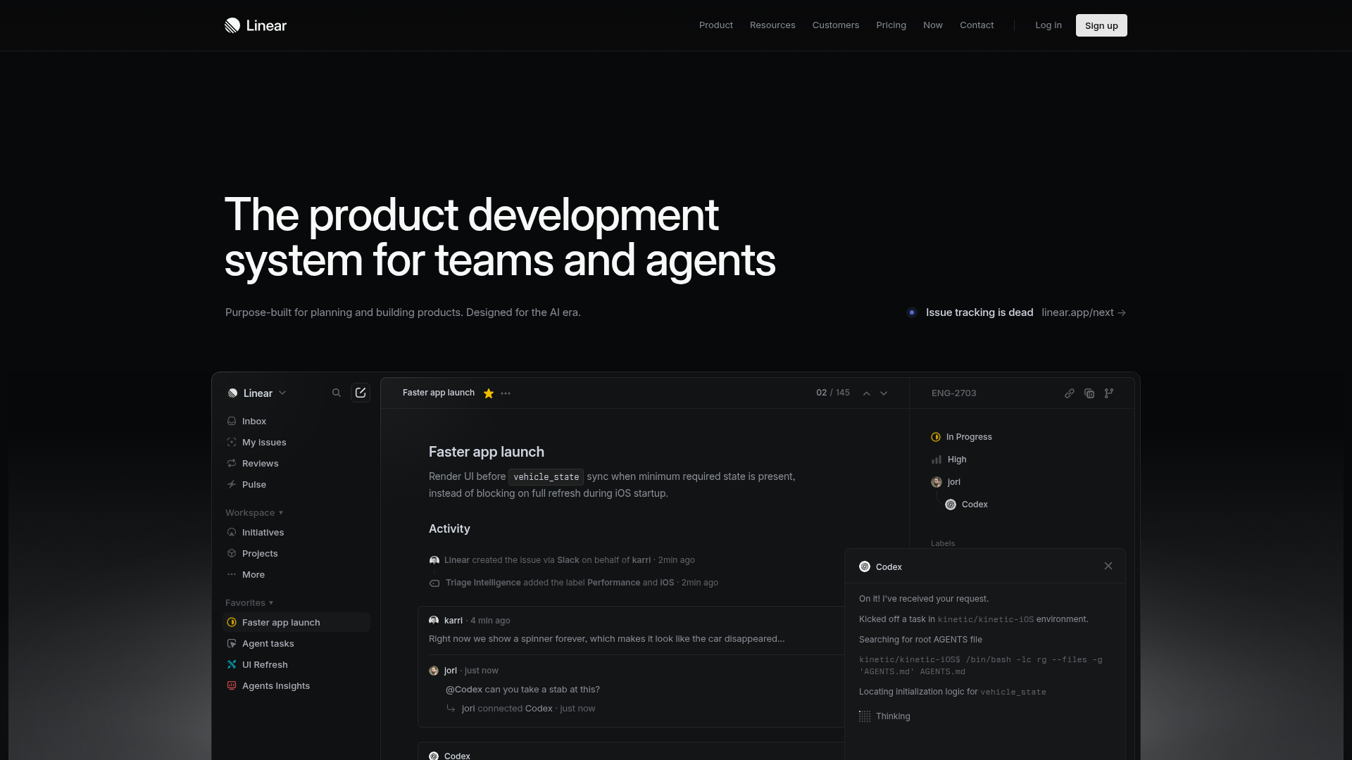
Linear Product Development System Landing Page
A high-fidelity dark-themed landing page featuring a complex dashboard UI mockup, glassmorphism effects, and a sophisticated sidebar navigation layout.
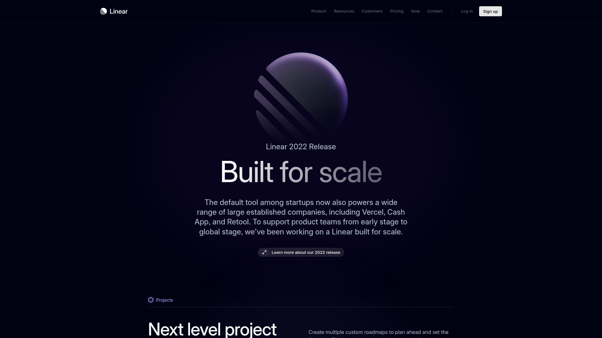
Linear 2022 Product Release Page
A high-end dark mode product launch page featuring a 3D glassmorphic logo, sleek typography, and a structured layout for feature announcements.
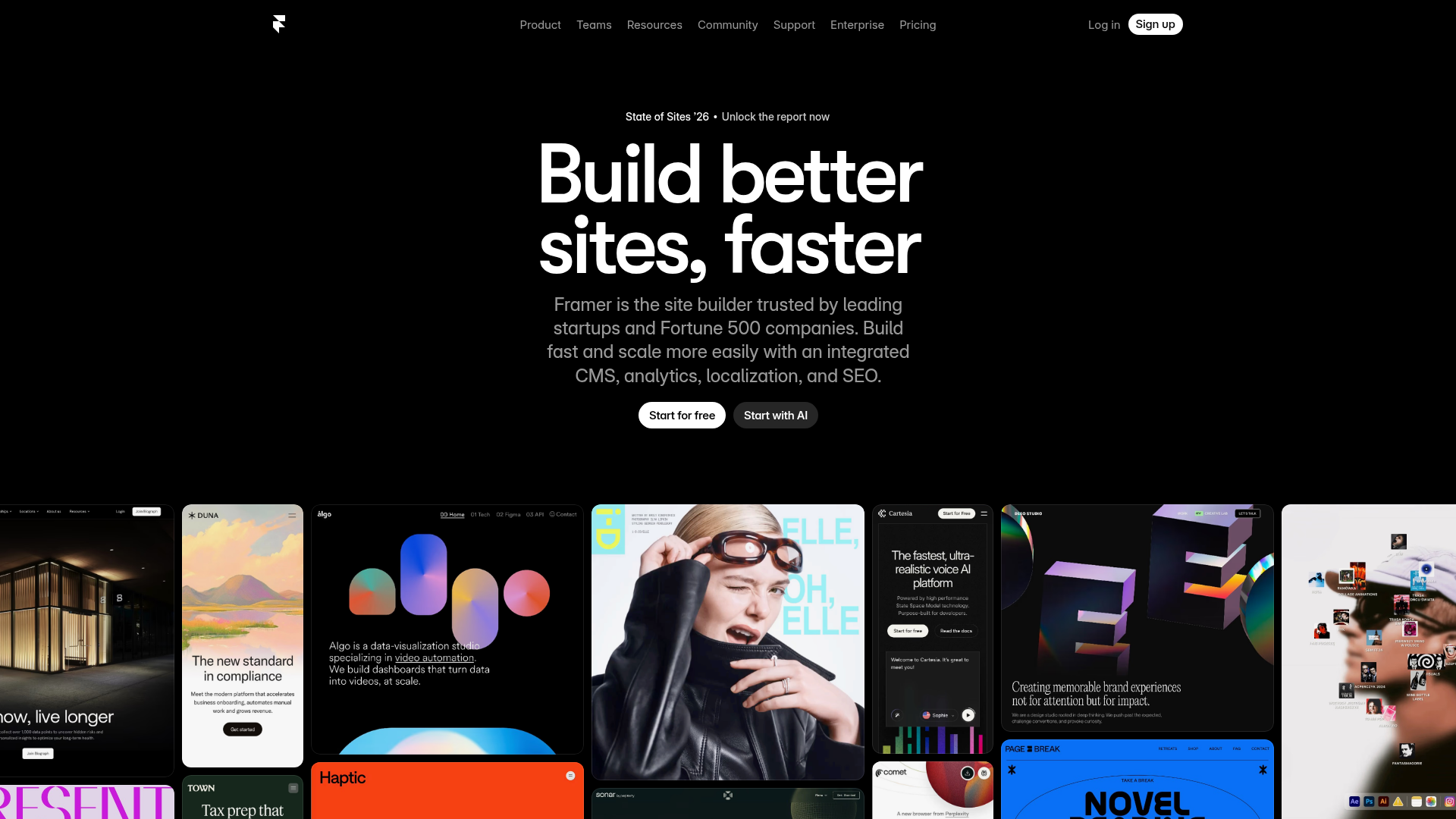
Framer Hero and Showcase Portfolio
A dark-themed landing page featuring a centered typography hero, integrated CMS/AI CTAs, and a horizontal scrollable masonry grid of site previews.
