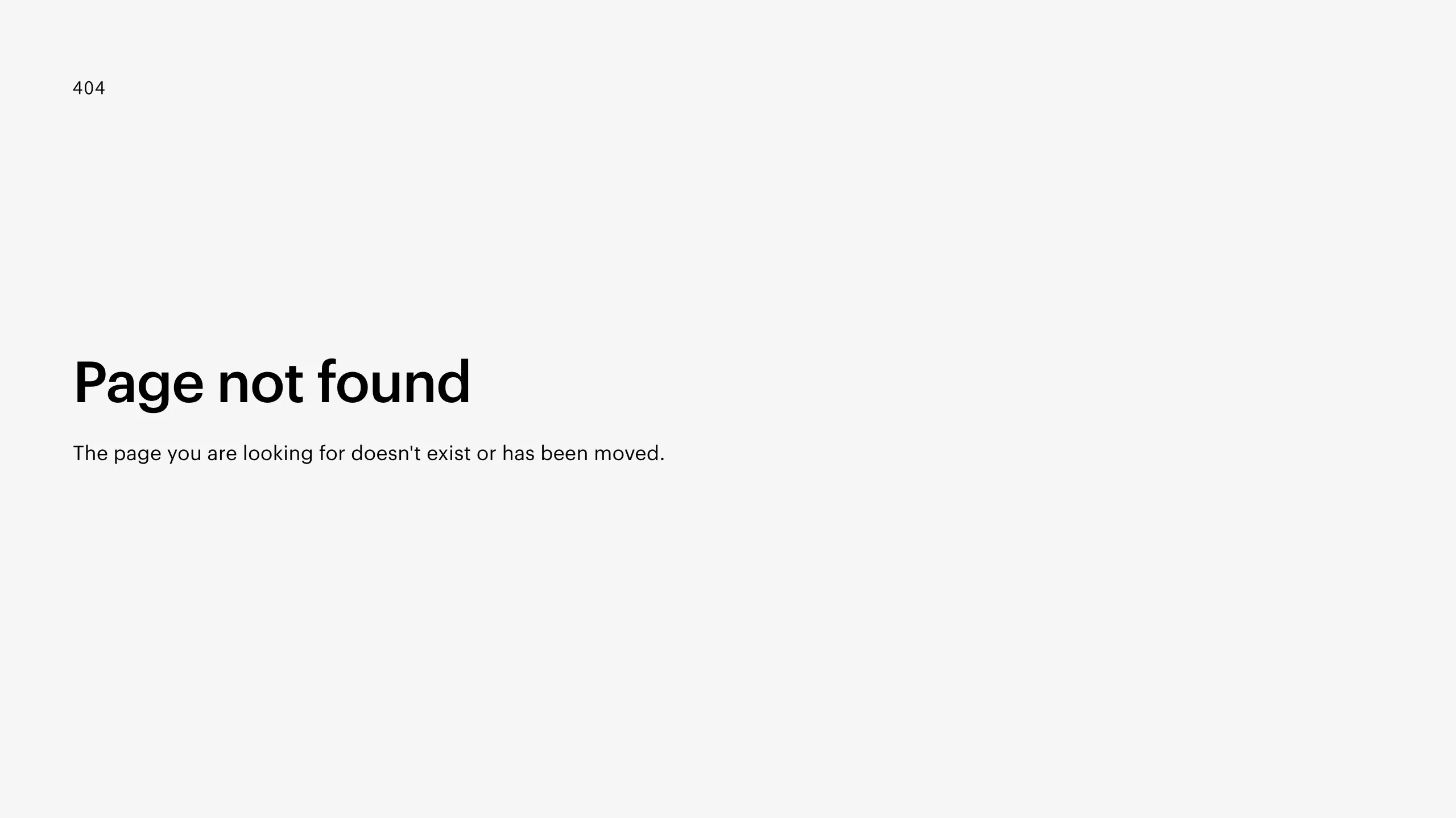
Minimalist Utility 404 Page
A clean and minimal 404 error page layout featuring a structured utility wrapper, bold typography, and a monospace status code label.
Overview
This is a highly minimalist 404 error page template that prioritizes readability and essential utility. It serves as an excellent clone reference for builders looking to implement a clean, professional fallback state without distracting visual overhead.
Design System
- Color Palette & Visual Hierarchy: The design uses a high-contrast black-on-white palette. The hierarchy is established through vertical stacking and significant white space, drawing the eye immediately to the status code and primary heading.
- Typography System: The layout utilizes a blend of sans-serif and monospace fonts. The status code ("404") is set in a small monospace font (
text-mono), while the main heading ("Page not found") uses a bold, large-scale sans-serif typeface to indicate urgency and clarity. The body text is a standard weight sans-serif for high legibility. - Page Structure & Section Flow: The structure is centered around a
utility-wrapperand autility-container. The flow is strictly top-down: status code indicator, followed by a large heading, and finally a descriptive paragraph. - Reusable Components: The core reusable element is the
.utility-wrapper, which acts as a centered container designed to keep essential messaging balanced on the screen regardless of the browser window's aspect ratio. - Implementation Clues: Based on the HTML snippet, the design relies on a class-based utility system (e.g.,
.text-mono,.utility-content). The presence of a trailing emptydivat the bottom of the container suggests a layout structure designed for flexbox or grid centering.
Use Cases
- Who should clone this pattern: Developers and designers building minimalist SaaS platforms, technical documentation sites, or personal portfolios who want a "no-fuss" error page.
- What products can remix it effectively: Any site requiring utility pages like "Maintenance Mode," "Coming Soon," or "Email Verified" can repurpose this semantic structure.
- Practical remix directions: Swap the white background for a brand-specific accent color, add a "Back to Home" CTA button below the paragraph, or integrate subtle brand iconography above the monospace label.
- Suggested clone scope: This is a full-page clone ideal for a single-route utility template in any modern web framework.
Related Inspirations

Christopher Doyle Agency Portfolio Layout
A minimalist, typography-led portfolio featuring a wide-margin grid system, smooth fade-in animations, and simple image-focused project cards.

NewTab Studio Minimalist Portfolio Landing Page
A clean, typography-focused landing page featuring an oversized SVG/canvas hero title, a top-aligned navigation bar, and a minimalist footer layout.
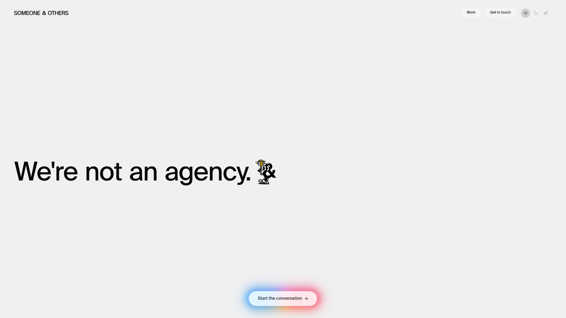
Someone & Others Studio Landing Page
A minimalist studio portfolio featuring scroll-reveal typography, overlapping sticky case study cards, and a vibrant glassmorphism CTA with animated glow rings.

Play Studio Minimalist Portfolio Landing
A high-impact agency layout featuring a oversized typography header, a full-width integrated Vimeo video background, and a unique expandable accordion list for industry showcases.
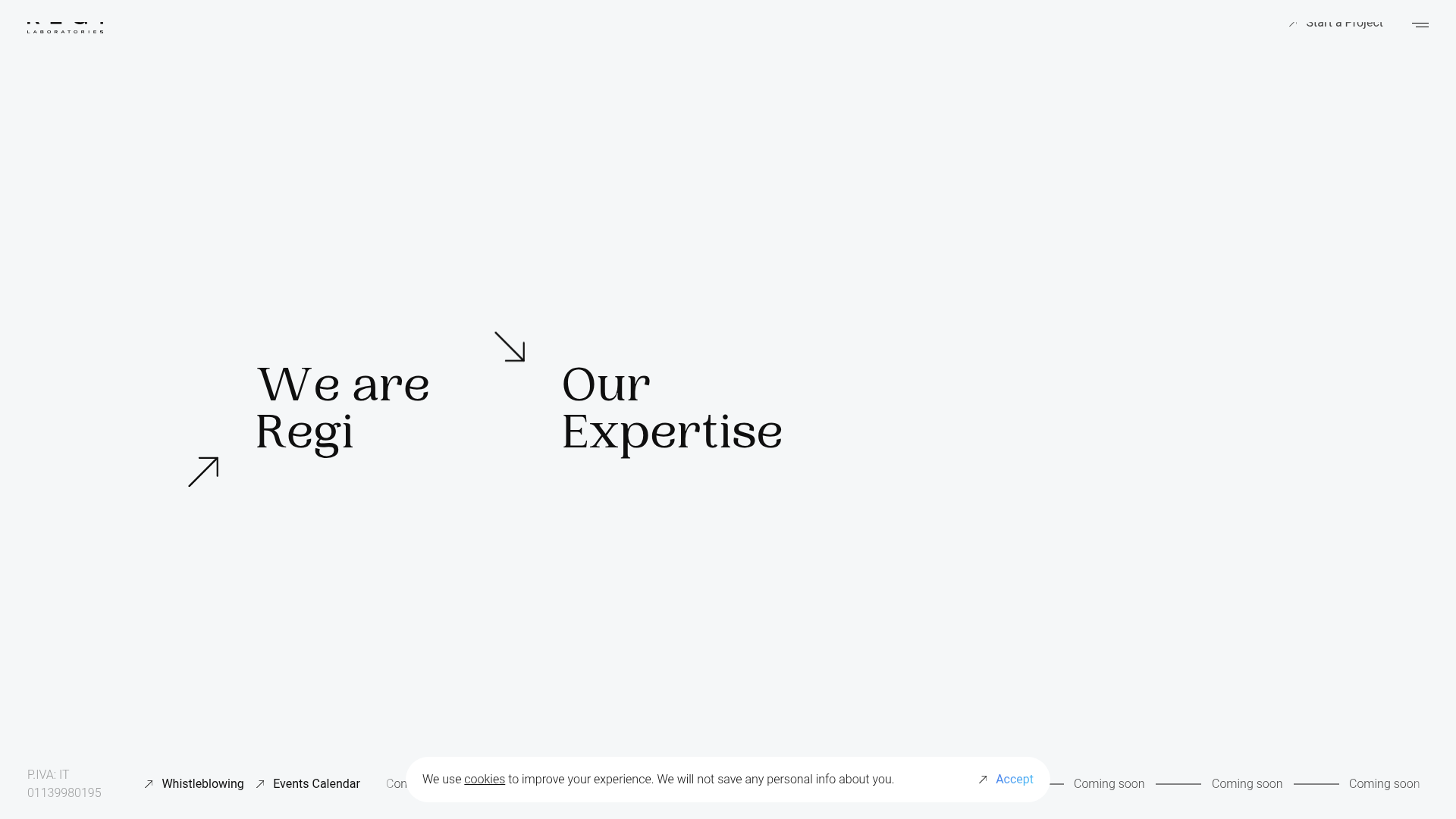
Regi Laboratories Minimalist Multi-Directional Landing Page
A high-concept landing page featuring a full-screen video background, custom mouse-interaction effects, and decentralized typography with directional arrow anchors.

Baubauwerk Minimal Agency Portfolio Homepage
A clean studio site featuring a centered text hero, scatter-plot filterable project gallery, and full-bleed image sections for case studies.
