Regi Laboratories Minimalist Multi-Directional Landing Page
A high-concept landing page featuring a full-screen video background, custom mouse-interaction effects, and decentralized typography with directional arrow anchors.
Overview
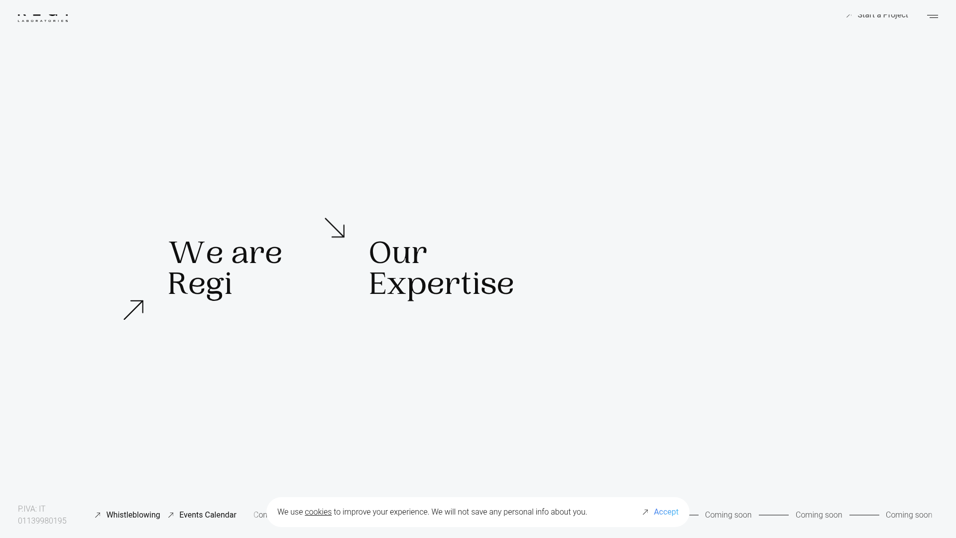
Regi Laboratories features a high-concept, minimalist landing page that prioritizes atmosphere and spatial typography over dense information. It is an excellent reference for builders looking to implement immersive video backgrounds with sophisticated UI overlays and non-traditional navigation layouts.
Design System
- Color Palette & Visual Hierarchy: The design uses a high-contrast monochromatic base (white/light grey background with black text) to ensure legibility over a dynamic video layer. Hierarchy is established through large, serif typography and negative space rather than color blocks.
- Typography: The system utilizes a sophisticated Serif typeface for primary headlines (
h1) and a clean, wide Sans-Serif for utility links and metadata. Typography is decentralized, with large headings positioned intentionally in the center-left and center-right of the viewport. - Page Structure: The layout follows a full-screen fixed hero structure. The primary navigation is embedded in the center stage as CTA links, while a secondary persistent utility bar handles global navigation (Start a Project), legal (P.IVA, Whistleblowing), and status indicators (Coming soon) at the extreme edges.
- Reusable Components:
- Directional Anchors: Minimalist arrow icons paired with high-impact serif text that indicate navigation flow.
- Floating Cookie Consent: A pill-shaped, translucent footer overlay with a subtle gradient-text button.
- Canvas-based Video FX: A
<canvas>element overlays the background video to provide visual texture or interactive effects.
- Interaction & Motion: The site uses a custom cursor (tracked via
transform: translate3d) and directional arrows that imply horizontal or off-axis page transitions. Hover states on links likely trigger the.text-strongand.ctaclasses defined in the HTML. - Implementation Clues: Built using Vue.js (noted by
v-applicationanddata-v-attributes) and Vuetify component framework. The structure heavily relies on CSS Flexbox/Grid for theoffset-md-1column positioning andfullFixedclasses for the viewport-filling container.
Use Cases
- Who should clone this: Creative agencies, luxury brand portfolios, and architecture firms looking for a "gallery" or "statement" landing page that feels premium and curated.
- Effective Remixes: High-end product launches or teaser sites for new technology. This layout works best for brands with high-quality video assets that need to be the primary focus.
- Remix Directions: Swap the monochromatic color scheme for a bold, brand-specific gradient or neon palette. Adapt the info architecture by replacing the centered links with a localized product carousel while keeping the peripheral utility navigation.
- Suggested Clone Scope: A full-page clone is recommended to capture the spatial relationship between the decentralized text and the edge-to-edge video background. The cookie consent and utility footer are excellent standalone components for any minimalist project.
Related Inspirations

Christopher Doyle Agency Portfolio Layout
A minimalist, typography-led portfolio featuring a wide-margin grid system, smooth fade-in animations, and simple image-focused project cards.

NewTab Studio Minimalist Portfolio Landing Page
A clean, typography-focused landing page featuring an oversized SVG/canvas hero title, a top-aligned navigation bar, and a minimalist footer layout.
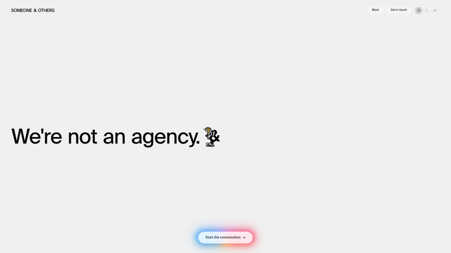
Someone & Others Studio Landing Page
A minimalist studio portfolio featuring scroll-reveal typography, overlapping sticky case study cards, and a vibrant glassmorphism CTA with animated glow rings.
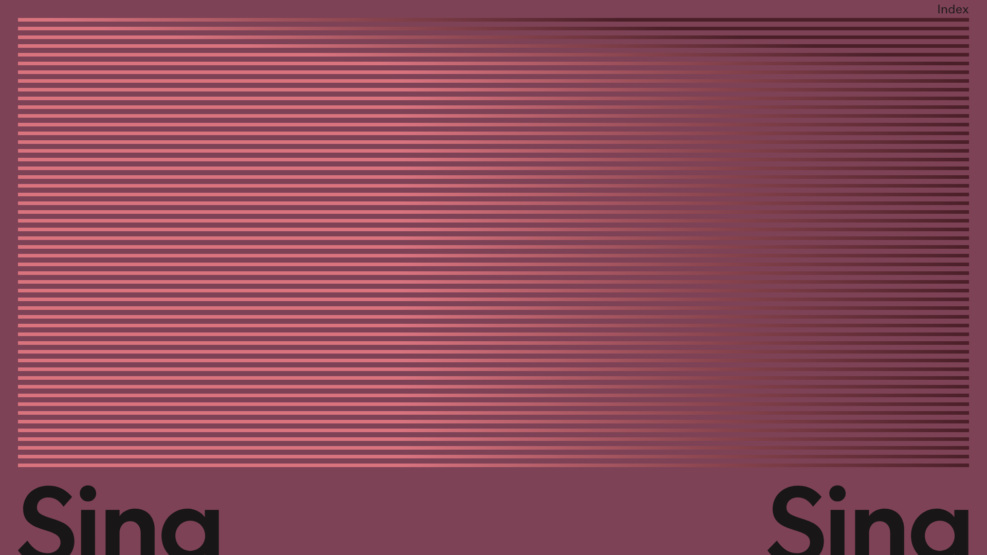
Sing-Sing Creative Portfolio Landing Page
A minimalist studio portfolio featuring high-contrast typography, a horizontal line-grid hero section, and responsive image components with custom cursor interactions.

Play Studio Minimalist Portfolio Landing
A high-impact agency layout featuring a oversized typography header, a full-width integrated Vimeo video background, and a unique expandable accordion list for industry showcases.

Baubauwerk Minimal Agency Portfolio Homepage
A clean studio site featuring a centered text hero, scatter-plot filterable project gallery, and full-bleed image sections for case studies.
