Increase Developer-Focused Fintech Landing Page
Features a modern dark-themed code editor component, a multi-colored geometric hero animation, and a grid of product cards with interactive service category filters.
Overview
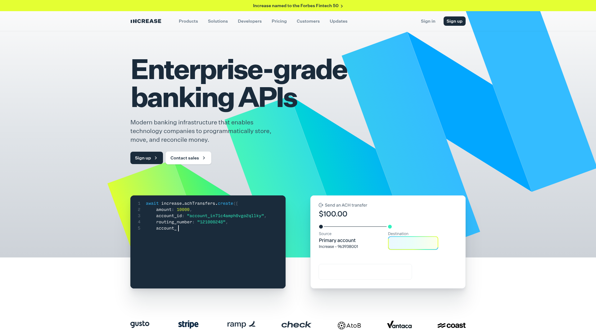
Increase's landing page is a premier example of a developer-first fintech aesthetic, balancing high-trust banking reliability with a modern software engineering feel. It is a strong clone reference for its sophisticated use of CSS-based geometric animations, balanced whitespace, and the seamless integration of raw code snippets with interactive UI mockups.
Design System
- Color Palette & Visual Hierarchy: The system uses a high-contrast foundation of deep near-blacks (
bg-gray-800,bg-gray-1000) against clean whites and light grays (bg-gray-50). Brand vibrancy is achieved through a technical neon spectrum—lime green (#DEFF34), cyan (#34C8F4), and bright blue (#02A7FF)—used primarily in the hero's geometric "ribbon" animation and focal elements like the "Sign up" button and code syntax highlighting. - Typography: The typography features a clean, sans-serif heading style set at a large scale (
text-8xlor72px+) for the hero, paired with a highly readable tabular monospace for code snippets and product identifiers (e.g., "FedACH"). This reinforces the "Banking for Builders" theme by treating technical labels as first-class visual elements. - Page Structure: The layout follows a classic SaaS flow: a high-impact animated hero with dual CTAs, a logo cloud for social proof, a dense grid of product category cards, and alternating sections that pair technical copy with side-by-side code/UI comparisons.
- Reusable Components:
- Code Editor Block: A dark-themed card with line numbers and syntax highlighting that represents the API.
- Interactive Overlay: UI components that overlap the code blocks to show the result of an API call (e.g., the transfer slider).
- Product Cards: Minimalist hover-sensitive cards that use subtle box-shadow transitions (
hover:shadow-xl) and colored accent icons.
- Interaction & Motion: The hero features a complex
animate-squigglebarandanimate-squigglediagonalCSS animation usingclip-pathand gradients to create a sense of movement. Buttons utilizetransition-allwith a150msduration for a snappy feel. - Implementation Clues: The HTML confirms a Next.js build using Tailwind CSS. Layouts are heavily reliant on
flexandgridutilities with responsive modifiers (e.g.,md:grid-cols-2).
Use Cases
- Who should clone this: This pattern is ideal for B2B infrastructure companies, API-first startups, and fintech platforms that need to project both technical competence and institutional reliability.
- Effectively Remixed Products: Identity verification services (KYC), cloud infrastructure monitoring tools, or headless e-commerce platforms could adapt this layout to showcase their technical "primitives."
- Remix Directions: Builders can swap the geometric hero ribbons for 3D renders or abstract SVG patterns while maintaining the highly effective "Code on Left, Result on Right" layout pattern found in the features section.
- Suggested Scope: For a fast win, clone the hero section's layout and the product card grid. For a high-fidelity project, the entire single-page architecture serves as an excellent template for long-form technical marketing.
Related Inspirations
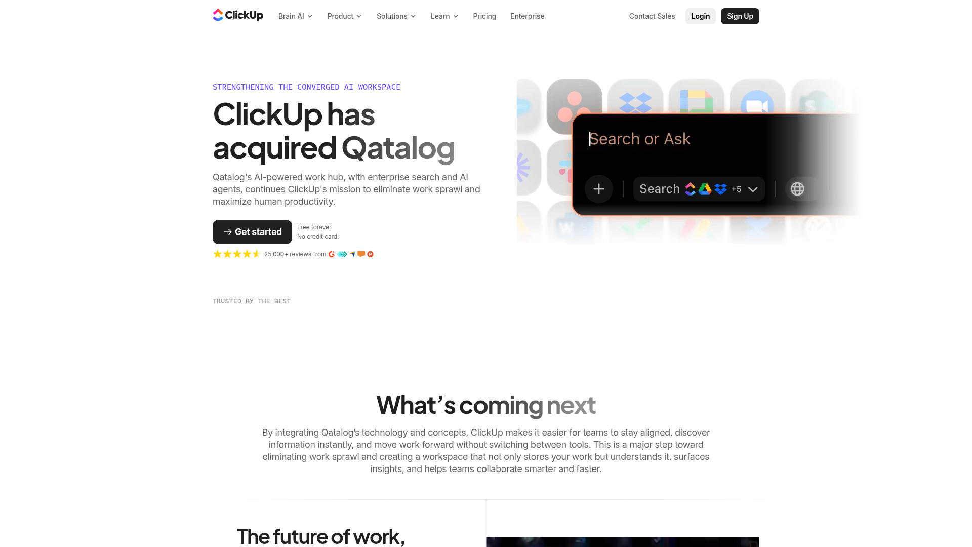
ClickUp Acquisition Hero Landing Page
Features a modern dark-themed hero section with a search UI graphic, bento-style feature grid, and a high-contrast CTA section with decorative gradients.
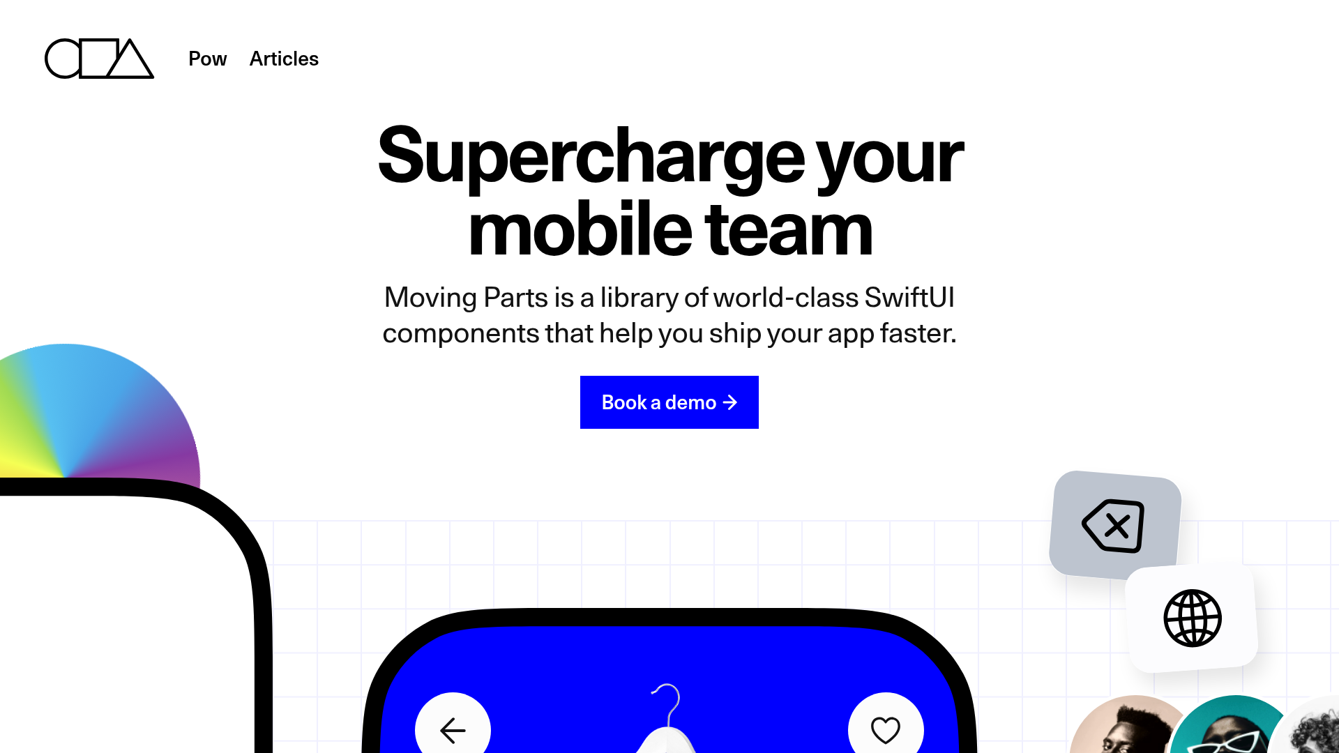
Moving Parts SwiftUI Component Library
A high-performance landing page featuring a interactive code comparison toggle, animated mobile UI previews, and a clean minimalist aesthetic for developer tools.
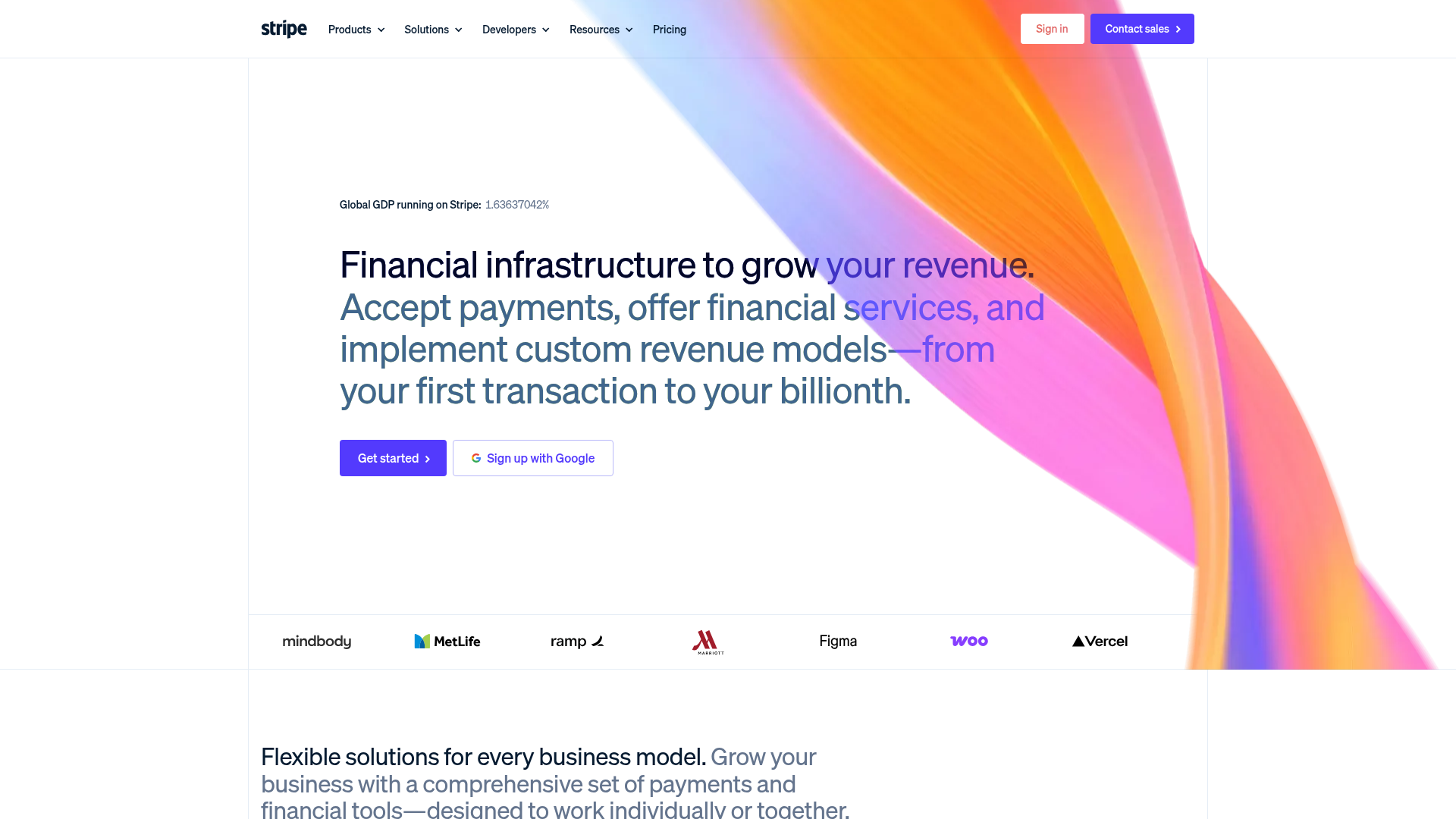
Stripe Modern SaaS Landing Page
A high-conversion landing page featuring a complex mesh-gradient hero, sticky navigation, and a horizontal logo wall for brand social proof.
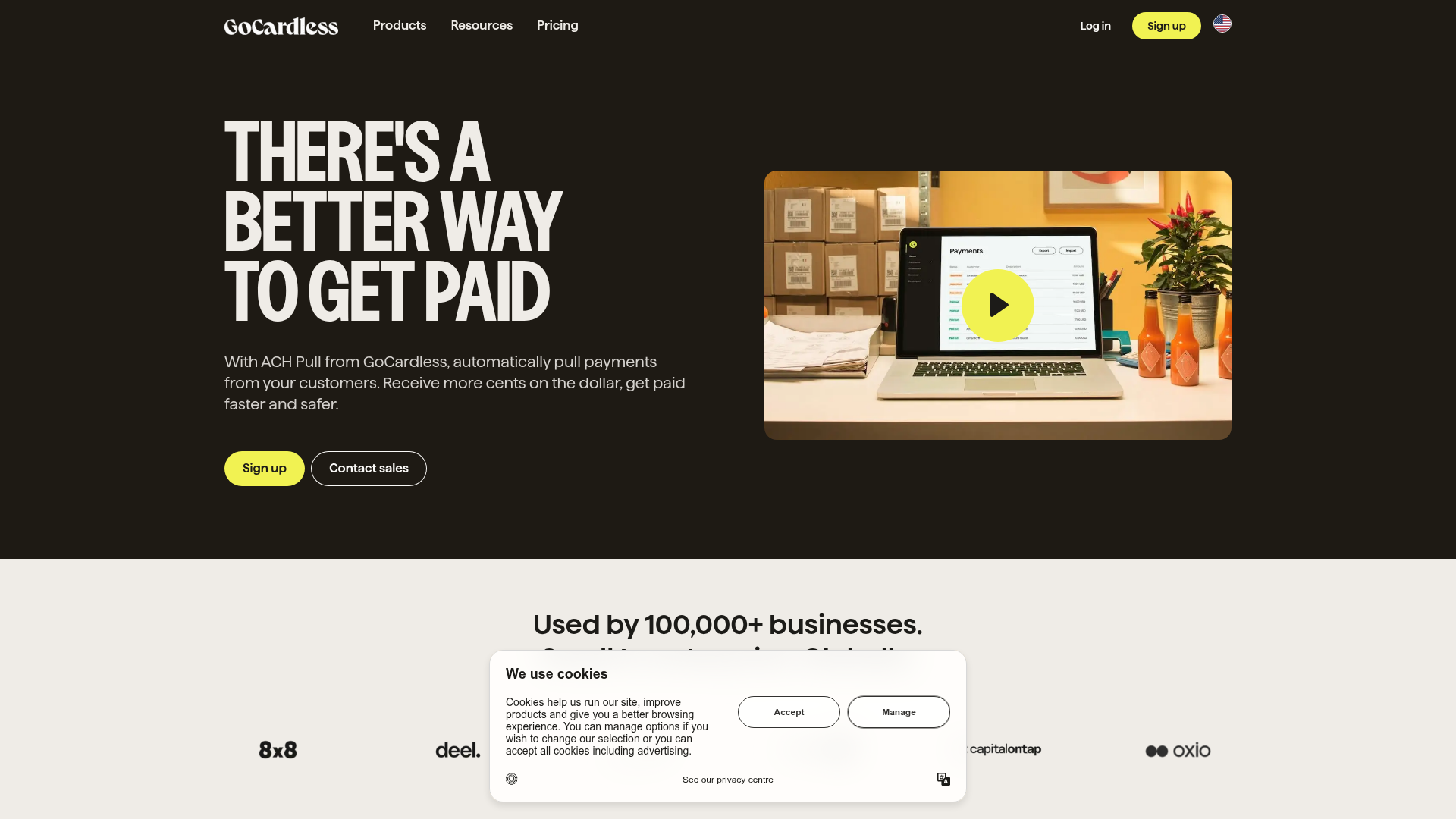
GoCardless Payments Platform Landing Page
A dark-themed fintech landing page featuring a split-screen video hero, bento-style feature cards, a horizontal logo slider, and step-by-step accordion guides.
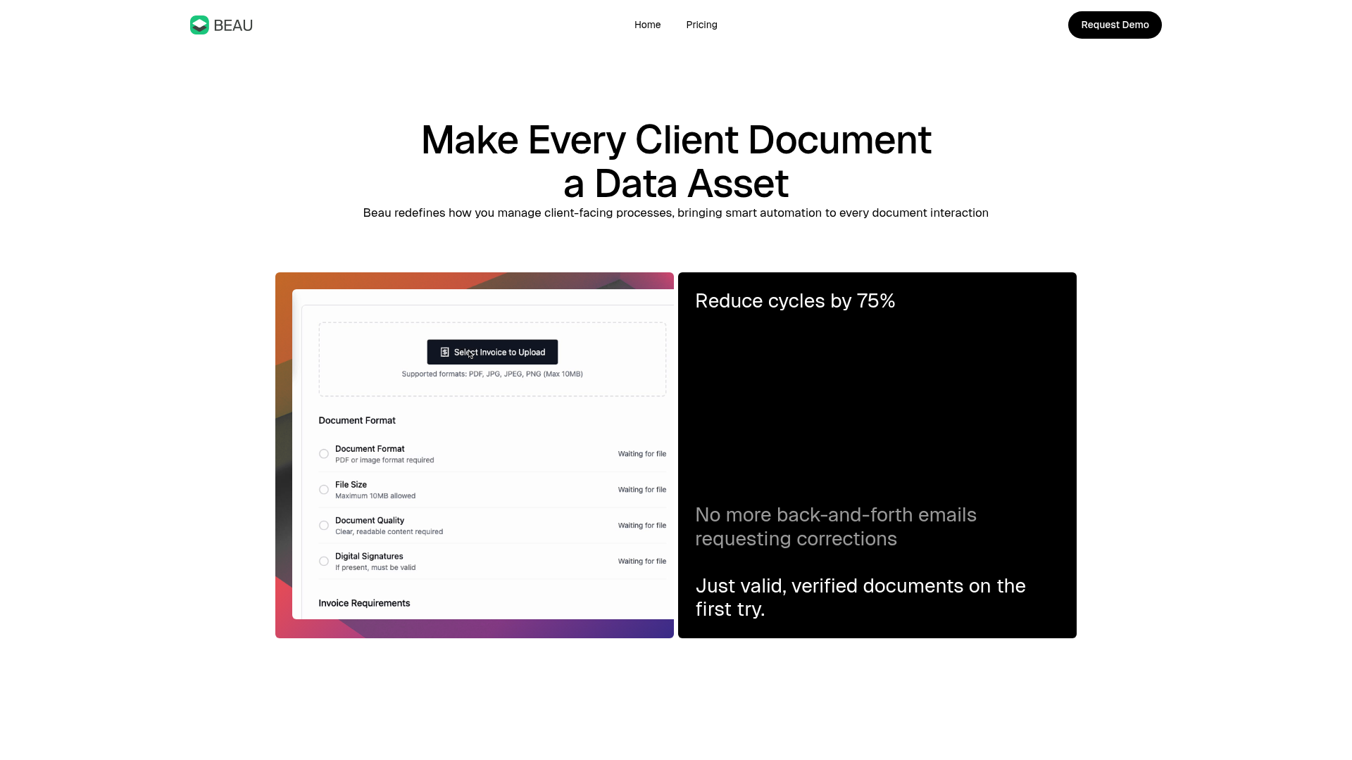
Beau Document Automation Landing Page
A modern software landing page featuring a bento-grid layout, split-screen hero assets with animated checkmarks, a step-by-step process guide, and a clean two-tier pricing table.
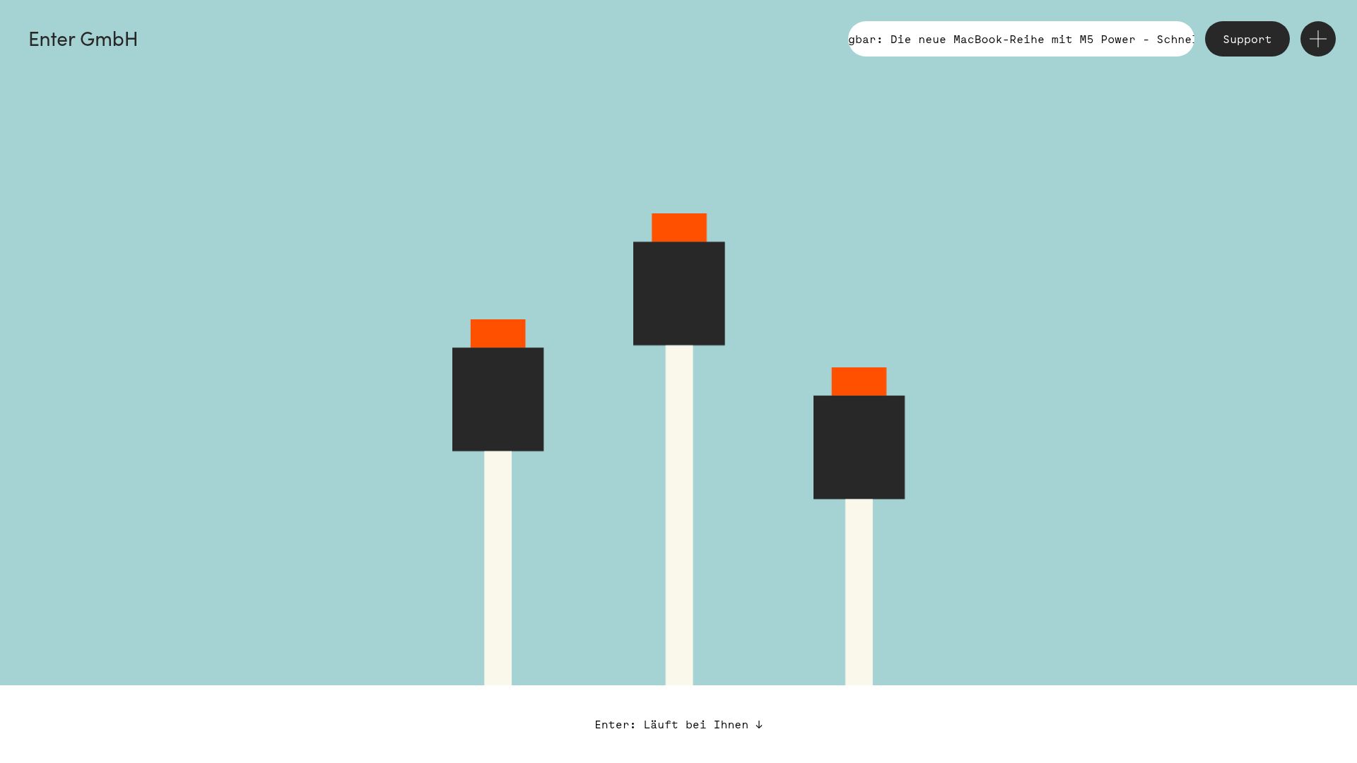
Enter GmbH IT Support Landing Page
A minimalist service site featuring a full-bleed block layout, SVG-driven hero illustrations, a masonry-style case study grid, and clean utility-focused typography.
