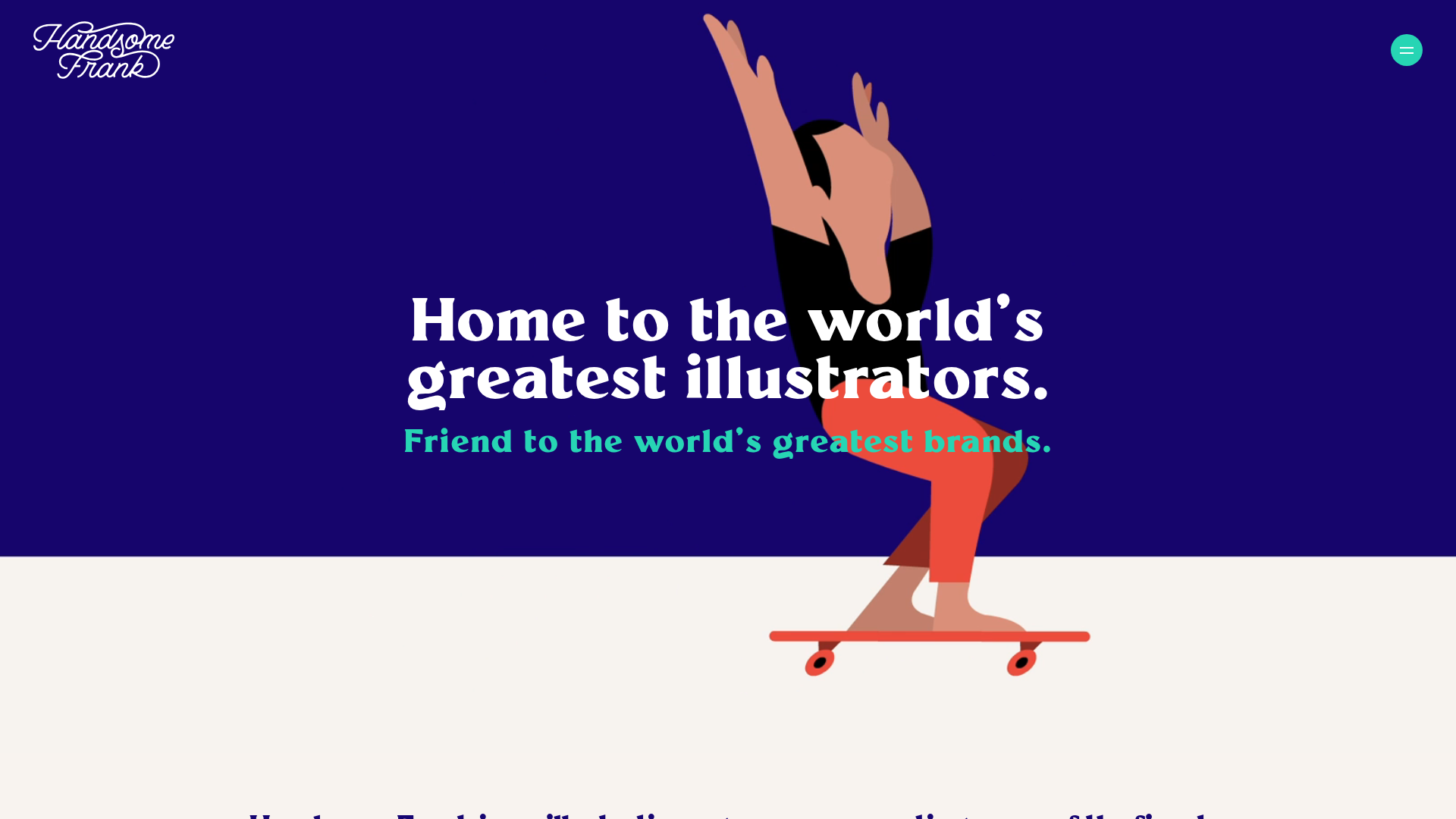
Handsome Frank Agency Landing Page
Minimalist portfolio hero featuring bold typography overlays and a split-background layout with large-scale vector character illustrations.
Overview
Handsome Frank is an illustration agency portfolio that uses a bold, split-background hero and high-impact vector graphics to showcase artistic talent. It is an exceptional reference for builders who want to balance minimalist navigation with a saturated, vibrant color story and large-scale media integration.
Design System
- Color Palette & Visual Hierarchy: The site uses high-contrast, atmospheric colors with a deep midnight blue (
rgb(21, 4, 125)) h1 section against a cream-colored base. Individual sections use high-saturation background colors like forest green (rgb(4, 59, 51)), vibrant red (rgb(234, 7, 6)), and soft blue (rgb(165, 195, 239)) to delineate content shifts as the user scrolls. - Typography: The system relies on a bold serif typeface for headings (h1, h2, h3) which provides a classic, editorial feel against the modern vector art. Smaller headings use a cleaner sans-serif or smaller serif variant, often utilizing bright accent colors like mint green (
rgb(39, 213, 180)) for secondary callouts. - Page Structure & Flow:
- Hero Section: A vertical split-layout featuring overlapping bold text and large vector character illustrations.
- Grid Teaser: A simplified artist showcase with dynamic image stacking.
- Alternating Feature Sections: Single-column blocks with media and text wrappers using a zigzag pattern (image left/text right and vice versa).
- Horizontal Scroll/Marquee: A carousel for blog insights and a continuous ticker for social proof/links.
- Reusable Components:
- Split-Background Hero: A full-height section where the background color changes halfway through the viewport.
- LinkWithArrow: A text link paired with a distinct arrow icon inside a container, styled to match specific section colors.
- Animated Eye Icon: A unique cursor-following or state-based navigational element used for the "View all" CTA.
- Stacked Image Cards: Portfolio cards that reveal multiple images on hover (
DiscoverArtistsTeaser__Card).
- Implementation Clues: The site is built with Next.js, utilizing a component-based structure. Media is served via Sanity.io (CDN) and Mux for video streaming, suggesting a headless CMS approach for managing a high volume of visual assets.
Use Cases
- Creative Portfolios: Agencies or luxury studios looking for a design-forward way to display diverse artistic styles without the interface feeling cluttered.
- Brand Campaigns: Small landing pages for product launches (e.g., beverages or fashion) that need to emphasize "vibe" and storytelling over heavy text content.
- Remix Directions: Swap the illustration style for high-resolution photography to create a fashion editorial look. Builders can reuse the alternating
SingleColumnSectionpattern for long-form case studies or service breakdowns while maintaining the distinct background color shifts. - Suggested Clone Scope: A quick section clone of the Hero Layout is recommended for those needing an immediate high-impact splash page. A full-page clone is ideal for agencies needing a robust, media-heavy content architecture that supports video, audio (podcasts), and blogs.
Related Inspirations
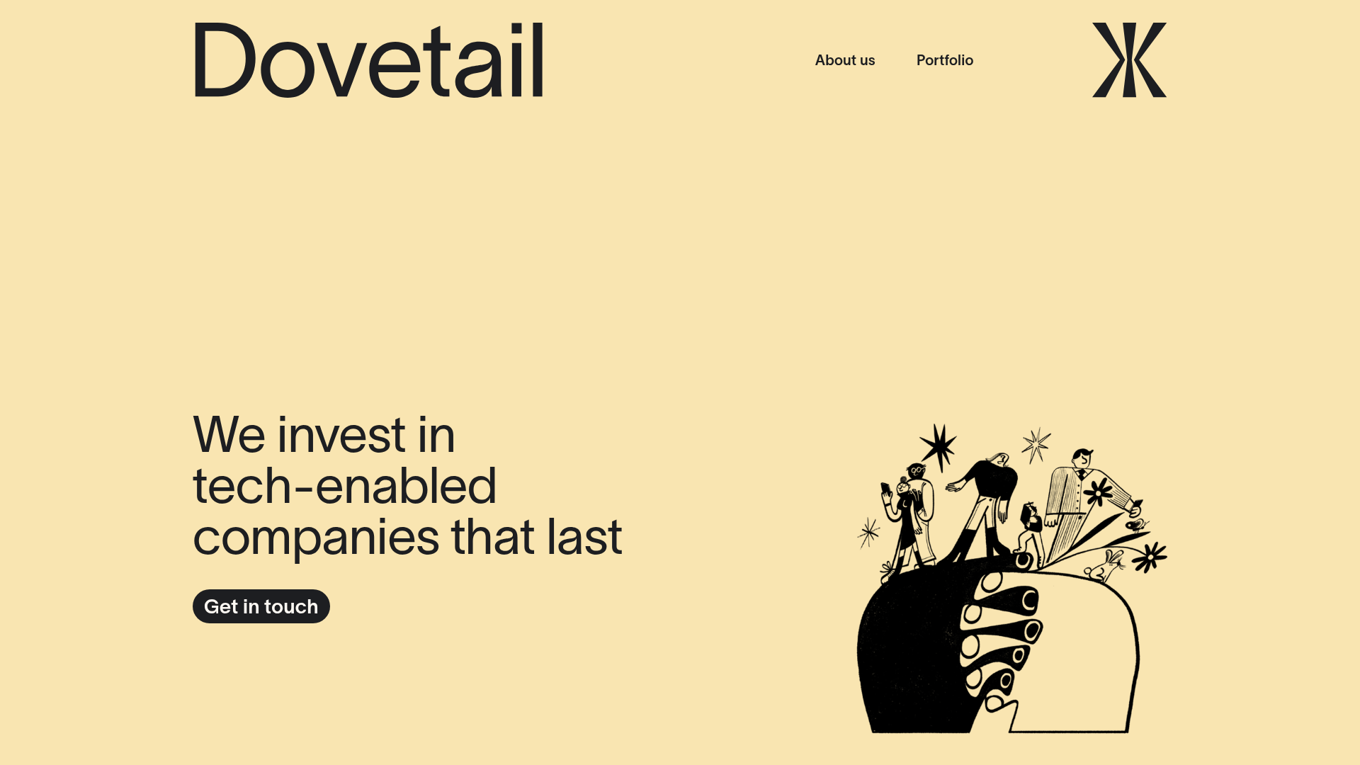
Dovetail Venture Portfolio Landing Page
A minimalist investment site featuring a warm pastel palette, distinctive hand-drawn illustrations, horizontal carousel for project cases, and a clean typography-focused grid layout.

Smiling Wolf Minimalist Portfolio Landing
A refined, ultra-minimalist layout featuring a centered vintage illustration, subtle typography, and a spacious monochromatic aesthetic ideal for a high-end brand splash page.
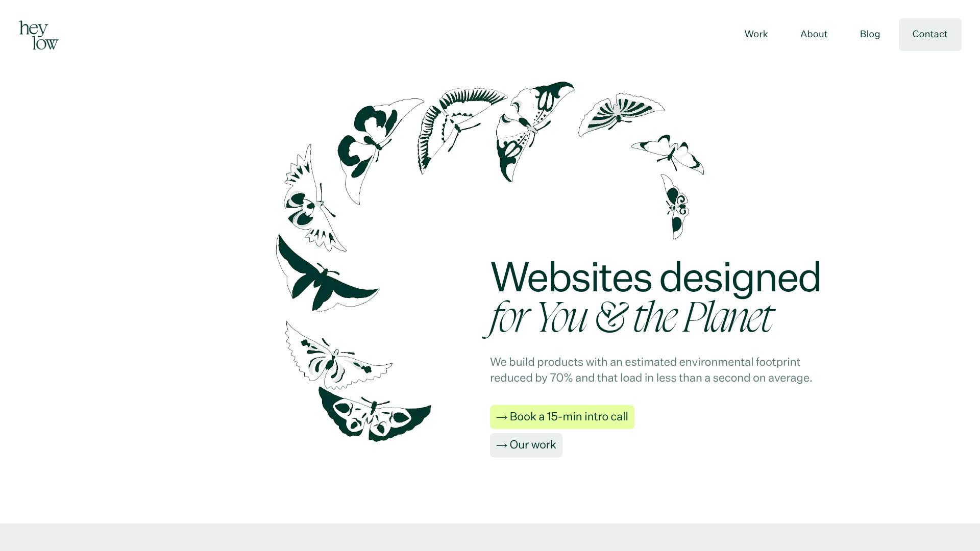
Heylow Portfolio Landing Page
A minimalist, eco-conscious portfolio featuring an animated butterfly hero section, Bento-style feature grid, and project cards with carbon rating and speed metrics.
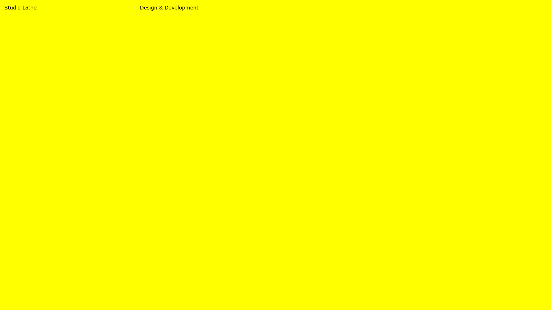
Studio Lathe Minimalist Portfolio List
A high-contrast, minimalist portfolio layout featuring a dense list-based project index with flexible category labeling and a full-screen yellow background.

Niklas Rosén Designer Portfolio Index
A minimalist, responsive grid-based portfolio index featuring a clean 16-column layout, typographic list components, and a custom dark mode transition.

Christopher Doyle Agency Portfolio Layout
A minimalist, typography-led portfolio featuring a wide-margin grid system, smooth fade-in animations, and simple image-focused project cards.
