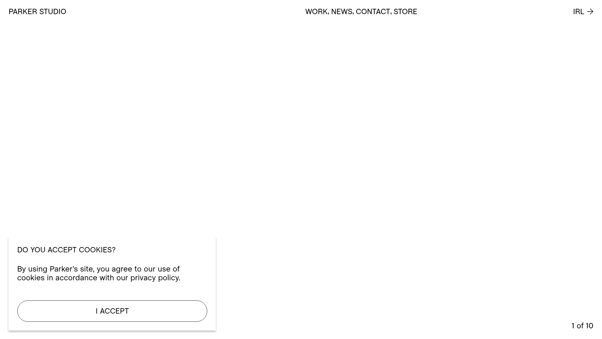
Parker Studio Minimalist Design Portfolio
A high-end creative portfolio featuring a full-screen video slideshow hero, masonry-style project grid, draggable news carousel, and modular layout with clean typography.
Overview
This high-end creative portfolio for Parker Studio serves as a benchmark for minimalist, media-first web design. It excels as a clone reference due to its sophisticated handling of full-screen video background transitions and a modular project grid that accommodates various aspect ratios while maintaining a clean, editorial aesthetic.
Design System
- Color Palette & Visual Hierarchy: The site uses a high-contrast monochromatic base (white background, black text) to ensure that colorful video and photography assets remain the focal point. Visual hierarchy is established through extreme whitespace and subtle lines rather than bold colors.
- Typography system: A clean, sans-serif font (appearing to be a custom or grotesque style) is used throughout. It utilizes a wide range of scales, from massive hero headers to extremely small, spaced-out utilitarian text for metadata (e.g., date and category in the news section).
- Page Structure: The layout follows a classic high-end agency flow:
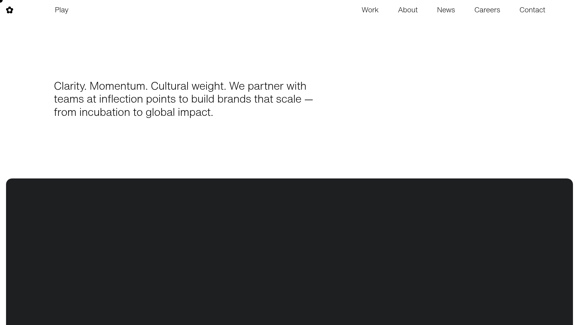
- Full-screen video hero with dynamic text overlays.
- Modular project grid (masonry-style).
- Horizontal draggable news carousel.
- Minimalist footer with simple navigation.
- Reusable Components: Notable components include the bottom-left cookie consent modal with a pill-shaped button, the project cards that combine
videoorimgtags with categorical text, and the minimalist top navigation which splits brand name, secondary links, and a call-to-action between the left, center, and right. - Interaction & Motion: The HTML indicates a heavy reliance on transitions (data-fade, visibility, and opacity attributes). Key patterns include a custom cursor, draggable horizontal containers for the 'News' section, and a slide-based hero that uses a counter ("1 of 10") to track state.
- Implementation Clues: Built using the Nuxt.js framework (as seen in the
__nuxtand__layoutIDs). It uses modular CSS (indicated bydata-vscoped attributes) and leverages Vimeo progressive redirects for high-quality background video delivery.
Use Cases
- Who should clone this: Creative directors, luxury brand agencies, and photographers looking for a digital "coffee table book" aesthetic that emphasizes visual quality over technical documentation.
- Remixing effectively: This layout is ideal for any industry where the product is highly visual—such as architecture firms, interior designers, or high-fashion retailers. The modular grid system can be remixed to prioritize different content densities (e.g., swapping a triple-column project block for a single wide hero).
- Practical Directions: A builder could reuse the horizontal draggable news carousel for testimonials or product features. To remix the brand style, one could introduce a soft pastel background color while keeping the black typography and thin border lines to maintain the professional structure.
- Suggested Clone Scope: For a fast win, clone the hero section's auto-playing video background with the overlaying text/counter. For a deeper build, replicate the entire project grid system to handle varied media types seamlessly.
Related Inspirations

Christopher Doyle Agency Portfolio Layout
A minimalist, typography-led portfolio featuring a wide-margin grid system, smooth fade-in animations, and simple image-focused project cards.
NewTab Studio Minimalist Portfolio Landing Page
A clean, typography-focused landing page featuring an oversized SVG/canvas hero title, a top-aligned navigation bar, and a minimalist footer layout.
Someone & Others Studio Landing Page
A minimalist studio portfolio featuring scroll-reveal typography, overlapping sticky case study cards, and a vibrant glassmorphism CTA with animated glow rings.
Sing-Sing Creative Portfolio Landing Page
A minimalist studio portfolio featuring high-contrast typography, a horizontal line-grid hero section, and responsive image components with custom cursor interactions.
Play Studio Minimalist Portfolio Landing
A high-impact agency layout featuring a oversized typography header, a full-width integrated Vimeo video background, and a unique expandable accordion list for industry showcases.

Baubauwerk Minimal Agency Portfolio Homepage
A clean studio site featuring a centered text hero, scatter-plot filterable project gallery, and full-bleed image sections for case studies.
