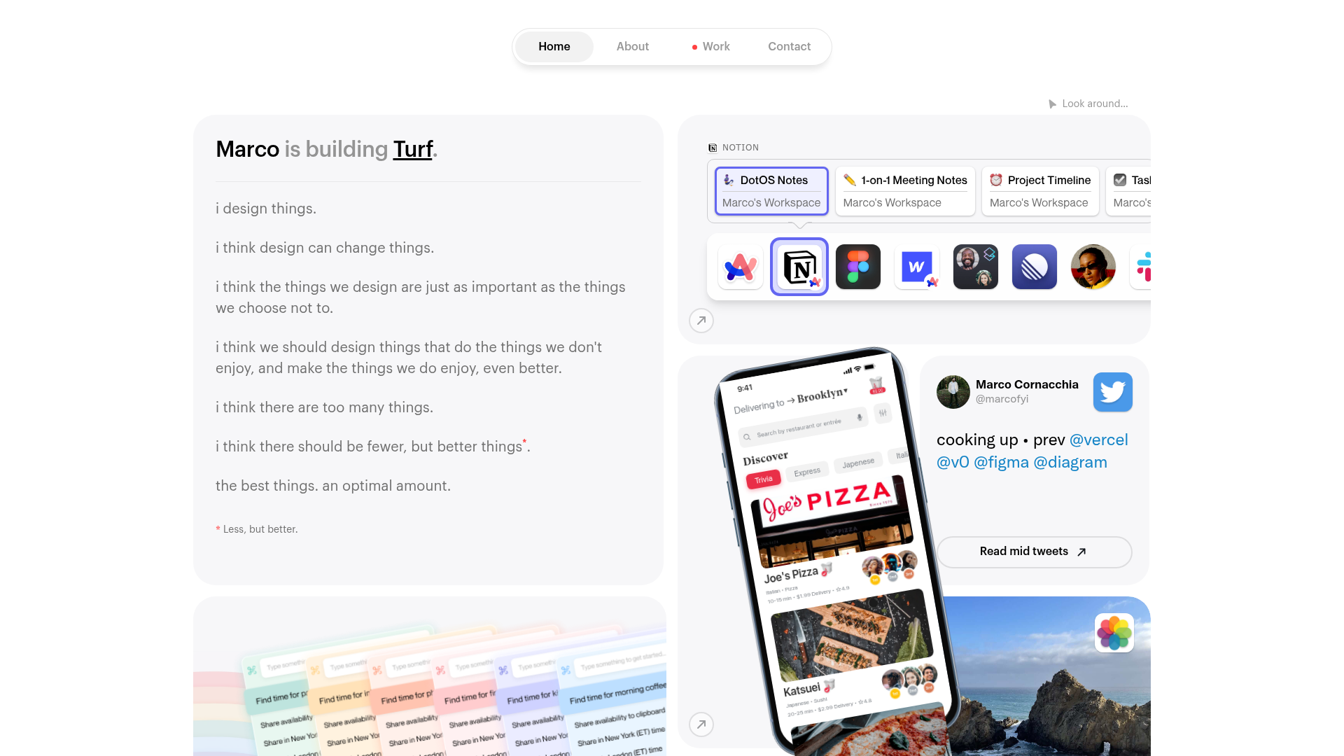
Marco Portfolio Bento Grid Portfolio
A high-fidelity bento grid layout featuring interactive OS-style cards, integrated audio sound effects for UI actions, and a floating pill navigation menu.
Overview
Marco's portfolio is a masterclass in the "Bento Grid" layout, utilizing a high-fidelity interface that mimics modern OS aesthetics. It is a premier reference for builders looking to implement highly interactive, tactile web experiences through the use of localized audio feedback and skuomorphic grid elements.
Design System
- Color Palette & Visual Hierarchy: The design uses a sophisticated light mode palette with a soft grey background (
#F5F5F7style). Hierarchy is established through depth and elevated surfaces; cards feature subtle drop shadows and rounded corners (24px-32px radius) to differentiate content blocks. - Typography System: A clean, sans-serif font family is used with a focus on readability and varying weights. Primary headings use a medium-to-bold weight with tight letter spacing, while body text uses a lighter weight with generous line height. Red accent text is used sparingly for footnotes or emphasis (e.g., the asterisk note).
- Page Structure: The layout follows a modular grid flow. It begins with a text-heavy introduction card on the left balances against interactive, visual media cards on the right, including a Notion-style app switcher, a mobile UI mock-up, and a social profile card.
- Reusable Components:
- Floating Pill Navigation: A center-aligned, semi-transparent blur (glassmorphism) nav bar with a pill-shaped active state.
- Bento Cards: Self-contained containers with fixed aspect ratios or flexible heights that snap to a grid.
- App Switcher: An interactive component mimicking a Dock or OS taskbar with tooltips and hover scaling.
- Interaction and Motion: The site is famous for its Audio Feedback System. The HTML reveals a massive library of
.mp3assets (via Dropbox) mapped to specific UI actions likenav-click,tab-click, andswatch-click. Movement is driven by Lottie animations (dots-loader.json) and specific IX2 interaction targets for smooth, physics-based transitions. - Implementation Clues: The HTML structure indicates a heavy reliance on Webflow’s interaction engine (indicated by
data-w-id) and a dedicated<audio>embed block that facilitates the tactile "click" sounds associated with different UI elements.
Use Cases
- Who should clone this: Product designers, creative developers, and high-end agencies who want a portfolio that feels like a functional application rather than a static document.
- Effective Remixes: This pattern works exceptionally well for SaaS landing pages, feature announcements, or personal brand hubs where high user engagement and "delight" are prioritized.
- Remix Directions: Builders can swap the OS-mimicry for a brand-specific aesthetic by changing the corner radii and shadow depth. The audio system can be remixed by swapping the provided Dropbox links with unique brand sounds (e.g., retro 8-bit sounds vs. minimalist mechanical clicks).
- Clone Scope: Start by cloning the Audio Trigger System and the Floating Pill Nav. These are the highest-impact elements that can transform any standard grid into a premium interactive experience.
Related Inspirations

Michael Speichert Web Designer Portfolio
A Gatsby-built creative portfolio featuring a Canvas-based 3D background effect, custom typography, and smooth page transitions for a modern interactive experience.
Peter Tarka Portfolio Bento Grid
An interactive, split-screen bento grid featuring full-height vertical columns, hover-triggered video overlays, and seamless transitions for a visual-heavy creative portfolio.

Nathan Riley Interactive Portfolio Hero
A refined Nuxt-based creative portfolio featuring a full-screen grid slider, elegant typography overlays, and sophisticated CSS mask-based button hover interactions.
Nev Flynn Bento Grid Portfolio
A modern bento grid personal portfolio featuring sticky navigation, interactive React-based widgets, a Spotify activity display, and a customizable dark mode toggle.
Karina Sirqueira Creative Bento Portfolio
A minimalist bento-grid landing page featuring rounded geometric cards with smooth SVG icon transitions and full-screen project navigation.
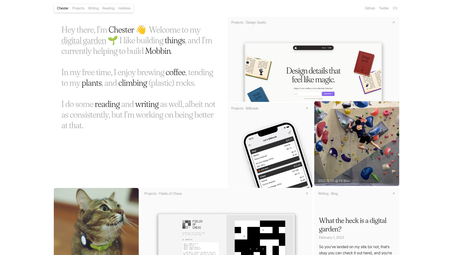
Chester's Bento Grid Personal Portfolio
A minimalist personal site featuring a responsive bento grid layout with color-coded interactive links, hover animations, and curated masonry tiles for projects and hobbies.
