Chester's Bento Grid Personal Portfolio
A minimalist personal site featuring a responsive bento grid layout with color-coded interactive links, hover animations, and curated masonry tiles for projects and hobbies.
Overview
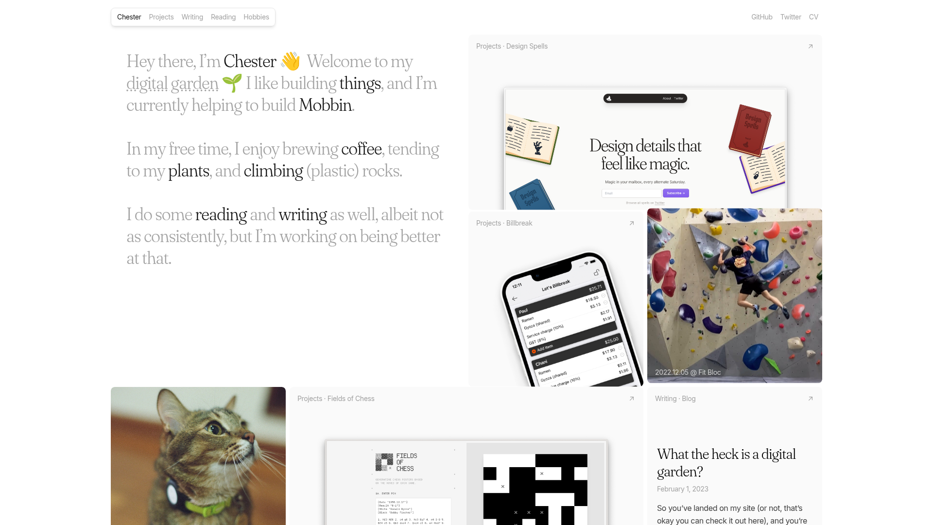
This personal portfolio site utilizes a sophisticated bento grid layout to showcase a diverse range of multifaceted content, including professional projects, blog posts, and personal hobbies. It is an excellent clone reference for its masterclass in responsive grid density, subtle micro-interactions, and a clean "digital garden" aesthetic that balances text-heavy sections with visual media.
Design System
- Color Palette & Visual Hierarchy: The design uses a muted neutral background (
bg-neutral-50) and text (text-neutral-400) to let content assets pop. High-contrast accent colors are used sparingly for interactive text underlines (sky, rose, lime, purple) and monochromatic labels. - Typography System: A sophisticated mix of a serif-variation font (used for headers and body introductions) and a clean sans-serif for metadata and navigation. Hierarchy is established through size (2xl to 4xl for headings) and font-weight variation rather than color.
- Page Structure: The layout is a masonry-style bento grid that shifts from 1 column on mobile to up to 4 columns on large screens (
xl:grid-cols-4). It begins with a double-span introductory text block followed by tiles of varying aspect ratios (1:1 and 2:1). - Reusable Components:
- Bento Tiles: Responsive containers with
rounded-lgcorners and overflow-hidden. - Skeuomorphic Tags: Small, high-contrast labels with
shadow-inset-skeuofor status or category indicators. - External Link Buttons: Circular hover-active icons that appear in the top right of cards.
- Bento Tiles: Responsive containers with
- Interaction & Motion: Extensive use of Tailwind-based hover states: cards shift background to
neutral-100, images scale slightly (group-hover:scale-105), and text underlines animate on hover. Some images feature a "slide-down" animation to reveal category headers. - Implementation Clues: The HTML reveals a Next.js framework utilizing Tailwind CSS for styling. The grid uses
sm:grid-flow-row-denseto automatically fill gaps in the masonry layout, ensuring a tight visual fit regardless of tile size.
Use Cases
- Who should clone this: Creatives, developers, or researchers who need to display a heterogeneous mix of work (code, photos, writing) without looking cluttered.
- Effective Remixes: This pattern works exceptionally well for curating "now" pages, resource libraries, or startup landing pages that need to highlight multiple distinct features or integrations.
- Remix Directions: Replace the hobby photos with product feature screenshots or testimonials. The specific color-coded underlines in the intro text can be mapped to different service categories to act as a primary navigation hub.
- Clone Scope: Developers should first clone the responsive grid container and the standardized tile logic (header, content, footer) to ensure layout stability before customizing the individual card internal structures.
Related Inspirations

Christopher Doyle Agency Portfolio Layout
A minimalist, typography-led portfolio featuring a wide-margin grid system, smooth fade-in animations, and simple image-focused project cards.
Vita Architecture Portfolio Landing Page
A minimalist, high-end architecture portfolio featuring a custom canvas-based image gallery, split-text animations, and a project slider with dynamic image masks.
Erno Works Minimalist Design Portfolio
A clean, typography-focused portfolio featuring a sticky grid layout, large editorial headers, and integrated video project thumbnails for dynamic case study previews.
Gio Pandone Minimalist Portfolio Template
A clean, grid-based designer portfolio featuring a sticky minimalist navigation, scroll-triggered entrance animations, and a responsive 12-column work gallery with embedded video previews.
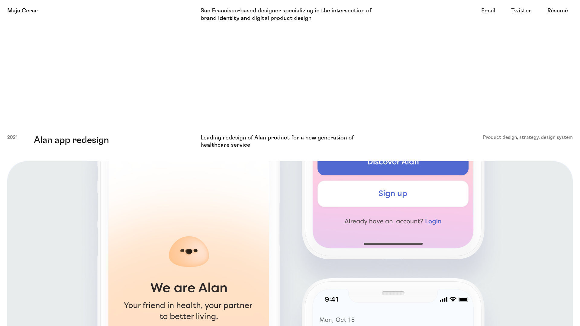
Maja Cerar Minimalist Portfolio Template
A clean, horizontal-grid portfolio featuring a sticky header, structured project metadata, and high-impact full-width imagery for product design case studies.
Ka Ra Studio Design Portfolio
A minimalist design portfolio featuring a centered typography-led layout with interactive image slideshows arranged in a flexible two-column grid.
