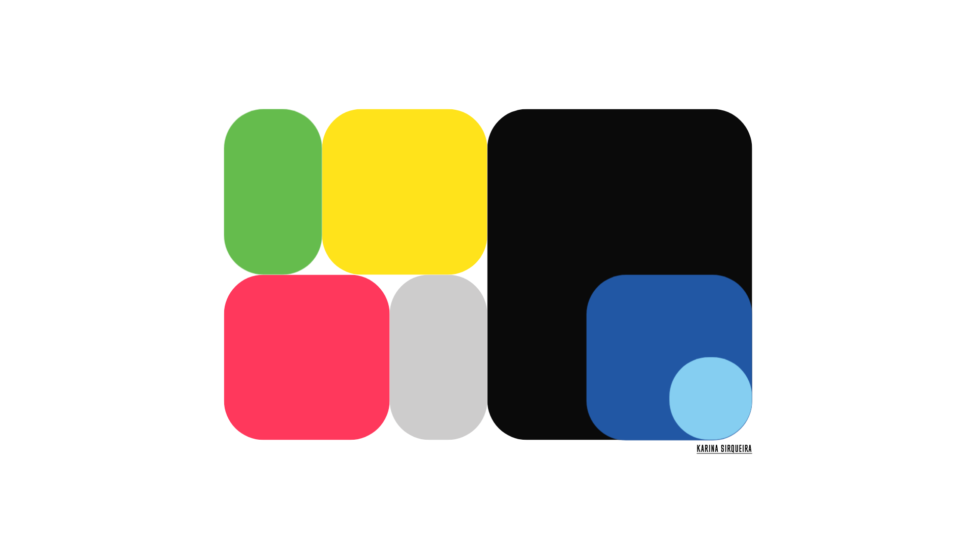
Karina Sirqueira Creative Bento Portfolio
A minimalist bento-grid landing page featuring rounded geometric cards with smooth SVG icon transitions and full-screen project navigation.
Overview
This website is a highly minimalist bento-grid portfolio that uses bold geometric shapes as primary navigation elements. It serves as an excellent clone reference for creatives looking to build a high-impact, low-text landing page that relies on color theory and smooth SVG transitions to guide the user experience.
Design System
- Color Palette & Visual Hierarchy: The design uses a vibrant, multi-colored palette where each "card" possesses a distinct background (e.g., #65BC4D green, #ffe31b yellow, #FF385C red). Hierarchy is established through varied card sizing within the grid, with a large black rectangle anchoring the right side of the layout.
- Typography: The typography is extremely restrained, featuring a clean, condensed sans-serif (seen in the name "KARINA SIRQUEIRA"). The scale is small relative to the graphic elements, emphasizing the brand's visual identity over verbal descriptions.
- Page Structure: The layout follows a non-standard bento-grid flow. It features a central cluster of seven interactive rounded-square and rectangular cards of varying heights and widths, centered vertically and horizontally on a stark white background.
- Reusable Components: The primary reusable component is the
home__media__element, a container designed to hold reactive SVG logos. The grid containers are defined by inline CSS variables (--background) which make them easily themeable. - Interaction and Motion: The HTML reveals that these project blocks are links (
<a>tags) wrapping SVG images. The design relies on hover states and fluid transitions between these shapes and their respective full-screen project pages. - Responsive Behavior: The minimalist grid is designed to scale; in mobile views, these rectangular blocks typically stack or reflow into a singular column of color while maintaining their high-contrast, edge-to-edge appearance.
- Implementation Clues: The HTML structure uses a
data-template="home"attribute and class-based naming (home__wrapper,home__content) suggesting a custom framework implementation where state determines the visibility of specific media elements.
Use Cases
- Who should clone this: Digital designers, motion artists, and brand directors who have a small selection of high-profile projects and want a "wow-factor" entrance without heavy copy.
- Effective Remixes: This pattern works well for agency landing pages, digital business cards, or aesthetic-heavy product launches (e.g., a jewelry line where each color block represents a different material).
- Remix Directions: Swap the brand colors for a monochromatic palette for a luxury feel, or replace the SVG logos with high-quality video loops inside the rounded rectangles.
- Clone Scope: A quick section clone is highly effective here—the bento-grid container itself can be extracted and used as a standalone navigation component inside a more traditional long-form website.
Related Inspirations
Studio Lathe Minimalist Portfolio List
A high-contrast, minimalist portfolio layout featuring a dense list-based project index with flexible category labeling and a full-screen yellow background.

Niklas Rosén Designer Portfolio Index
A minimalist, responsive grid-based portfolio index featuring a clean 16-column layout, typographic list components, and a custom dark mode transition.

Clase Agency Branding Portfolio
A minimalist design agency portfolio featuring a typographic hero section, full-width image articles, sticky title bars, and integrated scrolling text marquees for a clean editorial layout.
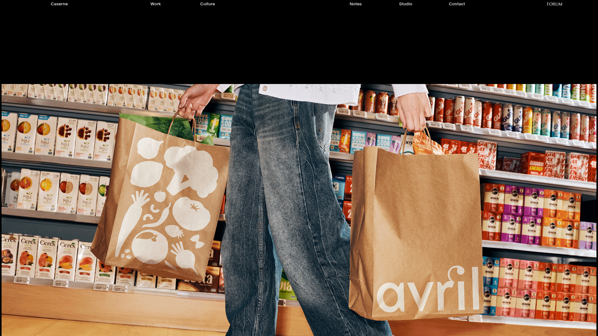
Caserne Design Studio Portfolio
A minimalist, high-impact portfolio featuring a dynamic masonry grid of project thumbnails with overlay text and a clean, oversized typography-driven footer.

Lundqvist & Dallyn Studio Portfolio
Minimalist design studio portfolio featuring a custom video loader, world clock navigation, and a fluid masonry-style grid for high-quality photography and type design showcases.

Baubauwerk Minimal Agency Portfolio Homepage
A clean studio site featuring a centered text hero, scatter-plot filterable project gallery, and full-bleed image sections for case studies.
