Peter Tarka Portfolio Bento Grid
An interactive, split-screen bento grid featuring full-height vertical columns, hover-triggered video overlays, and seamless transitions for a visual-heavy creative portfolio.
Overview
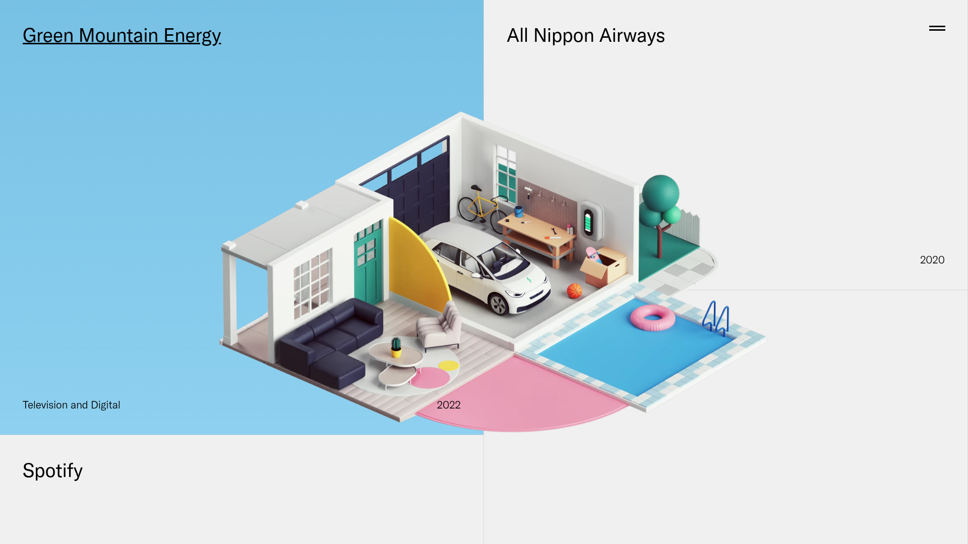
This portfolio site utilizes a dual-column vertical bento layout that prioritizes high-fidelity 3D artwork through an immersive, minimalist interface. It is an exceptional reference for builders who want to showcase a visual-heavy catalog using a unique split-screen navigation that feels both professional and experimental.
Design System
- Color Palette & Visual Hierarchy: The system relies on a high-contrast foundation of off-white (#f0f0f0) backgrounds against black typography. Individual grid items use vibrant gradient overrides (e.g.,
linear-gradient(rgb(119, 193, 229) 0%, rgb(142, 208, 239) 100%)) that appear on hover or selection, creating a dynamic visual hierarchy that guides the eye to the active project. - Typography: A clean, neo-grotesk sans-serif is used throughout. Headings (H1) are sized for impact but maintain tight letter-spacing, while secondary meta-information (like years and categories) is significantly reduced in scale to keep the focus on the artwork.
- Page Structure: The layout is built using a flex-grid of two primary columns (
FlexGrid__Col). Each project is an<article>tag occupying a segment of the column. This structure allows the content to scroll vertically within partitioned zones rather than across a standard full-width page. - Reusable Components: The core component to clone is the "Interactive Grid Tile." These tiles support dynamic background changes and serve as anchors for the overlay video system. A secondary component is the persistent "Social & Credit" footer tile that uses a distinct dark mode state (
data-dark="true"). - Interaction & Motion: The site features a sophisticated video overlay system (
video-solo). When a user interacts with a grid item, a high-quality video or image asset is rendered over the background, often bleeding across the split-screen divider. The transitions use CSS opacity and position transforms to ensure smooth scene changes. - Implementation Clues: The HTML reveals a React-based build (Next.js) using styled-components for CSS-in-JS. The use of
data-interactive="true"attributes suggests a custom hook-based system for triggering the complex hover states and video source swaps.
Use Cases
- Who Should Clone This: 3D artists, motion designers, architectural firms, and digital agencies with a small but highly polished set of marquee case studies.
- Effective Remixes: This pattern can be effectively remixed into a luxury e-commerce landing page where the left column features product categories and the right column displays immersive product close-ups upon selection.
- Practical Remix Directions: To adapt this, builders could replace the full-screen video background with static Lottie animations for better performance on mobile, or swap the dual-column layout for a triple-column grid for larger portfolios.
- Suggested Clone Scope: Start with a single-page clone focusing on the
FlexGridlogic and the hover-triggered background transitions. The navigation menu and social bar are secondary to the core interactive bento experience.
Related Inspirations
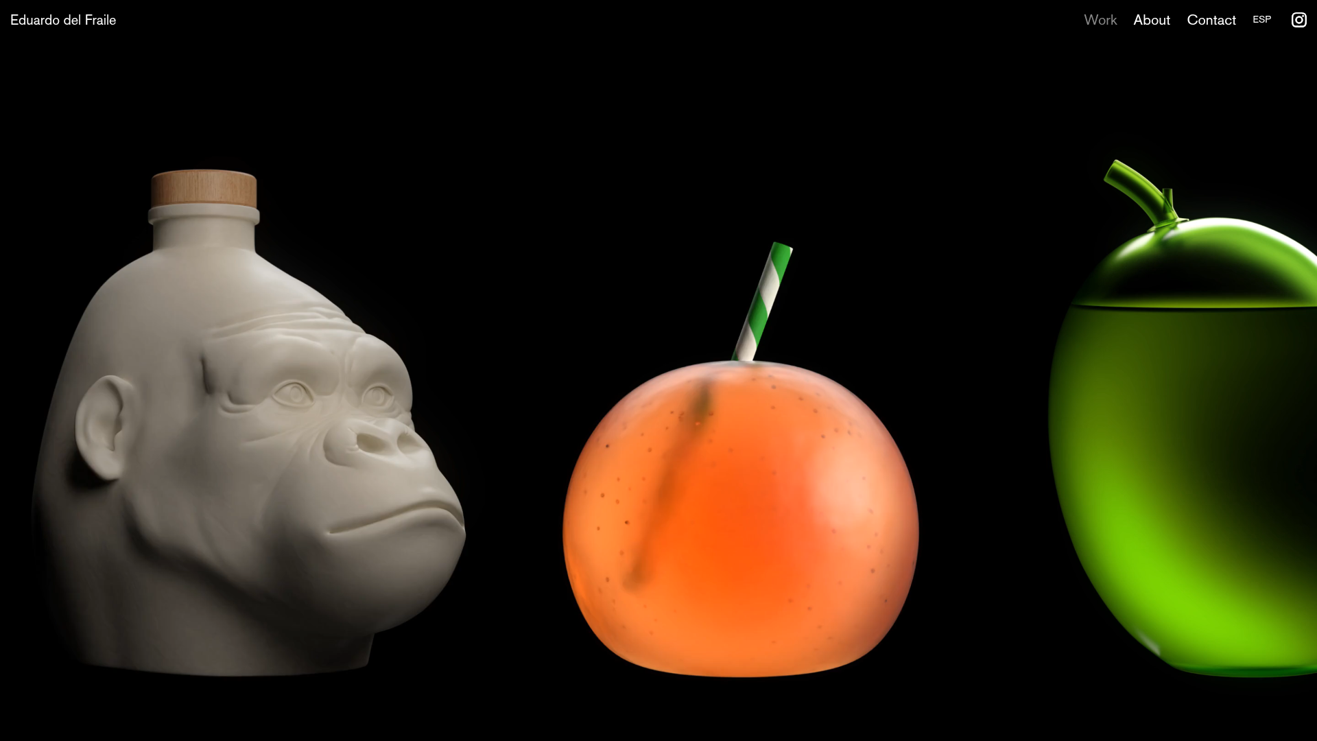
Eduardo del Fraile Horizontal Portfolio
A minimalist horizontal-scroll gallery featuring large-scale media blocks with integrated video-on-hover effects and a custom scrollbar tracker.
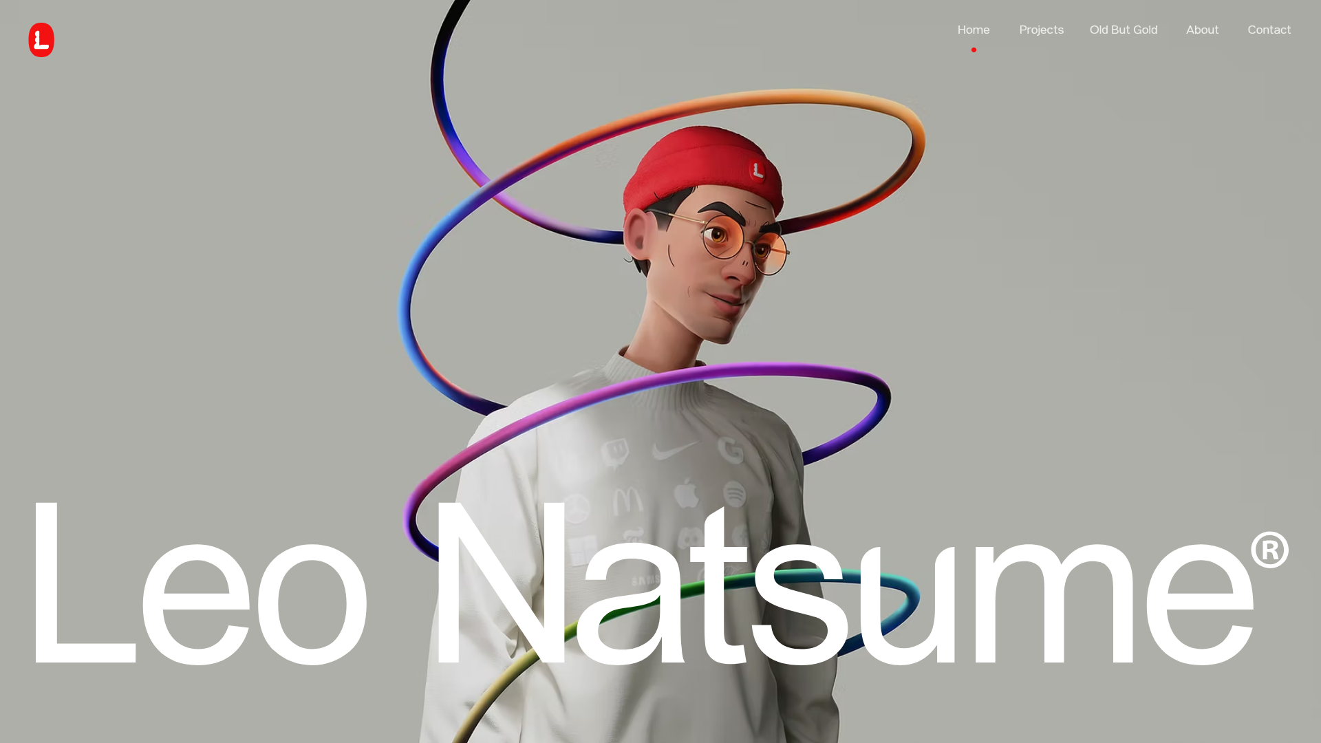
Leo Natsume Creative Portfolio
A high-impact portfolio featuring an animated 3D hero section, horizontal project separators, sticky navigation, and embedded video-based case study previews.
Bruno Arizio Designer Portfolio Website
A minimalist creative director portfolio featuring a clean typographic layout, side-aligned image previews, and high-contrast spacing patterns suitable for luxury or design showcases.
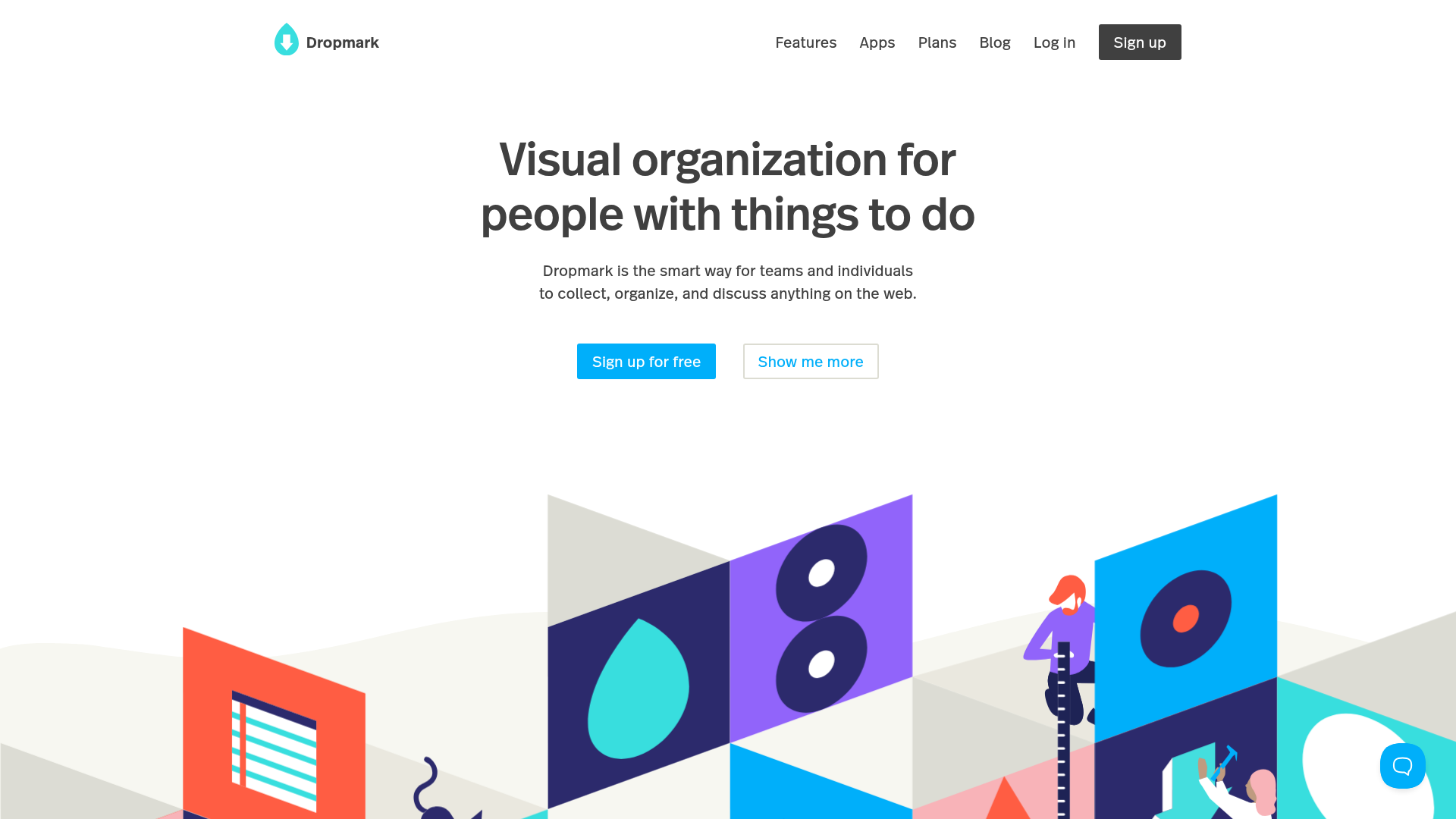
Dropmark Visual Organization Landing Page
Features a clean minimalist hero section with split-action buttons, a vibrant vector illustration footer, and an interactive horizontal flickity carousel for case studies.
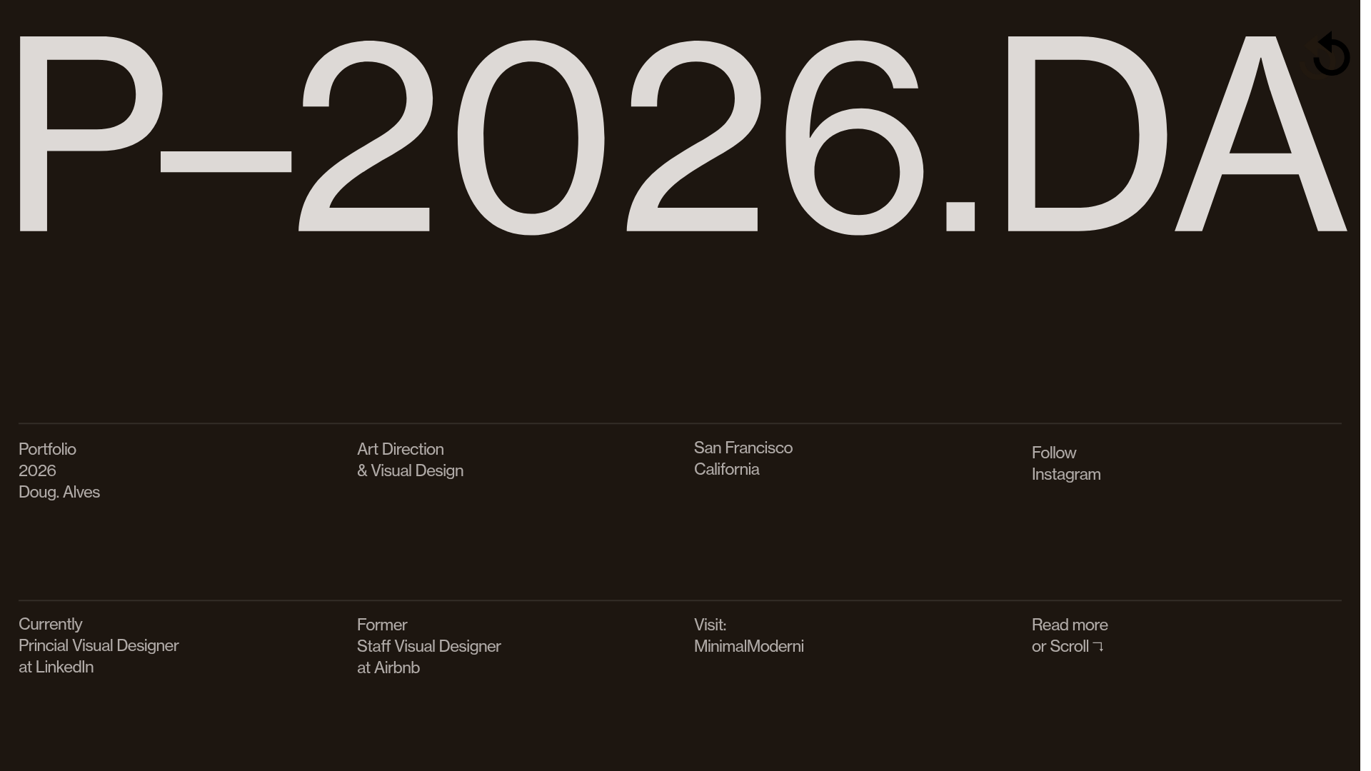
Doug Alves Visual Design Portfolio
A minimalist, high-contrast design portfolio featuring oversized typography, a sticky four-column grid footer, and a vertical scroll-triggered slide-show for project showcases.
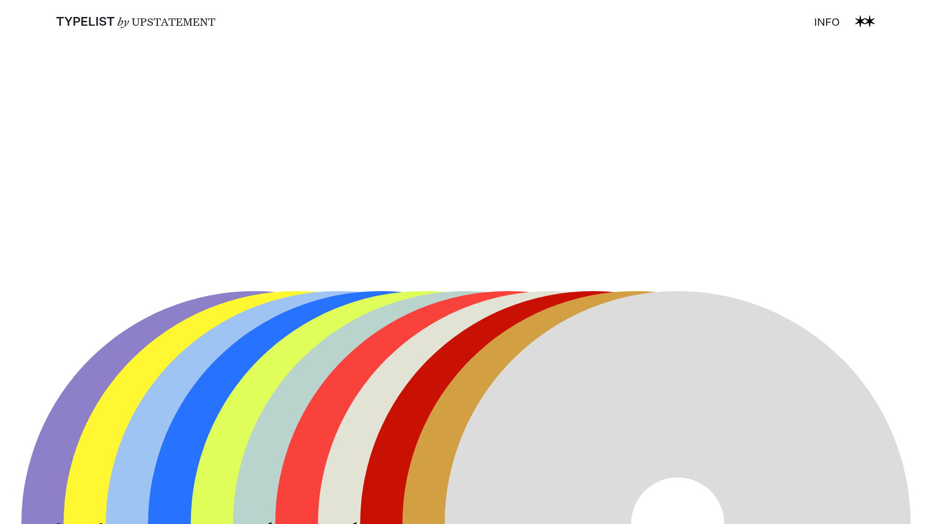
Typelist Typography Playlist Gallery
A creative curated gallery featuring a horizontal overlapping disc navigation pattern, CSS-driven theme color shifting, and smooth page transitions for showcasing design collections.
